Virtual Reality Computer Model of Jeremy Bentham’s Panopticon
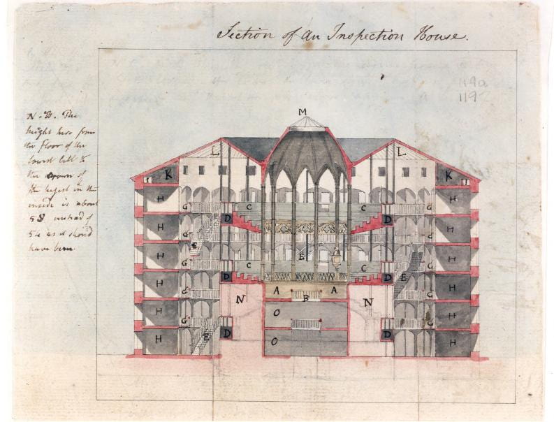
My master’s thesis project at the University of Cambridge explores the architecture and power dynamics of Jeremy Bentham’s panopticon. Based on exceptionally detailed and accurate-to-the-inch measurements given in Bentham’s 18th-century letters and drawings, this project reconstructs his panopticon in virtual reality. Despite his claims of total oversight, design flaws undermine effective surveillance. The project highlights how Bentham’s vision anticipates future technologies that only now – three centuries later – fully realize his original ambitions of total control.

As published by literary magazine Aeon: A World of Ideas VIEW PUBLICATION >

The Panopticon: a problem of definition

The panopticon is a conceptual proposal for a building developed by philosopher Jeremy Bentham in the 1790s. The panopticon claims to be an architectural model of surveillance for institutions that include prisons, hospitals, workhouses, factories, and schools. While Bentham envisioned it as an all-seeing design, practical implementations, such as the Eastern State Penitentiary, reveal significant design flaws that hinder its efficacy. Modern interpretations, in turn, link the panopticon to contemporary surveillance and the operations of the internet. VIEW PUBLICATION >

California Waterscape: time-lapse history of water supply

This time-lapse film visualizes the evolution of this state’s water delivery infrastructure from 1913 to 2019 through geo-referenced data on aqueducts, reservoir capacities, and land use. The animated film showcases population growth, urbanization, and agricultural demands, presenting cartographic snapshots that reflect the state’s increasing water needs over the decades. VIEW PUBLICATION >

Here Grows New York City

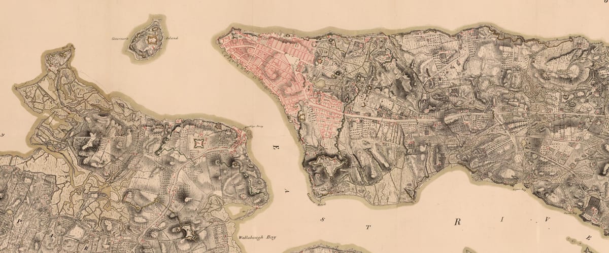
Here Grows New York is an American urban planning film directed by Myles Zhang and advised by urban historians Kenneth T. Jackson and Gergely Baics. The data visualization uses time-lapse cartography to follow the history of New York City’s infrastructure and street system development from 1609 to the present day. The video quickly went viral, gaining over five million views. The film is used in dozens of architecture and urban planning classes about the history of the urban form. VIEW PUBLICATION >

24 Hours in the London Underground

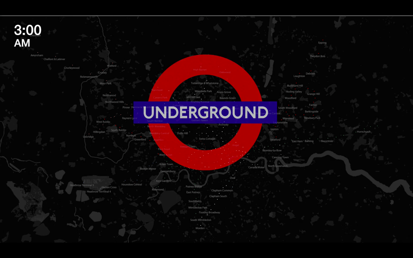
This animation visualizes London Underground commuting patterns using 25,440 data points from 265 stations over two weeks in 2010. Pulsating colored dots represent busy and less busy stations, while audio volume syncs with ridership density. The project draws analogies between urban movement and human physiology, highlighting the city as a complex web of nerve endings, cellular units, organs, and the pulsating blood vessels of mass-transit lines. VIEW PUBLICATION >

Railroad commuting patterns in New Jersey

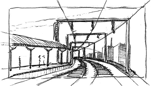
NJ Transit carries over 90,000 commuters per day to and from New York Penn Station, the busiest rail station in the Western Hemisphere. Like spokes on a wheel, these commuter rail lines radiate from the urban core of Midtown Manhattan. Hover over stations to view statistics. Dot size corresponds to number of riders per day: Large dots for busy stations and small dots for less busy stations. VIEW PUBLICATION >

Geography of Marijuana Arrests

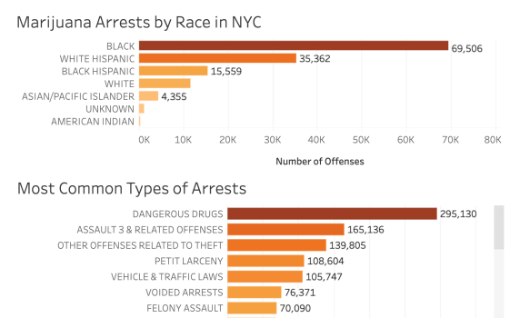
Before the legalization of recreational marijuana in 2021, the NYPD reported over 102,000 marijuana-related arrests in 2017, disproportionately affecting Black males from low-income areas, despite similar usage rates among other demographics. This system wastes taxpayer dollars and perpetuates a cycle of criminalization for those impacted by arrests. In this series of data visualizations and maps, I walk readers through the geography of marijuana incarceration. VIEW PUBLICATION >

New York City Subway Ridership Patterns

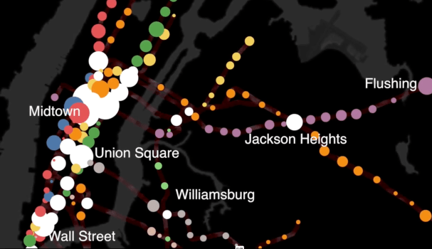
The MTA’s 424 subway stations and 665 miles of track are analogous to the human circulatory system. Every weekday pre-coronavirus, the subway carried 5.4 million people, mostly commuters. This daily commute is ordered, structured, and rhythmic – as Manhattan’s population swells during the daily commute and then contracts by night. Each passenger symbolizes the movement of a single red blood cell. With each paycheck, the oxygen of capitalism flows from the heart of Manhattan to the cellular homes in the outer boroughs.

As published by Gothamist VIEW PUBLICATION >

Where in the world is modernism?

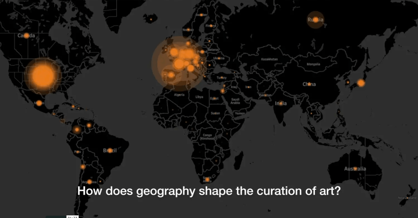
What if the nationality of every artist represented in the Museum of Modern Art’s collections were mapped to illustrate the museum’s evolving geographic diversity from the 1920s to today? Watch this data visualization that shows the provenance and geographical origins of 121,823 works of art selected from MoMA’s collections. Explore supporting data visualizations and interactive dashboards. VIEW PUBLICATION >

A History of Historic Preservation in New York City

Developed with historian Kenneth Jackson.

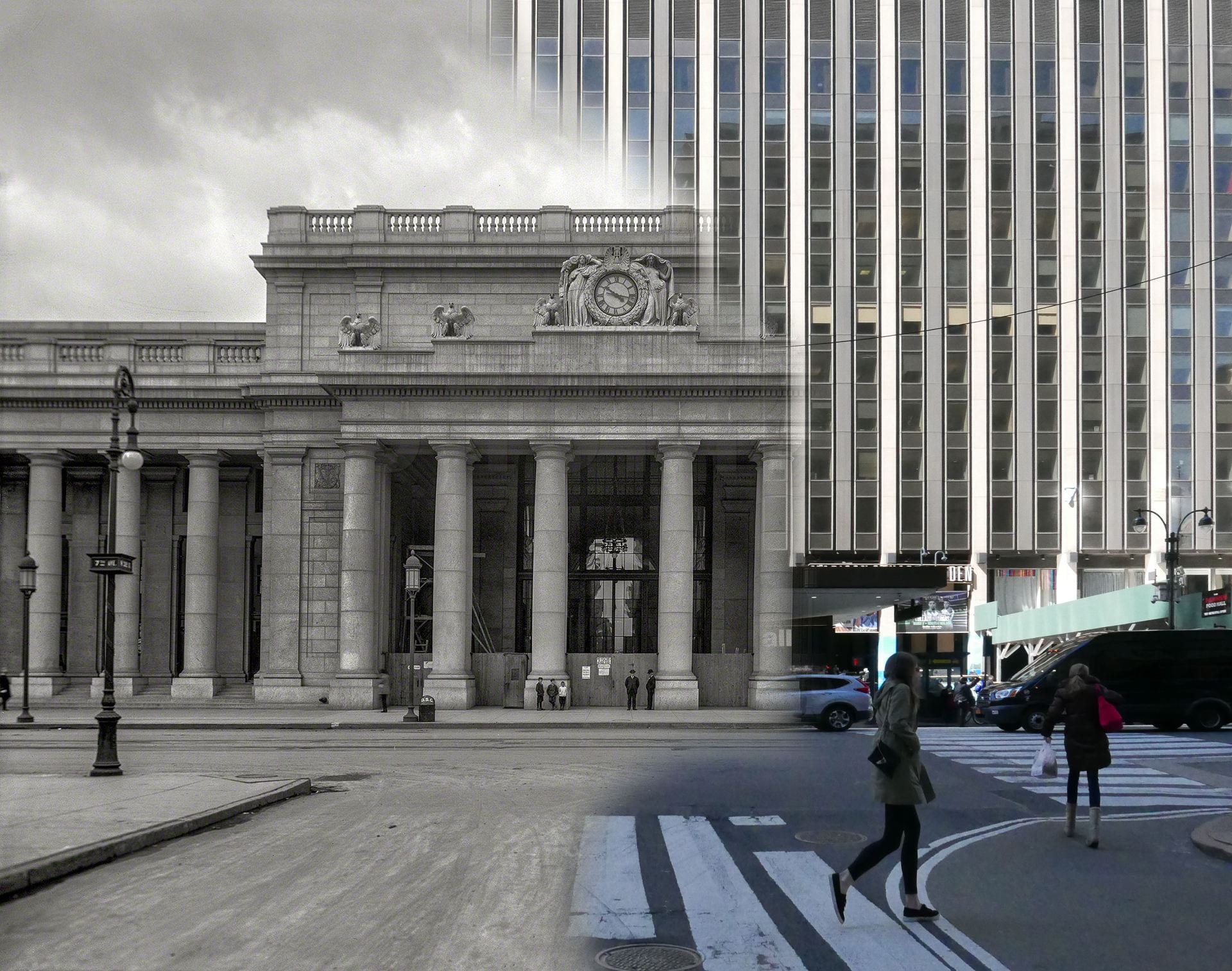
Data analysis of NYC landmarks since 1965 reveals trends and biases in the landmarks preservation movement. By 2018 estimates, New York City has granted historic
landmark status to 128,594 structures across Five Boroughs. This visualization and the accompanying analysis assess the geographical spread, location, and age of landmarks with publicly-available metadata. VIEW PUBLICATION >

The Geography of Art History

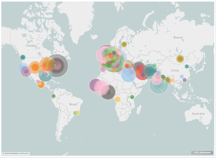
According to the Metropolitan Museum of Art Related: Data analysis and visualization of 120,000 works in the Museum of Modern Art In this film, each colored dot indicates one location represented by art in the Met’s online database. Dot location indicates artwork provenance. Dot size indicates the number of objects from this place. The time each dot appears corresponds to the year this work was created. This data is assumed to be an accurate sample size. Over the past few years, the Metropolitan Museum has catalogued over 25% of its holdings online. This represents ~590,000 objects, covering over 5,000 years… VIEW PUBLICATION >

Computer Model of the Kaaba in Mecca

The Kaaba (Arabic: ٱلْـكَـعْـبَـة “The Cube”) is a building at the center of Islam’s most important mosque in Mecca.

In 2018, I was unhappy with the available quality of 3D digital models of the Kaaba. So I created this accurate-to-the-inch model based on architects’ drawings and photos. VIEW PUBLICATION >