Interactive time-lapse map about construction of the Auschwitz-Birkenau concentration camp
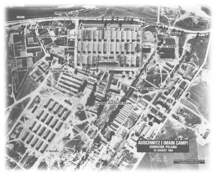
This project utilizes georeferenced historical maps and time sliders to document the transformation of the region around the Auschwitz-Birkenau concentration camp from 1945 to today. The interactive map highlights the selective preservation, demolition, decay, or adaptive reuse of significant camp structures linked to the Holocaust. The project uses interactive time-lapse cartography to inform public understanding of the Holocaust and the landscape of tragedy it produced. VIEW PUBLICATION >

Jersey City: Urban Planning in Historical Perspective

This urban planning pamphlet was commissioned by the Jersey City Public Library as an educational tool about the city’s history from 1900 to today. The project overlays citywide maps of every building in 1873, 1919, and today – to reveal changing land use patterns. The project also includes a PDF booklet about Jersey City’s six master plans, each of which captures the spirit of the city and the governing philosophies of city planners at the time. These documents reveal the city’s evolution in response to urban challenges and broader themes in U.S. urban history.

As published by Jersey City Public Library with financial support from Hudson County government VIEW PUBLICATION >

Newark Changing in Maps: 1889, 1927, 1930

This project overlays historical city-wide fire insurance and tax maps above the contemporary geography to reveal change over time. Detailed maps of building footprints from 1889, 1927, and 1930 reveal different patterns of land use, community life, and walkable streets. Find your building, your workplace, or any site in Newark – and identify who lived there a century ago with the unique tool of this interactive map. VIEW PUBLICATION >

Time-lapse History of the United States

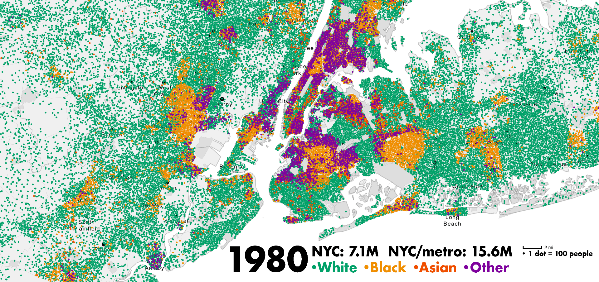
This animation maps 272,000 data points over 230 years of U.S. census data from 1790 to 2020. The film uses racial dot maps and maps of population density over time to illustrate America’s urbanization, industrialization, and conquest of the frontier. Each dot represents 10,000 people, with major cities highlighted. Philip Glass’s accompanying music prompts reflections immigration, land use, and transportation technology’s influence on settlement patterns. VIEW PUBLICATION >

The Detroit Evolution Animation

Old maps were layered and animated to reveal the scale of Detroit’s transformation from French colonial trading post, to 19th-century boom, to 20th-century decline. Cartography highlights how political policies, technological changes, and the Great Migration accelerated racial segregation and the decline of mass transit. Detroit reflects broader trends seen in American cities.

Project developed with historian Robert Fishman for an exhibit and lecture, funded by Egalitarian Metropolis grant from Mellon Foundation. VIEW PUBLICATION >

The time-lapse history of Manhattan in two minutes

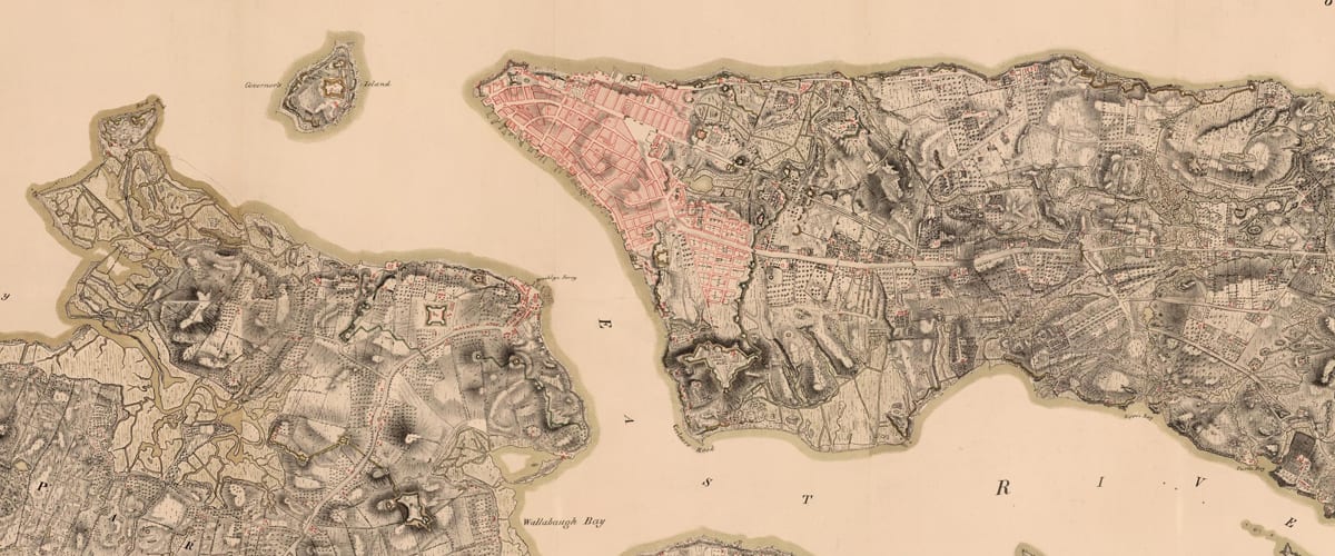
This two-minute time-lapse film illustrates the 400-year transformation of Lower Manhattan from a Dutch village to a modern metropolis, highlighting the impact of new technologies on evolving methods of urban representation. The film draws from seventeenth-century drawings to modern photography, showcasing how each generation perceived and depicted through art the city’s growth and the changing world around them. VIEW PUBLICATION >

The Berlin Evolution Animation

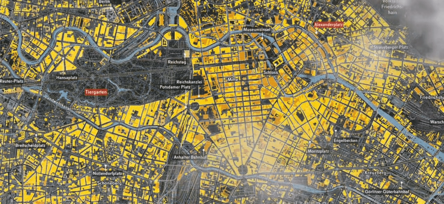
Abstract: The Berlin Evolution Animation visualizes the development of this city’s street network and infrastructure from 1415 to the present-day, using an overlay of historic maps. The resulting short film presents a series of 17 “cartographic snapshots” of the urban area at intervals of every 30-40 years. This process highlights Berlin’s urban development over 600 years, the rapid explosion of industry and population in the nineteenth-century, followed by the destruction and violence of two world wars and then the Cold War on Berlin’s urban fabric. VIEW PUBLICATION >

California Waterscape: time-lapse history of water supply

This time-lapse film visualizes the evolution of this state’s water delivery infrastructure from 1913 to 2019 through geo-referenced data on aqueducts, reservoir capacities, and land use. The animated film showcases population growth, urbanization, and agricultural demands, presenting cartographic snapshots that reflect the state’s increasing water needs over the decades. VIEW PUBLICATION >

Here Grows New York City

Here Grows New York is an American urban planning film directed by Myles Zhang and advised by urban historians Kenneth T. Jackson and Gergely Baics. The data visualization uses time-lapse cartography to follow the history of New York City’s infrastructure and street system development from 1609 to the present day. The video quickly went viral, gaining over five million views. The film is used in dozens of architecture and urban planning classes about the history of the urban form. VIEW PUBLICATION >

24 Hours in the London Underground

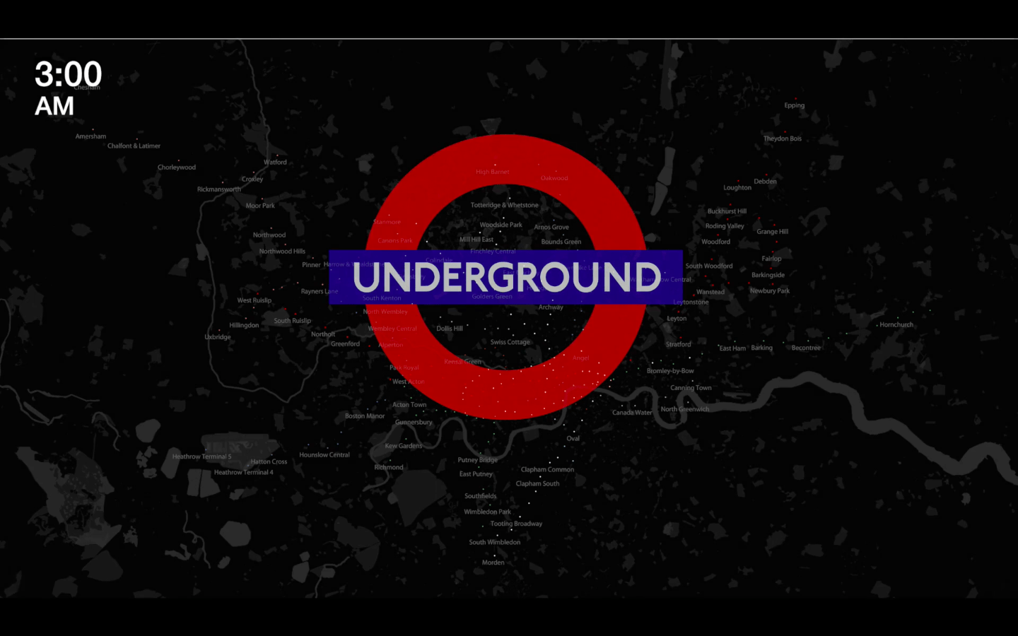
This animation visualizes London Underground commuting patterns using 25,440 data points from 265 stations over two weeks in 2010. Pulsating colored dots represent busy and less busy stations, while audio volume syncs with ridership density. The project draws analogies between urban movement and human physiology, highlighting the city as a complex web of nerve endings, cellular units, organs, and the pulsating blood vessels of mass-transit lines. VIEW PUBLICATION >

Railroad commuting patterns in New Jersey

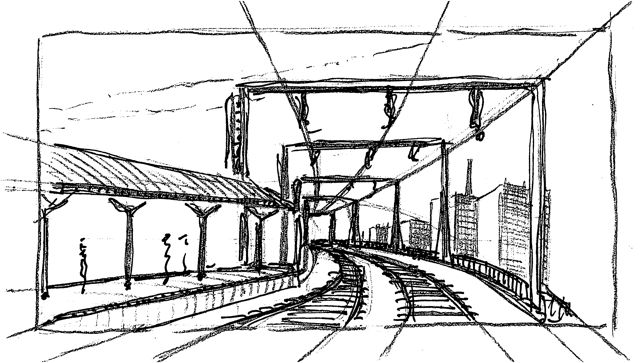
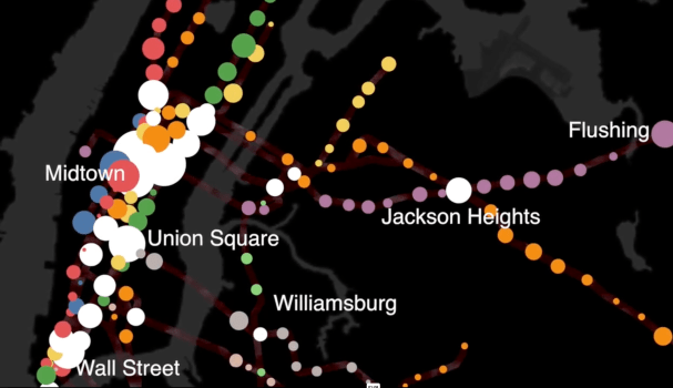
NJ Transit carries over 90,000 commuters per day to and from New York Penn Station, the busiest rail station in the Western Hemisphere. Like spokes on a wheel, these commuter rail lines radiate from the urban core of Midtown Manhattan. Hover over stations to view statistics. Dot size corresponds to number of riders per day: Large dots for busy stations and small dots for less busy stations. VIEW PUBLICATION >

New York City Subway Ridership Patterns

The MTA’s 424 subway stations and 665 miles of track are analogous to the human circulatory system. Every weekday pre-coronavirus, the subway carried 5.4 million people, mostly commuters. This daily commute is ordered, structured, and rhythmic – as Manhattan’s population swells during the daily commute and then contracts by night. Each passenger symbolizes the movement of a single red blood cell. With each paycheck, the oxygen of capitalism flows from the heart of Manhattan to the cellular homes in the outer boroughs.

As published by Gothamist VIEW PUBLICATION >

A History of Historic Preservation in New York City

Developed with historian Kenneth Jackson.

Data analysis of NYC landmarks since 1965 reveals trends and biases in the landmarks preservation movement. By 2018 estimates, New York City has granted historic
landmark status to 128,594 structures across Five Boroughs. This visualization and the accompanying analysis assess the geographical spread, location, and age of landmarks with publicly-available metadata. VIEW PUBLICATION >

The Geography of Art History

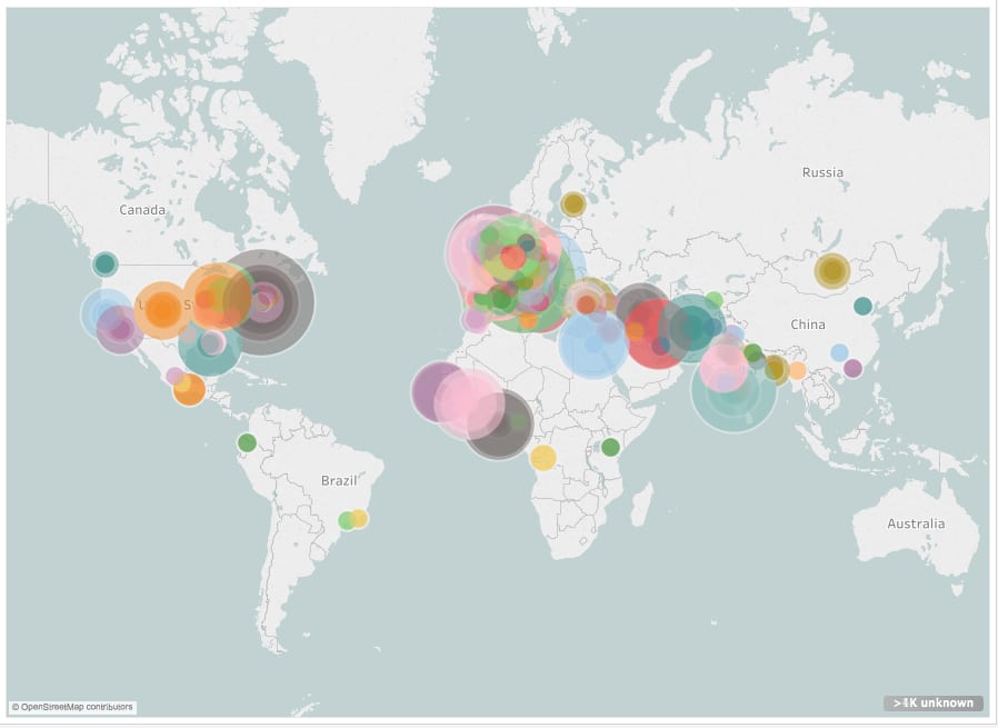
According to the Metropolitan Museum of Art Related: Data analysis and visualization of 120,000 works in the Museum of Modern Art In this film, each colored dot indicates one location represented by art in the Met’s online database. Dot location indicates artwork provenance. Dot size indicates the number of objects from this place. The time each dot appears corresponds to the year this work was created. This data is assumed to be an accurate sample size. Over the past few years, the Metropolitan Museum has catalogued over 25% of its holdings online. This represents ~590,000 objects, covering over 5,000 years… VIEW PUBLICATION >

New York Chinatown: time-lapse drawing

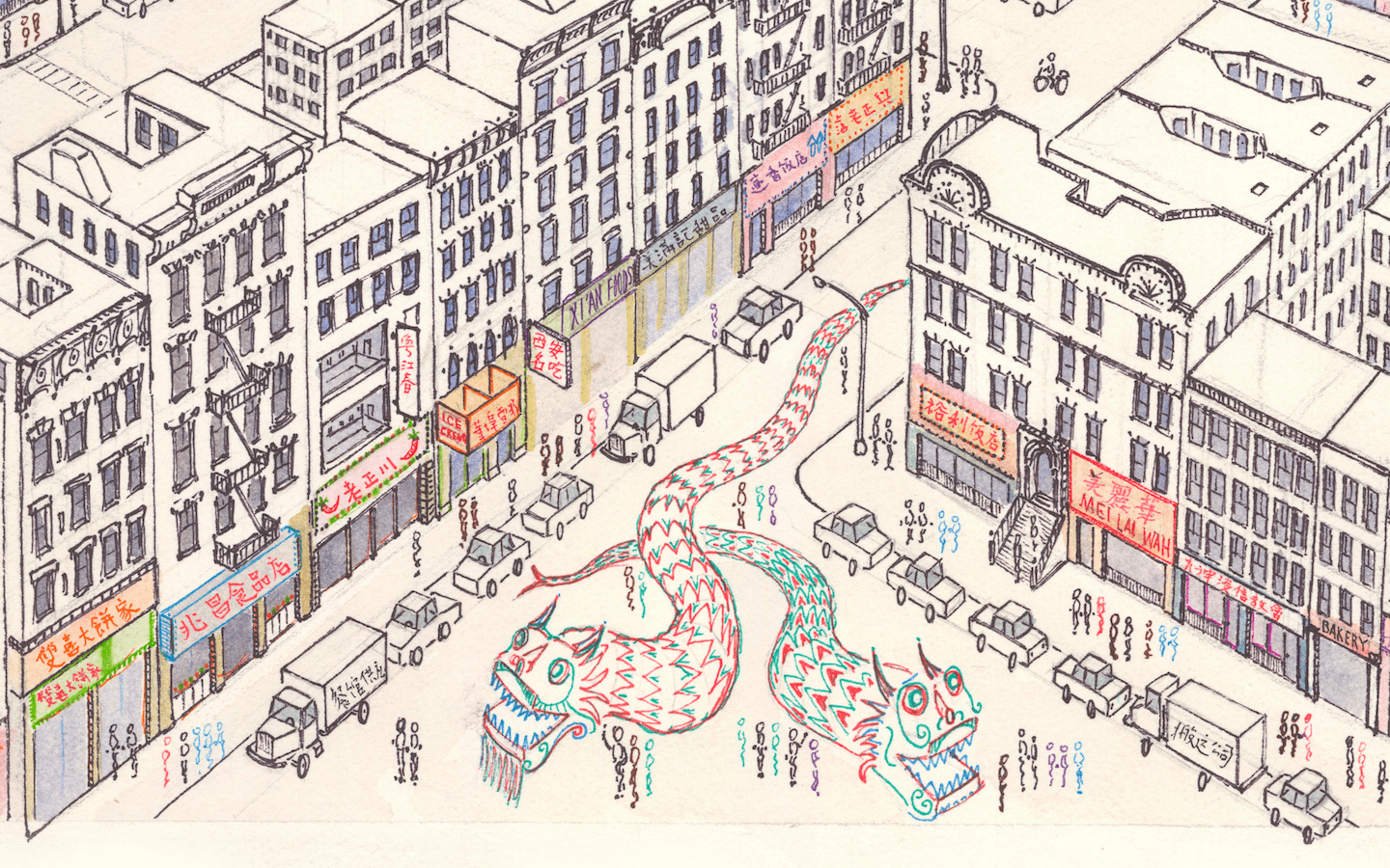
This time-lapse of Manhattan Chinatown took sixty hours to complete and measures 26 by 40 inches. The artwork features Chinatown’s tenements in the foreground, with Lower Manhattan’s skyscrapers towering above.

Drawing is shared online in lower resolution. Email me for the full-size file. Custom size prints will be mailed to your home address on request. VIEW PUBLICATION >