• This website includes dozens of videos, hundreds of essays, and thousands of drawings created over the past twenty years. Search to learn more about the history of buildings, places, prisons, Newark, New York City, and my PhD research on spatial inequality.

  • Or scroll down for the latest publications.

Railroad commuting patterns in New Jersey

View my data visualizations of New Jersey’s suburban growth here.
Created with data from NJ Transit on weekday and weekend rail ridership.
Or download my data from Tableau Public.
NJ Transit carries over 90,000 commuters per day to and from New York Penn Station, the busiest rail station in the Western Hemisphere. The construction of this rail network in the nineteenth and early twentieth centuries was focused around New York City. Like spokes on a wheel, these rail lines radiate from the urban center.
Hover over stations to view statistics. Dot color corresponds to train line. White dots are for stations where multiple lines intersect. Dot size corresponds to number of riders per day: Large dots for busy stations and small dots for less busy stations. For each station, the average number of daily riders is listed.

.

.

The map above shows weekday ridership patterns. Movement is centered around the employment hubs of Newark and New York Penn Station. The next two busiest stations are Secaucus Junction and Hoboken, but these two stations are not destinations. Instead, they are transfer points for commuters en route to New York City. Commuters collected from stations on the Pascack Valley, Bergen County, and Main Line are almost all headed to New York City, but they must transfer at Secaucus (to another NJT train) or at Hoboken (to PATH / Hudson River ferries).

.

.

This map shows Sunday ridership. On average, stations are 66% to 75% less busy on weekends. The thirteen stations along the Montclair-Boonton Line – between Bay Street and Denville – are also closed on weekends because ridership is so low. However, the only line that is almost as busy on weekends as it is on weekdays is the Atlantic City Line. This is likely because trains on this line serve weekend tourists to the New Jersey Shore and Atlantic City casinos.

.

.

Notice the large difference between the first four stations and all others listed. Keep in mind that a lot of this data double-counts a single passenger. For instance, someone riding from their home to work will be counted once in the morning, and again in the evening.

.

Writing Here Is New York in 1949, American writer E.B. White has this to say about suburban commuters:

.

“The commuter is the queerest bird of all. The suburb he inhabits […] is a mere roost where he comes at day’s end to go to sleep. Except in rare cases, the man who lives in Mamaroneck or Little New or Teaneck, and works in New York, discovers nothing much about the city except the time of arrival and departure of trains and buses, and the path to a quick lunch. […] About 400,000 men and women come charging onto the Island each week-day morning, out of the mouths of tubes and tunnels. […] The commuter dies with tremendous mileage to his credit, but he is no rover. […] The Long Island Rail Road alone carried forty million commuters last year, but many of them were the same fellow retracing his steps.” (p.18-21)

Northeast Corridor railroad time-lapse

Audio effects from Freesound; music is Metamorphosis by Philip Glass

.

The Northeast Corridor is the busiest passenger railroad in North America. This drone flight follows a high-speed Acela train making this 456 mile journey from Washington D.C. to Boston via Baltimore, Wilmington, Philadelphia, Trenton, Newark, New York City, Stamford, New Haven, and Providence.
This animation was created from Google Earth satellite imagery. I traced the Northeast Corridor route onto the ground, and I then programmed the computer to follow this route. I then added the inset map, sound effects, and clock in post-production.
The above animation is condensed. View the full and uncut 28 minute flight here.

New York City Subway Ridership

Created with data from the MTA.
Published by Gothamist on 22 January 2019.
Related: my data visualization of London Underground commuting patterns.

.

The visual language of data addresses a deeper need to humanize and soften the concrete jungle.

.

Sounds of breathingheartbeat, and subway from Freesound

.

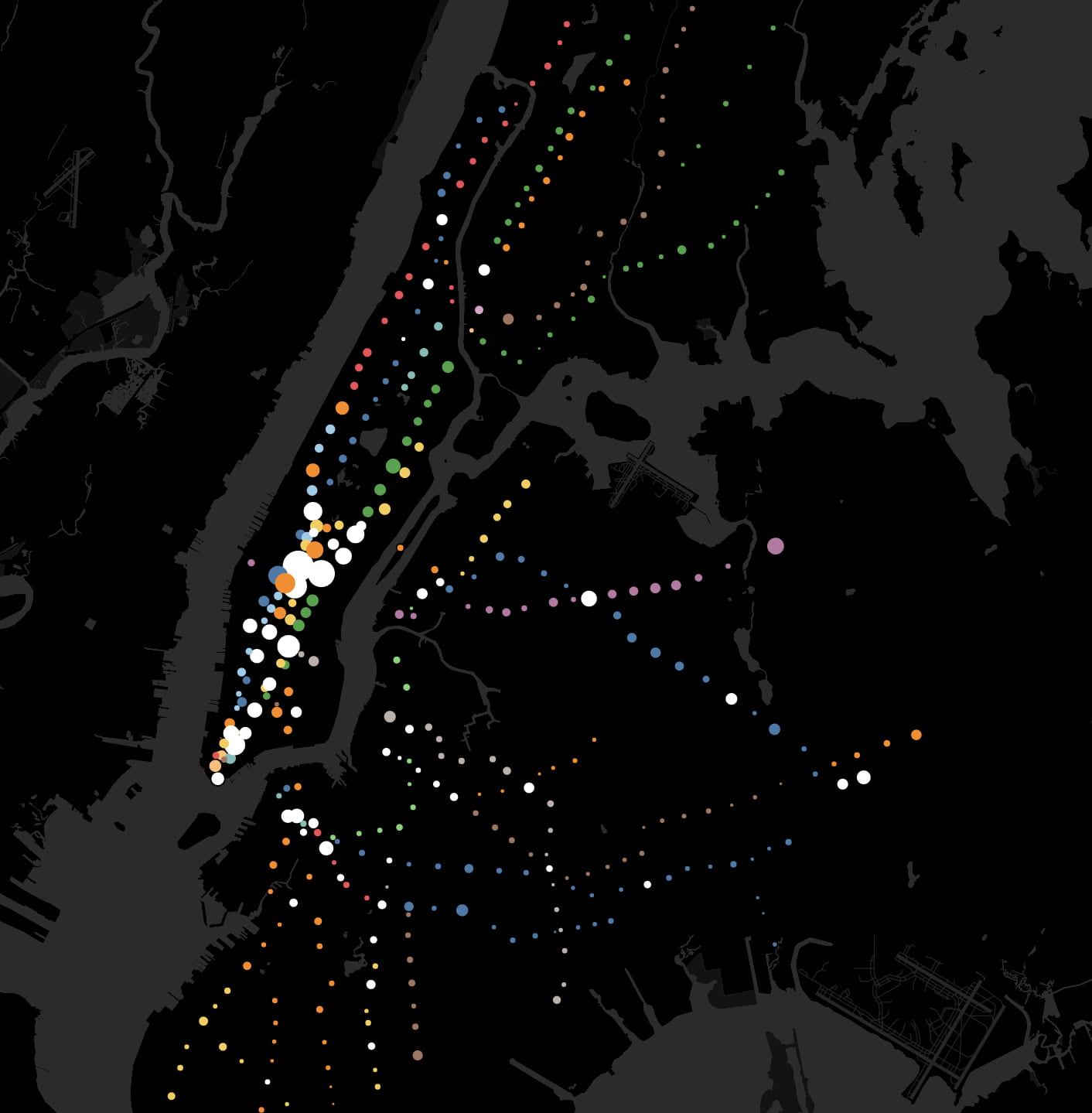
In this animation based on subway ridership statistics by station:
● Dots are color-coded according to the subway lines they serve.
● White dots are for junctions between two or more lines of different color.
● Dot size corresponds to the number of riders entering each station within a 24 hour period.
● Larger dots are for busier stations. Smaller dots are for less busy stations.
Movements through the New York City subway are analogous to rhythmic breathing.
People often describe cities in relation to the human body. Major roads are called “arteries” in reference to blood flow. The sewers are the city’s “bowels” in reference to our own digestive systems. Central Park is the city’s “lungs.” At various times in history, key industries like garments and finance were described as the “backbone” of New York’s economy. Although cities are complex organisms, wordplay makes the giant metropolis somehow more human and familiar.
The 424 subway stations and 665 miles of track are analogous to the human circulatory system. Every weekday pre-coronavirus, the subway carried 5.4 million people, mostly commuters. This daily commute is ordered, structured, and rhythmic – as Manhattan’s population swells during the daily commute and then contracts by night. Each passenger symbolizes the movement of a single red blood cell. With each paycheck, the oxygen of capitalism flows from the heart of Manhattan to the cellular homes in the outer boroughs.
Commuting patterns mirror the rhythmic expansion and contraction of the human body while breathing. By contrasting weekday and weekend ridership patterns, we detect the city’s respiratory system.

.

.

Interactive Map

.

Research Method

In this video lecture, I walk you through how I manipulated MTA and NYC open data
to create this animation.

.

The Metropolitan Transit Authority (MTA) publishes statistics on weekday and weekend (Saturday + Sunday) ridership for all 424 stations. These statistics, updated yearly, are public and can be analyzed to track trends in urban growth. I downloaded the MTA data and assigned each station a geographical coordinate (latitude + longitude) so that the data points would appear at their corresponding map locations.

I have a love-hate relationship with the New York City subway. At rush hour, it is crowded, hot, and slow. From years of riding its squeaky trains, it’s given me a ringing tinnitus sound in my ear. Despite its flaws, the subway is one of the few urban spaces where all social classes and ethnicities mix, where their separate lives are momentarily shared. Rich or poor, everyone rides the subway. I hope this animation renews appreciation for this engineering and the people behind it.

.

Sources

A History of Historic Preservation in New York City

Data analysis of NYC landmarks since 1965 reveals trends and biases in the landmarks preservation movement.

Developed with urban historian Kenneth Jackson at Columbia University’s Department of History

.

.

A visual history of landmarks preservation in NYC. Data from NYC Open Data. Music from Freesound.

.

Introduction

There is ongoing debate between in NYC between developers seeking to rebuild the city in the image of global capitalism and preservationists seeking to slow the rate of change and protect the appearance of the city’s many and distinct neighborhoods. Several factors drive historic preservation: fear of losing heritage; fear of change; historians, public servants, and well-intentioned activists in the spirit of Jane Jacobs. This debate has played out every year since 1965 through the hundreds of structures that are added to (or rejected from) the Landmarks Preservation Commission’s running list of landmarks (LPC). Once added, landmarked buildings cannot be modified without first seeking approval from the city. Landmarks preservation is contentious for developers because the protections of preservation law are permanent and affect all current and future owners. Preservation law further restricts significant rebuilding, even if demolition and rebuilding are lucrative for the property owner.
Historians decide the future of the city’s built environment. The sites they preserve will become the architectural lens through which future generations will appreciate the past. The sites they approve for demolition will be lost to history. Preservation is a response to larger historical questions: Which aspects of the past are worth preserving? How should the city balance the economic need for development with the cultural need for history?
This paper will assess the landscape of historic preservation through analysis of publicly-available landmark records from NYC Open Data. We identified two datasets, both containing ~130,000 spreadsheet entries for every single LPC listing from 1965 to 2019. The first dataset is titled “Individual Landmarks” 1 and includes the structure’s address, lot-size, and date landmarked. The second dataset is titled “LPC Individual Landmark and Historic District Building Database” 2  and includes the construction date, original use, style, and address of all structures. We downloaded both datasets as .csv files, imported them into a visualization software called Tableau, merged them into a single map, and then analyzed the data. The results of inform the conclusions presented here. This analysis is broken into four case studies:
  1. Distribution of Landmarks over the Five Boroughs
    Assesses where landmarks preservation is densest or least dense by neighborhood.
  2. Contextual Preservation?
    Analyzes how protecting a landmark limits redevelopment of neighboring properties of less aesthetic value
  3. How does the preservation movement reflect economic patterns?
    – Factor affecting the preservation of city-owned structures
    – Factors affecting the preservation of residential structures
    – Relationship between preservation and gentrification?
  4. Keeping up to pace?
    Questions the degree to which landmarks preservation succeeds in protecting recently-built landmarks
From this data, hidden trends and biases in historic preservation become visible. Firstly, we identify a higher-density of landmarks in certain (and usually higher income) neighborhoods. Secondly, we identify a marked preference among historians for protecting structures pre-1945. (Is there so little in the city’s recent architectural history that is worth preserving?) And thirdly, our analysis hints at the strength of market forces and developers in shaping the scope and definition of preservation.

Read More

.

.

  1. “Individual Landmarks,” NYC Open Data, https://data.cityofnewyork.us/Housing-Development/Individual-Landmarks/ch5p-r223 (retrieved 5 November 2018).
  2. “LPC Individual Landmark and Historic District Building Database” NYC Open Data, https://data.cityofnewyork.us/Housing-Development/LPC-Individual-Landmark-and-Historic-District-Buil/7mgd-s57w (retrieved 5 November 2018).

The Geography of Art History

According to the Metropolitan Museum of Art

.

Related: Data analysis and visualization of 120,000 works in the Museum of Modern Art

.

.

In this film, each colored dot indicates one location represented by art in the Met’s online database. Dot location indicates artwork provenance. Dot size indicates the number of objects from this place. The time each dot appears corresponds to the year this work was created. This data is assumed to be an accurate sample size.

.

Over the past few years, the Metropolitan Museum has catalogued over 25% of its holdings online. This represents ~590,000 objects, covering over 5,000 years of human history from 17 curatorial departments. The diversity of objects in a museum’s collection (and the amount of contextual information known about these objects) may reflect the kinds of narratives a museum can curate about artistic and global history. This visualization charts the provenance and year of production of every single object that is catalogued on the Metropolitan Museum website, whenever this information is known.
The geography of art history is uneven. Certain regions, particularly cities, are home to diverse and famous artistic output. Thomas Friedman similarly describes globalization as being spiky and concentrated in big cities. Other regions are comparatively less productive and less studied. Either this reflects museum curators’ historic bias against Africa, Latin America, and the “Global South” in favor of Europe. Or this might reflect a more fundamental historical reality: If geography guides artistic production and privileges regions with good geography, like areas surrounding the Mediterranean, then landlocked and inaccessible regions with poor geography will have less artistic output.

.

.

Art objects from ancient cultures like China, Egypt, and Sumeria frequently have known provenance but unknown year of production. Unfortunately, they are therefore excluded from this visualization. There are many objects in the collections with known provenance but unknown production date. Figure one illustrates objects with known provenance and known year. Figure two shows objects with known provenance only.

.

.

The original data was downloaded here from the Met Museum’s website.
This visualization and interactive map are free to view and download here.

New York Chinatown: time-lapse drawing

As featured by the blog Kottke.org

.

.

Chinese music: Feng Yang (The Flower Drum)

.

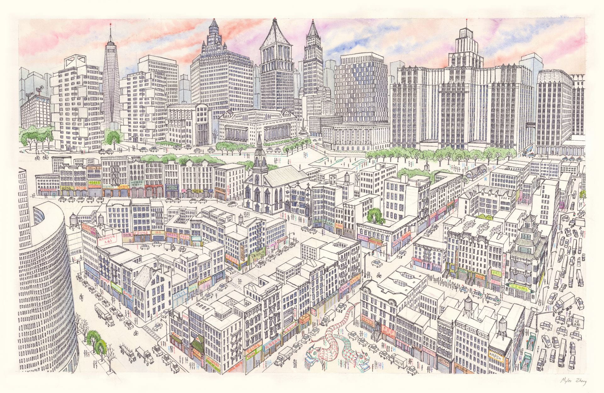
This time-lapse of Manhattan Chinatown took sixty hours to complete and measures 26 by 40 inches. Chinatown’s tenements are in the foreground, while the skyscraper canyons of Lower Manhattan rise on top. This shows the area of Chinatown bordered by Bowery, Canal Street, and Columbus Park.

.