Written with Zeynep Çelik Alexander, historian at Columbia University
Inspired by Elizabeth Blackmar’s inspiring lectures on urban development and Central Park
.
Download this essay as a PDF file
.
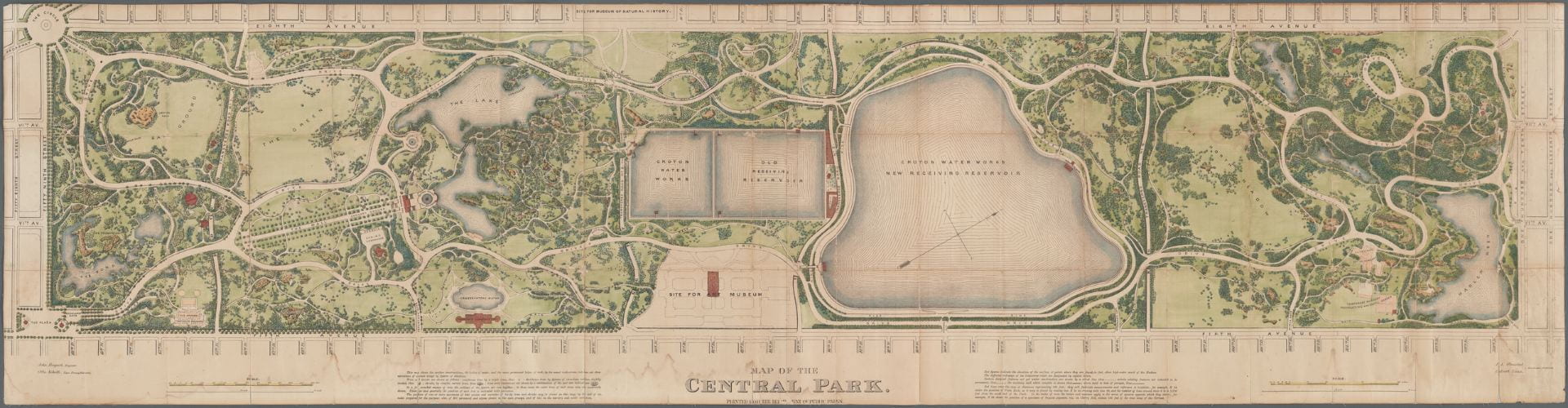 Figure 1. Map of completed Central Park in 1873
.
Central Park is not only the major recreational facility of Manhattan but also the record of its progress: a taxidermic preservation of nature that exhibits forever the drama of culture outdistancing nature. Like the [Manhattan] Grid, it is a colossal leap of faith; the contrast it describes – between the built and the unbuilt – hardly exists at the time of its creation.
– Rem Koolhaas, Delirious New York1
.
Koolhaas presents one of the challenges core to Central Park’s construction: the tension between natural and manmade, urban and rural. What sets this park apart from most other parks is its yearning to seemingly become something that it clearly is not: natural. Many other pocket parks in this city incorporate existing topography and trees into their design – yet they are smaller. And from the confines of their interior, the sights and sounds of the city are hard to escape. Central Park succeeds in permitting its visitor to make-believe, at least momentarily, that they have left the city and are immersed in the countryside. The original park contained, for instance, a sheep pasture and barn, a nature preserve called “The Ramble,” and a dairy for urban mothers to buy fresh milk.
The scale of Central Park and the engineering that went into its creation is not unprecedented – architects and engineers have completed far larger infrastructure projects. The New York City watershed, for instance, catches all the rainfall within a 2,000 square mile area, stores this water in 19 reservoirs, and then transports this water up to 150 miles in underground pipes that serve nine million people.2 Central Park, by comparison, was built by some of the same engineers but is a mere three-square-miles of “improved” wilderness. However, what is surprising is the degree to which Central Park’s landscape features seem natural, as if land speculators and developers had chanced upon the park and left it as untouched as they had found it, except framed on four sides by the city grid (figure 5). So successful is this intervention that there is often the popular misconception that it is natural. This Huffington Post article, for instance: “I know that it may come as a shock to some, but New York’s Central Park is not an act of God. It might seem that way, especially in the woodlands, which appear so authentically, well, natural.”3
.
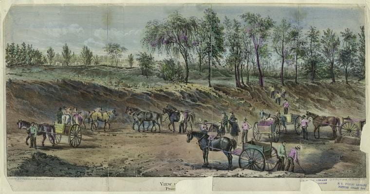 Figure 2. Earthworks projects in 1858, most likely in the vicinity of 72nd Street
.
In the 1857 text entitled “The Plan for the Park,” the project’s landscape architect, Frederick Law Olmsted (b.1822-d.1903), writes that it “seems desirable to interfere with its easy, undulating outlines, and picturesque, rocky scenery as little as possible, and, on the other hand, to endeavor rapidly and by every legitimate means, to increase and judiciously develop these particularly individual and characteristic sources of landscape effects.”4 Olmsted’s claim is a good place to start because it expresses a paradox central to the design. Olmsted’s project “interferes” with the landscape “as little as possible” simultaneously with large-scale efforts to move soil, blast rock, and plant trees that employed – at the height of work – some 4,000 men.5 Around five million cubic feet of rock and soil were blasted and removed from the park. Rem Koolhaas interprets this quote from Olmsted as follows: “If Central Park can be read as an operation of preservation, it is, even more, a series of manipulations and transformations performed on the nature ‘saved’ by its designers.”6
How can we reconcile these two seemingly opposed tendencies in Central Park – natural vs. manmade – when almost all manmade features are disguised as natural? I propose that we can better understand the park by dispensing with the pretense that it is in any way natural.
Central Park presents an unusually refined interpretation of nature. Of the approximately 20,000 trees of 175 species, solidly 60% are non-native to New York.7 Of the seven lakes contained within the park, none are natural to the terrain and are mostly the result of damning existing streams. Of the paths, trails, and roads winding through the park – with curves to match the contours of hills and valleys – none are original, nor do they correspond to pre-development dirt roads and Lenape Indian trails.8
.
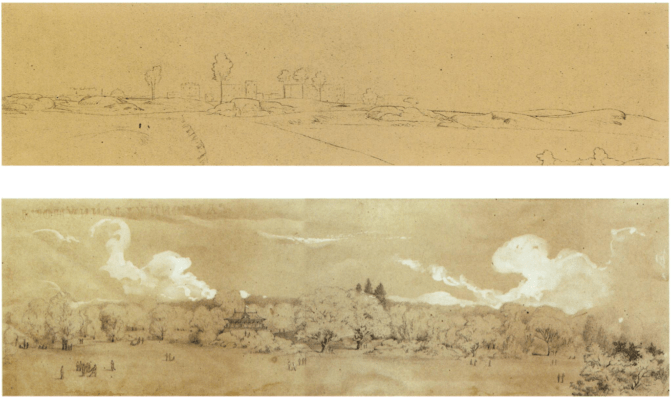 Figure 3. Frederick Law Olmsted’s 1857 drawing of the park before and after the planned “improvements.”
The style and content of this image evokes the work of English landscape architects and Humphry Repton.
.
Before work began in 1857, the pre-development topography was insufficient for use as a public park. The Manhattan grid – comprising some 2,000 plus city blocks each measuring exactly 200 feet wide – implies a flat terrain and originally made no accommodations for interfering rivers, hills, or marshes. Looking at a street map of the island, one might be surprised to learn that the terrain rises and falls the length of the island from zero feet at sea level to ~250 feet at its highest peak (figures 4 and 16).9 The name “Manhattan” is a Lenape Indian word that means “Island of Many Hills.”10 Yet, despite the variety of sites planners could have chosen from, the park’s rectangular boundaries were not determined by the availability of topographic features appropriate for a park.
.
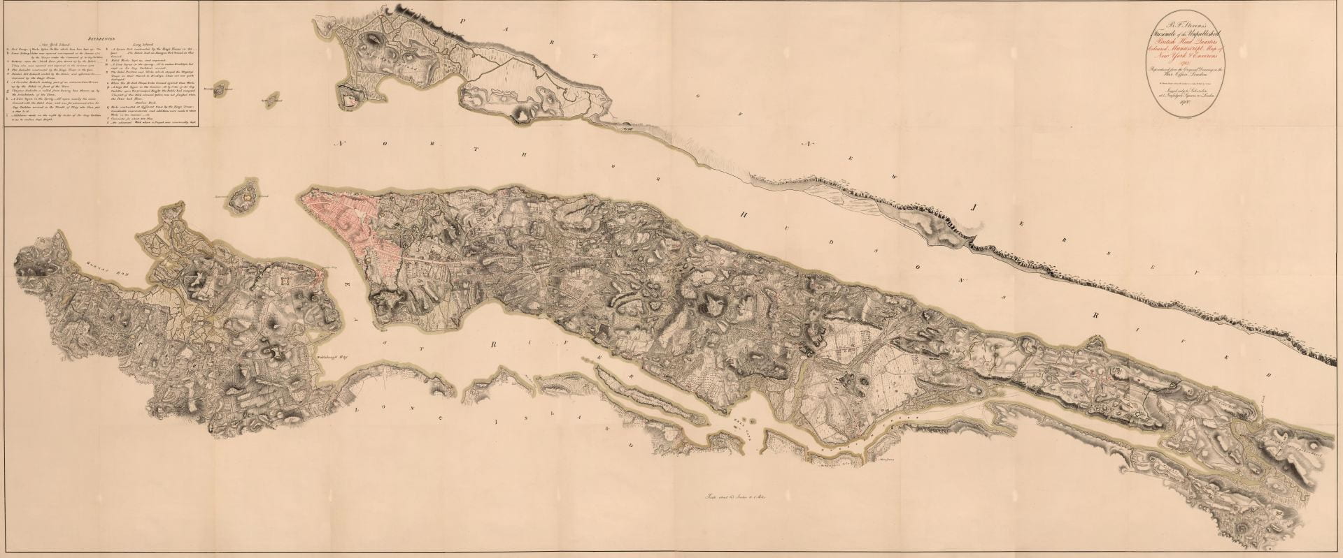 Figure 4. British Headquarters Map of Manhattan Island from c.1789. Only the shaded pink section at top of island is developed at city-level density. The rest consists of rolling hills, forest, and farmland that inspired Henry Hudson, the first European who “discovered” the island in 1609, to remark that: “The land is the finest for cultivation that I ever in my life set foot upon.”11
.
Instead of topography, three main factors determined the location: First, planners needed to choose a site close to the expanding city yet far enough away that the land could be acquired cheaply and without displacing large numbers of residents. Second, the city’s population had grown 160% in the twenty years from 1840 to 1860,12 and the city’s existing Croton reservoir (then located in the exact center of the proposed park) was insufficient. The city needed an expanded reservoir; the most convenient location on Manhattan Island for this reservoir was next to the existing one. The otherwise purely practical infrastructure of water supply could thus become a landscape feature.13 Third, the city planned to offset the approximately five-million-dollar price tag of land acquisition and construction through corresponding increases in the taxable property values of land adjacent the park. The architects also went so far as to suggest “a toll of three cents on visitors coming on foot, and six cents for all others” collected on visitors to fund park maintenance and offset construction costs. (This was never implemented.)14 Olmsted also writes:
Land immediately about the Park, the frontage on it being seven miles in length, instead of taking the course anticipated by those opposed to the policy of the Commission, has advanced in value at the rate of two hundred per cent per annum. […] It is universally admitted, however, that the cost, including that of the original off-hand common sense blunders, has been long since much more than compensated by the additional capital drawn to the city through the influence of the Park.15
The park’s location might be strengthened by the simple fact that a linear or smaller park along the waterfront would have fewer miles of frontage of taxable properties adjacent to the park. For instance, locating just one side Central Park along the Hudson and East River (instead of the island’s center) would result in 2.5 miles fewer of abutting properties. Within the following decades, the properties in the Upper East and Upper West Side that overlook the park became (and remain) among the most expensive in the city. This method of development – sacrificing a fraction of the land for park use so as to increase the monetary value of the adjoining lands – was common in New York City (e.g., Gramercy Park) and particularly in London’s fashionable West End and Hyde Park neighborhoods.16 What makes Central Park different, though, is the unprecedented scale of this investment to boost civic pride and to increase property taxes.
.
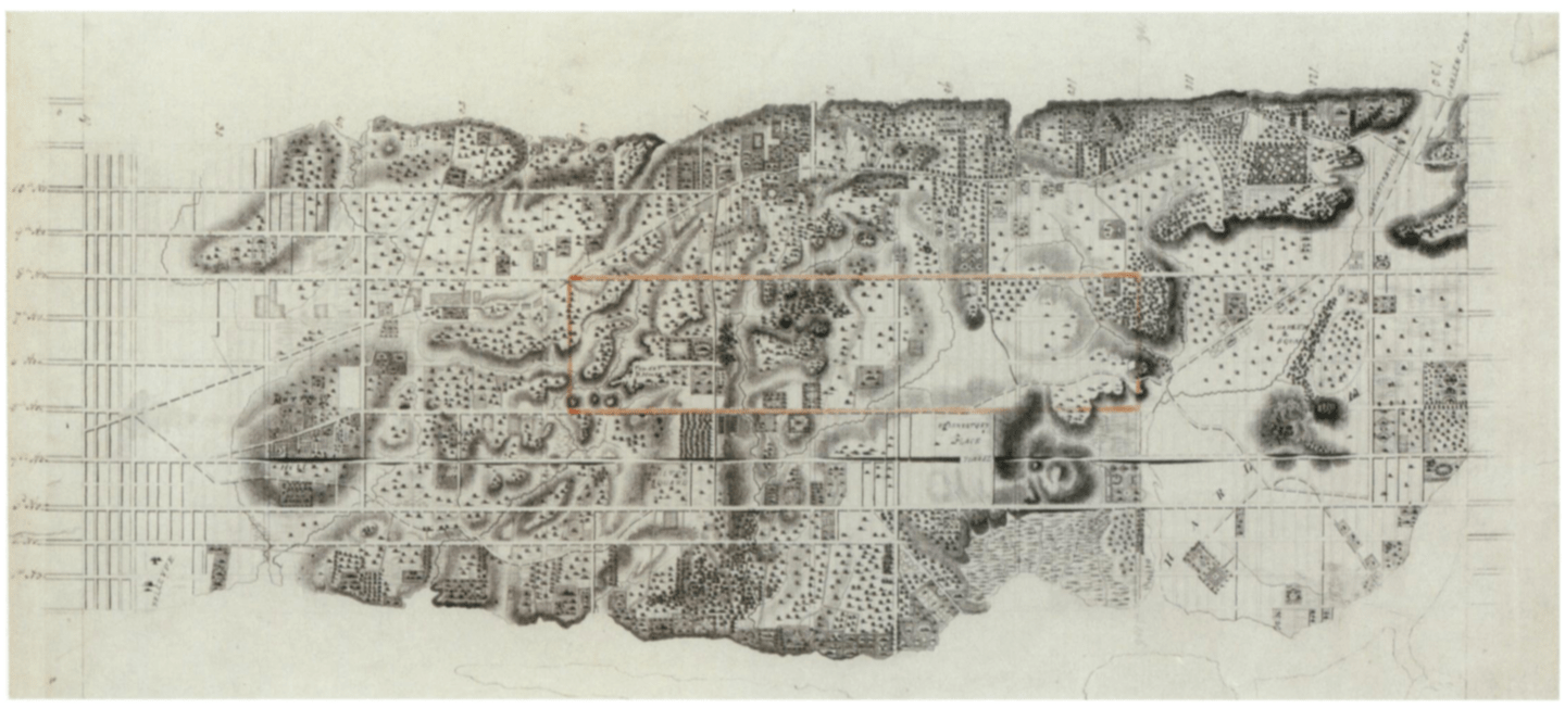 Figure 5. A c.1836 engraved map of mid-Manhattan with the outline of the future park drawn in orange ink c.1858. The incongruity between the park’s outline and the topography is also illustrated by the fact that the park’s northern boundary (originally at 106th street) would require blasting through a one hundred foot high solid-rock mountain to make way for the perimeter street.
.
Given these priorities – real estate and infrastructure interests over aesthetics – the choice of location was not ideal (figure 5). The rough terrain was mostly barren of trees and was a mosquito-laden wetland. (More readily converted and forested terrain was originally proposed along the East River in the vicinity of Roosevelt University.) Before beginning the architect’s work of planting trees and building scenic garden features, the first major task was to prepare the land and make it suitable for public use. To that effect, Olmsted contracted the engineer (and later military coronel) George E. Waring to drain the swamp. Waring directed 400 men to construct some 105,000 linear feet (32 kilometers) of drainpipes over two years (figure 8).17 His military-style approach toward clearing the park followed him into later life when he became New York City’s sanitation commissioner. As commissioner, he required all his street cleaners to wear white pith helmets (identical to those worn by European colonists in Africa) and then declared the war on filth. Given his interest in sanitation and dislike of dirt, his answer to the park commissioners’ question is revealing:
Commission’s Question: “To what degree shall the park be drained?”
Waring’s Answer: “Totally.”
Q: “By what form of drains?”
A: “Earthenware, of varying calibers.”
Q: “At what depth?”
A: “Three feet in open glades, four feet in forested areas.”
Q: “For best economy, by contract or days’ work?”
A: By days’ work because of the endlessly varied conditions requiring uncommon on-site super vision.”18
.
 Figure 6. Buried Pipes in Connection with the New Reservoir, c.1862.
.
 Figure 7. General View of North Reservoir from 102nd Street, 23 October 1862.
All the land visible here is now buried beneath the reservoir.
.
Another requirement asked of the planners was to incorporate a new reservoir into the park (figures 6-7 show terrain now flooded beneath reservoir). The existing stone reservoir and Croton Aqueduct, completed 1842, were no longer sufficient19 despite Walt Whitman’s claim that: “Ages after ages these Croton works will last, for they are most substantial than the old Roman aqueducts.”20 To augment the Croton’s capacity, the new reservoirs combined covered approximately 20% of the park’s surface area over terrain that otherwise would have become parkland. Before Olmsted had even submitted his plan in 1857, the engineer Egbert L. Viele, who had been surveying the parkland since 1853,21 had decided on placing this reservoir on a natural depression in the land, to be augmented by an earthen embankment around the perimeter. Olmsted’s final proposal follows the contours of Viele’s proposed reservoir exactly – illustrating the degree to which engineering needs dictated the landscape architect’s choices.
.
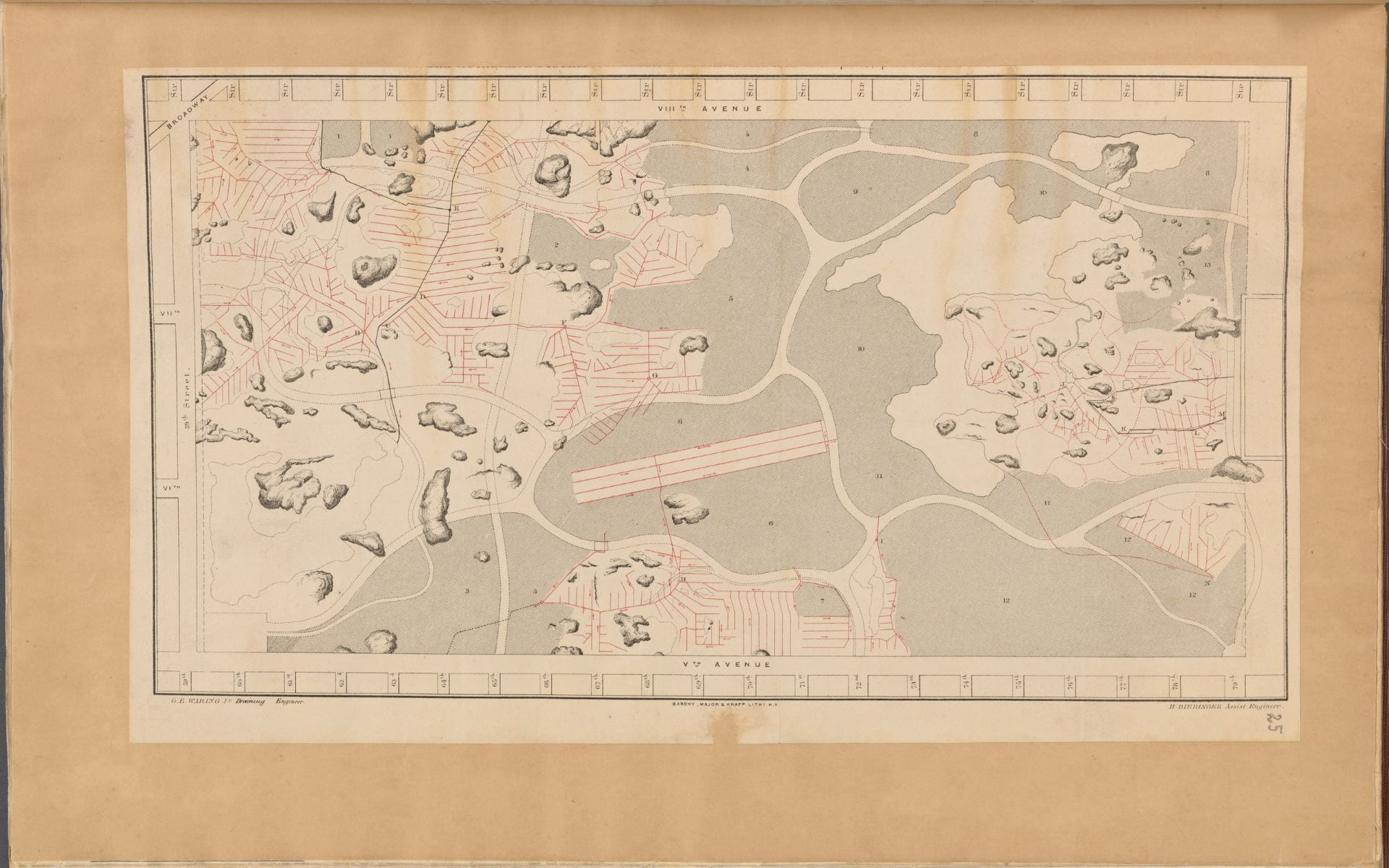 Figure 8. Map of drainage system on lower part of the Central Park as far as completed up to 31 December 1858. On the left is 59th Street, 5th Avenue is at bottom, and 8th Avenue (i.e. Central Park West) is at top. This map only illustrates the paths of future carriage roads within the park – that is, the thick white lines that wind through the landscape. Red lines indicate the buried clay pipes that drain water from the marshy soil – and many continue to do so today. Shaded gray areas correspond to areas to be raised with dirt fill. The shaded blotches are for preserved boulders protruding above ground. The slightly off-kilter rectangle in center is for the area drained to create the Central Park Mall – the only geometrically symmetrical part of the park.
.
Although the park was extensively surveyed and re-landscaped there was, nonetheless, an attempt to appear rustic and unkempt. The architect, Calvert Vaux, blanketed the park in little pavilions and bridges made from unpolished and rustic wood with bark still on the beams – a nineteenth-century re-reading of the primitive hut.22 The passage from the southern to the northern reaches of the park was also a parable in the march of civilization and progress. By this time, the city was advancing northward up the island from its historic center in Lower Manhattan (figure 9). Within forty years, the island would be completely built-up. With this recognition of urban sprawl, Olmsted named the park’s 16 original entrances to reflect the city’s movement and types of people living in New York. In order from south to north, the names are as follows: Artisan’s Gate, Merchant’s Gate, Scholar’s Gate, Woman’s Gate, Inventor’s Gate, Miner’s Gate, Mariner’s Gate, Engineer’s Gate, Gate of All Saints, Woodman’s Gate, Boy’s Gate, Girl’s Gate, Stranger’s Gate, Warrior’s Gate, Farmer’s Gate and Pioneer’s Gate. This list almost reads as a list of social classes in increasing order of proximity to raw nature.23 The design features also evolve over distance. The southern reaches (also the busiest section due to the proximity to the city center) was built first and included more pruned botanic features, rectangular parterres of trees, and the proposed flower garden. Olmsted thought it appropriate to leave the northern reaches of the park as wooded as possible with a c.1812 fortress left standing atop a mountain as a picturesque ruin in the style of English garden follies. The northern reaches (also surrounded mostly by farmland at this time) were intentionally more heavily forested, had fewer of the park’s signature bridges, retained the park’s largest rock escarpment, and for the first few decades of its life contained no statues, monuments, or plaques commemorating important people. By contrast, about two dozen monuments to Western Civilization’s great cultural and political leaders (all male) were concentrated in the south: William Shakespeare (installed 1872), Thomas Moore (1879), Alexander Hamilton (1880), Beethoven (1884), Columbus (1894), etc.24 Paradoxically, while the south may appear more refined and cultivated than the north, the pre- development terrains in both sections were equally crafted and manipulated. There is, here, the illusion of moving north toward nature, instead of the reality.
.
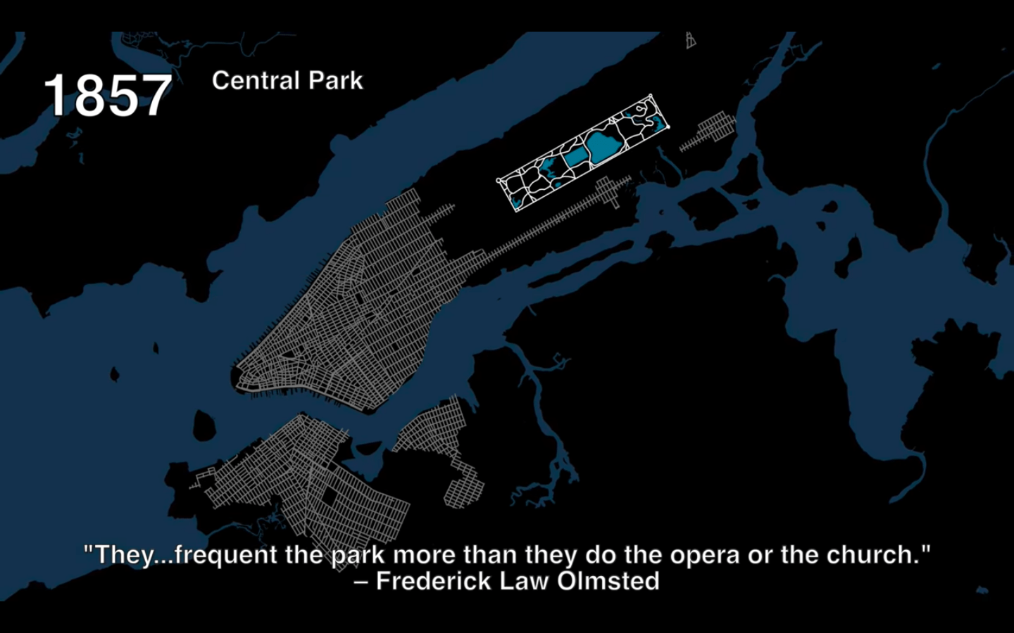 Figure 9. The extent of northward marching urban development by 1857, with the park beyond the developed city. Notice how large the park is relative to the city’s surface area, and how the city becomes rural travelling north. View this animation online.
.
At this stage, we might arrive at a better understanding by shifting the descriptive language. Perhaps we should describe the park not in terms of nature or landscape – given that considerations of the natural were not foremost in the design. We might do better to describe the park in terms of infrastructure, engineering, movement, and social class. Indeed, one of the strengths of Olmsted’s proposal – and one of the reasons he won out of the 33 designs submitted – was his decision to separate the park by four different social classes and speeds of movement (figures 10 and 11), each of which corresponded to a width of road and minimum permitted vehicle turning radius (color-coded in figure 12).25 This detailed plan for road separation and drainage were finished before the architects had even begun working on planting diagrams or selecting which species of trees would make for the most varied landscape composition. There were four classes of segregated roads. First, because of the park’s length, size, and location, there would be many vehicles passing through the park, not for leisure, but simply to pass from one side of the park to the other as fast as possible. For these vehicles, the engineers planned four buried transverse roads with entirely separate right-of-way. These straight and wide roads at no point intersected other types of traffic and were entirely below grade level. Second, there were carriage roads for slightly slower carriage traffic within the park. While the relatively straight transverse roads were for practical through-traffic, these carriage roads were for leisure. Third, the next highest speed consisted of a narrower and more curving path than the carriage roads, gravel paths for horseback riders. Horseback riding was a popular leisure and sporting activity – these roads are now largely used for joggers who move faster than pedestrians but slower than vehicles. Fourth, the most ubiquitous road type of all consisted of unpaved footpaths for pedestrians on foot only. With the help of bridges and tunnels (figure 11), at no point did these four systems of conveyance intersect, leading Olmsted to claim: “By this means it was made possible, even for the most timid and nervous, to go on foot to any district of the Park designed to be visited, without crossing a line of wheels on the same level, and consequently, without occasion for anxiety and hesitation.”26
.
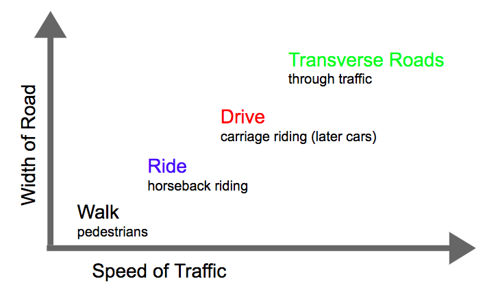 Figure 10. Author’s diagram of road types
.
![]() Figure 11. 1862 cross-section of transverse road. Notice how the trees above the road are drawn small, as if to exaggerate the tunnel’s monumentality.
Figure 11. 1862 cross-section of transverse road. Notice how the trees above the road are drawn small, as if to exaggerate the tunnel’s monumentality.
.
 WALK RIDE DRIVE TRANSVERSE
Figure 12.
.
Incidentally, these separate and unequal paths also corresponded to different social classes. The wealthiest individuals – those who could afford a carriage, horse, and driver – would implicitly have exclusive use of the carriage roads, while horseback riders had their separate right of way, and service vehicles were segregated below grade. The rest of the public and working classes were restricted to the footpaths, where security guards patrolled the park and prohibited them from loitering, picking flowers, picnicking, or forming large groups. Elizabeth Blackmar and Roy Rozenzweig write: “In the decade after the opening, more than half of those visiting the park arrived in carriages (which less than 5 percent of the city’s population could afford to own, and each day there were elaborate carriage parades in the late afternoon.”27 Yet, disproportionate design considerations and park surface area seems to be given to this minority of users on carriages. We should return here to the fact that city leaders intended this park to boost property values and taxes on the wealthy residents who lived adjacent to the park. It is only natural, then, that the park design should reflect their interests and preferences.
.


.
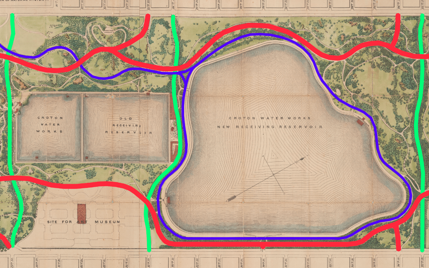
Figure 15. Map of middle section of the park between the 79th Street and 97th Street transverse roads, the empty area at lower left hand corner is the future site of the Metropolitan Museum of Art. The blue road corresponds to the horseback trail, now jogging path. After starting at the 59th Street entrance and passing through manmade forests, valleys, and tunnels, horseback riders’ visual experience culminated as they circled this manmade reservoir.
.
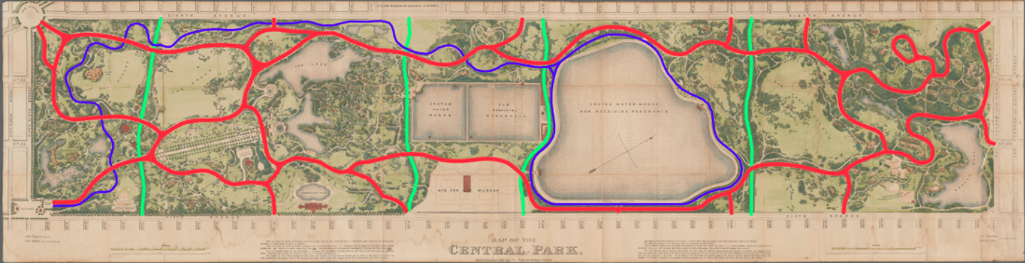
These maps of the park – color coded by road type – can help us begin to unravel the degree to which the current landscape is manmade. At first glance, the smooth passage of roads and their organic contours may seem effortless, as if they were laid out along existing roads with regards to existing topography. By separating the different grades of traffic by color (figure 14) and upon closer examination, there is a complex and extensive hidden infrastructure beneath these natural appearances (figure 13).
.
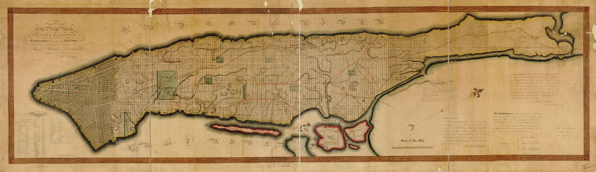 Figure 16. 1811 Commissioners’ Plan
.
These maps also reveal a park that is not separate from or opposite to the city, but instead a continuation of the city. A glance at a map of Manhattan reveals two seemingly different philosophies of urbanism, as imprinted through the laying of road networks. Most of the island is covered in the orthogonal 1811 grid (figure 16). This grid gives no consideration to topography, nature, or aesthetics. Then, there is the three square mile area of Central Park with winding and seemingly organic roads. The absence of symmetry and straight lines might lead one to conclude that the park reflects an attempt to harmonize with nature. Existing popular literature commonly situates this park as a reaction to the grid’s perceived faults and excesses. Upon closer examination, this park’s near obsessive attention to detail, its concern with segregated movement, and its reliance on complex (but hidden) infrastructure reveal the park to be a continuation of the 1811 grid’s interest in real estate, property values, and engineering, more than it is a prosaic and romantic reaction to excessive urban growth. This infrastructure is also wrapped up in a coded message about the progress of civilization. The passage from cultivated south to rugged north can read as a condensed representation of the passage from the center of civilization to its undeveloped edges. One should also keep in mind that simultaneous to the construction of Central Park, engineers and developers were at work on the other side of the country clearing the American West for development. Within the following decades, the extent of farmed land would creep westwards on former Indian soil, generally following the paths of railroads toward California. Does the design of Central Park mirror 1860s American society’s belief in the civilizing power of science and technology to tame the wilderness? Alternatively, is Central Park’s design just a matter-of-fact effort to boost the city’s tax revenues, with no moral agenda intentionally encoded in the park design? Such questions might be impossible to answer, given the lack of conclusive evidence.
Now is the time to return to the question we started with: How can we reconcile these two seemingly opposed tendencies – natural vs. manmade? I posit that by describing Central Park in the language of infrastructure and real estate – instead of nature and aesthetics – we can arrive at a more accurate assessment of the park’s origins, objectives, and construction process. Seemingly, the only way to adapt this ill-suited site into a park that fulfilled the nineteenth-century definition of the picturesque was through public works that, upon their completion, effaced almost all traces of the people, trees, and landscape that existed before. The engineering here succeeds insofar as it is invisible and functions as if no manmade intervention had ever occurred. While at work, Olmsted made this prediction on the future of Manhattan Island:
The time will come when New York will be built up, when all the grading and filling will be done, and when the picturesquely-varied rock formations of the Island will have been converted into formations for rows of monotonous straight streets, and piles of erect buildings. There will be no suggestion left of its present varied surface, with the single exception of the few acres contained in the Park.28
The park is an architectural contradiction. On the one hand, its rock formations, hills, and valleys look to a pre-developed and rugged Manhattan in the public imagination, a landscape more fictive than real. On the other hand, the park’s very presence is a testament to the power of real estate interests, engineers, and the water supply board in shaping the city. This tension underlies the landscape features now almost universally praised for their vision, beauty, and harmony.
.


.
List of figures
- Lionel Pincus and Princess Firyal Map Division, The New York Public Library, “Map of the Central Park” New York Public Library Digital Collections, http://digitalcollections.nypl.org/items/4e6a6080- 3569-0134-549e-00505686a51c (retrieved 4 May 2019).
- Art and Picture Collection, The New York Public Library, “View in Central Park, Promenade, June 1858,” New York Public Library Digital Collections, http://digitalcollections.nypl.org/items/510d47e1- 0fb6-a3d9-e040-e00a18064a99 (retrieved 4 May 2019).
- Frederick Law Olmsted and Calvert Vaux (designers); Calvert Vaux (artist), Greensward Plan presentation board with “Present Outlines” (above) and “Effect Proposed” (below): No. 1. From Point A (view at Fifth Avenue entrance), 1858, graphite, wash and white lead on paper, New York Municipal Archives.
- Lionel Pincus and Princess Firyal Map Division, The New York Public Library. “Map of New York City and of Manhattan Island with the American defences in 1776,” New York Public Library Digital Collections, http://digitalcollections.nypl.org/items/ee2f1060-d488-0135-3577-67321a8090bc (retrieved 4 May 2019).
- David H. Burr (cartographer), Topographical Map of the City and County of New-York and the Adjacent Country (proof impression of center sheet), published by J.H. Colton and Co., New York, 1836, engraving, ca. 1836, the Metropolitan Museum of Art.
- Rare Book Division, The New York Public Library, “Pipes in Connection with the New Reservoir,” New York Public Library Digital Collections, http://digitalcollections.nypl.org/items/510d47e3-6289- a3d9-e040-e00a18064a99 (retrieved 4 May 2019).
- Rare Book Division, The New York Public Library, “General View of N. Reservoir from 102nd St. October 23, 1862,” New York Public Library Digital Collections, http://digitalcollections.nypl.org/items/510d47e3-6288-a3d9-e040-e00a18064a99 (retrieved 4 May 2019).
- Lionel Pincus and Princess Firyal Map Division, The New York Public Library, “Map of Drainage System on Lower Part of the Central Park as far as completed up to December 31st, 1858,” New York Public Library Digital Collections, http://digitalcollections.nypl.org/items/7fe3e680-0c6a-0132-bc3c- 58d385a7bbd0 (retrieved 4 May 2019).
- Author’s illustration from Here Grows New York animation, https://youtu.be/f6U7YFPrz6Y?t=226 (retrieved 5 May 2019).
- Author’s diagram of road types
- Calvert Vaux (architect), W.B. Swan (delineator), and Sarony, Major, and Knapp (lithographers), Bridge “E” over Transverse Road No. 2, 1861, lithograph, from Fifth Annual Report of the Board of Commissioners of the Central Park, January 1862, the Metropolitan Museum of Art.
- “Map of the Central Park” New York Public Library Digital Collections, 1873, modified by author with blue, red, and green color-coding.
- “Map of Drainage System on Lower Part of the Central Park as far as completed up to December 31st, 1858.”
- 1873 map of Central Park, color-coded by author to indicate types and widths of roads
- Ibid.
- Manuscripts and Archives Division, The New York Public Library, “Plan of Manhattan Island,” New York Public Library Digital Collections, http://digitalcollections.nypl.org/items/26e27e80-be8a-0131- bf1a-58d385a7bbd0 (retrieved 4 May 2019).
- Irma and Paul Milstein Division of United States History, Local History and Genealogy, The New York Public Library, “Central Park Tunnel,” New York Public Library Digital Collections, http://digitalcollections.nypl.org/items/a44288b4-9bdc-b31f-e040-e00a18060314 (retrieved 5 May 2019).
- Rare Book Division, The New York Public Library, “Men standing on Willowdell Arch,” New York Public Library Digital Collections, http://digitalcollections.nypl.org/items/94b7acd9-dc81-74f7-e040- e00a18063585 (retrieved 5 May 2019).
.
Works cited
- Rem Koolhaas, “Prehistory,” in Delirious New York (New York: The Monacelli Press, 1994), p.21. ↩
- Kenneth Jackson, Lisa Keller, et al., “Water Supply,” in The Encyclopedia of New York City (New Haven: Yale University Press, 2010), p.1381-86. ↩
- Charles A. Birnbaum, “The Big Task of Managing Nature at New York’s Central Park,” The Huffington Post, 12 September 2012, https://www.huffpost.com/entry/an-unlimited-range-of-rur_b_1870450? (retrieved 15 May 2019). ↩
- Kenneth Jackson and David Dunbar (editors), “Selected Writings on Central Park, Frederick Law Olmsted (1858, 1870),” in Empire City: New York through the Centuries, (New York: Columbia University Press, 2002), p.279. This anthology of urban history assembles various primary sources from across NYC history into a single book. ↩
- Ibid., “Central Park,” p.222-24. ↩
- Rem Koolhaas, Delirious New York, p.23. ↩
- Robert Demcker, “Central Park Plant List and Map Index of 1873,” published by the Frederick Law Olmsted Association and The Central Park Community Fund, 1979. ↩
- Concluded from comparing maps of the park pre and post construction. ↩
- Hilary Ballon, “Introduction,” in The Greatest Grid: The Master Plan of Manhattan 1811-2011 (New York: Columbia University Press, 2012), p.13-15. ↩
- Eric Sanderson et al., The Welikia Project, https://welikia.org/about/how-it-all-began/ (retrieved 15 May 2019). – Sanderson created the most detailed visualization of Manhattan’s pre-development topography. ↩
- “Early Descriptions of New Netherland,” New Netherland Institute: Exploring America’s Dutch Heritage, https://www.newnetherlandinstitute.org/history-and-heritage/additional-resources/dutch-treats/early-impressions-of- new-netherland/ (retrieved 15 May 2019). ↩
- “NYC Total and Foreign-born Population 1790 – 2000,” NYC Planning Department, https://www1.nyc.gov/site/planning/data-maps/nyc-population/historical-population.page (retrieved 15 May 2019). ↩
- The old rectangular shaped Croton Reservoir covered 8% of the park’s area. The new reservoir covered about 12%. Combined they covered 20%. Values calculated by author using Google MyMaps. ↩
- Frederick Law Olmsted and American Social Science Association, Public Parks And the Enlargement of Towns: Read Before the American Social Science Association At the Lowell Institute, Boston, Feb. 25, 1870, (Cambridge: Printed for the American Social Science Association, at the Riverside Press, 1870), p.35. https://catalog.hathitrust.org/Record/008726621 (retrieved 4 May 2019). ↩
- Ibid., p.35. ↩
- Jon Campbell and Christopher Robbins, “The Origin Story Of Gramercy Park Is A Classic NYC Tale Of Real Estate Hucksterism, Cronyism, And Gate Crashing,” The Gothamist, 28 June 2018, http://gothamist.com/2018/06/28/gramercy_park_history_amazing.php (retrieved 15 May 2019). ↩
- Morrison H Heckscher, “Creating Central Park,” The Metropolitan Museum of Art Bulletin, New Series, 65, no. 3 (2008): p.40, http://www.jstor.org/stable/25434142 (retrieved 15 May 2019). ↩
- Ibid. ↩
- A mere 94 years after opening, the old Croton reservoir was deemed inadequate, drained of water, and filled with debris from subway excavations. ↩
- “Murray Hill Reservoir, November 25, 1849, Walt Whitman,” in Empire City, p.207. ↩
- “Creating Central Park,” p.18. ↩
- Patricia Heintzelman for the U.S. Department of the Interior, Central Park Nomination Form for NRHP, 1966, https://npgallery.nps.gov/AssetDetail/NRIS/66000538 (retrieved 15 May 2019). ↩
- To my knowledge, the claim that Olmsted named the gates in 1862 to mirror the transition from civilization to nature has never been made before. However, Olmsted describes in writing how the terrain should evolve from smooth to rough during the passage north; it follows for naming conventions to reflect this shift. ↩
- Wikipedia assembles lists of monuments, parks, streets, etc. organized as metadata with lat-long coordinates. Plotting these coordinates on a map and eliminating recently added monuments reveals a clear spatial concentration of artwork and sculpture in the south. https://en.wikipedia.org/wiki/List_of_sculptures_in_Central_Park (retrieved 16 May 2019). Identical list also found from NYC Parks Department: https://www.nycgovparks.org/parks/central- park/monuments (retrieved 16 May 2019). ↩
- Landmarks Preservation Commission, Central Park Designation Report for the NYC Planning Department, 1974, http://s-media.nyc.gov/agencies/lpc/lp/0851.pdf (retrieved 15 May 2019). ↩
- “Selected Writings on Central Park, Frederick Law Olmsted (1858, 1870),” in Empire City, p.281. ↩
- “Central Park,” in The Encyclopedia of New York City, p.223. ↩
- “Selected Writings on Central Park, Frederick Law Olmsted (1858, 1870),” in Empire City, p.279. ↩

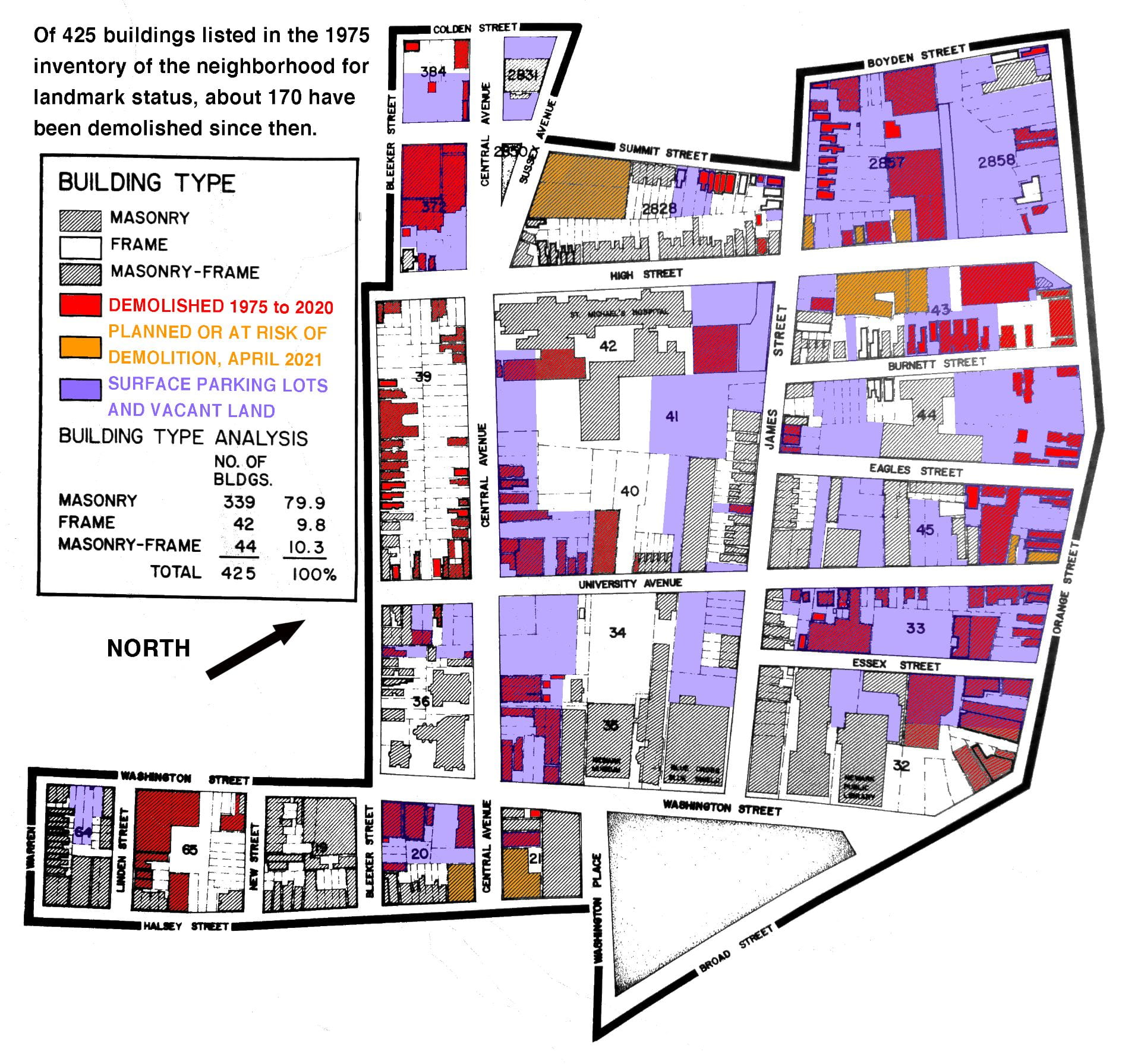
 Explore an interactive map of the 300+ acres of parking in Downtown Newark. This map is part of