• This website includes dozens of videos, hundreds of essays, and thousands of drawings created over the past twenty years. Search to learn more about the history of buildings, places, prisons, Newark, New York City, and my PhD research on spatial inequality.

  • Or scroll down for the latest publications.

Architecture of Exclusion in Manhattan Chinatown

Originally published in the 2018-19 edition of the Asia Pacific Affairs Council journal with help from Seeun Yim at Columbia University’s Weatherhead East Asian Institute, pages 18-20

.
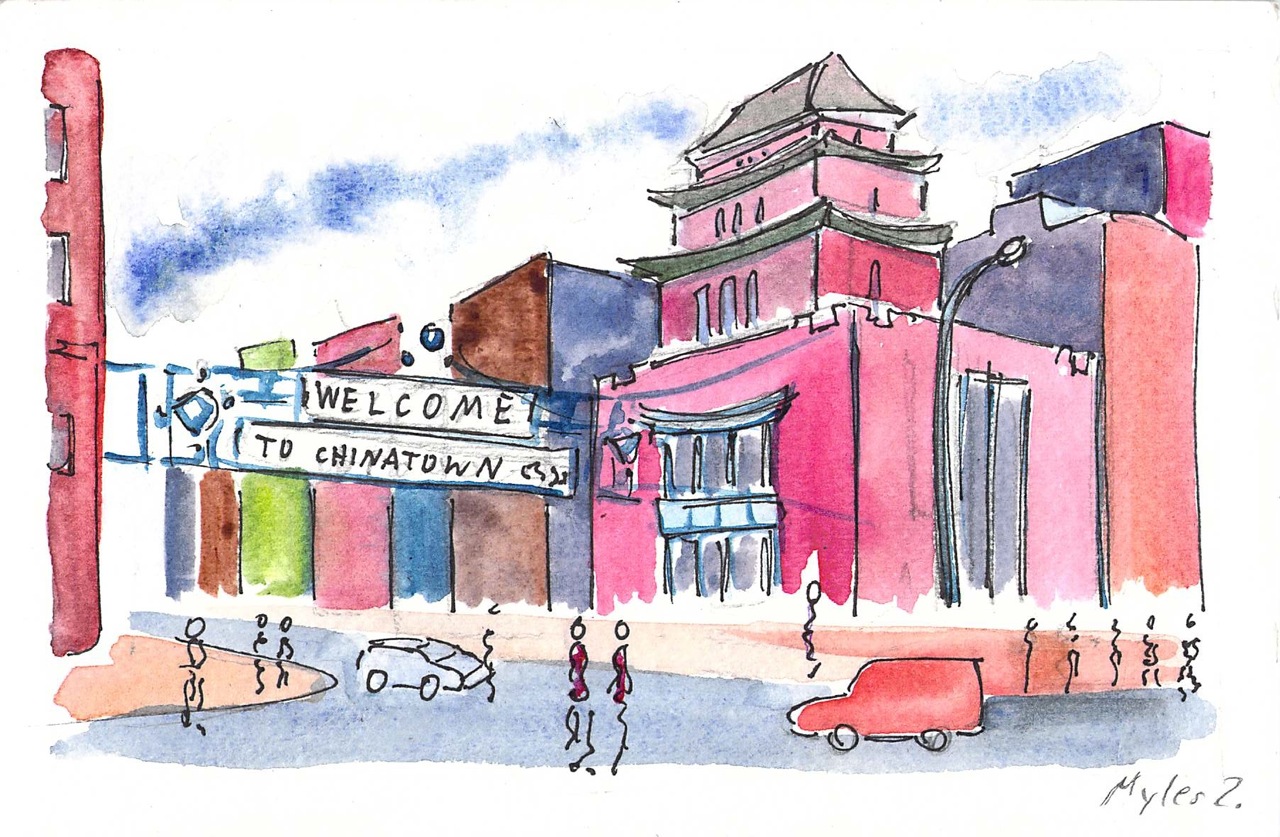
Canal and Mott Street

In 1882, the Chinese Exclusion Act restricted Chinese immigration to the US, prohibited Chinese females from immigrating on grounds of “prostitution,” and revoked the citizenship of any US citizen who married a Chinese male. The consequences of this xenophobic legislation motivated Chinese immigrants to flee racial violence in the American West and to settle in Manhattan’s Chinatown. With a population now of around fifty thousand (2010 census), this remains the largest ethnically Chinese enclave in the Western Hemisphere.
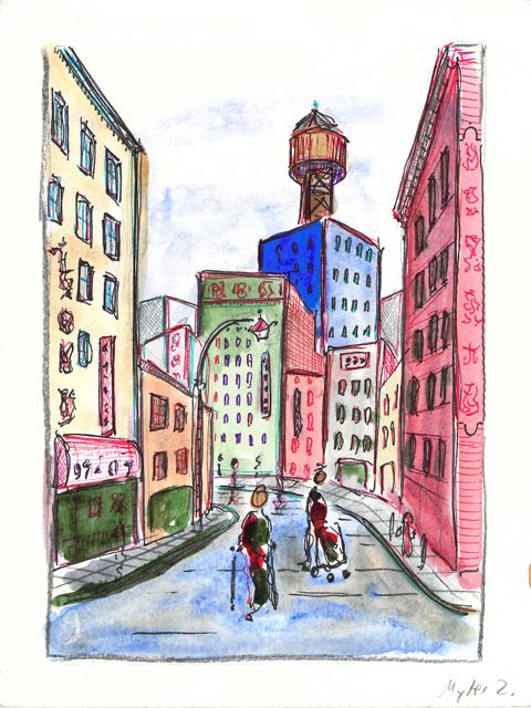
Barbershop Row on Doyers Street

Thanks to New York’s geographic location as a port city with high industrial employment and easy connections to the American interior, this city became the primary point of entry for waves of immigrant groups in the nineteenth century: Irish, Germans, Italians, and Eastern Europeans. What makes the Chinese different, though, is the survival and resilience of the immigrant community they created. Other immigrant groups – namely the Germans and Irish – converged around large neighborhoods and surrounded themselves with familiar languages and businesses. Of these enclaves, all have since disappeared. The children of these first-generation immigrants successfully assimilated into American society, earned higher incomes than their parents, and therefore chose to disperse to non-immigrant neighborhoods with better housing stock and schools. Yet, the Chinese remained.
The resilience of this community results from a confluence of factors: cultural, geographic, and political. Of innumerable immigrant groups to the US, the Chinese were among the only to have the most restrictive laws placed on their immigration. This stigma drove them toward three types of low-paid labor – with which white Americans still deeply associate with the Chinese – laundries, restaurants, and garment manufacturing. Like the Chinese, other groups – particularly Irish-immigrant females – began working in these professions, but they soon climbed the social ladder.
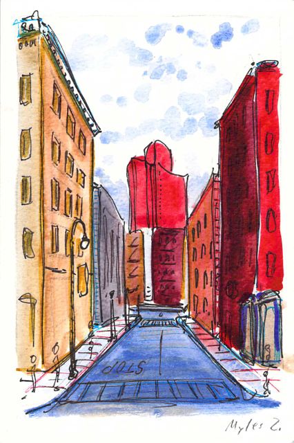
Mosco Street and Mulberry Bend

As an architectural historian, I see that the political and racial agenda of exclusion is imprinted in the built environment of Chinatown. To present this neighborhood’s geography: For most of its history, Chinatown was bordered to the north by Canal Street, to the east by Bowery, and to the South and West by the city’s federal courthouse and jail. The center of this community lies on the low wetland above a filled-in and polluted lake called the Collect Pond. Historically, this area contained the city’s worst housing stock, was home to the city’s first tenement building (65 Mott Street), and was the epicenter for waterborne cholera during the epidemics of 1832 (~3,000 deaths) and again in 1866 (1,137 deaths). The city’s first slum clearance project was also in Chinatown to create what is now present-day Columbus Park.
Race-based policies of exclusion can take different forms in the built-environment. The quality of street cleaning and the frequency of street closures are a place to start. Some of the city’s dirtiest sidewalks and streets are consistently located within Chinatown – as well as some of the most crowded with street vendors, particularly Mulberry and Mott Street). Yet, as these streets continue northward above Canal Street, their character changes. The street sections immediately north in the enclave of Little Italy are frequently cleaned and closed for traffic most of the year to create a car-free pedestrian mall bordered by upscale Italian restaurants for tourists. The sections of Mulberry Street in Chinatown are always open to traffic and truck deliveries.
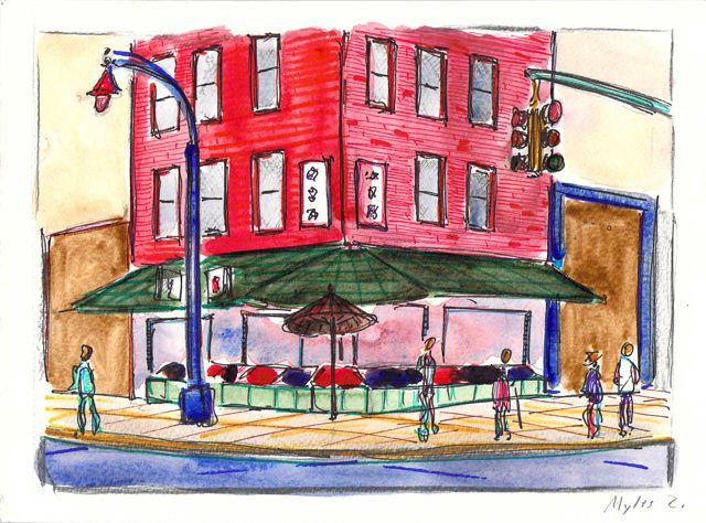
Grocery Store at Bayard and Mulberry Streets

Unequal treatment continues when examining the proximity of Chinatown to centers of political power and criminal justice. Since 1838, the city’s central prison (named the Tombs because of its foreboding appearance and damp interior) was located just adjacent to Chinatown. The Fifth Police Precinct is also located at the center of this community at 19 Elizabeth Street. Although Chinatown was ranked 58th safest out of the city’s 69 patrol areas and has a crime rate well below the city average, the incarceration rate of 449 inmates per 100,000 people is slightly higher than the city average of 443 per 100,000. This incarceration rate is also significantly higher than adjacent neighborhoods like SoHo that have a rate well below 100 per 100,000. NYC Open Data reveals this neighborhood to be targeted for certain – perhaps race-specific and generally non-violent crimes – like gambling and forgery. Over half of all NYPD arrests related to gambling are in Manhattan Chinatown. Similarly, the only financial institution to face criminal charges after the 2008 financial crisis was Chinatown’s family-owned Abacus Federal Savings Bank – on allegations of mortgage fraud later found false in court by a 12-0 jury decision in favor of Abacus. Abacus provided mortgages and unconventional financial services to the kinds of immigrants traditionally locked out of the banking system, and therefore denied the means to climb the social ladder. The mistreatment of the Chinese in America both past and present is part of a larger anti-China agenda.
When it comes to tourism, Americans seem to have a paradoxical relationship with Chinatown’s “oriental” culture and cuisine. On the one hand, there is a proclaimed love of East Asian cuisine and art, as evidenced by the profusion of Asian-themed restaurants for tourists, or as evidenced by the phenomenon in art history for western artists (and particularly French Impressionists) to incorporate decorative motifs from East Asian woodcuts and ceramics into their work. On the other hand, there is simultaneously exclusion of the people who created this Chinese food and art from political power and social mobility. Still today, Americans seem to want competitively priced Chinese products without suffering the presence of the foreigners who produced these products.
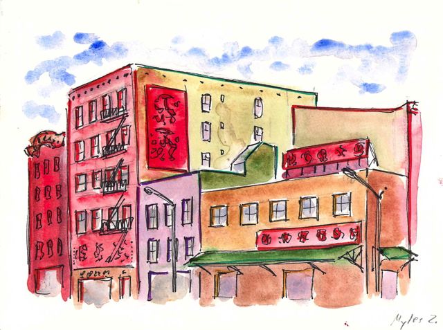
Forsyth and Delancey Street

Let us clarify one thing: The division in Chinatown is not “apartheid” in the strict sense. It is perhaps a division more subtle and difficult to notice. It expresses the kind of unequal treatment – antiquated housing, crowded conditions, and municipal apathy – that face many immigrant groups in America. The built environment of Chinatown is something altogether more complicated and layered with other ethnic groups, too. For instance, the Church of the Transfiguration in the center of Chinatown now has a majority Asian congregation, even though it was founded in 1815 as a German and Lutheran church. Similarly, some of the funeral parlors on Mulberry Bend have Italian origins and old Italian men in the funeral bands.  This neighborhood is also in the active process of gentrification with rising rents pushing out older Asian businesses.
If and when the Chinese become fully integrated into American society, how should the architectural fabric of this immigrant enclave be preserved, considering that its very existence is a marker of race-based exclusion and the century-long challenge of the Chinese in America?

.
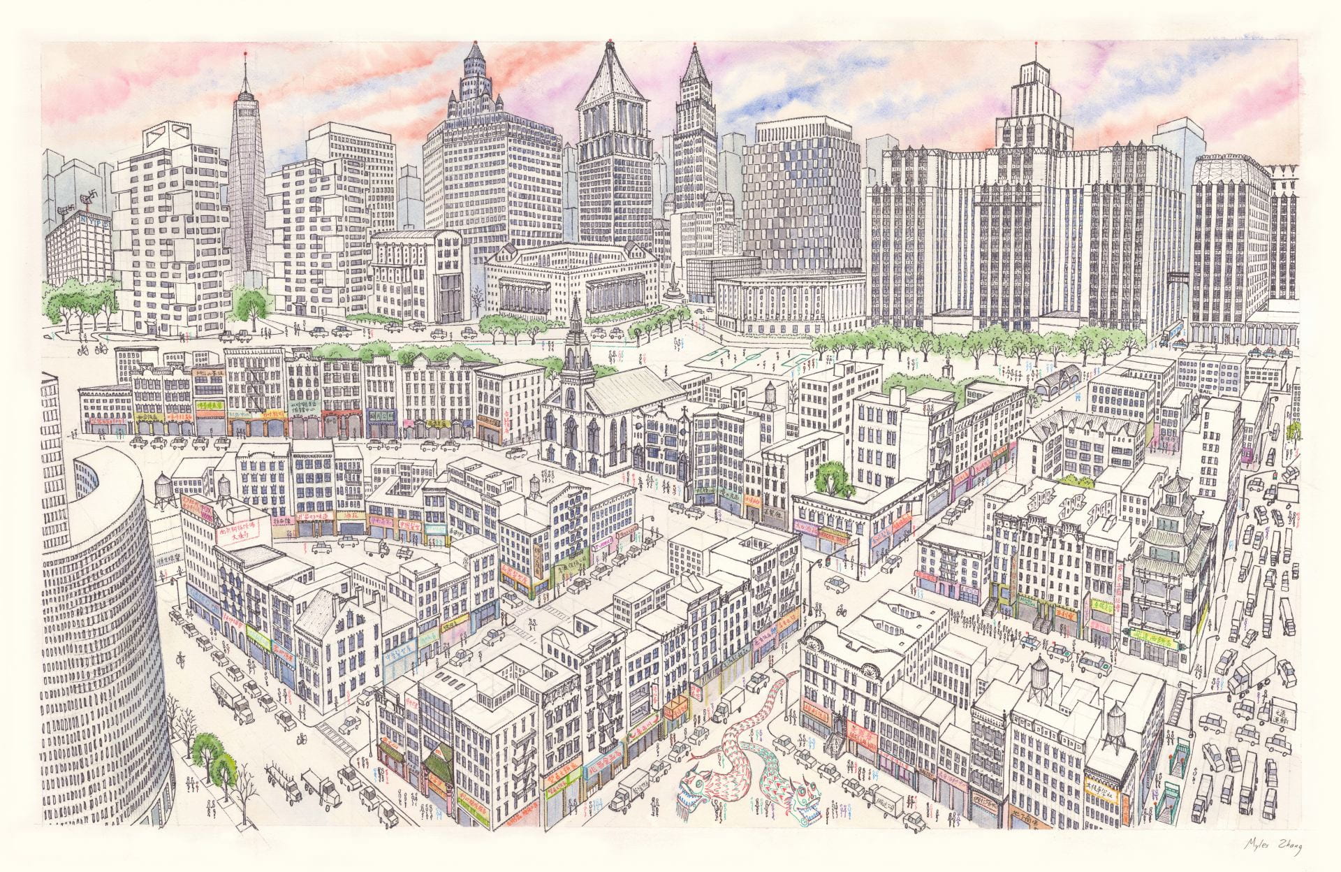
This time-lapse of Manhattan Chinatown took sixty hours to complete and measures 26 by 40 inches. Chinatown’s tenements are in the foreground, while the skyscraper canyons of Lower Manhattan rise on top. This shows the area of Chinatown bordered by Bowery, Canal Street, and Columbus Park.

.

Chinese music: Feng Yang (The Flower Drum)

Railroad commuting patterns in New Jersey

View my data visualizations of New Jersey’s suburban growth here.
Created with data from NJ Transit on weekday and weekend rail ridership.
Or download my data from Tableau Public.
NJ Transit carries over 90,000 commuters per day to and from New York Penn Station, the busiest rail station in the Western Hemisphere. The construction of this rail network in the nineteenth and early twentieth centuries was focused around New York City. Like spokes on a wheel, these rail lines radiate from the urban center.
Hover over stations to view statistics. Dot color corresponds to train line. White dots are for stations where multiple lines intersect. Dot size corresponds to number of riders per day: Large dots for busy stations and small dots for less busy stations. For each station, the average number of daily riders is listed.

.

.

The map above shows weekday ridership patterns. Movement is centered around the employment hubs of Newark and New York Penn Station. The next two busiest stations are Secaucus Junction and Hoboken, but these two stations are not destinations. Instead, they are transfer points for commuters en route to New York City. Commuters collected from stations on the Pascack Valley, Bergen County, and Main Line are almost all headed to New York City, but they must transfer at Secaucus (to another NJT train) or at Hoboken (to PATH / Hudson River ferries).

.

.

This map shows Sunday ridership. On average, stations are 66% to 75% less busy on weekends. The thirteen stations along the Montclair-Boonton Line – between Bay Street and Denville – are also closed on weekends because ridership is so low. However, the only line that is almost as busy on weekends as it is on weekdays is the Atlantic City Line. This is likely because trains on this line serve weekend tourists to the New Jersey Shore and Atlantic City casinos.

.

.

Notice the large difference between the first four stations and all others listed. Keep in mind that a lot of this data double-counts a single passenger. For instance, someone riding from their home to work will be counted once in the morning, and again in the evening.

.

Writing Here Is New York in 1949, American writer E.B. White has this to say about suburban commuters:

.

“The commuter is the queerest bird of all. The suburb he inhabits […] is a mere roost where he comes at day’s end to go to sleep. Except in rare cases, the man who lives in Mamaroneck or Little New or Teaneck, and works in New York, discovers nothing much about the city except the time of arrival and departure of trains and buses, and the path to a quick lunch. […] About 400,000 men and women come charging onto the Island each week-day morning, out of the mouths of tubes and tunnels. […] The commuter dies with tremendous mileage to his credit, but he is no rover. […] The Long Island Rail Road alone carried forty million commuters last year, but many of them were the same fellow retracing his steps.” (p.18-21)

Geography of Marijuana Arrests

Update March 2021: Marijuana is now legal in NY state.


.

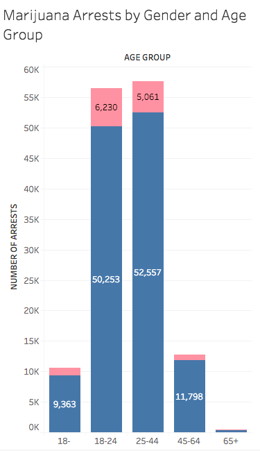
The New York Police Department (NYPD) made 102,992 arrests in 2017 for the possession, sale, and/or use of marijuana. 1 While only 25.5% of New Yorkers are Black, 67.5% of marijuana arrests are of Blacks. Similarly, 90% marijuana arrests are male, even though only 65% marijuana users are male. 2 Males more than females and Blacks more than others are arrested for marijuana in disproportionate numbers.

.

Race
Percentage of New Yorkers who identify as this race 3
Percentage of marijuana arrests of individuals belonging to this race
White
44.0%
11.2%
Black
25.5%
67.5%
Asian/Pacific Islander
12.8%
4.2%
Other
17.7%
17.1%

.


.

2017 data

.

Click table to view in detail

NYPD marijuana arrests are disproportionately of Black males between the ages of 18 and 44 from low-income communities, even though this demographic represents less than 10% of the city’s population. Why should this matter? Arresting individuals for using a relatively harmless and non-addictive drug is expensive for taxpayers. According to the Drug Policy Alliance, the city spends $75 million on marijuana arrests and prosecution per year. 4 This is money that could have gone to education, parks, and community programs. Marijuana policy targets our country’s poorest people of color.
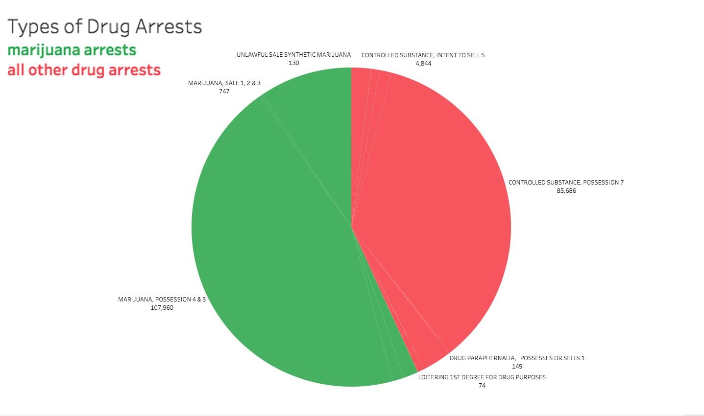
The common argument, and the grounds on which marijuana was initially made illegal, is that marijuana is a “gateway drug.” Marijuana supposedly introduces and later encourages individuals to experiment with more dangerous and addictive substances. Whether or not this is true, the arrest and punishment of individuals for marijuana may incur the equal risk of becoming a “gateway crime” to the legal system. With a prison record from a marijuana arrest, a person of color may have more difficulty finding employment and re-entering society – ironically pushing them to desperation and possibly new and greater crimes than their initial arrest.

.

.

View this pie chart in more detail.

.

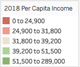
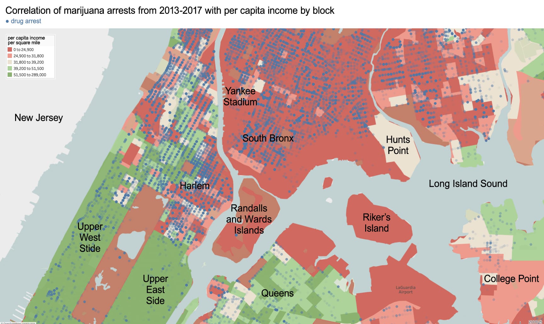
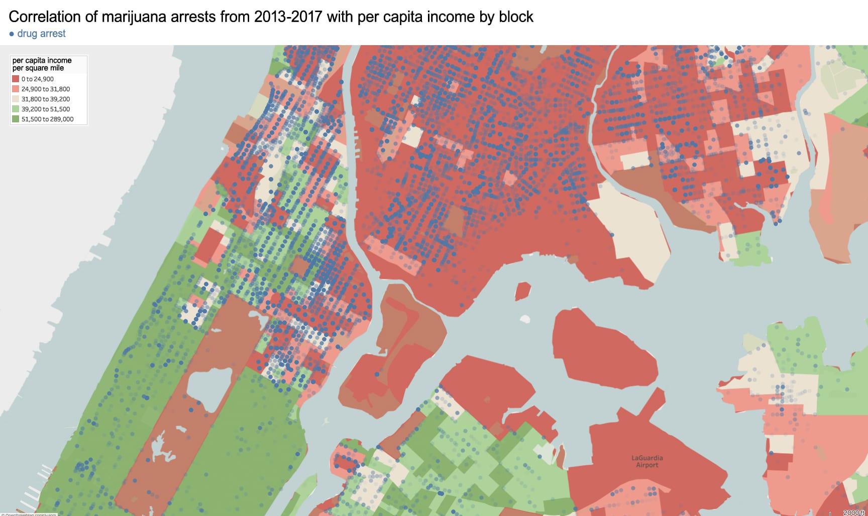
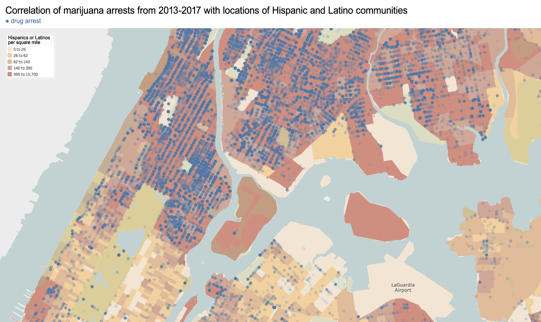
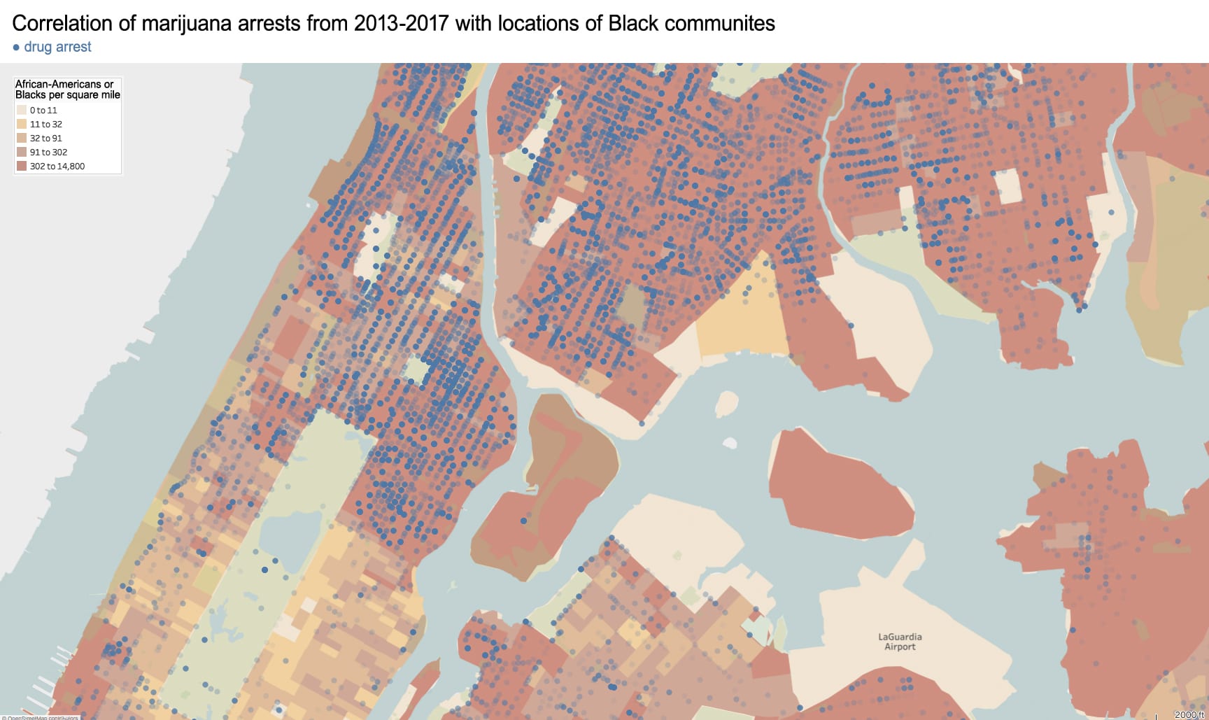
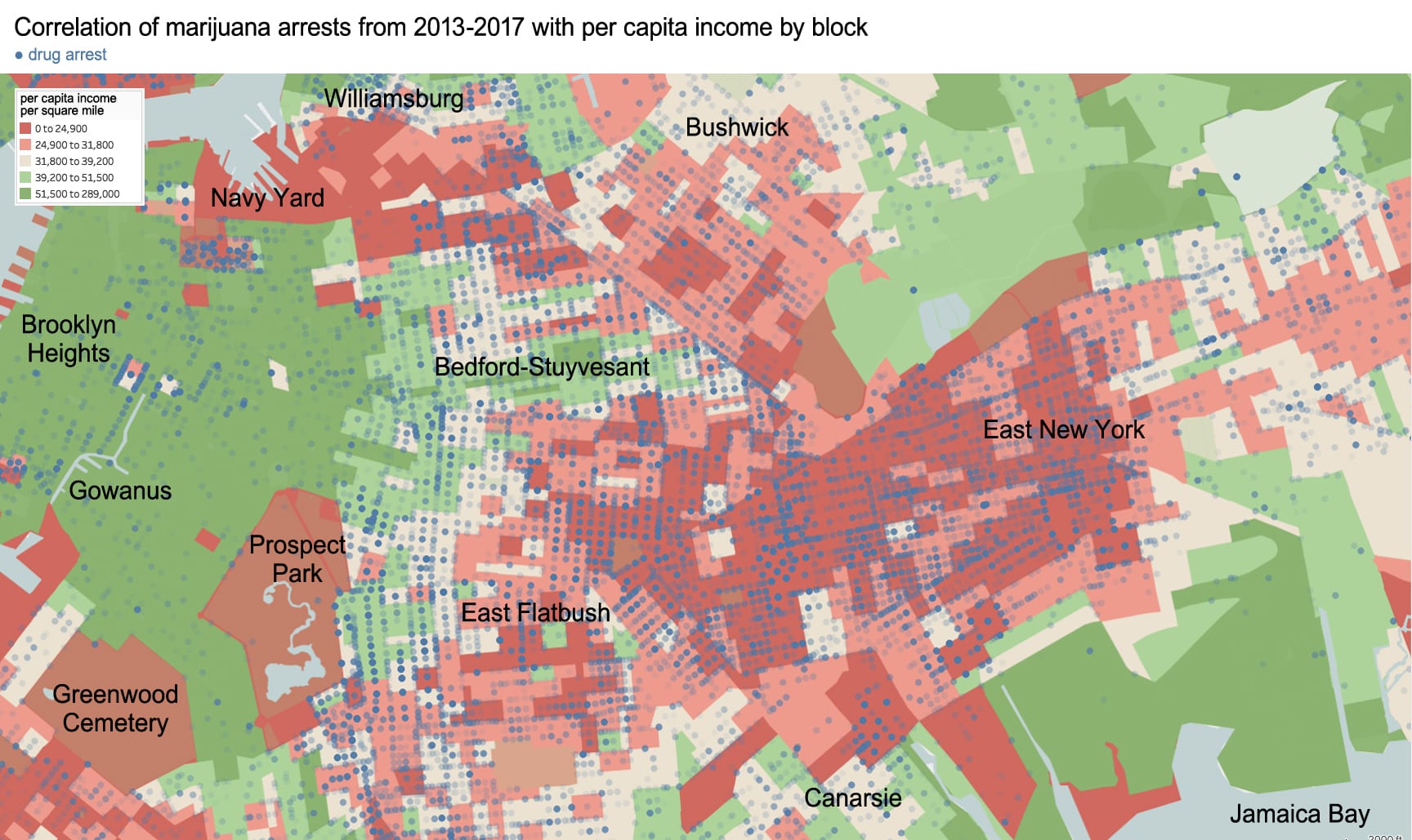
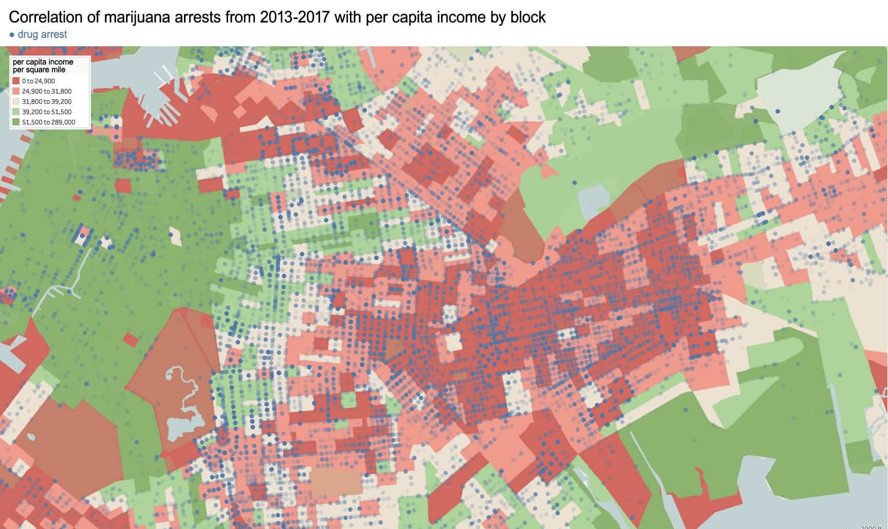
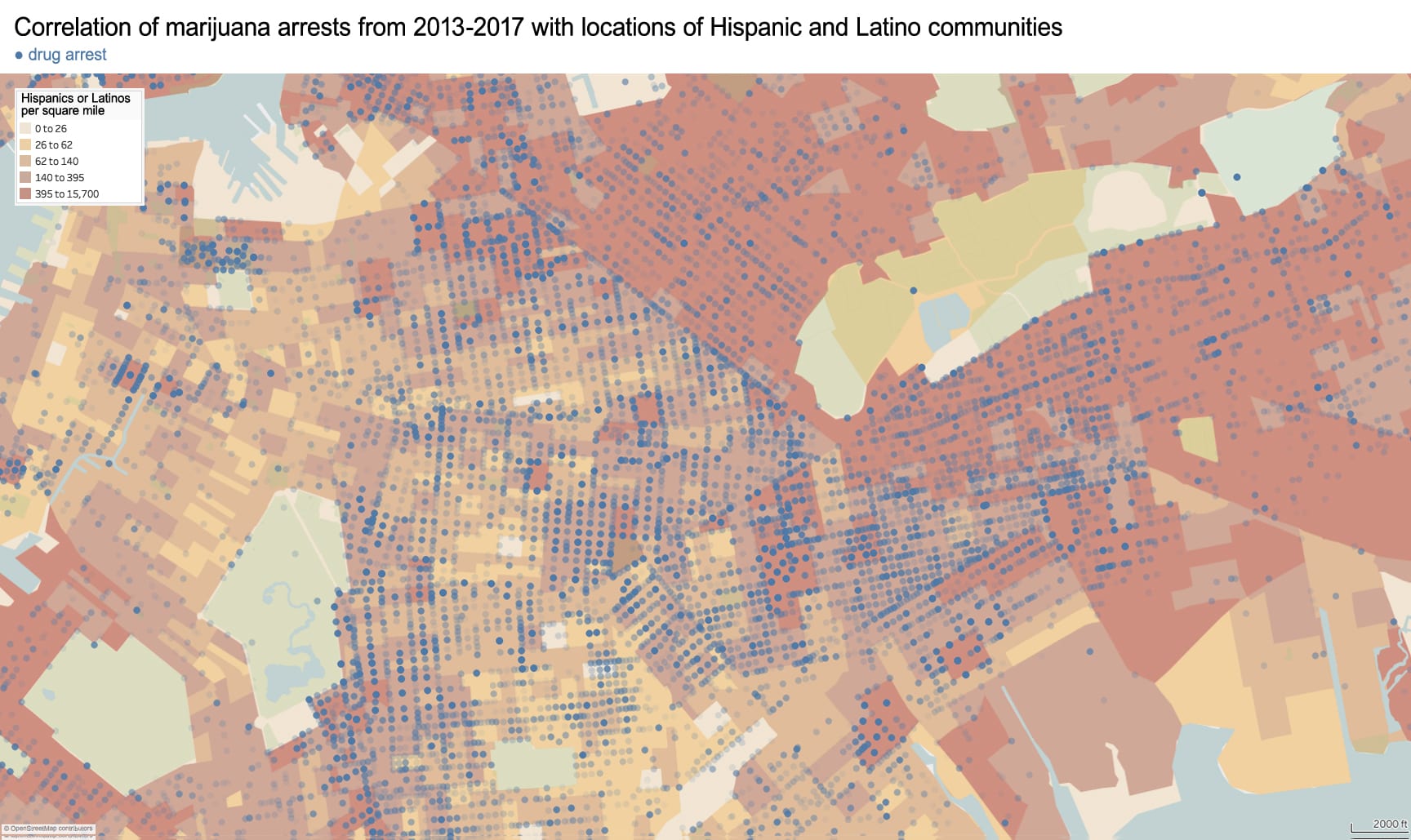
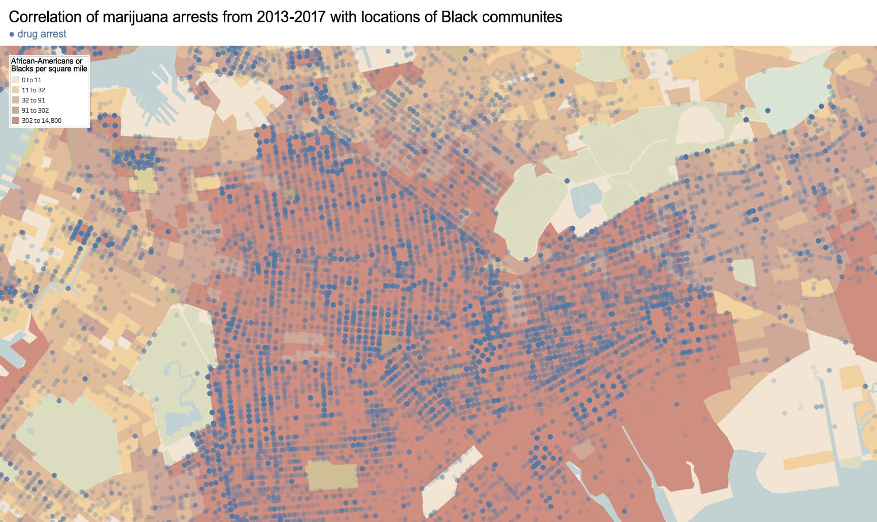
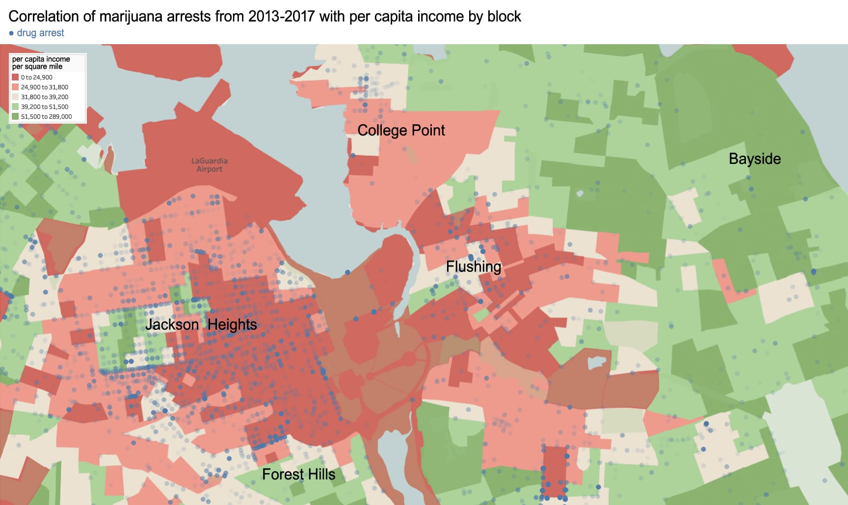
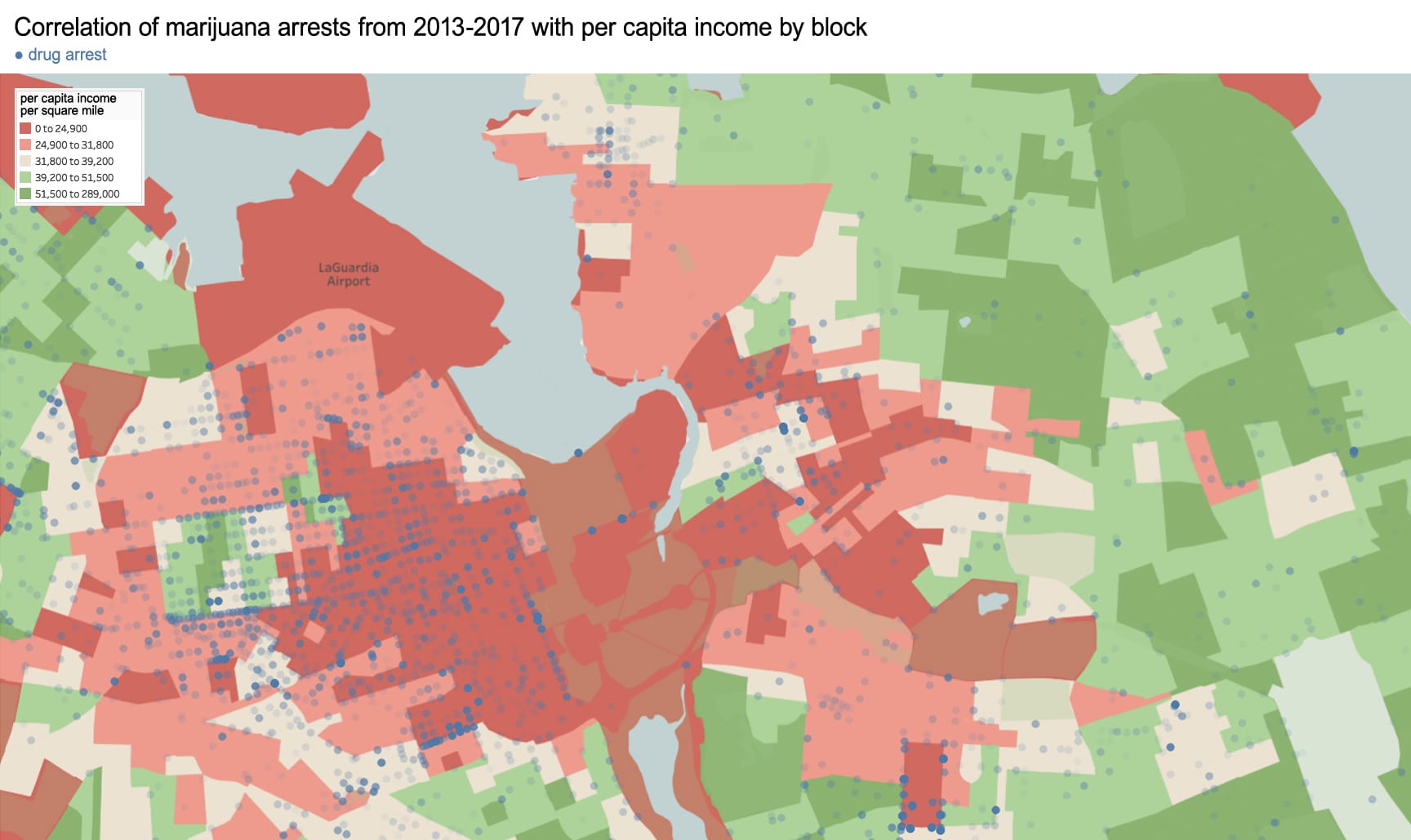
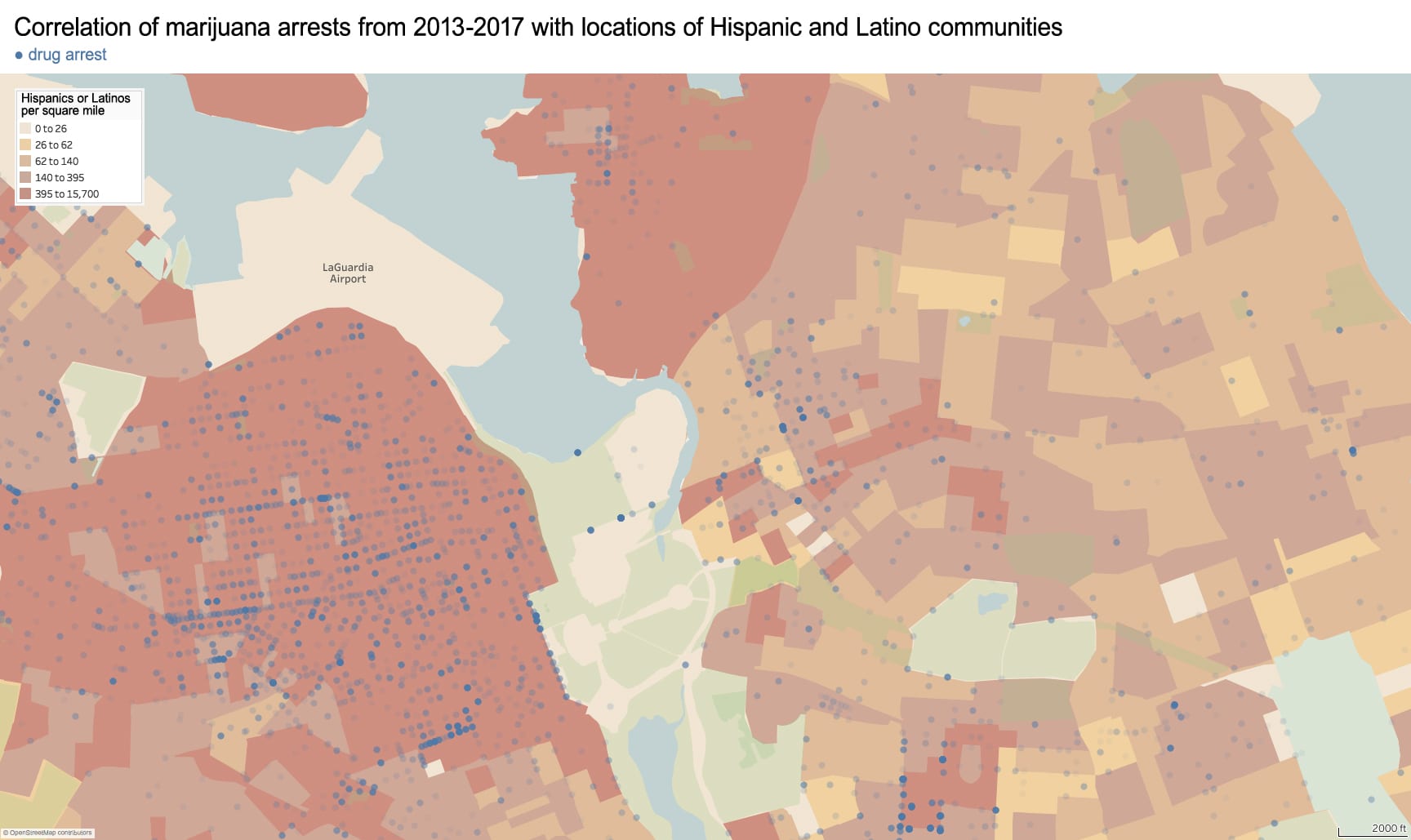
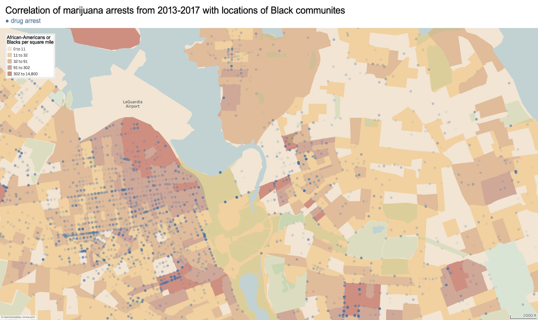
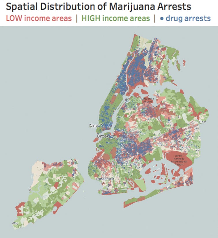
Below are three maps of neighborhood “hotspots” for marijuana arrests. The income of every block is indicated on a red to green color scale from low to high income. The population of Latinos and Blacks per square mile is also indicated; unsurprisingly, these groups cluster in low-income neighborhoods. On this base map is the geo-referenced address of every arrest for marijuana possession or sale from 2013 to 2017.
Marijuana arrests tend to happen in low-income neighborhoods. For instance, Manhattan’s 96th Street represents an income divide between the wealthy Upper East Side and the comparatively poorer Harlem. Drawing a “thin blue line” down 96th Street, we also identify an unspoken policing boundary. Marijuana arrests are significantly less likely to happen in the majority-White neighborhood south of 96th than in the majority-Black neighborhood north, even though both neighborhoods are of comparable population density and likely comparable rates of marijuana use. According to the UCLA: “Despite roughly equal usage rates, Blacks are 3.73 times more likely than Whites to be arrested for marijuana.” 5 Similarly, the wealthy and majority-White neighborhood of Riverdale in the Bronx has few arrests in comparison to the poorer and majority-Black West Bronx, even though these two neighborhoods are less than mile apart.


.

.

Research Method

.

Note that on the above map, there are numerous low-income neighborhoods without any drug arrests. This is largely because these areas have little to no population, such as Central Park or LaGuardia Airport. Controlling for population density, marijuana arrests still target communities of color.
This project was assembled from public data. I downloaded anonymized microdata on the race, crime, gender, and approximate age of every individual arrested by NYPD, as well as the address where this individual was arrested. Of the approximately 1.7 million arrests in this data set, I filtered out the marijuana crimes. The colored basemap indicating per capita income and race by city block is extracted from Tableau Public, the mapping software I use. The infographics presented above can be explored or downloaded here. Arrest data is from NYC Open Data here.

.

Endnotes

  1. Marijuana arrests represent 5.98% of all NYPD arrests in 2017.
  2. From “Statista,” accessed 15 January 2019, link.
  3. From the United States Census Bureau, 2010 statistics on NYC demographics, link to report, link to database.
  4. From the Drug Policy Alliance, accessed 15 January 2019, link to press release, link to report.
  5. From the American Civil Liberties Union, accessed 18 January 2019, link to article.

New York City Subway Ridership

Created with data from the MTA.
Published by Gothamist on 22 January 2019.
Related: my data visualization of London Underground commuting patterns.

.

The visual language of data addresses a deeper need to humanize and soften the concrete jungle.

.

Sounds of breathingheartbeat, and subway from Freesound

.

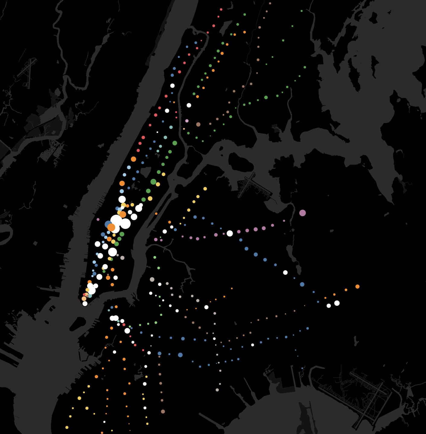
In this animation based on subway ridership statistics by station:
● Dots are color-coded according to the subway lines they serve.
● White dots are for junctions between two or more lines of different color.
● Dot size corresponds to the number of riders entering each station within a 24 hour period.
● Larger dots are for busier stations. Smaller dots are for less busy stations.
Movements through the New York City subway are analogous to rhythmic breathing.
People often describe cities in relation to the human body. Major roads are called “arteries” in reference to blood flow. The sewers are the city’s “bowels” in reference to our own digestive systems. Central Park is the city’s “lungs.” At various times in history, key industries like garments and finance were described as the “backbone” of New York’s economy. Although cities are complex organisms, wordplay makes the giant metropolis somehow more human and familiar.
The 424 subway stations and 665 miles of track are analogous to the human circulatory system. Every weekday pre-coronavirus, the subway carried 5.4 million people, mostly commuters. This daily commute is ordered, structured, and rhythmic – as Manhattan’s population swells during the daily commute and then contracts by night. Each passenger symbolizes the movement of a single red blood cell. With each paycheck, the oxygen of capitalism flows from the heart of Manhattan to the cellular homes in the outer boroughs.
Commuting patterns mirror the rhythmic expansion and contraction of the human body while breathing. By contrasting weekday and weekend ridership patterns, we detect the city’s respiratory system.

.

.

Interactive Map

.

Research Method

In this video lecture, I walk you through how I manipulated MTA and NYC open data
to create this animation.

.

The Metropolitan Transit Authority (MTA) publishes statistics on weekday and weekend (Saturday + Sunday) ridership for all 424 stations. These statistics, updated yearly, are public and can be analyzed to track trends in urban growth. I downloaded the MTA data and assigned each station a geographical coordinate (latitude + longitude) so that the data points would appear at their corresponding map locations.

I have a love-hate relationship with the New York City subway. At rush hour, it is crowded, hot, and slow. From years of riding its squeaky trains, it’s given me a ringing tinnitus sound in my ear. Despite its flaws, the subway is one of the few urban spaces where all social classes and ethnicities mix, where their separate lives are momentarily shared. Rich or poor, everyone rides the subway. I hope this animation renews appreciation for this engineering and the people behind it.

.

Sources

Where in the world is modernism?

What if the nationality of every artist represented in the Museum of Modern Art’s collections were mapped to illustrate the museum’s evolving geographic diversity through time? Watch the data visualization below of 121,823 works at MoMA.

.

.

Introduction

“The Museum of Modern Art (MoMA) acquired its first artworks in 1929, the year it was established. Today, the Museum’s evolving collection contains almost 200,000 works from around the world spanning the last 150 years. The collection includes an ever-expanding range of visual expression, including painting, sculpture, printmaking, drawing, photography, architecture, design, film, and media and performance art.
“MoMA is committed to helping everyone understand, enjoy, and use our collection. The Museum’s website features 79,870 artworks from 26,215 artists. This research dataset contains 135,804 records, representing all of the works that have been accessioned into MoMA’s collection and cataloged in our database. It includes basic metadata for each work, including title, artist, date made, medium, dimensions, and date acquired by the Museum. Some of these records have incomplete information and are noted as ‘not Curator Approved.’
“The Artists dataset contains 15,757 records, representing all the artists who have work in MoMA’s collection and have been cataloged in our database. It includes basic metadata for each artist, including name, nationality, gender, birth year, death year, Wiki QID, and Getty ULAN ID.” – from MoMA’s website.
I downloaded this dataset and dissected it with this question in mind:
What trends might this dataset reveal about the history of curating and the growth of a museum’s collections?
In the three interactive features below, hover over the graphs to explore the data in depth.

.

1. Geographic and Gender Diversity

This map visualizes the nationalities of ~15,757 artists whose work is displayed at MoMA. There are 121,823 data entries displayed below. The data can be browsed by year or by department. This illustrates the evolving geographic breadth of collections. Beginning in the 1930s, over 80% of artworks were from the four key countries of the US, UK, France, and Germany. Beginning the 1960s, the museum acquired some of its first works from Latin America and Japan. Post-1991, the museum acquired the bulk of its collections from Russia and China. Recent years have also seen a slight growth in collections of African art
An important distinction: This map does not show where each artwork was made. Rather, it shows where each artist is from. Nationality and national identity are, depending on the artist, an important influence shaping the unique perspective artists bring to their work.

.

.

The bar chart below shows the gender distribution of artworks by date. On the horizontal axis: the date acquired. On the vertical axis: the number of artworks acquired in this year. Each bar is divided into three colors: Blue for artwork by a male artist. Pink for art by a female artist. Grey for art where the gender of the artist is not known.
This data can be explored by year and by department. Across departments, male artists represent the clear majority. The departments with the greatest number of works by female artists: Photography and Drawings. The department with the least female representation: Prints & Illustrated Books. The department with greatest number of works where the artists’ gender is unknown: Architecture & Design. However, across departments, the representation of female artists has slightly increased over the past few decades from around zero to somewhere around 20%.

.

.

2. Do newer acquisitions tend to be smaller?

The two graphs below plot the relationship between year produced, year acquired by MoMA, and the dimensions of each artwork (width in cm). I’ve plotted 12,250 points. They are color coded with the same blue, pink, and grey system as the previous chart.
In the first graph, we see that newly produced paintings are becoming progressively larger. In 1929, the year of MoMA’s founding, the width of the average painting being produced was less than 100cm. Today, the average width of newly produced paintings is around 400cm – and is steadily increasing.

.

.

In the second graph, we see that MoMA’s new acquisitions are becoming progressively smaller, even though newly produced artworks are larger than before. In 1929, the average width of a new acquisition was over 300 cm. Today, the width is less than 150cm.

.

.

In other words, while artists seem to be working in ever larger dimensions, MoMA seems to be acquiring ever smaller paintings from these artists. Have the growing costs of buying and storing art priced MoMA out of acquiring larger artworks? What is the relationship between size and the decision whether or not to acquire a work?

.

3. Is the scope and definition of modernism expanding?

The challenge facing any museum dedicated to modern art is keeping up-to-date. Modern art is constantly being produced. Like any leading museum, MoMA is:
  • growing its collection of newly-produced contemporary works
  • while also enhancing its collection of older works
  • and expanding the geographic and national representations of artists and artworks
The graph below compares the relationship between production year and acquisition year for 7,797 data entires. Dot size indicates the size of the acquisition (i.e. number of pages or number of paintings from said artist). The red trend line indicates the linear relationship between when a work was produced (vertical axis) and when it was acquired by MoMA (horizontal axis). The vertical gap between the trend line and the upper reaches of the graph indicates the time elapsed between when the work was produced and when it was acquired. With time, the number of years elapsed between production and acquisition has grown.
In 1929, most new acquisitions were produced in the 1920s – modernism was a new movement and a new idea. Today, new acquisitions range in date from the early nineteenth century through present day. The temporal definition of modernism is growing, with origins that stretch ever further back in time.

.

.

Modernism is not geographically restricted. With globalization and the march of capitalism, the world is becoming more modern and interconnected. As new regions adopt modern technology, materials, and ideas, the character of art and artists will change. Cultural institutions, particularly modern art museums, are positioned to curate these global trends through the kinds of works they acquire and display. However, the kinds of stories museums and curators can tell are limited by the size and diversity of the collections available.

.

Related Data Projects

.

Sources

Download MoMA’s data from GitHub. The analysis above reflects this dataset as of 17 October 2018. New entries after this date are not included as these infographics are not updated in real-time.

Download my analysis of this data and the infographics above from Tableau Public.

A History of Historic Preservation in New York City

Data analysis of NYC landmarks since 1965 reveals trends and biases in the landmarks preservation movement.

Developed with urban historian Kenneth Jackson at Columbia University’s Department of History

.

.

A visual history of landmarks preservation in NYC. Data from NYC Open Data. Music from Freesound.

.

Introduction

There is ongoing debate between in NYC between developers seeking to rebuild the city in the image of global capitalism and preservationists seeking to slow the rate of change and protect the appearance of the city’s many and distinct neighborhoods. Several factors drive historic preservation: fear of losing heritage; fear of change; historians, public servants, and well-intentioned activists in the spirit of Jane Jacobs. This debate has played out every year since 1965 through the hundreds of structures that are added to (or rejected from) the Landmarks Preservation Commission’s running list of landmarks (LPC). Once added, landmarked buildings cannot be modified without first seeking approval from the city. Landmarks preservation is contentious for developers because the protections of preservation law are permanent and affect all current and future owners. Preservation law further restricts significant rebuilding, even if demolition and rebuilding are lucrative for the property owner.
Historians decide the future of the city’s built environment. The sites they preserve will become the architectural lens through which future generations will appreciate the past. The sites they approve for demolition will be lost to history. Preservation is a response to larger historical questions: Which aspects of the past are worth preserving? How should the city balance the economic need for development with the cultural need for history?
This paper will assess the landscape of historic preservation through analysis of publicly-available landmark records from NYC Open Data. We identified two datasets, both containing ~130,000 spreadsheet entries for every single LPC listing from 1965 to 2019. The first dataset is titled “Individual Landmarks” 1 and includes the structure’s address, lot-size, and date landmarked. The second dataset is titled “LPC Individual Landmark and Historic District Building Database” 2  and includes the construction date, original use, style, and address of all structures. We downloaded both datasets as .csv files, imported them into a visualization software called Tableau, merged them into a single map, and then analyzed the data. The results of inform the conclusions presented here. This analysis is broken into four case studies:
  1. Distribution of Landmarks over the Five Boroughs
    Assesses where landmarks preservation is densest or least dense by neighborhood.
  2. Contextual Preservation?
    Analyzes how protecting a landmark limits redevelopment of neighboring properties of less aesthetic value
  3. How does the preservation movement reflect economic patterns?
    – Factor affecting the preservation of city-owned structures
    – Factors affecting the preservation of residential structures
    – Relationship between preservation and gentrification?
  4. Keeping up to pace?
    Questions the degree to which landmarks preservation succeeds in protecting recently-built landmarks
From this data, hidden trends and biases in historic preservation become visible. Firstly, we identify a higher-density of landmarks in certain (and usually higher income) neighborhoods. Secondly, we identify a marked preference among historians for protecting structures pre-1945. (Is there so little in the city’s recent architectural history that is worth preserving?) And thirdly, our analysis hints at the strength of market forces and developers in shaping the scope and definition of preservation.

Read More

.

.

  1. “Individual Landmarks,” NYC Open Data, https://data.cityofnewyork.us/Housing-Development/Individual-Landmarks/ch5p-r223 (retrieved 5 November 2018).
  2. “LPC Individual Landmark and Historic District Building Database” NYC Open Data, https://data.cityofnewyork.us/Housing-Development/LPC-Individual-Landmark-and-Historic-District-Buil/7mgd-s57w (retrieved 5 November 2018).

A Brief History of Mulberry Bend

At the intersection of history and the immigrant experience

Written for Kenneth Jackson’s Columbia University undergraduate course “History of the City of New York”

.

Mulberry Bend c.1896. Buildings on left side of street are now demolished.[1]

.

Mulberry Bend, nestled between the New York County Criminal Court and the tenements of Chinatown, is at the geographic crossroads of New York City history. At 500 feet long and 50 feet wide, Mulberry Bend is between Bayard Street to the north and Worth Street to the south. Named after the slight turn the street makes midblock, the Bend has a rich, over 350 year history: marsh, city slum, site of urban renewal, and now heart of the Western Hemisphere’s largest Chinese enclave.[2] Through its rich history, the Bend’s brick and wood-frame tenements hosted waves of immigrant groups: Irish, Italians, freed blacks, and now the Chinese, one of New York’s most resilient immigrant groups whose presence in Chinatown reaches as far back as the 1830s. Consistent to these immigrant groups is their struggle to survive and prosper in America. Many of these immigrants, such as the Irish and Italians, have long left the Five Points neighborhood where the Bend is located, leaving few traces of their presence. But the neighborhood was vital as their first point of contact in the New World, a way station between their country of origin and future prosperity in the Promised Land. As such, the Bend exemplifies some of the trademarks of the immigrant experience: a working-class community populated by an immigrant diaspora that emulates the language and tradition of their country of birth. Though their homeland may be distant, in Italy, Spain, Germany, Ireland, or China, they recreated a familiar world beneath the skyscrapers of Lower Manhattan. Neither fully American nor fully foreign, neither a quiet residential street nor busy commercial thoroughfare, the Bend existed and exists as a community of transient identity.
When the Dutch first settled New York, the area of Mulberry Bend and Chinatown was wooded and marshy land. The Bowery, one block east of what would become Mulberry Bend, was a Lenape Indian trail traveling from the tip of Manhattan to the heights of Harlem, about ten miles distant. The New York County Criminal Courts, one block west of the Bend, was the site of colonial New York’s main source of drinking water, the Collect Pond.[3] Change came when the city’s tanning industry developed at the adjoining Collect Pond because it could carry away their industrial waste. The Ratzer Map of Manhattan, dated 1776, even plots the Bend, which bends to avoid the marshy topography of the Collect Pond. Despite this moderate industrial development and gradual filling in of the pond with soil, the area remained marshy and unfit for living.[4]

Read More

.

Excerpt from the 1776 Ratzer Map of Lower Manhattan. The area labeled as “Common” is now City Hall Park, the “Fresh Water” body was known as Collect Pond, and the “Tanners Yards” was the center of the future Five Points Slum. Mulberry Bend is the line in bright red. The dotted land pattern indicated low-lying marshes and woods that have yet to be developed. The grid of streets had been laid out, but had yet to be populated with tenements and businesses.[5]

.

The Geography of Art History

According to the Metropolitan Museum of Art

.

Related: Data analysis and visualization of 120,000 works in the Museum of Modern Art

.

.

In this film, each colored dot indicates one location represented by art in the Met’s online database. Dot location indicates artwork provenance. Dot size indicates the number of objects from this place. The time each dot appears corresponds to the year this work was created. This data is assumed to be an accurate sample size.

.

Over the past few years, the Metropolitan Museum has catalogued over 25% of its holdings online. This represents ~590,000 objects, covering over 5,000 years of human history from 17 curatorial departments. The diversity of objects in a museum’s collection (and the amount of contextual information known about these objects) may reflect the kinds of narratives a museum can curate about artistic and global history. This visualization charts the provenance and year of production of every single object that is catalogued on the Metropolitan Museum website, whenever this information is known.
The geography of art history is uneven. Certain regions, particularly cities, are home to diverse and famous artistic output. Thomas Friedman similarly describes globalization as being spiky and concentrated in big cities. Other regions are comparatively less productive and less studied. Either this reflects museum curators’ historic bias against Africa, Latin America, and the “Global South” in favor of Europe. Or this might reflect a more fundamental historical reality: If geography guides artistic production and privileges regions with good geography, like areas surrounding the Mediterranean, then landlocked and inaccessible regions with poor geography will have less artistic output.

.

.

Art objects from ancient cultures like China, Egypt, and Sumeria frequently have known provenance but unknown year of production. Unfortunately, they are therefore excluded from this visualization. There are many objects in the collections with known provenance but unknown production date. Figure one illustrates objects with known provenance and known year. Figure two shows objects with known provenance only.

.

.

The original data was downloaded here from the Met Museum’s website.
This visualization and interactive map are free to view and download here.

Columbia University Artwork

Featured in:
The Columbia Daily Spectator in September 2016
The Columbia student newspaper in October 2016
The 2018-19 edition of the Asia Pacific Affairs Council journal
– And the Columbia College Today alumni magazine in winter 2019-20 (last page) and summer 2022 (pages 18-22)

.

A map of campus

.

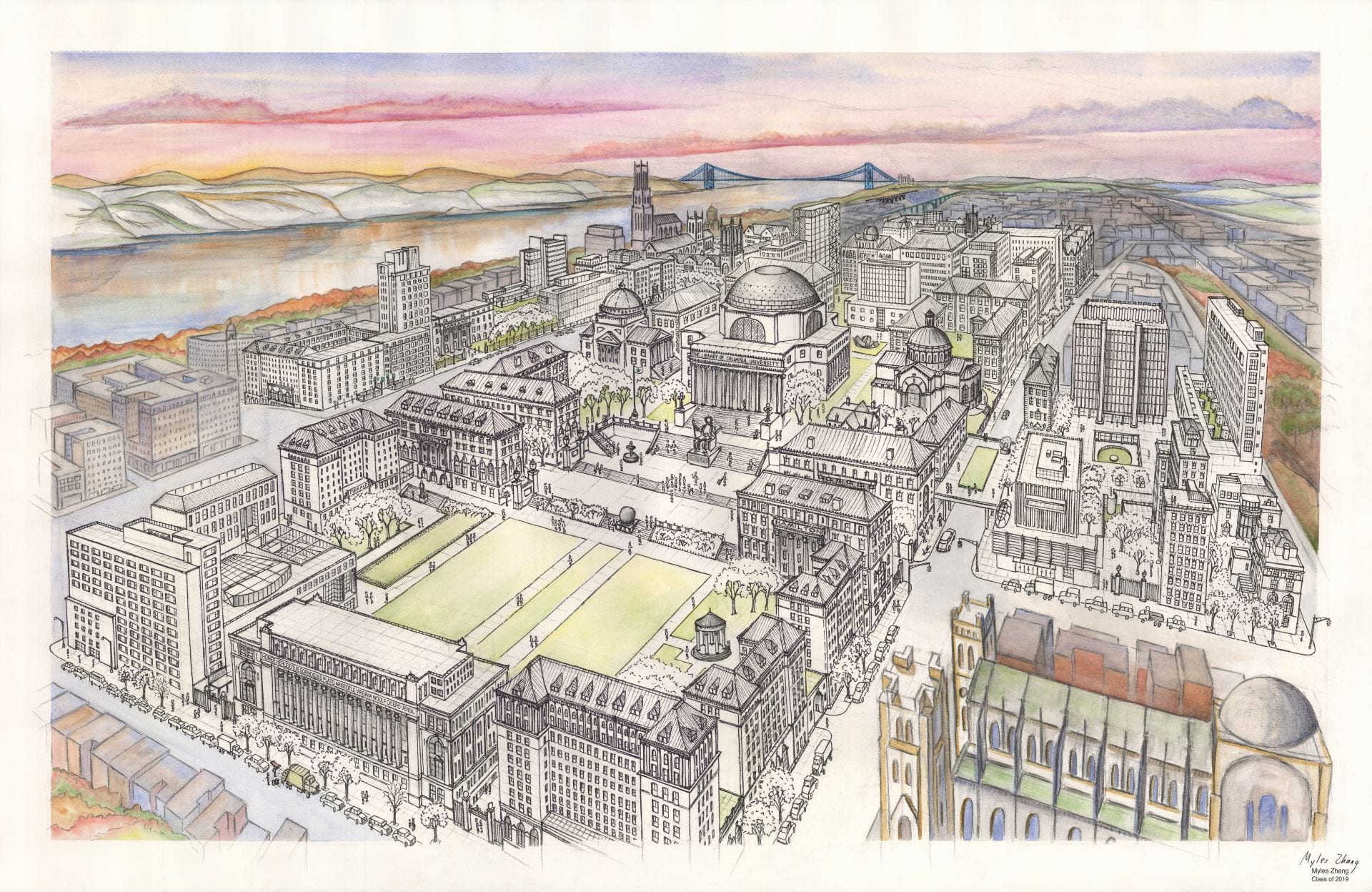
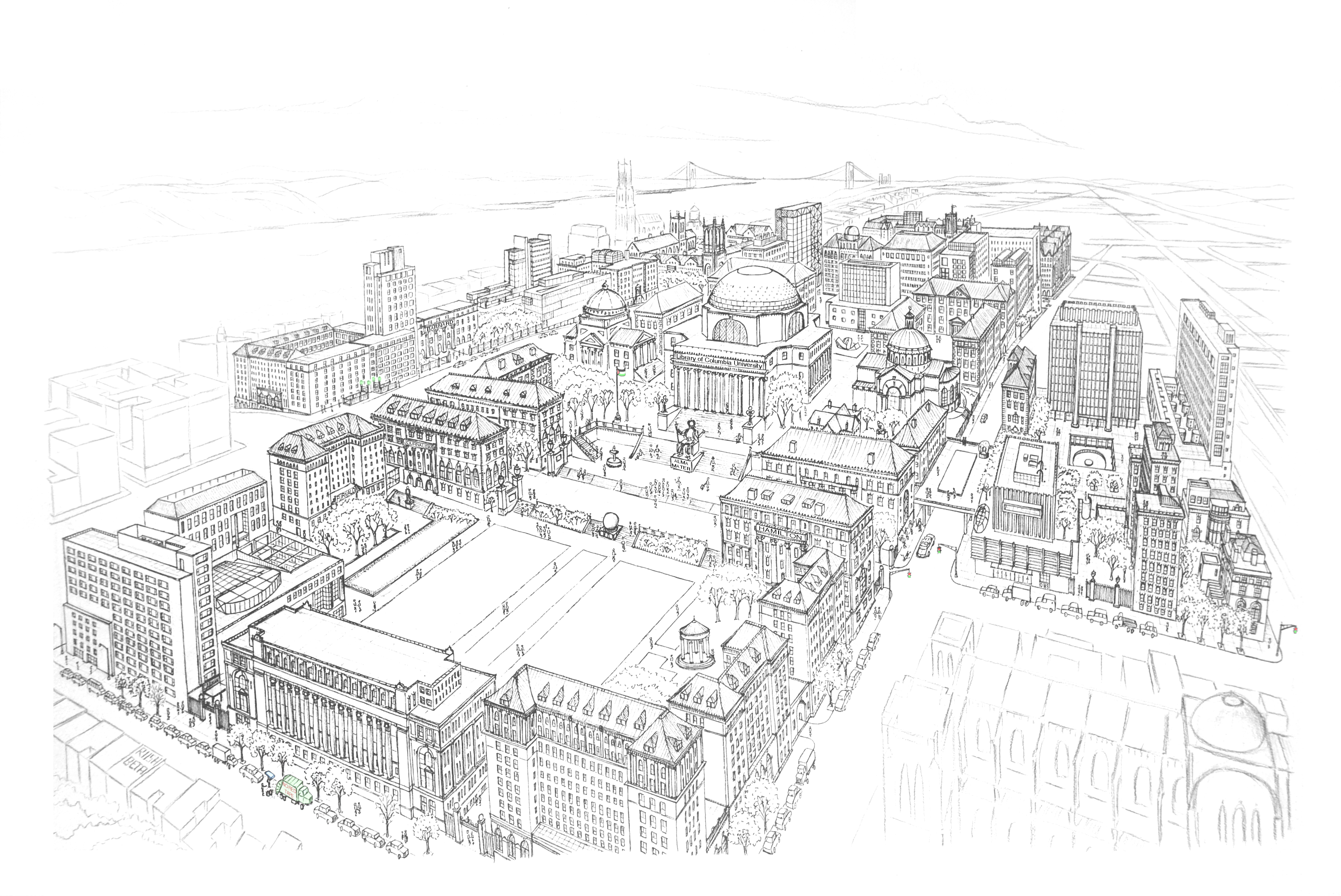
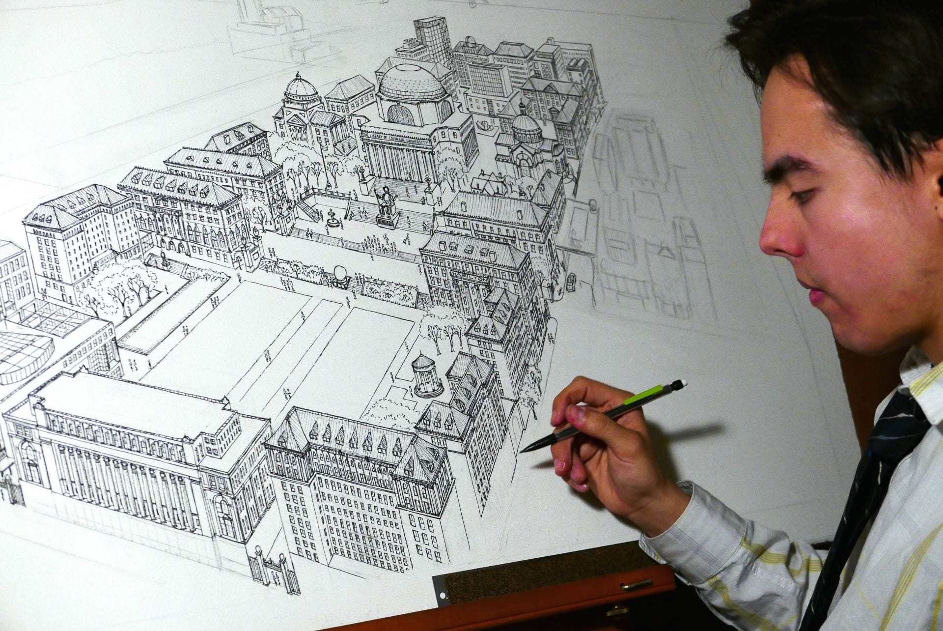
This ink and watercolor drawing shows every building, window, and architectural detail on campus. The number of windows on each façade are faithful to reality. There are at least 2,000 windows. The perspective was formed from Google Earth satellite and street view images. The image measures 26 by 40 inches and is framed in my dorm room. I wanted to create a souvenir of my four years at Columbia. Years from now, I will look at this image and remember.
The scan below is suitable for viewing but not for large-format printing. Please request access to the full-size scan at ~300dpi
View more artwork like this about my experiences walking in New York City.

.

.

Columbia Campus

.

.

Ink sketches of campus

.

.

Columbia in a Box

.

Before my first year at Columbia University, I assembled this tiny model of the campus out of painted and folded paper. Each building was measured out on a flat sheet of paper, decorated, painted, cut out, and then folded. Each building is made with no more than one sheet of paper. This creation folds out of a vintage cigar-box. Dimensions: 5 inches wide, 9 inches long, and 3 inches deep.

.

Music: Columbia University Fight Song

.

.

Timelapses of Morningside

.

This project features six time-lapse sequences of Columbia University’s campus. I mounted a camera above my desk as I drew and painted each watercolor.

.

Music: Columbia University Fight Song performed by Justin Zhao

.

New York Chinatown: time-lapse drawing

As featured by the blog Kottke.org

.

.

Chinese music: Feng Yang (The Flower Drum)
.

This time-lapse of Manhattan Chinatown took sixty hours to complete and measures 26 by 40 inches. Chinatown’s tenements are in the foreground, while the skyscraper canyons of Lower Manhattan rise on top. This shows the area of Chinatown bordered by Bowery, Canal Street, and Columbus Park.

.