• This website includes dozens of videos, hundreds of essays, and thousands of drawings created over the past twenty years. Search to learn more about the history of buildings, places, prisons, Newark, New York City, and my PhD research on spatial inequality.

  • Or scroll down for the latest publications.

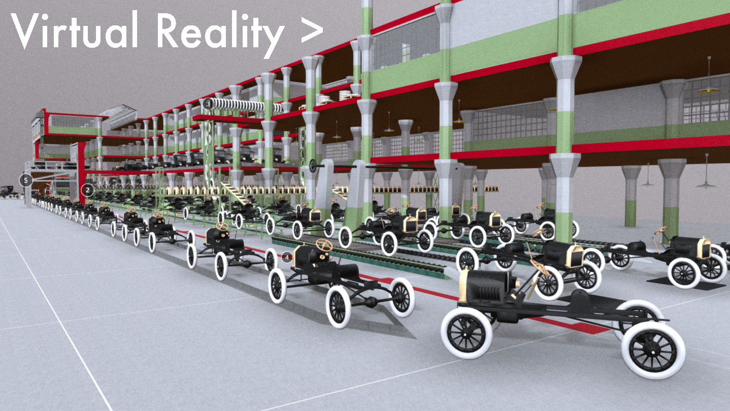
Historical Reconstruction of Ford Model T Assembly Line

As featured on Kottke.org
This digital model and film show, for the first time, the entire Model T being assembled from start to finish in a single time-lapse shot of the Ford factory in Highland Park, Michigan. Numerous photos were taken and some films were made in the 1910s and 1920s, but no film from the time tracks the entire car’s assembly from start to finish. There were many types of Model Ts produced, but the specific car shown here is the 1915 Model T Runabout. Watch the film and see as the various car components are hoisted over and bolted into place. Or walk across the factory floor in the virtual reality computer model.

.

The film’s audio replicates the sound of Model T production. The accompanying music at start and end is from the 1936 film Modern Times, where comedian Charlie Chaplin parodies Ford’s assembly line production methods.

.

Explore Model T assembly in virtual reality.
Give thirty seconds for browser to load. Link opens in new window.

.

Henry Ford did not invent the car, nor he did invent the assembly line to produce the car. For years before Ford, cars were being built in small numbers at local workshops. For centuries before Ford, assembly line production was being used to make all manner of goods like pins, fabrics, and steel. At the same time as Ford, others were making cars and building assembly lines.
Ford was not the first, but his car and moving assembly line were certainly the most successful and memorable. After creating his version of the automobile in 1896, Ford moved workshops first to Mack Avenue and later to Piquette Avenue in Detroit. These first two factories were small-scale structures for limited car production. Only in 1913 at Ford’s third factory at Highland Park did mass-production begin on a truly large scale. As shown in this film, here Ford applied assembly line methods throughout the factory to all aspects of car production.

.
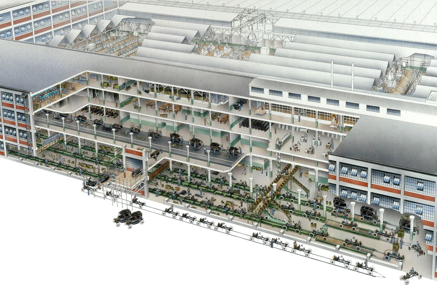
Final Stage of Model T Assembly in Highland Park c.1915, David Kimble’s illustration for National Geographic

.

Between when the first Model T rolled off the assembly line in 1913 and when the fifteen millionth rolled off in 1927, the car’s appearance did not change significantly. The car chassis, motor, and color-scheme in 1927 were almost identical to 1913. Despite variations in the number of seats and exterior of car, the motor and chassis beneath were consistent and unchanging over time. Henry Ford liked it that way to bring down costs and to produce the greatest variety of car types with as few variations as possible to the car’s internal structure.
However, although Ford resisted changes to his car design, he was always redesigning the factory floor and assembly line to produce the greatest number of cars with the least amount of human labor. In this same period from 1913 to 1927, the Highland Park factory was constantly redesigned and expanded. Few records survive of all changes to the factory. However, the 1915 book Ford Methods and the Ford Shops includes detailed plans and photos of the factory at one point in time. Ford was still tinkering with the assembly line, as Model T production had begun just over a year before this book was printed. Within a few months of these photos, assembly line methods had improved once again as Ford redesigned the factory floor shown in this film. Rather than documenting Ford production for all time, this film captures Ford production the way it looked in the months it started.

.
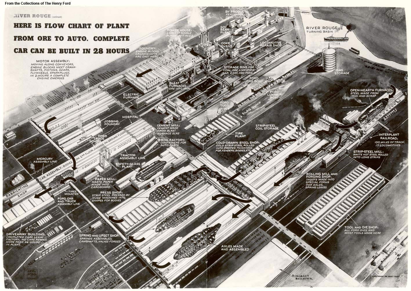
Assembly line flowchart of River Rouge c.1941, showing Ford’s production methods applied to the design of an entire complex. The ideas in embryo at Highland Park become fully visible at River Rouge.

.

After Ford stopped producing Model Ts in 1927, newer models started production at the new and larger factory at River Rouge, where Ford makes cars to this day. The Highland Park factory switched to producing other goods like tractors and later tanks for WWII. Within a few years, production methods had so quickly improved under Ford that Highland Park became too small and obsolete. The factory was largely demolished, and with its demolition the initial appearance of Ford’s first and greatest invention was lost for all time: the moving assembly line.
Some of the factory buildings still stand, and the specific part of the factory shown in this film still exists. But the buildings were all cleared of their original machinery, and the most impressive part of Ford’s invention was not the factory itself but instead the equipment and processes within that factory that are no longer visible. The buildings themselves were simply functional warehouses designed with large open spaces to allow the easy movement of machinery.
The entire complex covered many acres, and the other factories that supplied the Highland Park factory with materials and components created a web of trade that spanned the globe. Instead of filming the entire process, this film focuses on the final and most important stage of production where finished parts from all over the world and factory complex came together for final testing and assembly.

.

Sources

Main reference text: Fay Leone Faurote and Horace Lucian Arnold. Ford Methods and the Ford Shops. New York, Engineering Magazine Company: 1915. See esp. Chapter V on “Chassis-Assembling Lines” that includes factory floor plan and photos from pages 131-57. Also see pages 142-150 that describe the 45 steps required for chassis assembly. Link.
Main reference photo: David Kimble. “Exploring the Model T Factory.” Motor1.com. September 1, 2017. Link. Kimble’s image originally published in June 1987 National Geographic centerfold.
Animation opening image: Postcard of Highland Park in 1917. Link.
Animation opening music: Factory Scene from Modern Times, directed by Charlie Chaplin in 1936. Link.
Model T shown in film can be downloaded as a computer model at this link.

The Detroit Evolution Animation

Created in gratitude to the University of Michigan’s PhD program in architecture
Related: The New York City Evolution Animation

.

Soundtrack: “Pruitt Igoe” from Koyaanisqatsi, directed by Godfrey Reggio and composed by Philip Glass.

.

This film traces Detroit’s evolution from its origins as a French trading post in the 1700s, to its explosion as a metropolis, followed by its precipitous decline as a symbol of America’s post-industrial urban landscape. The film weaves in details about the city’s politics, population, and technology – all of which influenced the city’s geography and built environment. At each phase in urban history, the built environment grew and was modified in direct response to political events like racial segregation, population changes like the Great Migration, technology developments like the mass-produced car, and government interventions like urban renewal.
The animation tells the story of Detroit specifically and the story of American cities more broadly. To varying degrees, the path of Detroit’s development mirrors hundreds of other smaller cities and towns scattered across the American Northeast and Midwest. No other American city witnessed as large a population loss, as dramatic 1960s racial unrest, or as radical a transformation from symbol of progress into symbol of decay. To a lesser degree, other places in America followed Detroit in lockstep. Urban renewal projects, highway construction, racial tensions, suburban growth, and infrastructure under-investment happened across America, and in parallel to Detroit.
However, the most dramatic transformation of Detroit is left unwritten in this film. Beneath the surface-level events of political conflict and urban change, the largest event in Detroit is not unique to Detroit. As filmmaker Godfrey Reggio describes, the most important theme in the history of civilization is “the transiting from all nature, or the natural environment as our hosts of life for human habitation, into a technological milieu into mass technology as the environment of life.” European cities developed slowly and gradually over centuries, in the process removing all memory of the natural landscape before civilization. American cities are unique in their youth and speed of growth. They are new enough that an active memory survives through place names and written records of the landscape and indigenous peoples who lived there before colonization. As the oldest colonial settlement west of the Appalachians, and as the city that perfected the mass-produced automobile, Detroit becomes the prime symbol of man’s transformation of his home from a natural world into a technological society removed from nature.

View map bibliography and project methodology

Includes links to download all source files on which the film is based

.

The accompanying music is by composer Philip Glass and was written for Godfrey Reggio’s 1982 experimental documentary Koyaanisqatsi. The shifting layers and repetitive phrases of Glass’ music accompany Reggio’s montages of natural landscapes, factory assembly lines, and chaotic city streets. Koyaanisqatsi means “life out of balance” in the language of an indigenous American tribe called the Hopi. In the original documentary, Glass’ music was paired with scenes of desolate streets in the South Bronx, the abandoned Pruitt-Igoe public housing in St. Louis, and ruined skyscrapers falling in slow motion. In my reinterpretation of Glass’ music, the imagery is now of Detroit in maps. The pace and events in the animation are tied to the structure of the music. As the volume and speed of the music increase and decrease, so too does the growth and decline of Detroit.

View music in original context

Pruit Igoe from Koyaanisqatsi; composed by Philip Glass with images by Godfrey Reggio

.

Population Changes to Detroit Over Time

Hover over infographic for details of each census year.

.

The influx of Black people during the Great Migration and the outflow of cars from Detroit’s factories reshaped the city’s built environment and the American public’s perception of Detroit. Detroit is now thought of as a majority-Black city surrounded by majority-White suburbs. Today, 83% of Detroit’s population is Black, and only 11% is White. But the graph above shows that Detroit was majority-White until the 1980 census. For most of its history, Detroit was 95 to 99% White. Today, the majority of the metro region’s population lives in the suburbs that surround Detroit. But until the 1960 census, the majority of the population lived within the city limits. Today, Detroit is so reliant on the car that it has no commuter rail network, no subways, and limited public transportation options. But until the 1950s demolition of Detroit’s light rail network, a majority of residents lived within walking distance of a light rail station for commuting. Detroit’s demographics, suburban sprawl, and transportation options have all flipped in the past century. From a high-density, transportation rich, and majority-White city in 1920, Detroit has become a low-density, transportation poor, and majority-Black city in 2020.
A lot of people say Detroit has terrible public transit design. But from the perspective of car companies, the real estate lobby, and fearful Whites, the system does exactly what it was intended to do: to segregate and divide our country by covert means long after Jim Crow officially “ended.” Failure by design. The failure of Detroit is, in large part, planned and a consequence of government policy decisions that: prioritize suburban growth over urban development; benefit suburban Whites over urban Blacks; and encourage private cars at the expense of public transit.
As the Detroit Evolution Animation plays, the map key on the lower right hand corner indicates Detroit’s demographics at each decade in history. Try to link changes to demographics with changes to the urban form. Ask yourself the questions: How were technology, transportation, and demographic changes imprinted on the built environment? How does the built environment, in turn, shape urban and suburban life?

.

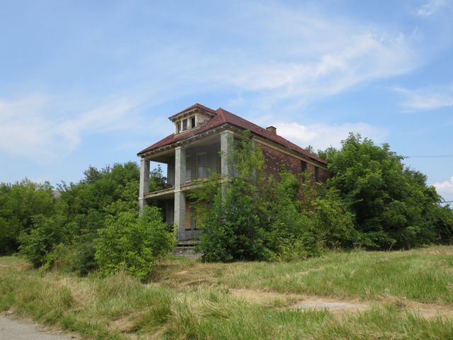
Decaying home near Detroit’s abandoned Packard Automotive Plant

A Drop of Water

Walking along Newark’s Pequannock Aqueduct from source, to tap, to sewer

.

The general public views rural, suburban, urban, and industrial areas as being separate with different land uses, populations, and landscapes. The rural reaches and forests of northwestern New Jersey exist outside the imagination of Newark residents, as if these green mountain lakes with WASPy names have nothing to do with their lived urban experiences in the concrete and asphalt jungle. For the suburban and rural residents of West Milford, Ringwood, Wanaque, Bloomingdale, Kinnelon, Rockaway, Jefferson, Hardyston, and Vernon where Newark’s water supply originates, the experiences and troubles of Newark seem similarly distant, as if the quality of their forest oasis has nothing to do with the health outcomes of Newark residents. However, Newark’s century-old system supplies a half million people with clean water and invisibly knits together the fates of diverse communities along its buried path.

.

Handmade drawing of Newark’s Pequannock water supply system, dated December 1892
The red line traces the path of the aqueduct from start at the Macopin Intake to end at South Orange Avenue. Green is the area of the watershed. The red graph beneath charts the relative height of the aqueduct above sea level at each point in the route. The aqueduct does not flow in a continuous downhill slope. Rather it hugs the ground just below the surface.

.

Map of Newark water supply system in 1946, showing the Pequannock system opened 1892 (lower left) and Wanaque system opened 1930 (upper left). View full size map from Newark Public Library website.

.

Over winter 2021, I documented the route of the Newark aqueduct from its origins in West Milford Township to its terminus in Newark Bay. I trace the path of Newark’s 26-mile-long aqueduct and 63-square-mile Pequannock Watershed and 94-square-mile Wanaque Watershed on the interactive map below.

.

Click on water features to display details of name, dimensions, or volume.

■   Watersheds
■   Reservoirs (7 total)
~~ Aqueducts (~55 miles total)

■   Towns supplied with Newark water (~10)
■   Towns relying on Newark sewers (48)
~~ Main sewer interceptor (~ 28 miles total)
      Along path of Passaic River from Paterson to New York Harbor via Newark

Read More

.

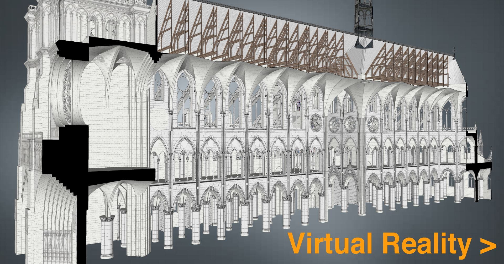
Notre-Dame of Paris Construction Sequence

Created with architectural historian Stephen Murray
As featured in:
1. Notre Dame’s official website
2. Open Culture, May 2021
2. Rebuilding a Legacy, hosted April 2021 by the French Embassy, view recording
3. Restoring a Gothic Masterpiece, hosted May 2021 by the Los Angeles World Affairs Council and Town Hall, view recording

.

1. Construction time-lapse

This construction time-lapse illustrates the history of Notre-Dame from c.1060 to the present day, following ten centuries of construction and reconstruction. Model is based on actual measurements of the cathedral and was peer reviewed for accuracy by scholars at Columbia University’s art history department and at the Friends of Notre-Dame of Paris.
The film was created in the computer modeling software SketchUp, based on hand-drawn image textures. The ink drawings of nineteenth-century architect Viollet-le-Duc were scanned and applied to the model surfaces, so as to transform the two-dimensional artwork into the three-dimensional digital. I believe computer models should preserve a certain handmade quality.

.

Music: Pérotin, Viderunt Omnes

View animation with music only.

Read text of Stephen Murray’s audio narration.

.

2. Virtual reality computer model

Explore the interior and exterior of Notre-Dame in virtual reality.
Give thirty seconds for browser to load. Link opens in new window.
Complete model of Notre-Dame inside and out. Download includes simulation of cathedral construction sequence.

.

.

Fire on 15 April 2019

.

3. Research method and work flow

Learn how this model was created – and how to create similar models of your own – with my series of online tutorials shared to this page.

.

4. Computer model and construction sequence sources

– Dany Sandron and Andrew Tallon. Notre-Dame Cathedral: nine centuries of history.
– Eugène Viollet-le-Duc. Drawings of Notre-Dame. From Wikimedia Commons.
J. Clemente. Spire of Notre-Dame. From SketchUp 3D Warehouse.
– Eugène Viollet-le-Duc and Ferdinand de Guilhermy. Notre-Dame de Paris. From BnF Gallica.
– Caroline Bruzelius. “The Construction of Notre-Dame in Paris” in The Art Bulletin. From JSTOR.
– Michael Davis. “Splendor and Peril: The Cathedral of Paris” in The Art Bulletin. From JSTOR.

.

5. Exterior still images from model

.

.

6. Interior still images

.

.

7. Dynamic angles

.

St. Paul’s Cathedral Dome: a synthesis of engineering and art

Developed with James Campbell, architectural historian at the University of Cambridge
Inspired by taking George Deodatis’ lectures on The Art of Structural Design
at Columbia University’s Department of Civil Engineering

.

In 1872, Eugène-Emmanuel Viollet-le-Duc, the French author and architect celebrated for restoring Notre-Dame of Paris, wrote in his Lectures on Architecture that the form of the Gothic cathedral was the synthesis of the early Christian basilica and the Romanesque three-aisled church. In this analysis, Viollet-le-Duc reasoned that a thesis (early Christian) plus an antithesis (Romanesque) produced the synthesis (Gothic).

.

Animation from Stephen Murray

Although the history and origins of Gothic are more complex than Viollet-le-Duc’s formula, this formula provides a method to dissect the Renaissance and Enlightenment counterpart to the medieval cathedral: the Greco-Roman basilica, as embodied by St. Paul’s Cathedral, constructed from 1675 to 1711 by Christopher Wren (1632-1723). St Paul’s is a symbol of Enlightenment-era London, built to rival its medieval counterpart of Westminster Abbey.
In this essay, and in my analysis of this neoclassical cathedral, I will parallel Viollet-le-Duc’s analysis of the medieval church. The thesis is that St. Paul’s is a work of techno-scientific engineering. The antithesis is that this building is a work of art that speaks to the larger cultural moment of Enlightenment London. The synthesis is the dome of St. Paul’s that merges these two forces of engineering and art into a unified and impressive creation.

.

Thesis: ENGINEERING
The engineering of this dome is more complex than meets the eye.

In this animated construction sequence, view how the dome was engineered.

.

Music from the organ (William Tell’s Overture) and bells of St Paul’s (recorded 2013)

.

St. Paul’s Cathedral features an innovative triple dome structure. On the circular drum, the inner dome rises and is visible from the cathedral interior. Above this inner dome, a brick cone rises to support the 850 ton lantern. This brick cone also supports the wood rafters and frame of the outer dome, which is covered in wood and lead. This three dome system allows the cathedral to support such a heavy lantern, all the while maintaining the great height needed to be a visible London landmark.
  • Inner dome – visible from inside and purely for show; height 225 ft (69m)
  • Middle brick cone – a brick cone that is invisible from below but supports the 850 ton lantern above; height 278 ft (85m)
  • Outer dome – a wood and lead-roofed structure visible from the cathedral exterior; height 278 ft (85m)
  • Lantern – an 850 ton stone lantern and cross, whose weight is carried to the ground via the middle brick cone 365ft (111m)
The inner and outer domes are decorative, while the brick cone is the true weight-bearing support. The model below is created from measured plans and is accurate to reality.

Read More

.

Virtual Reality Model
(click to play)

.

.

Architecture of Redemption?

Contradictions of Solitary Confinement
at Eastern State Penitentiary

Master’s thesis at the University of Cambridge: Department of Art History & Architecture
Developed with Max Sternberg, historian at Cambridge

.

.

The perfect disciplinary apparatus would make it possible for a single gaze to see everything constantly. A central point would be both the source of light illuminating everything, and a locus of convergence for everything that must be known: a perfect eye that nothing would escape and a centre towards which all gazes would be turned.
– Michel Foucault

.

Abstract

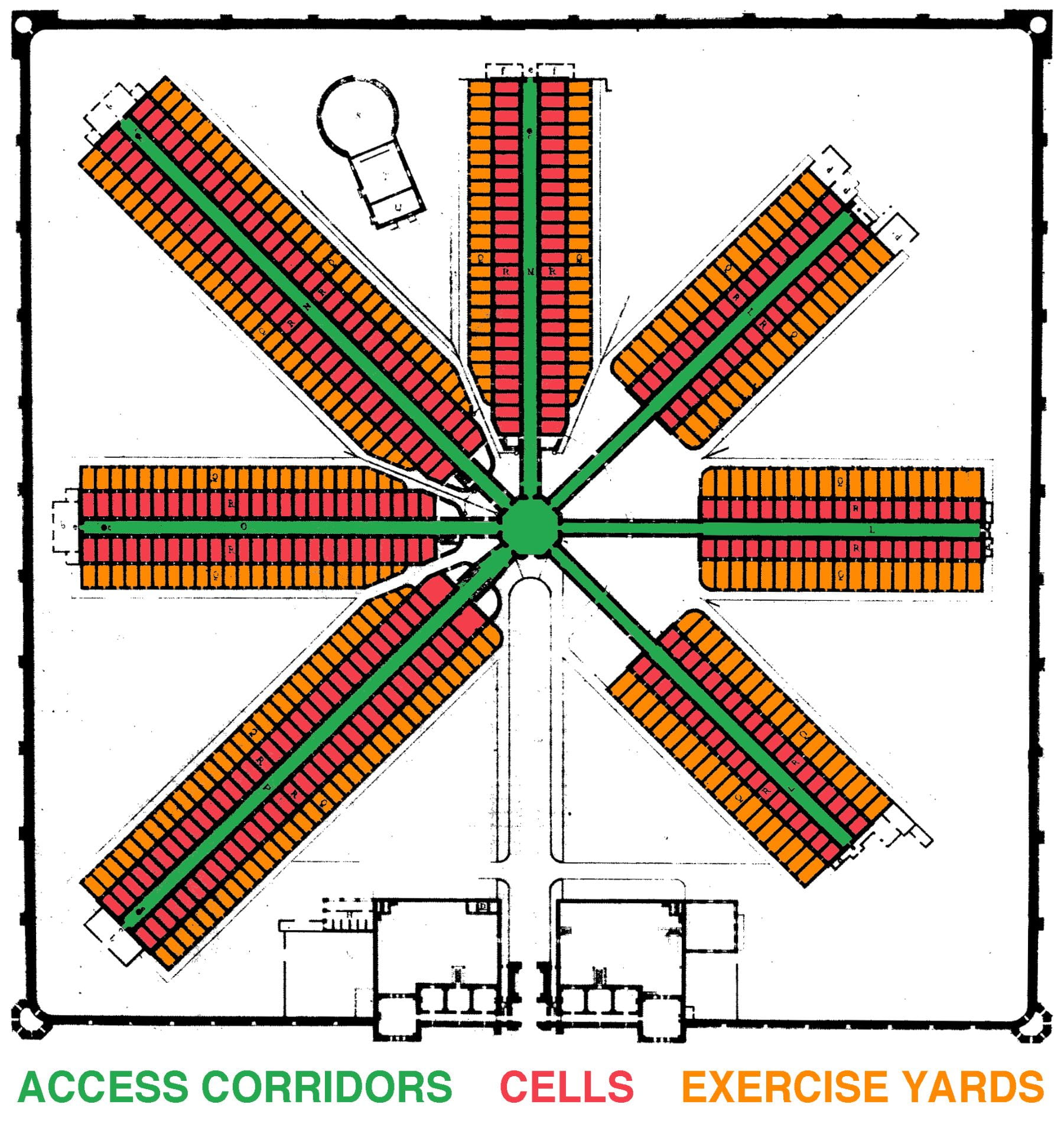
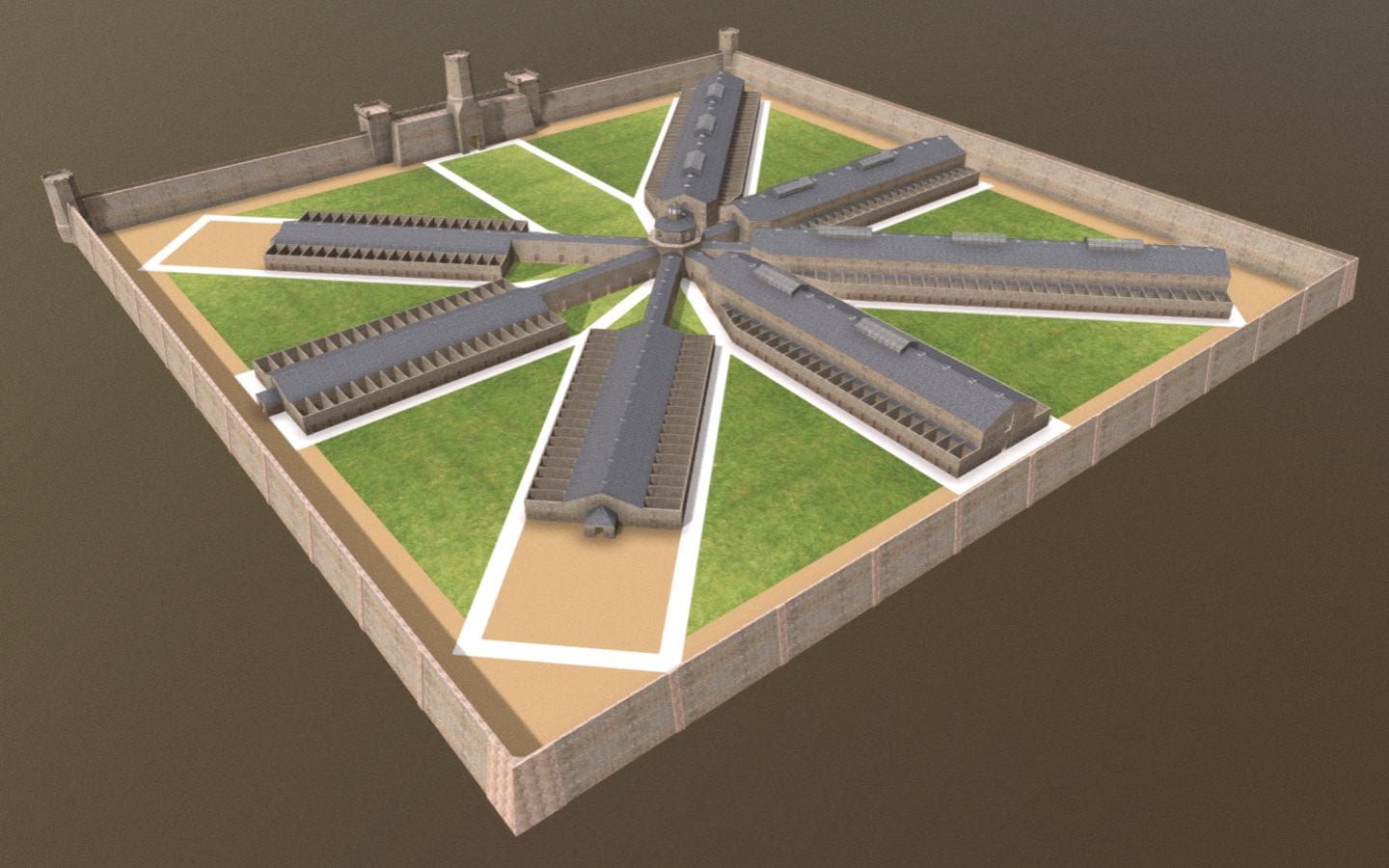
Prison floor plan in 1836

In the contemporary imagination of prison, solitary confinement evokes images of neglect, torture, and loneliness, likely to culminate in insanity. However, the practice originated in the late-eighteenth- and early-nineteenth-century as an enlightened approach and architectural mechanism for extracting feelings of redemption from convicts.
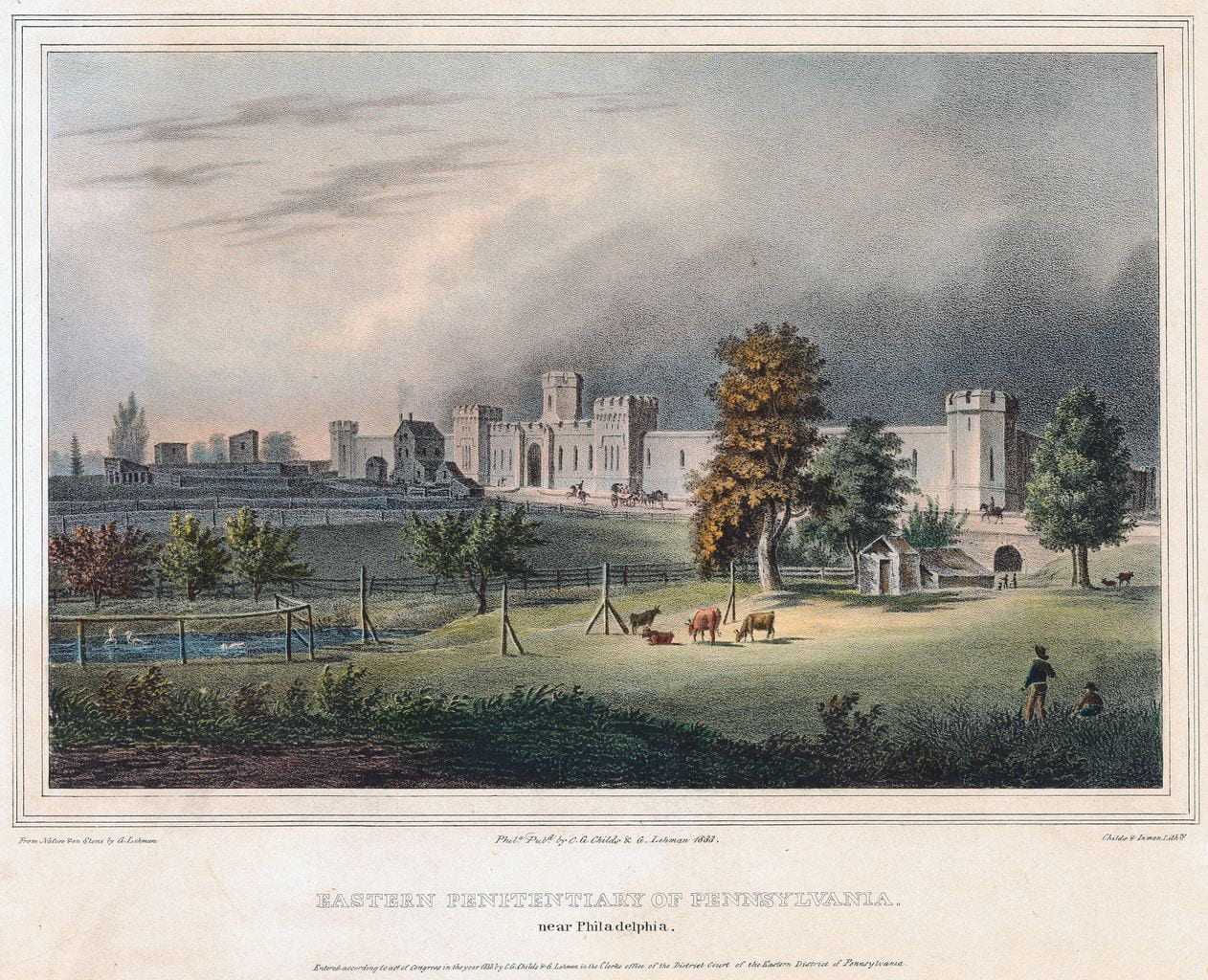
This research examines the design of Eastern State Penitentiary, built by English-born architect John Haviland from 1821 to 1829 in Philadelphia, Pennsylvania. This case study explores the builders’ challenge of finding an architectural form suitable to the operations and moral ambitions of solitary confinement. Inspired by Jeremy Bentham’s panopticon, Haviland’s design inspired the design of over 300 prisons worldwide. With reference to primary sources and to philosophers Jeremy Bentham and Michel Foucault, this research interrogates the problematic assumptions about architecture and human nature encoded in the form of solitary confinement practiced at Eastern State Penitentiary, which has wider implications for the study of surveillance architecture.

.

Click here to read

Opens in new window as PDF

.

Acknowledgments

I am indebted to Max Sternberg for his attentive guidance throughout this research, and his support of my experience in providing undergraduate supervisions at Cambridge. I am grateful to Nick Simcik Arese for encouraging me to examine architecture as the product of labor relations and relationships between form and function. I am inspired by Alan Short’s lectures on architecture that criticize the beliefs in health and miasma theory. My research also benefits from co-course director Ronita Bardhan. Finally, this research is only possible through the superb digitized sources created by the staff of Philadelphia’s various archives and libraries.
I am particularly indebted to the guidance and friendship of Andrew E. Clark throughout my life.
The COVID-19 pandemic put me in a “solitary confinement state-of-mind,” allowing me to research prison architecture from a comfortable confinement of my own.

.

Related Projects

.

Digital Reconstruction
of Eastern State: 1836-1877

Digital Reconstruction
of Jeremy Bentham’s Panopticon

Exhibit on Prison Design
Research begun before MPhil

.


New York City Water Supply: animated history

Developed with Gergely Baics, urban historian at Barnard College

.

New York City has some of the world’s cleanest drinking water. It is one of only a few American cities (and among those cities the largest) to supply unfiltered drinking water to nine million people. This system collects water from around 2,000 square miles of forest and farms in Upstate New York, transports this water in up to 125 miles of buried aqueducts, and delivers one billion gallons per day, enough to fill a cube ~300 feet to a side, or the volume of the Empire State Building. This is one of America’s largest and most ambitious infrastructure projects. It remains, however, invisible and taken for granted. When they drink a glass of water or wash their hands, few New Yorkers remind themselves of this marvel in civil engineering they benefit from.
This animated map illustrates the visual history of this important American infrastructure.

.

Sound of water and ambient music from Freesound

New York City is surrounded by saltwater and has few sources of natural freshwater. From the early days, settlers dug wells and used local streams. As the population grew, these sources became polluted. Water shortages allowed disease and fire to threaten the city’s future. In response, city leaders looked north, to the undeveloped forests and rivers of Upstate New York. This began the 200-year-long search for clean water for the growing city.

.

Credits

Gergely Baics – advice on GIS skills and animating water history
Kenneth T. Jackson – infrastructure history
Juan F. Martinez and Wright Kennedy – data

.

Interactive Map

I created this animation with information from New York City Open Data about the construction and location of water supply infrastructure. Aqueduct routes are traced from public satellite imagery and old maps in NYPL map archives. Thanks is also due to Juan F. Martinez, who created this visualization.
Explore water features in the interactive map below. Click color-coded features to reveal detail.

.

Watersheds   Subsurface Aqueducts   Surface Aqueducts   Water Distribution Tunnels   City Limits

.

▼ For map legend, press arrow key below.

.

Sources

.
For such an important and public infrastructure, the data about this water supply, aqueduct routes, and pumping stations is kept secret in a post 9/11 world. However, the data presented here is extracted from publicly-available sources online, and through analysis of visible infrastructure features on satellite imagery when actual vector file data or raster maps are unavailable from NYC government.
.
Contemporary Maps
NYC System and Shapefiles – Juan F. Martinez
Watershed Recreation Areas – NYC Department of Environment Protection (DEP)
General System Map – NY State Department of Environmental Conservation (DEC)
.
Historic Maps
.
Texts
Water Supply Fast Facts – NY State DEC
Encyclopedia of the City of New York – Kenneth T. Jackson
.
Animation music – Freesound
Audio narration – Myles Zhang

What’s wrong with Jeremy Bentham’s Panopticon?

Animation and research as featured by Open Culture

.

Postmodernist thinkers, like Michel Foucault, interpret Jeremy Bentham’s panopticon, invented c.1790, as a symbol for surveillance and the modern surveillance state.
This lecture is in two parts. I present a computer model of the panopticon, built according to Bentham’s instructions. I then identify design problems with the panopticon and with the symbolism people often give it.

.

Related Projects

– Computer animation of Jeremy Bentham’s panopticon
View the panopticon in virtual reality
Explore about Eastern State Penitentiary, a building inspired by Bentham

Computer Model of Jeremy Bentham’s Panopticon

Created at the University of Cambridge: Department of Architecture
As part of my Master’s thesis in Architecture and Urban Studies, as featured by:
– Special Collections department at University College London
– Open Culture
– Tomorrow City
– Aeon: a world of ideas
.
To say all in one word, it [the panopticon] will be found applicable, I think, without exception, to all establishments whatsoever, in which, within a space not too large to be covered or commanded by buildings, a number of persons are meant to be kept under inspection.
– Jeremy Bentham
.

.

Since the 1790s, Jeremy Bentham’s panopticon remains an influential building and representation of power relations. Yet no structure was ever built to the exact dimensions Bentham indicates in his panopticon letters. Seeking to translate Bentham into the digital age, I followed his directions and descriptions to construct an exact model in virtual reality. What would this building have looked like if it were built? Would it have been as all-seeing and all-powerful as Bentham claims?
Explore Bentham’s panopticon in the animation above or in virtual reality below
based on Bentham’s drawings at University College London:

.

.

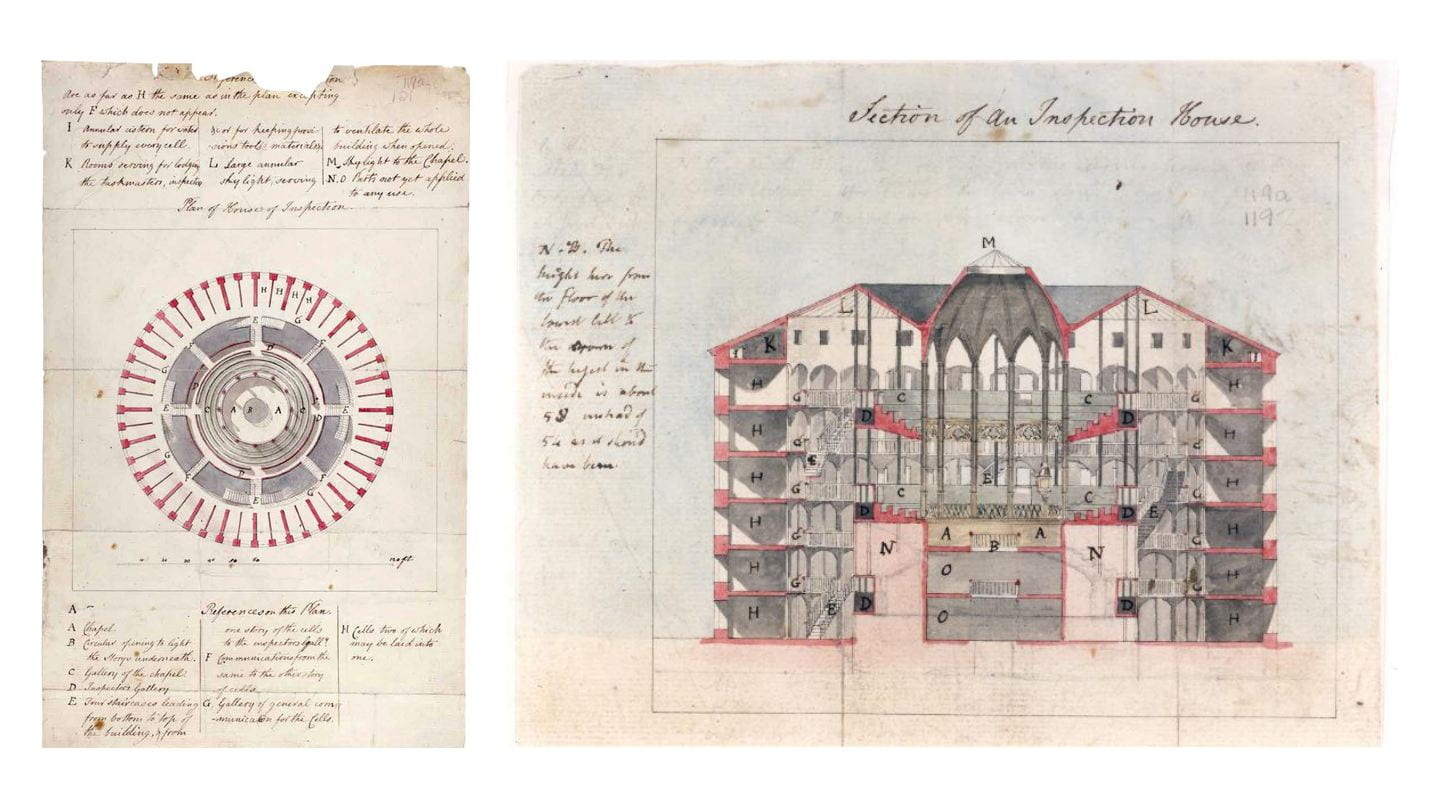
c.1791 plans of panopticon, drawn by architect Willey Reveley for Jeremy Bentham

Creative Commons image credit: Bentham MS Box 119a 121, UCL Special Collections

.

Panopticon: Theory vs. Reality

Central to Bentham’s proposed building was a hierarchy of: (1) the principal guard and his family; (2) the assisting superintendents; and (3) the hundreds of inmates. The hierarchy between them mapped onto the building’s design. The panopticon thus became a spatial and visual representation of the prison’s power relations. As architectural historian Robin Evans describes: “Thus a hierarchy of three stages was designed for, a secular simile of God, angels and man.”

.

Author’s images from computer model

.

To his credit, Bentham recognized that an inspector on the ground floor could not see all inmates on the upper floors. The angle of view was too steep and obstructed by stairs and walkways. To this end, Bentham proposed that a covered inspection gallery be erected between every two floors of cells.
By proposing these three inspection galleries, Bentham addressed the problem of inspecting all inmates. However, he created a new problem: From no central point was it now be possible to see all activity, as the floor plans below show. The panoramic view below shows the superintendent’s actual field of view, from which he could see into no more than four complete cells at a time. The view from the center was not, in fact, all-seeing. Guards would have to walk a continuous circuit round-and-round, as if on a treadmill. They, too, are prisoners to the architecture.

.

.

Author’s images from computer model

.

The intervening stairwells and inspection corridors between the perimeter cells and the central tower might have allowed inspectors to see into the cells. Yet these same architectural features would also have impeded the inmates’ view toward the central rotunda. Bentham claimed this rotunda could become a chapel, and that inmates could hear the sermon and view the religious ceremonies without ever needing to leave their cells. The blinds, normally closed, could be opened up for viewing the chapel.

.

.

Bentham’s suggestion was problematic. The two cross sections above show that, although some of the inmates could see the chapel from their cells, most would be unable to do so.
In spite of all these obvious faults in panopticon design, Bentham still claimed that all inmates and activities were visible and controlled from a single central point. When the superintendent or visitor arrives, no sooner is he announced that “the whole scene opens instantaneously to his view,” Bentham wrote.

.

.

Despite Bentham’s claims to have invented a perfect and all-powerful building, the real panopticon would have been flawed were it built as this data visualization helps illustrate. Although the circular form with central tower was chosen to facilitate easier surveillance, the realities and details of this design illustrate that constant surveillance was not possible. That the British public and Parliament rejected Bentham’s twenty year effort to build a real panopticon should be no surprise.
However flawed the architecture, Bentham remained ahead of his time. He envisioned an idealistic and rational, even utopian, surveillance society. Without the necessary (digital) technology to create this society, Bentham fell back on architecture to make this society possible. The failure of this architecture and its obvious shortcomings do not invalidate Bentham’s project. Instead, these flaws with architecture indicate that Bentham envisioned an institution and society that would only become possible through new technologies invented hundreds of years later.

.

Related Projects

My computer model is available here in virtual reality.
Read my research on Eastern State Penitentiary, a radial prison descended from Bentham’s panopticon

.

Credits

Supervised by Max Sternberg at Cambridge, advised by Philip Schofield at UCL
The archives and publications of UCL special collections, Bentham MS Box 119a 121

Audio narration by Tamsin Morton
Audio credits from Freesound
panopticon interior ambiance
panopticon exterior ambiance
prison door closing
low-pitched bell sound
high-pitched bell sound

You may reuse content and images from this article, according to the Creative Commons license.

California Waterscape: time-lapse history of water supply

California Waterscape animates the development of this state’s water delivery infrastructure from 1913 to 2019, using geo-referenced aqueduct route data, land use maps, and statistics on reservoir capacity. The resulting film presents a series of “cartographic snapshots” of every year since the opening of the Los Angeles Aqueduct in 1913. This process visualizes the rapid growth of this state’s population, cities, agriculture, and water needs.

.

Music: Panning the Sands by Patrick O’Hearn

.

Dams and Reservoirs

^ Created with open data from the US Bureau of Transportation Statistics and visualized in Tableau Public. This map includes all dams in California that are “50 feet or more in height, or with a normal storage capacity of 5,000 acre-feet or more, or with a maximum storage capacity of 25,000 acre-feet or more.” Dams are georeferenced and sized according to their storage capacity in acre-feet. One acre-foot is the amount required to cover one acre of land to a depth of one foot (equal to 325,851 gallons or 1.233 ● 10liters). This is the unit of measurement California uses to estimate water availability and use.

.

.

Aqueducts and Canals

^ Created with open data from the California Department of Water Resources, with additional water features manually added in QGIS and visualized in Tableau Public. All data on routes, lengths, and years completed is an estimate. This map includes all the major water infrastructure features; it is not comprehensive of all features.


Method and Sources

The most important data sources consulted are listed below:

This map excludes the following categories of aqueducts and canals:

  • Features built and managed by individual farmers and which extend for a length of only a few hundred feet. These features are too small and numerous to map for the entire state and to animate by their date completed. This level of information does not exist or is too difficult to locate.
  • Features built but later abandoned or demolished. This includes no longer extant aqueducts built by Spanish colonists, early American settlers, etc.
  • Features created by deepening, widening, or otherwise expanding the path of an existing and naturally flowing waterway. Many California rivers and streams were dredged and widened to become canals, and many more rivers turned into “canals” remain unlined along their path. Determining the construction date for these semi-natural features is therefore difficult. So, for the purposes of simplicity and to aid viewers in seeing only manmade water features, these water features are excluded.
Download and edit the open source QGIS dataset behind this animation.