• This website includes dozens of videos, hundreds of essays, and thousands of drawings created over the past twenty years. Search to learn more about the history of buildings, places, prisons, Newark, New York City, and my PhD research on spatial inequality.

  • Or scroll down for the latest publications.

The time-lapse history of Manhattan in two minutes

.

This two minute time-lapse reconstructs the 400 year evolution of Lower Manhattan’s skyline. Watch as the city evolves from a small village into a glistening metropolis.
This is also a film about the history of technology. Changing methods of representing urban space influence our perception of time and the city. When New York City was founded, Dutch settlers captured their town’s appearance through seventeenth-century drawings and paintings. As the city grew, people started using printing presses to reproduce images of the city in the eighteenth and nineteenth centuries. In the twentieth century, photographers started capturing their city from above through aerial photos. For the first time, New Yorkers could view the entire city in a single panoramic photo.
In tribute to this long artistic tradition, this film constructs the city as each generation of New Yorkers would have represented it: through the subsequent technologies of drawing, printing, photography, and film.
.
New York City: Past and Present, 1870 and 2017

.

Sound effects from Freesound
Water and cloud effects from YouTube

Excavating Old New York Penn Station

Also published by Viewing NYC in May 2019

.

“Through Penn Station one entered the city like a god. Perhaps it was really too much. One scuttles in now like a rat.”
– Vincent Scully

.
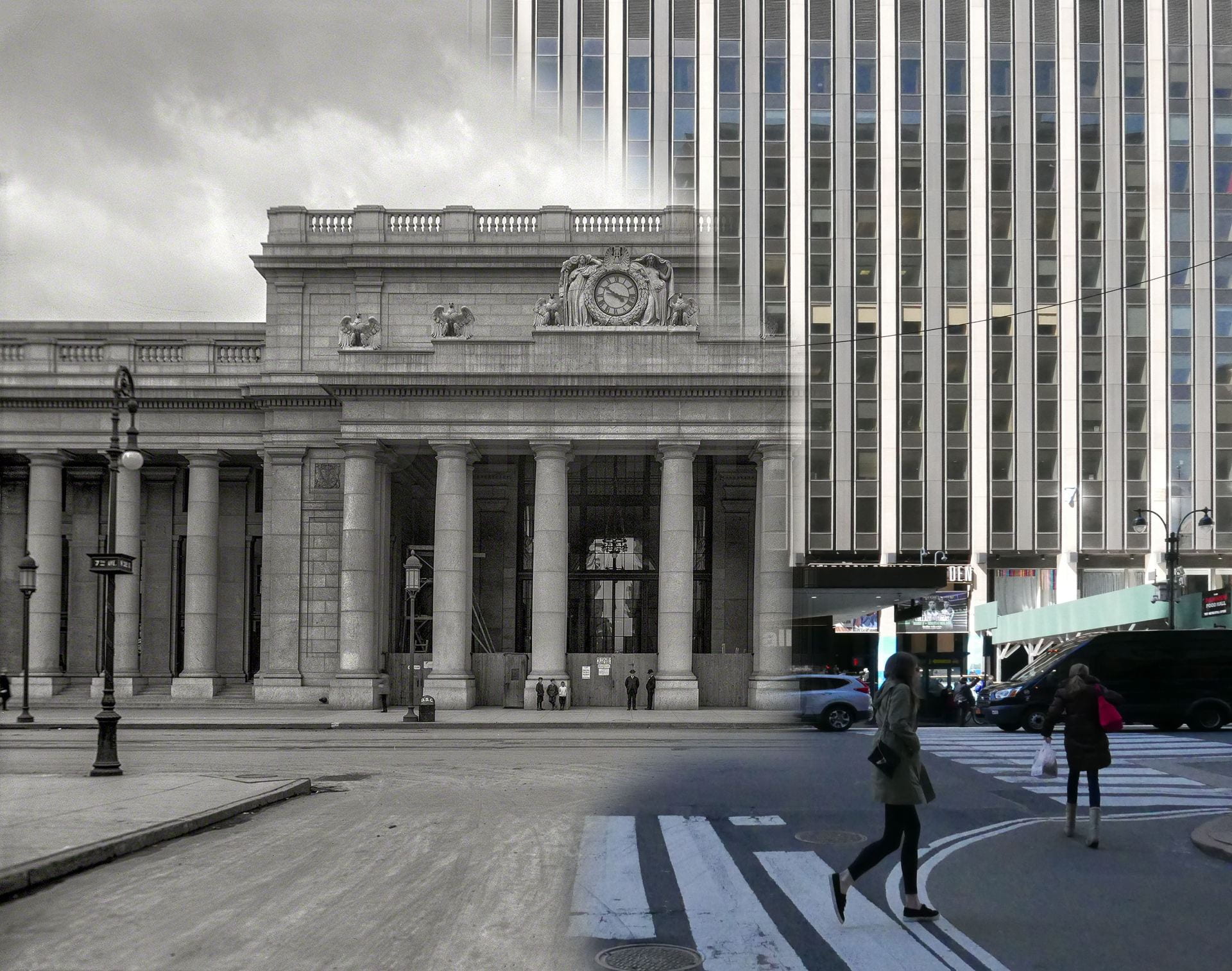
.
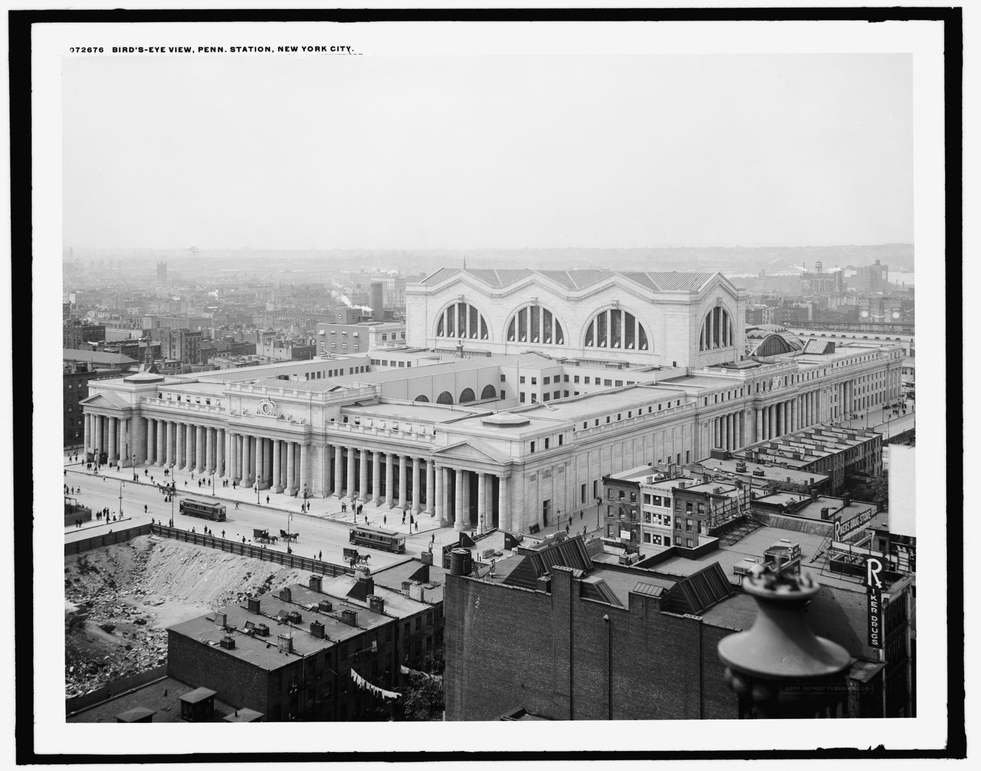
View of Penn Station from roof of Macy’s department store c.1910

.

“Human beings, myself included, have an unfortunate tendency to appreciate people and things only after they are gone. Pennsylvania Station is the catalyst for the historic preservation movement.”
– Kenneth Jackson

.

.

The accompanying audio is accurate to what the place sounds like from the locations shown. The audio for old Penn Station is my imaginative reconstruction of how the original station might have sounded like, based on recordings from MoMA. My project was also inspired by this 2015 New York Times article about the subtle influence of sound on how we experience urban space: “Penn Station’s low ceilings suppress sound, which becomes hard to make out, an audible metaphor for its rat’s maze of architecture.”


“You feel that your life is being lost in a room where sound dies. We need reverberation.”
– architect Renzo Piano on the design of the current Penn Station

.

.

.

When New York Penn Station opened in 1910, the Pennsylvania Railroad boasted in advertisements that their vast new station was built of travertine marble from the same ancient Italian quarries as the Coliseum and Pantheon. Old Penn Station was rich in the architectural language of Greece and Rome. The façade comprised a colonnade of massive, Doric columns that stretched almost 450-feet end-to-end; it was inspired from temples on the Greek Acropolis. The main waiting room, at 314-feet-long, 109-feet-wide, and 150-feet-high, was modeled on Rome’s Baths of Diocletian. The project was as much an aesthetic gesture to the emerging City Beautiful Movement as it was a political statement: The Pennsylvania Railroad was here to stay, as permanent as the Penn Station it built.
The finished station, however, was an architectural contradiction. The Neoclassical exterior concealed what was, belowground, an extensive and, at-the-time, hyper-modern system of tunnels, electric trains, and communication systems that conveyed millions of people, baggage, and mail from street-level to each of 21 platforms. Aside from the solid stone columns of the main façade, most of the interior was of thin limestone, marble, and plaster sheets mounted on a metal structural frame. The seeming permanence of the stone walls was a cover for the steel frame and modern technology within on which this Neoclassical stage-set rested.

.

.

Just over fifty years later, on October 28, 1963, demolition began. The Pennsylvania Railroad, burdened with debt and aging infrastructure, was selling off its most profitable real estate assets – its land, buildings, and equipment – to stay afloat until it declared bankruptcy by 1970. Through the same two Hudson River tunnels that building materials for the original Penn Station were delivered, some of the same rubble now passed. Much of this rubble was carted off and dumped in the New Jersey Meadowlands adjacent the tracks where commuter trains still pass. The Pennsylvania Railroad used, quite literally, the station’s technology to cannibalize itself, and as the foundations for the new, and current, Penn Station.
Searching for remnants of old Penn Station, I found historic photos from the New York Public Library, Historic American Buildings Survey, and Library of Congress. I returned to the same locations in fall 2019 to re-photograph these images from the identical camera angles. The resulting and visible ghost of the lost Penn Station presents a strong-clear vision of what Penn Station used to be, and by extension, what it could return to, given financial commitment and political will.

.

Train concourse: past and present from the same location

.

The current subterranean warrens represent a clean break from what was here before. As long as Madison Square Garden chokes Penn Station for air and light from above, the current lightless and oppressive Penn Station is here to stay. The current station’s cheap ceilings of corrugated metal, garish electric signage, and exposed concrete floors ironically proved more durable than the Roman marble and limestone of old. The current station is not so fleeting and has, in fact, existed longer on this site than the station before it.
Surprising still is how, for many New Yorkers, it seems inconceivable that the permanent and imposing appearance of the original station could, one day, vanish without a trace. This old station is more dream than reality, and it seems almost impossible to imagine the current arrangement as having anything to do with what came before. So little of the original station – and the pride in civic life and New York City this station stood for – remains visible. Interestingly, more of the original architectural fabric survives belowground than meets the eye aboveground.

.

View from corner of 31st Street and 7th Avenue in 1962 and 2019. The structure is unrecognizable aboveground.

.

.

.

.

32nd Street entrance to waiting room in 1962 and 2019
The southeast corner of the still-standing General Post Office is in both frames, in the far left hand distance.

.

.

.

In the five years that demolition and rebuilding lasted (from 1963 to 1968), Penn Station remained in active service. While builders demolished the old station above, commuters continued to pass by on the platforms and corridors below. For this brief moment, the two buildings lived side-by-side, until the present building swallowed almost all visible traces of the past. In spite of this loss, the confusing floor plan of the current Penn Station has much to do with remaining traces of the original. Column for column and void for void, the current Penn Station is built within the fabric of the original. The old Penn Station, completed 1910, had 21 tracks on 11 platforms. The new Penn Station has 21 tracks on 11 platforms. In the demolition process, not one track or platform moved. In the five-year re-construction process, none of the tracks and platforms were moved, and most of the stairs between concourse and track-level survived. This similarity enables us to situate parts of the old structure in relation to the new.

.

Frame of new Penn Station rises simultaneous to the demolition of the old c.1963-68
Passengers in train concourse as new structural frame divides them from the soon-to-be-demolished glass canopy of the old station.

.

Train concourse before and after insertion of the new structural frame, from the same camera angle

.

.
.

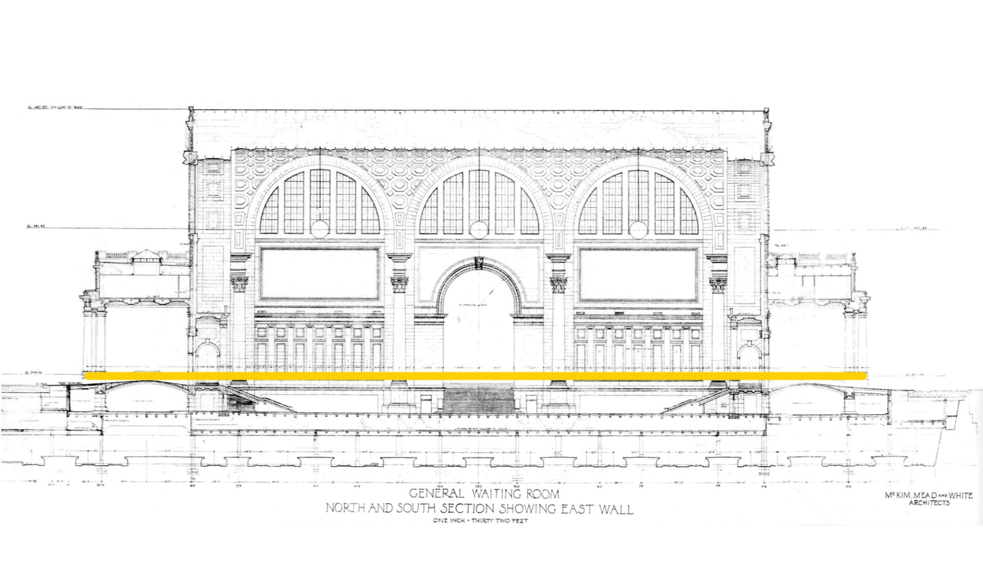
The above cross-section of old Penn Station’s waiting room shows the extent of change. The orange line indicates the elevation at ground-level to which the architectural fabric of the old building was demolished. Above this line, nothing of Penn Station survives. Below this line, most of the original structure, tracks, infrastructure, stairwells, and the general contours of the original rooms survive, except now hidden.
After the Roman Empire collapsed, its architectural monuments to empire and power fell into disuse; many were repurposed for more humble and practical purposes. The Coliseum became a stone quarry, the Roman Senate House a humble church, and the Theatre of Marcellus a medieval fortress. New purposes were developed in the shells of old monuments. When a building is reused and altered but still bears visible traces of its earlier form, architectural historians call this creation a palimpsest. A palimpsest is neither of the present nor of the past; it is a mixture of both. For instance, the two square fountains of the 9/11 Memorial in Lower Manhattan mirror the locations of the now-vanished Twin Towers. For a modern and young city in world terms, Penn Station is New York City’s largest palimpsest.

.

Shopping arcade in 1911 and 2019

.

.

View from 7th Avenue shopping arcade into the waiting room in 1911 and 2019

.
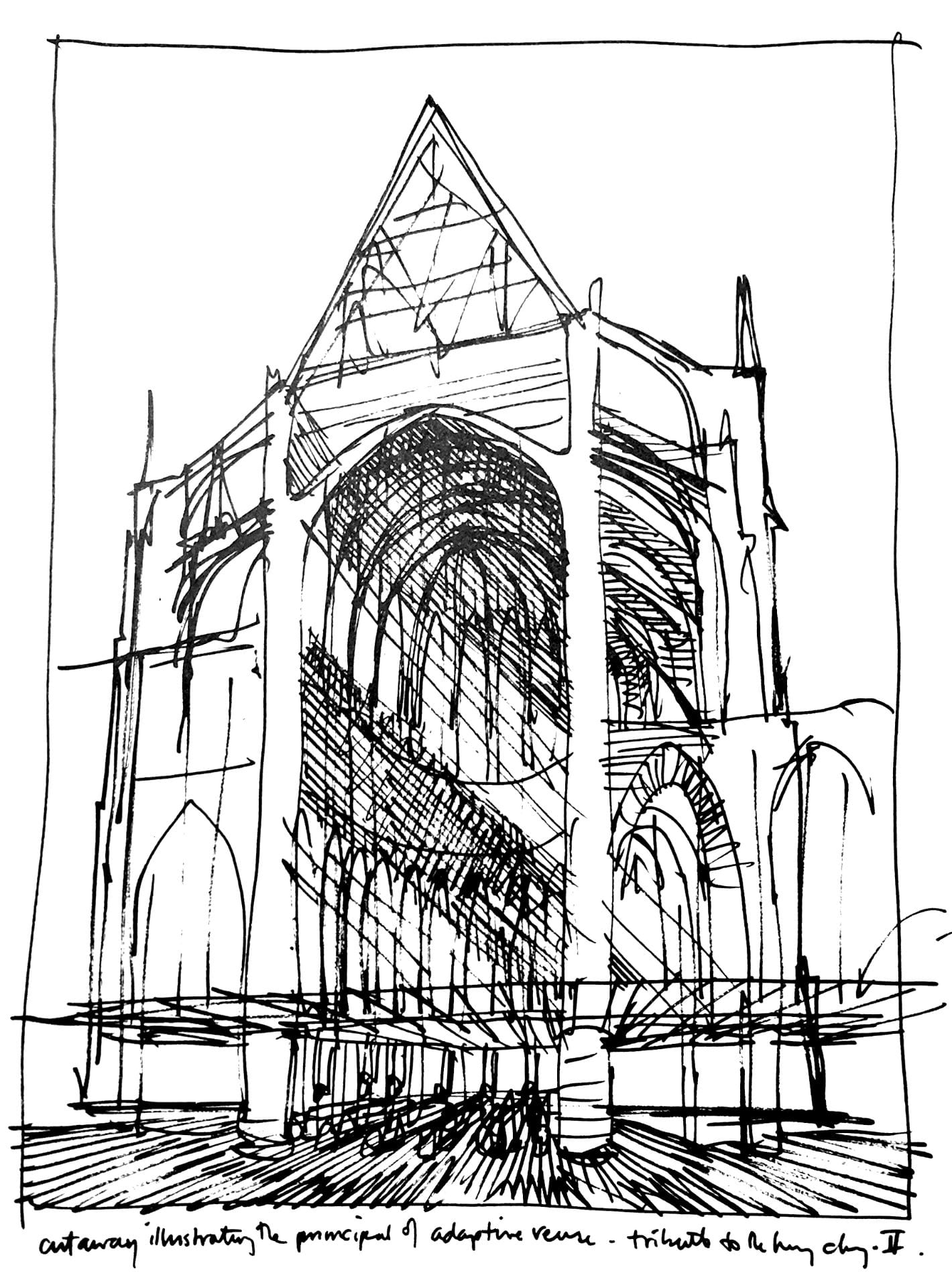
“Cutaway illustrating the principle of adaptive reuse.” Drawing by architectural children’s book illustrator, David Macaulay, proposes to discard the “non- functional” spaces of the medieval cathedral by erecting a Styrofoam drop ceiling just above the floor. Everything above – light, soundscape, and ornament is “superfluous” to the cathedral’s function.

The oppressively low ceilings of the current station are the structural division between the public areas belowground and the now private (formerly public) areas aboveground. These ceilings also align to the border between the infrastructure of the original station that survives and the architectural fabric that was lost.
The Pennsylvania Railroad made the decision that made the most economic sense: to keep the infrastructure beneath and decapitate the “non-functional” aesthetics of the soaring ceilings and open spaces aboveground. This was valuable land that could be put to more profitable use. Into these empty “air rights,” the corporation could insert Penn Station’s new functions of Madison Square Garden and office towers that would, at last, generate additional income. While exploring the station, I discovered this palimpsest valued the practical and made absolute economic sense: Who needs to enter the city on the scale of a titanic-sized god when humans require spaces no higher than 8-feet-high to pass through?

.

A cathedral with a drop ceiling

.

.

The shopping arcade in 1911 and 2019
Statue of Samuel Rea is in the shadows.

.
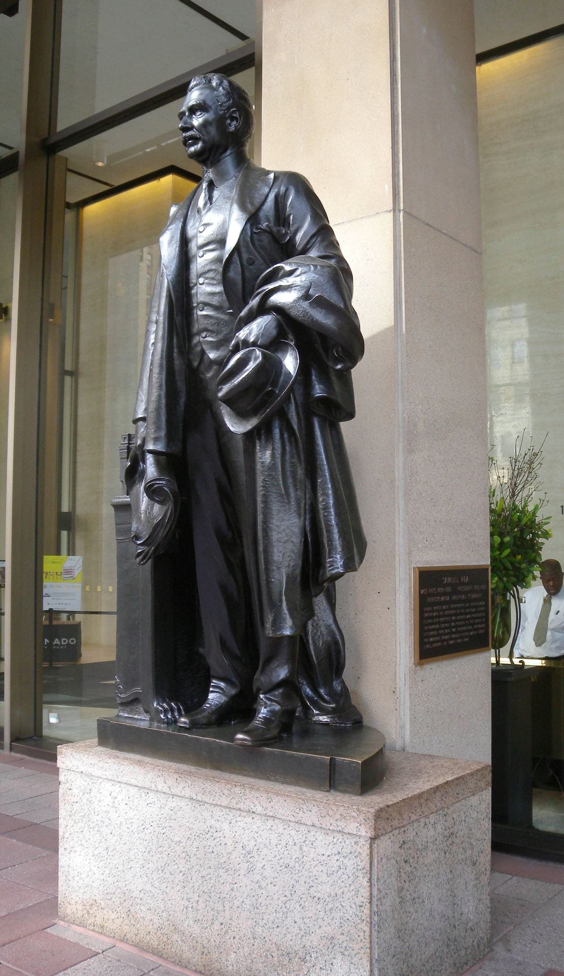
President Samuel Rea

The nuances of this palimpsest become clearer from inside the building. Passengers entering the old station proceeded down a long shopping arcade to the waiting room and platforms. What was once public space is now the private lobby of the commercial offices aboveground. On the right hand side, in the shadows of the private lobby, stands a statue of Samuel Rea, president of the Pennsylvania Railroad. A century ago, Rea stood at the entrance and welcomed passengers and the public; he now stands and watches the corporate clients and office workers. In old Penn Station, an inscription beneath announced his name and title. In the current location, Rea is out of place and has no relationship with his surroundings; the once prominent inscription is almost invisible on the new tablet behind him.

.

Statue of Samuel Rea is in the left hand niche.
Almost stone for stone, the location of the current waiting room escalator mirrors the location of the original.

.

.

Main entrance to waiting room: The left hand niche contains the statue of Alexander Cassatt, Pennsylvania Railroad president during construction.

.

.

The waiting room, once the largest indoor public space in New York City, is now a parking lot.

.

From the street-level arcade, passengers descended into the cavernous waiting room, sunken a few feet belowground. While the room itself is gone, the contours of this room survive in the general footprint of the sunken parking lot that now occupies the site. What was once public space is now private and patrolled by Madison Square Garden security guards who forbade me from standing at this location with my camera.

.

Perhaps, beneath this asphalt parking lot, fragments of the original waiting room floor remain.

.

.

Train Concourse

.

.

Train concourse, past and present.
White cutouts on the drop ceiling mirror the former locations of the demolished skylights.

.

.

.

.

.

.

This part of the train concourse is now the VIP entrance for spectators at Madison Square Garden.

.

The design problems with the current Penn Station are similar to those of old Penn Station: too few tracks, too many passengers, confusing circulation, and outdated infrastructure. After all, it is not the engineering and infrastructure that set these two buildings apart, as brick-for-brick and beam-for-beam, the 1960s rebuilding did not generally alter the areas belowground. This early-twentieth-century infrastructure was, after all, designed to handle no more than 200,000 passengers-per-day, and yet now struggles under the burden of 650,000-per-day. Instead, it is the envelope around this infrastructure that was rebuilt in the 1960s, and whose loss the public and historians now mourn.

.

.

At track-level, the railroad ties, location of the third rail, and support columns are original to 1910. The columns in the foreground were added in the 1960s to support the weight of Madison Square Garden. The columns in the distance are original to 1910. The 1960s modernist buildings above conceal below what is, in essence, early-twentieth-century infrastructure.

.

View from Track Six

.

Generations of New Yorkers hoped Penn Station would one day be restored with an architectural monument befitting New York City and the Western hemisphere’s busiest train station. In addition to rebuilding the General Post Office next door, other proposals over the years have called for rebuilding Penn Station exactly as it appeared before, or imagining a futuristic Penn Station emerging from the structural shell of the current Madison Square Garden, entitled “Penn Station Palimpsest.” Precedent exists for both proposals. Some post World War II cities rebuilt their monuments and bombed out city centers as they appeared before (such as Dresden and Warsaw), while others incorporated the rubble of the lost buildings into a modern building (such as Coventry Cathedral in England and Kaiser Wilhelm Memorial Church in Berlin). What we miss about old Penn Station was not the infrastructure, operations, or even the building itself, but rather the way this architecture made us feel dignified, and which we feel no longer.

St. Paul’s Cathedral Dome: a synthesis of engineering and art

Developed with James Campbell, architectural historian at the University of Cambridge
Inspired by taking George Deodatis’ lectures on The Art of Structural Design
at Columbia University’s Department of Civil Engineering

.

In 1872, Eugène-Emmanuel Viollet-le-Duc, the French author and architect celebrated for restoring Notre-Dame of Paris, wrote in his Lectures on Architecture that the form of the Gothic cathedral was the synthesis of the early Christian basilica and the Romanesque three-aisled church. In this analysis, Viollet-le-Duc reasoned that a thesis (early Christian) plus an antithesis (Romanesque) produced the synthesis (Gothic).

.

Animation from Stephen Murray

Although the history and origins of Gothic are more complex than Viollet-le-Duc’s formula, this formula provides a method to dissect the Renaissance and Enlightenment counterpart to the medieval cathedral: the Greco-Roman basilica, as embodied by St. Paul’s Cathedral, constructed from 1675 to 1711 by Christopher Wren (1632-1723). St Paul’s is a symbol of Enlightenment-era London, built to rival its medieval counterpart of Westminster Abbey.
In this essay, and in my analysis of this neoclassical cathedral, I will parallel Viollet-le-Duc’s analysis of the medieval church. The thesis is that St. Paul’s is a work of techno-scientific engineering. The antithesis is that this building is a work of art that speaks to the larger cultural moment of Enlightenment London. The synthesis is the dome of St. Paul’s that merges these two forces of engineering and art into a unified and impressive creation.

.

Thesis: ENGINEERING
The engineering of this dome is more complex than meets the eye.

In this animated construction sequence, view how the dome was engineered.

.

Music from the organ (William Tell’s Overture) and bells of St Paul’s (recorded 2013)

.

St. Paul’s Cathedral features an innovative triple dome structure. On the circular drum, the inner dome rises and is visible from the cathedral interior. Above this inner dome, a brick cone rises to support the 850 ton lantern. This brick cone also supports the wood rafters and frame of the outer dome, which is covered in wood and lead. This three dome system allows the cathedral to support such a heavy lantern, all the while maintaining the great height needed to be a visible London landmark.
  • Inner dome – visible from inside and purely for show; height 225 ft (69m)
  • Middle brick cone – a brick cone that is invisible from below but supports the 850 ton lantern above; height 278 ft (85m)
  • Outer dome – a wood and lead-roofed structure visible from the cathedral exterior; height 278 ft (85m)
  • Lantern – an 850 ton stone lantern and cross, whose weight is carried to the ground via the middle brick cone 365ft (111m)
The inner and outer domes are decorative, while the brick cone is the true weight-bearing support. The model below is created from measured plans and is accurate to reality.

Read More

.

Virtual Reality Model
(click to play)

.

.

Eastern State Penitentiary: Decorative Fortress

Developed with Max Sternberg, historian at the University of Cambridge

.

Presentation

Paper delivered 6 March 2020 at the University of Cambridge: Department of Architecture
As part of my Master’s thesis in Architecture and Urban Studies


.

.


Digital Reconstruction

Created in SketchUp. Based on original drawings and plans of the prison.
All measurements are accurate to reality.

.

With ambient music from Freesound

.

Eastern State Penitentiary was completed in 1829 in northwest Philadelphia, Pennsylvania by architect John Haviland. It was reported as the most expensive and largest structure yet built in America.
The design featured a central guard tower from which seven cell blocks radiated like a star. This system allowed a single guard to survey all prisoners in one sweep of the eye. A square perimeter wall surrounded the entire complex – thirty feet high and twelve feet thick. The decorative entrance resembled a medieval castle, to strike fear of prison into those passing. This castle contained the prison administration, hospital, and warden’s apartment.
As we approach the central tower, we see two kinds of cells. The first three cell blocks were one story. The last four cell blocks were two stories. Here we see the view from the guard tower, over the cell block roofs and over the exercise yards between cell blocks. Each cell had running water, heating, and space for the prisoner to work. Several hundred prisoners lived in absolute solitary confinement. A vaulted and cathedral-like corridor ran down the middle of each cell block. The cells on either side were stacked one above the other. Cells on the lower floor had individual exercise yards, for use one hour per day. John Haviland was inspired by Jeremy Bentham’s panopticon. (Don’t know what the panopticon is? Click here for my explanation.)
Over its century in use, thousands visited and admired this design. An estimated 300 prisons around the world follow this model – making Eastern State the most influential prison ever designed.

.

360° panoramic view from guard tower

.

Computer Model

Shows prison as it appeared in the period 1836 to 1877 before later construction obstructed the original buildings.

.

.

Research Paper

Eastern State Penitentiary’s exterior resembles a medieval castle. More than a random choice, the qualities of Gothic attempt to reflect, or fall short of reflecting, the practices of detention and isolation within. Contrary to the claim often made about this structure that the appearance was supposed to strike fear into passerby, the use of Gothic is in many ways unexpected because of its untoward associations with darkness and torture, which the prison’s founders were working to abolish. It is therefore surprising that America’s largest and most modern prison should evoke the cruelties and injustices of the medieval period. The choice of Gothic appearance, and the vast funds expended on the external appearance few inmates would have seen, leads one to question the audience of viewers this penitentiary was intended for – the inmates within or the public at large?
This essay responds by analyzing what the Gothic style represented to the founders. The architectural evocation of cruelty and oppression was, in fact, not contradictory with the builders’ progressive intentions of reforming and educating inmates. This prison’s appearance complicates our understanding of confinement’s purpose in society. The two audiences of convicted inmates and tourist visitors would have received and experienced this prison differently, thereby arriving at alternative, even divergent, understandings of what this prison meant. More than an analysis of the architect John Haviland and of the building’s formal qualities in isolation, this essay situates this prison in the larger context of Philadelphia’s built environment.

.

Acknowledgements

I am indebted to my supervisor Max Sternberg, to my baby bulldog, and to my ever-loving parents for criticizing and guiding this paper.

.

Continue reading paper.

Opens in new window as PDF file.

.

.

Related Projects

Master’s thesis on this prison
Animation of Jeremy Bentham’s panopticon
Computer model of panopticon in virtual reality
Lecture on problems with the panopticon

The Berlin Evolution Animation

Abstract: The Berlin Evolution Animation visualizes the development of this city’s street network and infrastructure from 1415 to the present-day, using an overlay of historic maps. The resulting short film presents a series of 17 “cartographic snapshots” of the urban area at intervals of every 30-40 years. This process highlights Berlin’s urban development over 600 years, the rapid explosion of industry and population in the nineteenth-century, followed by the destruction and violence of two world wars and then the Cold War on Berlin’s urban fabric.

.

.

.

Animation der Wandlung Berlins

Zusammenfassung: Auf der Grundlage von historischen Karten visualisiert die „Animation der Wandelung Berlins“ die Entwicklung des Straßennetzwerks und der Infrastruktur Berlins von 1415 bis heute. In diesem kurzen Video wird eine Serie von 17 „kartographischen Momentaufnahmen“ der Stadt in einem Intervall von 30 – 40 Jahren präsentiert. Dadurch wird die Entwicklung der Stadt Berlin über 600 Jahre, das rapide Wachstum der Industrie und Bevölkerung im 19. Jahrhundert, die Zerstörung und Gewalt der zwei Weltkriege und abschließend des Kalten Krieges auf Berlins Stadtbild verdeutlicht.

German translations by Richard Zhou and Carl von Hardenberg

.

Year, Event and Estimated Population
1415 – Medieval Berlin – 7,000
1648 – Thirty Years War – 6,000
1688 – Berlin Fortress – 19,000
1720 – Rise of Prussian Empire – 65,000
1740 – War with Austria – 90,000
1786 – Age of Enlightenment – 147,000
1806 – Napoleonic Wars – 155,000
1840 – Industrial Revolution – 329,000
1875 – German Empire – 967,000
1920 – Greater Berlin – 3,879,000
1932 – Rise of Fascism – 4,274,000
1945 – Extent of Bomb Damage – 2,807,000
1950 – Germania – World Capital
1953 – Recovery from War – 3,367,000
1961 – Berlin Wall – 3,253,000
1988 – A City Divided – 3,353,000
Contemporary – A City United
Census year
Jahr, Ereignis und geschätzte Anzahl von Bewohnern
1415 – Berlin im Mittelalter – 7,000
1648 – Der Dreißigjährige Krieg – 6.000
1688 – Die Festung Berlin – 19.000
1720 – Der Aufstieg des Königreichs Preußen – 65,000
1740 – Der Österreichische Erbfolgekrieg – 90.000
1786 – Das Zeitalter der Aufklärung – 147.000
1806 – Die Koalitionskriege – 155.000
1840 – Die industrielle Revolution – 329.000
1875 – Das Deutsche Kaiserreich – 967.000
1920 – Groß-Berlin – 3.879.000
1932 – Der Aufstieg des Faschismus – 4.274.000
1945 – Die Spuren des 2. Weltkrieges – 2.807.000
1950 – Germania – Welthauptstadt
1953 – Deutsches Wirtschaftswunder – 3.367.000
1961 – Die Berliner Mauer – 3.253.000
1988 – Eine geteilte Stadt – 3.353.000
Heute – Eine wiedervereinte Stadt
Jahr der Volkszählung

.

Methodology and Sources

I chose not to represent urban development before 1415 for three reasons: Firstly, there are too few accurate maps of the city before this time. Secondly, I needed to find accurate maps that had visual style consistent with later years, to enable easier comparison of development over time. Thirdly, the extent of urban development and population is limited (fewer than 10,000 Berliners).
There are numerous maps showing Berlin’s urban growth. Yet, few of them are drawn to the same scale, orientation and color palette. This makes it more difficult to observe changes to the city form over time. Fortunately, three map resources show this development with consistent style.
  1. The Historischer Atlas von Berlin (by Johann Marius Friedrich Schmidt) published 1835 represents Berlin in the selected years of: 1415, 1648, 1688, 1720, 1740, 1786. This atlas is available, free to view and download, at this link.
  2. After the year 1786, I rely on three books from cartographer Gerd Gauglitz:
    Berlin – Geschichte des Stadtgebietsin vier Karten
    Contains four maps of Berlin from 1806, 1920, 1988 and 2020. Read article.
    Berlin – Vier Stadtpläne im Vergleich
    Contains four maps from 1742, 1875, 1932 and 2017. Read article.
    Berlin – Vier Stadtpläne im VergleichErgänzungspläne
    Contains four maps from 1840,1953, 1988 and 1950. The last map from 1950 is speculative and shows Berlin as it would have looked had Germany won WWII and executed Albert Speer’s plans for rebuilding the city, named “Germania.” Read article.
    Gerd Gaulitz’s three map books can be purchased from Schropp Land & Karte.
  3. I also show the estimated extent of WWII bomb damage to Berlin. This map is sourced from an infographic dated 8 May 2015 in the Berliner Morgenpost. View original infographic. This infographic is, in turn, based on bombing maps produced by the British Royal Air Force during WWII (and Albert Speer’s c.1950 plan for Berlin).
Below is an interactive map I created of the Berlin Wall’s route and the four Allied occupation areas:

.

.

Population statistics in the 17 “cartographic snapshots” are estimates. The historical development of Berlin’s population is known for a few years. For other years, the population is estimated with regards to the two censuses between which the year of the “snapshot” falls.

New York City Water Supply: animated history

Developed with Gergely Baics, urban historian at Barnard College

.

New York City has some of the world’s cleanest drinking water. It is one of only a few American cities (and among those cities the largest) to supply unfiltered drinking water to nine million people. This system collects water from around 2,000 square miles of forest and farms in Upstate New York, transports this water in up to 125 miles of buried aqueducts, and delivers one billion gallons per day, enough to fill a cube ~300 feet to a side, or the volume of the Empire State Building. This is one of America’s largest and most ambitious infrastructure projects. It remains, however, invisible and taken for granted. When they drink a glass of water or wash their hands, few New Yorkers remind themselves of this marvel in civil engineering they benefit from.
This animated map illustrates the visual history of this important American infrastructure.

.

Sound of water and ambient music from Freesound

New York City is surrounded by saltwater and has few sources of natural freshwater. From the early days, settlers dug wells and used local streams. As the population grew, these sources became polluted. Water shortages allowed disease and fire to threaten the city’s future. In response, city leaders looked north, to the undeveloped forests and rivers of Upstate New York. This began the 200-year-long search for clean water for the growing city.

.

Credits

Gergely Baics – advice on GIS skills and animating water history
Kenneth T. Jackson – infrastructure history
Juan F. Martinez and Wright Kennedy – data

.

Interactive Map

I created this animation with information from New York City Open Data about the construction and location of water supply infrastructure. Aqueduct routes are traced from public satellite imagery and old maps in NYPL map archives. Thanks is also due to Juan F. Martinez, who created this visualization.
Explore water features in the interactive map below. Click color-coded features to reveal detail.

.

Watersheds   Subsurface Aqueducts   Surface Aqueducts   Water Distribution Tunnels   City Limits

.

▼ For map legend, press arrow key below.

.

Sources

.
For such an important and public infrastructure, the data about this water supply, aqueduct routes, and pumping stations is kept secret in a post 9/11 world. However, the data presented here is extracted from publicly-available sources online, and through analysis of visible infrastructure features on satellite imagery when actual vector file data or raster maps are unavailable from NYC government.
.
Contemporary Maps
NYC System and Shapefiles – Juan F. Martinez
Watershed Recreation Areas – NYC Department of Environment Protection (DEP)
General System Map – NY State Department of Environmental Conservation (DEC)
.
Historic Maps
.
Texts
Water Supply Fast Facts – NY State DEC
Encyclopedia of the City of New York – Kenneth T. Jackson
.
Animation music – Freesound
Audio narration – Myles Zhang

Computer Model of Jeremy Bentham’s Panopticon

Created at the University of Cambridge: Department of Architecture
As part of my Master’s thesis in Architecture and Urban Studies, as featured by:
– Special Collections department at University College London
– Open Culture
– Tomorrow City
– Aeon: a world of ideas
.
To say all in one word, it [the panopticon] will be found applicable, I think, without exception, to all establishments whatsoever, in which, within a space not too large to be covered or commanded by buildings, a number of persons are meant to be kept under inspection.
– Jeremy Bentham
.

.

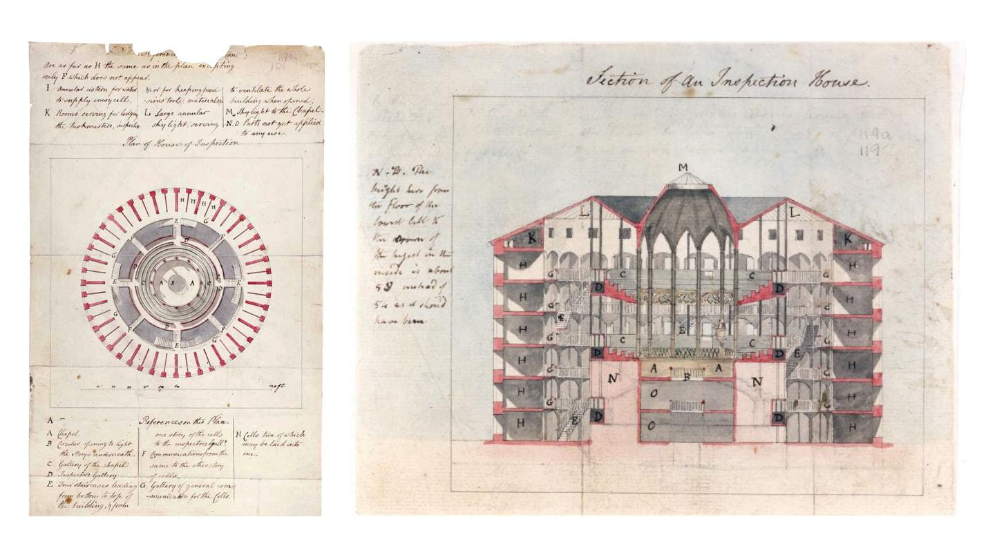
Since the 1790s, Jeremy Bentham’s panopticon remains an influential building and representation of power relations. Yet no structure was ever built to the exact dimensions Bentham indicates in his panopticon letters. Seeking to translate Bentham into the digital age, I followed his directions and descriptions to construct an exact model in virtual reality. What would this building have looked like if it were built? Would it have been as all-seeing and all-powerful as Bentham claims?
Explore Bentham’s panopticon in the animation above or in virtual reality below
based on Bentham’s drawings at University College London:

.

.

c.1791 plans of panopticon, drawn by architect Willey Reveley for Jeremy Bentham

Creative Commons image credit: Bentham MS Box 119a 121, UCL Special Collections

.

Panopticon: Theory vs. Reality

Central to Bentham’s proposed building was a hierarchy of: (1) the principal guard and his family; (2) the assisting superintendents; and (3) the hundreds of inmates. The hierarchy between them mapped onto the building’s design. The panopticon thus became a spatial and visual representation of the prison’s power relations. As architectural historian Robin Evans describes: “Thus a hierarchy of three stages was designed for, a secular simile of God, angels and man.”

.

Author’s images from computer model

.

To his credit, Bentham recognized that an inspector on the ground floor could not see all inmates on the upper floors. The angle of view was too steep and obstructed by stairs and walkways. To this end, Bentham proposed that a covered inspection gallery be erected between every two floors of cells.
By proposing these three inspection galleries, Bentham addressed the problem of inspecting all inmates. However, he created a new problem: From no central point was it now be possible to see all activity, as the floor plans below show. The panoramic view below shows the superintendent’s actual field of view, from which he could see into no more than four complete cells at a time. The view from the center was not, in fact, all-seeing. Guards would have to walk a continuous circuit round-and-round, as if on a treadmill. They, too, are prisoners to the architecture.

.

.

Author’s images from computer model

.

The intervening stairwells and inspection corridors between the perimeter cells and the central tower might have allowed inspectors to see into the cells. Yet these same architectural features would also have impeded the inmates’ view toward the central rotunda. Bentham claimed this rotunda could become a chapel, and that inmates could hear the sermon and view the religious ceremonies without ever needing to leave their cells. The blinds, normally closed, could be opened up for viewing the chapel.

.

.

Bentham’s suggestion was problematic. The two cross sections above show that, although some of the inmates could see the chapel from their cells, most would be unable to do so.
In spite of all these obvious faults in panopticon design, Bentham still claimed that all inmates and activities were visible and controlled from a single central point. When the superintendent or visitor arrives, no sooner is he announced that “the whole scene opens instantaneously to his view,” Bentham wrote.

.

.

Despite Bentham’s claims to have invented a perfect and all-powerful building, the real panopticon would have been flawed were it built as this data visualization helps illustrate. Although the circular form with central tower was chosen to facilitate easier surveillance, the realities and details of this design illustrate that constant surveillance was not possible. That the British public and Parliament rejected Bentham’s twenty year effort to build a real panopticon should be no surprise.
However flawed the architecture, Bentham remained ahead of his time. He envisioned an idealistic and rational, even utopian, surveillance society. Without the necessary (digital) technology to create this society, Bentham fell back on architecture to make this society possible. The failure of this architecture and its obvious shortcomings do not invalidate Bentham’s project. Instead, these flaws with architecture indicate that Bentham envisioned an institution and society that would only become possible through new technologies invented hundreds of years later.

.

Related Projects

My computer model is available here in virtual reality.
Read my research on Eastern State Penitentiary, a radial prison descended from Bentham’s panopticon

.

.

Credits

Supervised by Max Sternberg at Cambridge, advised by Philip Schofield at UCL
The archives and publications of UCL special collections, Bentham MS Box 119a 121

Audio narration by Tamsin Morton
Audio credits from Freesound
panopticon interior ambiance
panopticon exterior ambiance
prison door closing
low-pitched bell sound
high-pitched bell sound

You may reuse content and images from this article, according to the Creative Commons license.

New York City in a Box

As featured in this article from Live Auctioneers

.

.

.

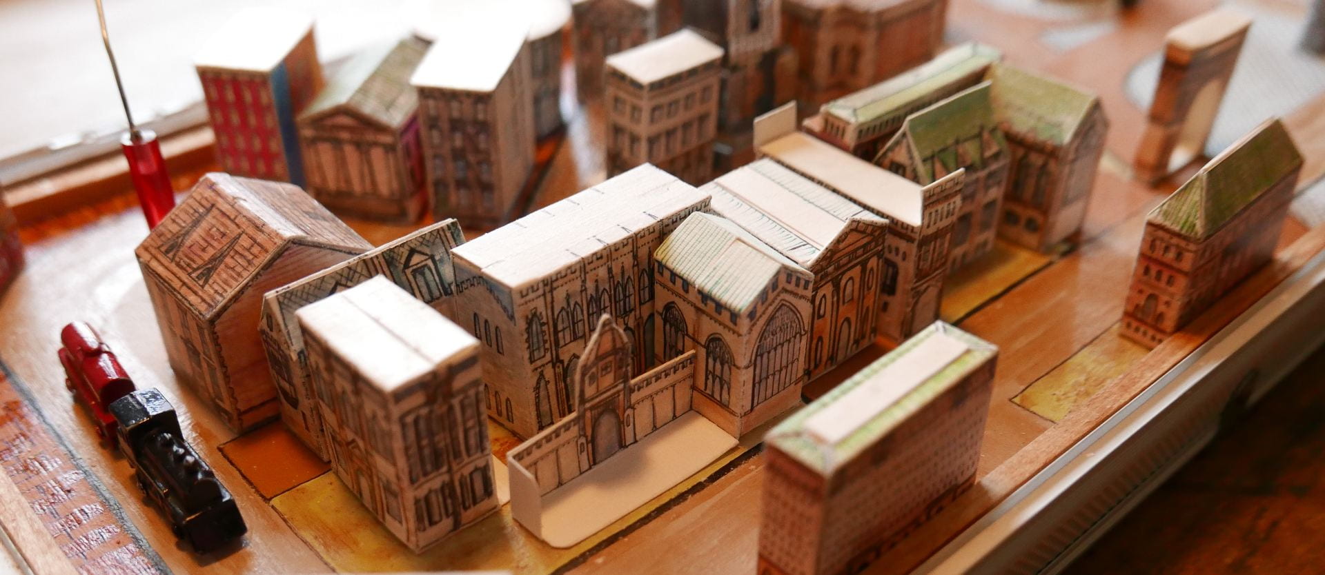
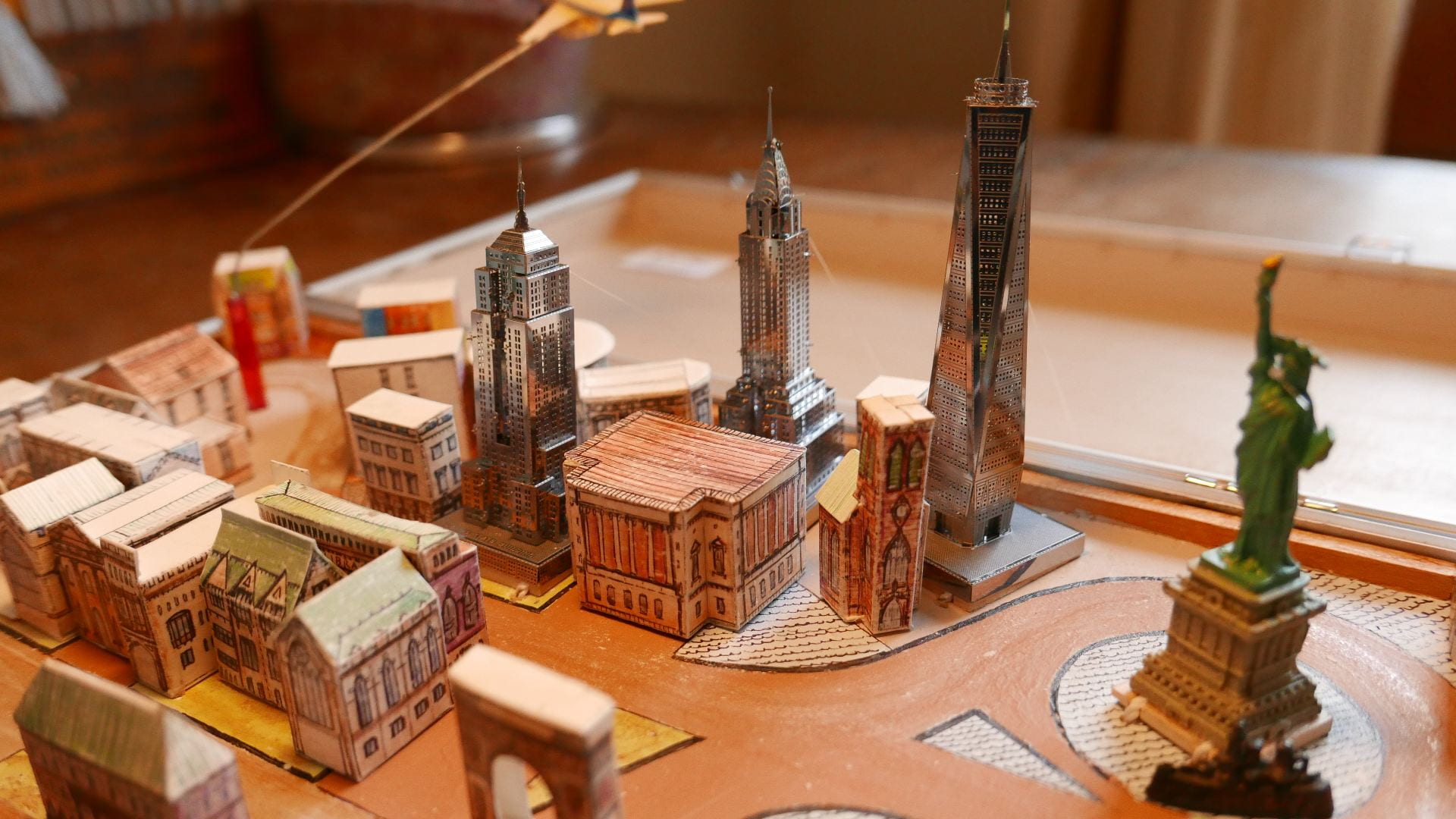
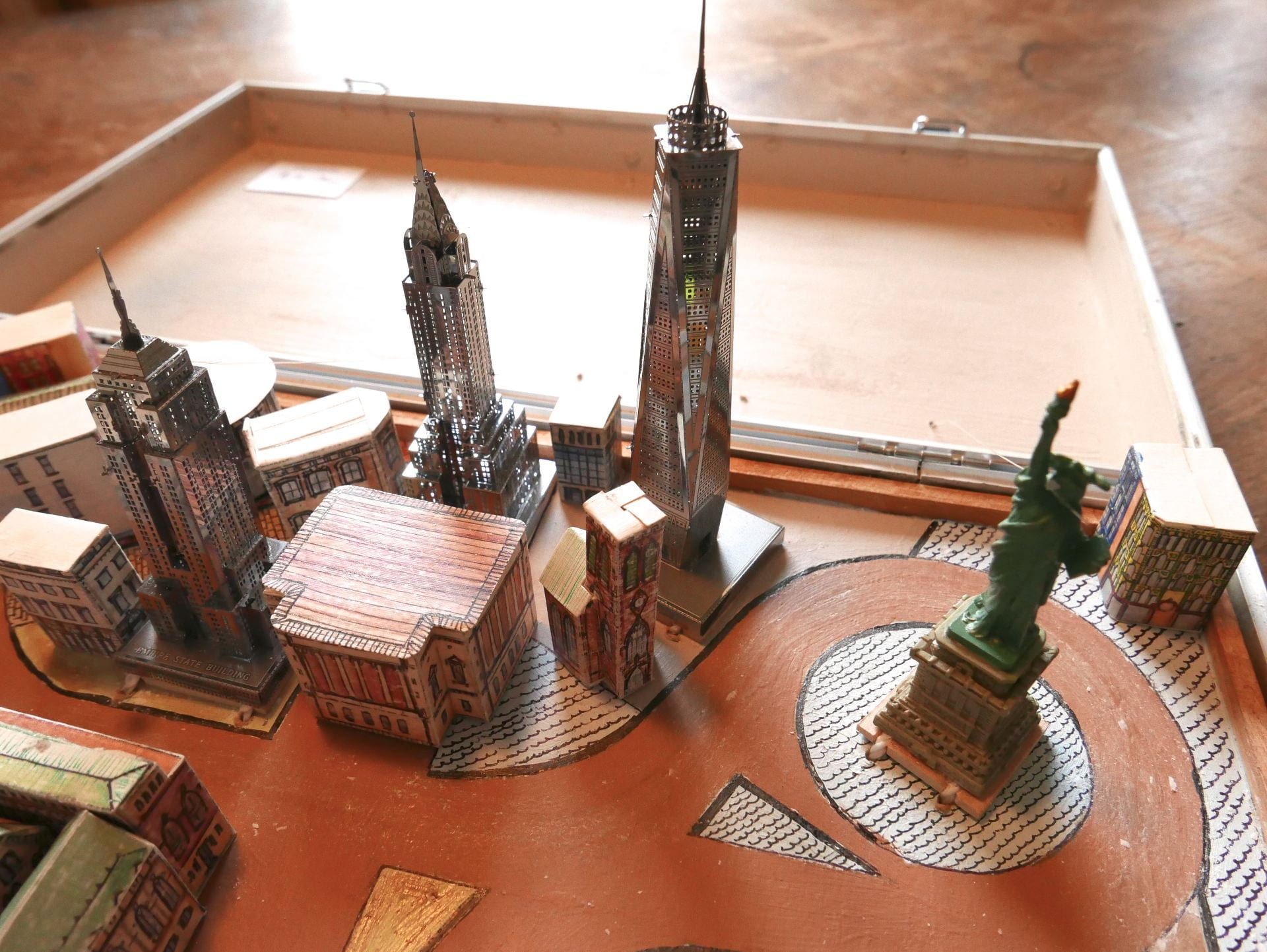
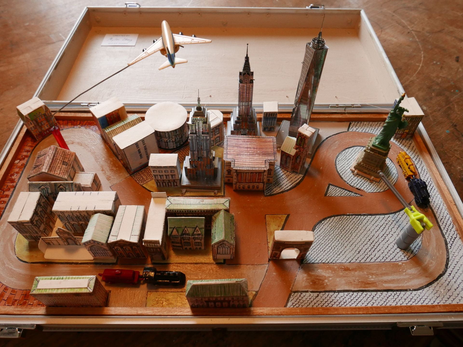
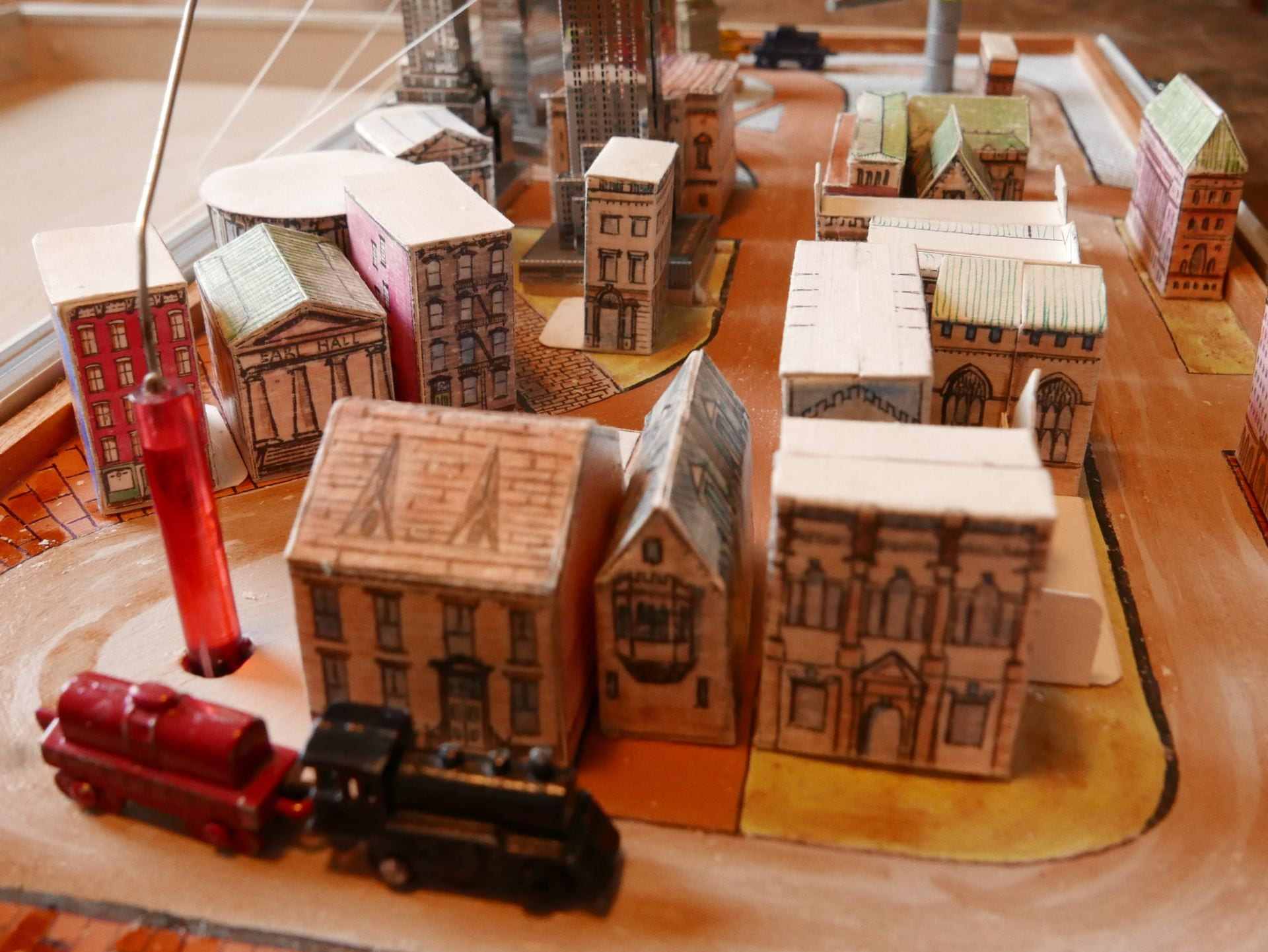
Inspired by the Stettheimer Dollhouse at the Museum of the City of New York, this pop up model in a recycled metal box (measuring 8 inches wide by 15.5 long and 2.5 deep) reveals a miniature world of New York City architecture and landmarks within. About 30 buildings made from hand cut paper and tin are spread across a flat ground of painted streets. Each building is made from a single sheet of paper that is cut and folded like origami to create different shapes and sizes. A hand cranked lever operates a mechanism of chains and gears hidden beneath the  paper surface of the city streets. These gears move the magnetized trains and airplanes through the city.

.

.


.

Hand-crank and music box recording from Freesound

California Waterscape: time-lapse history of water supply

California Waterscape animates the development of this state’s water delivery infrastructure from 1913 to 2019, using geo-referenced aqueduct route data, land use maps, and statistics on reservoir capacity. The resulting film presents a series of “cartographic snapshots” of every year since the opening of the Los Angeles Aqueduct in 1913. This process visualizes the rapid growth of this state’s population, cities, agriculture, and water needs.

.

Music: Panning the Sands by Patrick O’Hearn

.

Dams and Reservoirs

^ Created with open data from the US Bureau of Transportation Statistics and visualized in Tableau Public. This map includes all dams in California that are “50 feet or more in height, or with a normal storage capacity of 5,000 acre-feet or more, or with a maximum storage capacity of 25,000 acre-feet or more.” Dams are georeferenced and sized according to their storage capacity in acre-feet. One acre-foot is the amount required to cover one acre of land to a depth of one foot (equal to 325,851 gallons or 1.233 ● 10liters). This is the unit of measurement California uses to estimate water availability and use.

.

.

Aqueducts and Canals

^ Created with open data from the California Department of Water Resources, with additional water features manually added in QGIS and visualized in Tableau Public. All data on routes, lengths, and years completed is an estimate. This map includes all the major water infrastructure features; it is not comprehensive of all features.


Method and Sources

The most important data sources consulted are listed below:

This map excludes the following categories of aqueducts and canals:

  • Features built and managed by individual farmers and which extend for a length of only a few hundred feet. These features are too small and numerous to map for the entire state and to animate by their date completed. This level of information does not exist or is too difficult to locate.
  • Features built but later abandoned or demolished. This includes no longer extant aqueducts built by Spanish colonists, early American settlers, etc.
  • Features created by deepening, widening, or otherwise expanding the path of an existing and naturally flowing waterway. Many California rivers and streams were dredged and widened to become canals, and many more rivers turned into “canals” remain unlined along their path. Determining the construction date for these semi-natural features is therefore difficult. So, for the purposes of simplicity and to aid viewers in seeing only manmade water features, these water features are excluded.
Download and edit the open source QGIS dataset behind this animation.

Here Grows New York City

Music: “The Language of Cities” by Maserati

1. The Animation

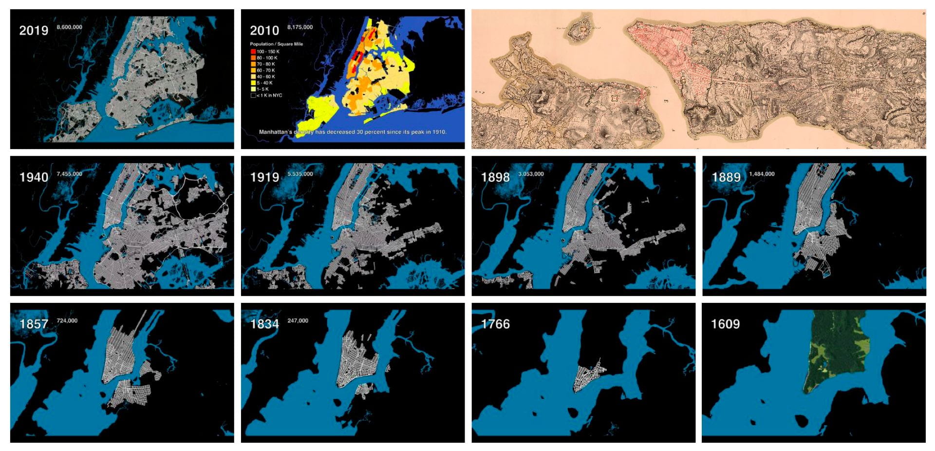
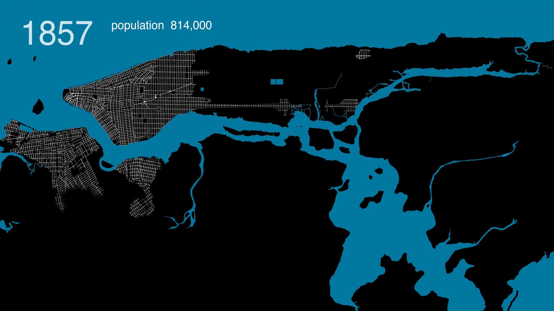
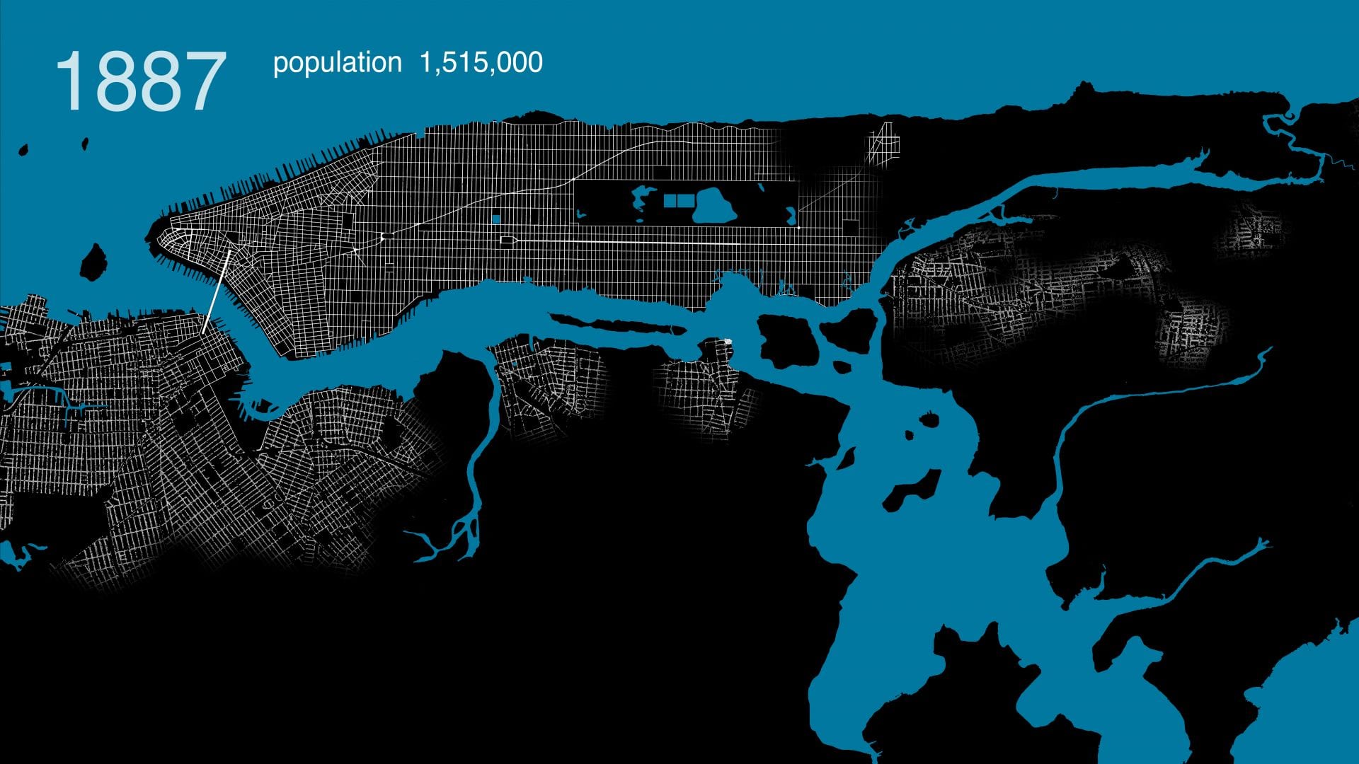
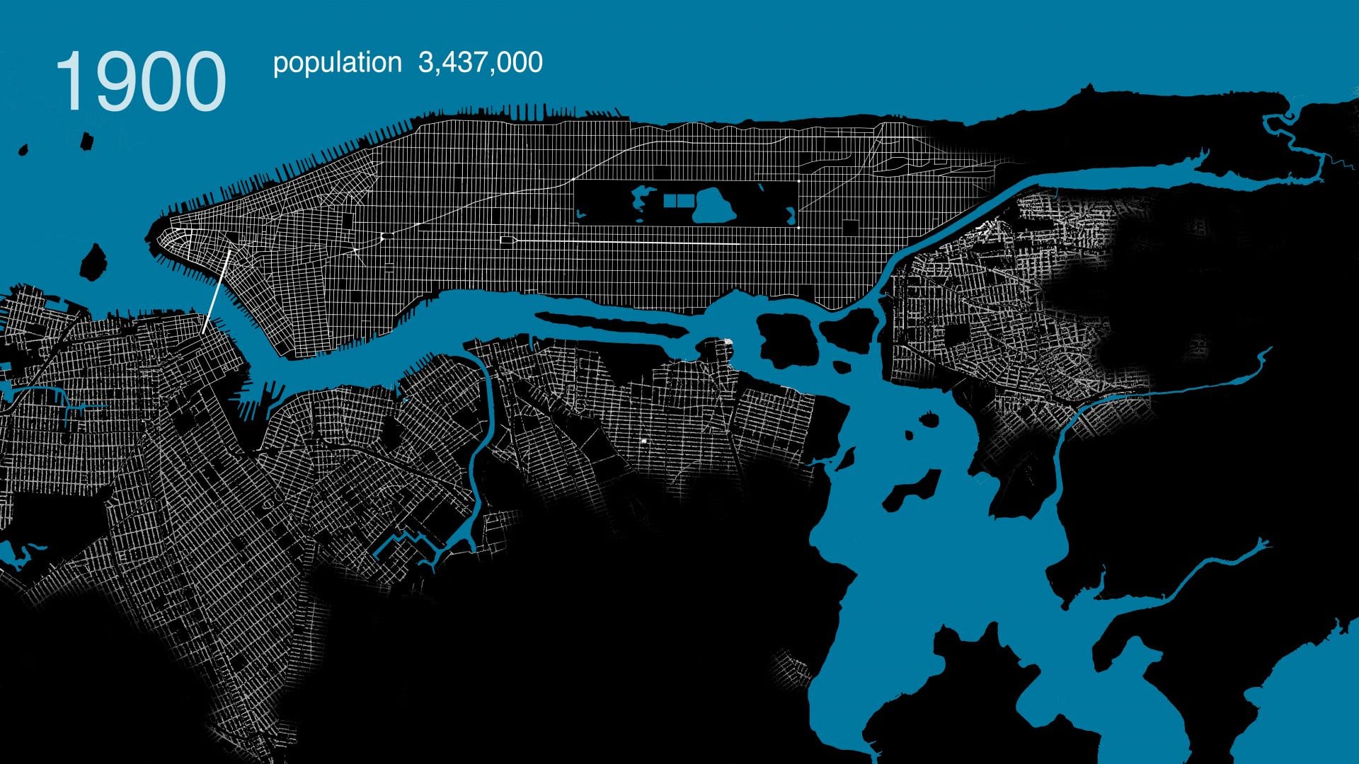
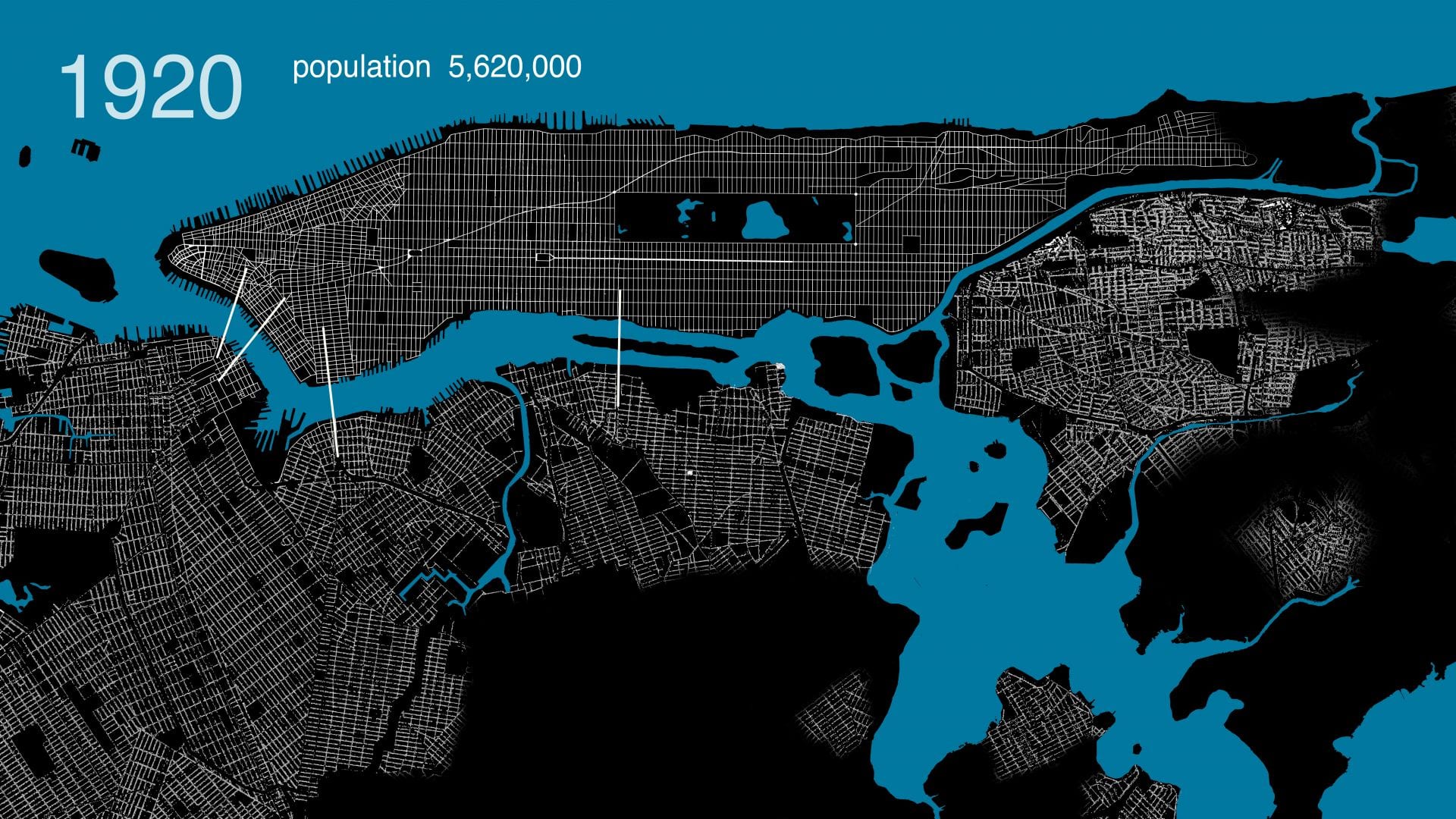
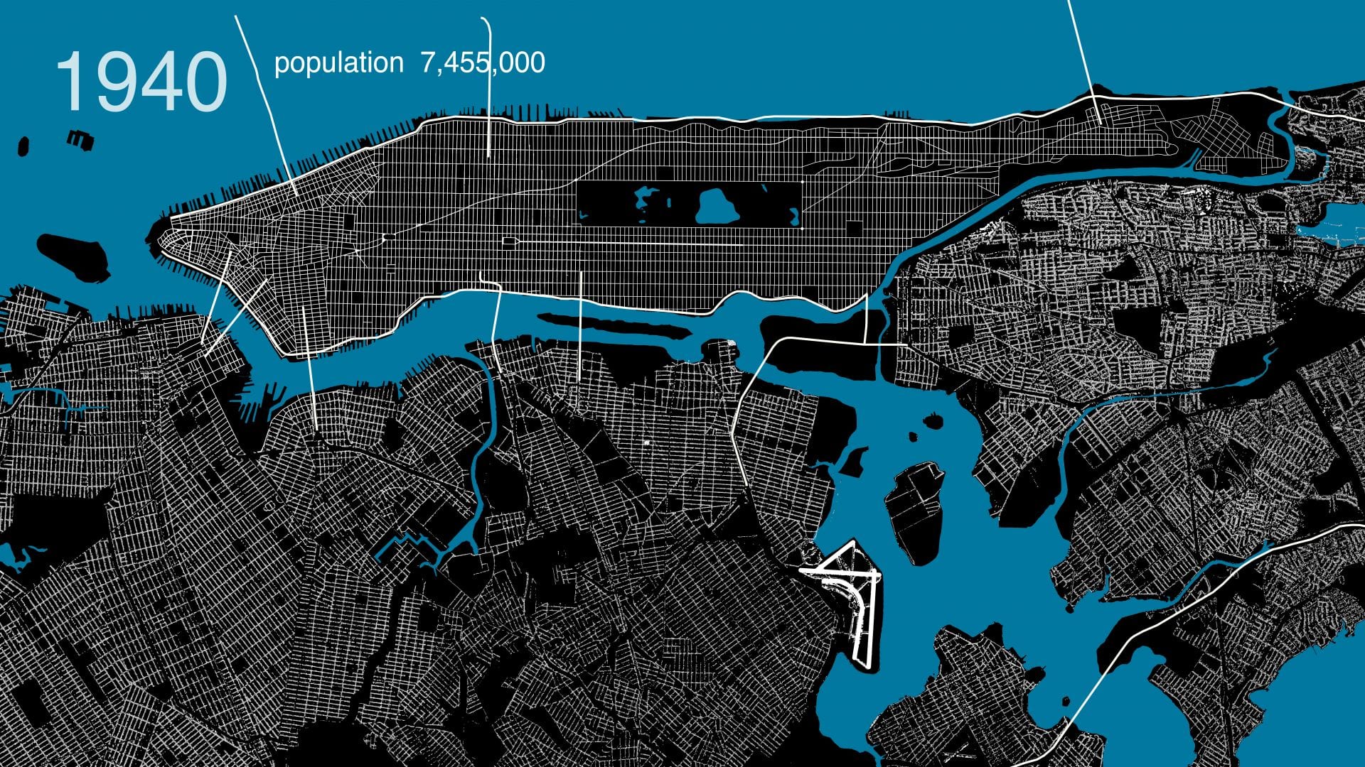
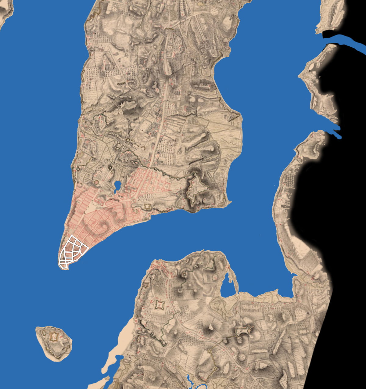
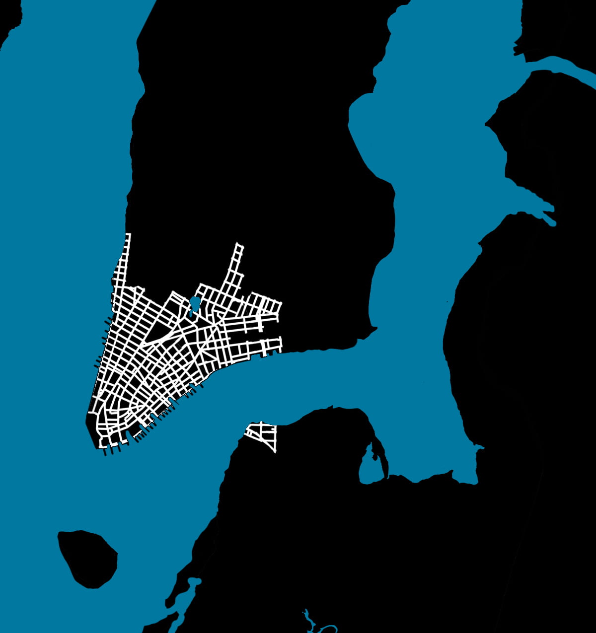
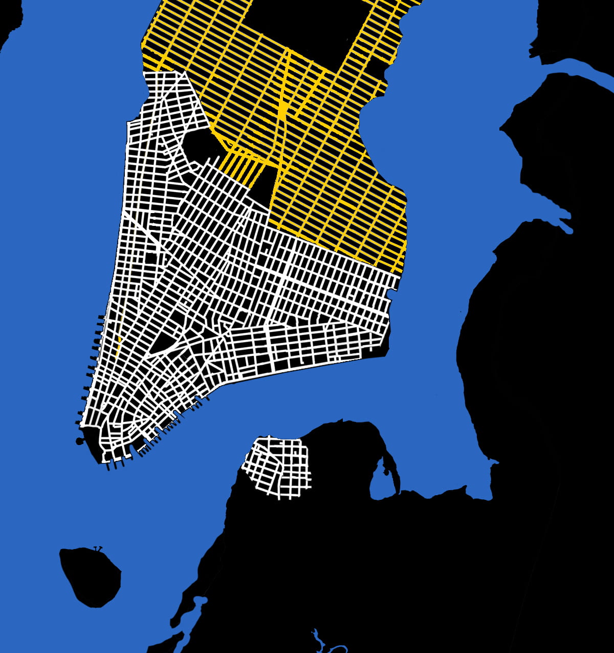
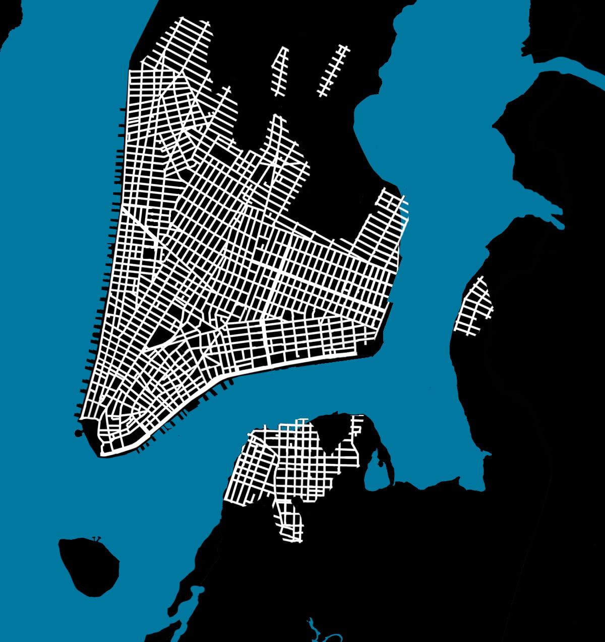
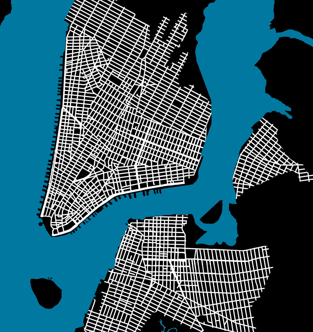
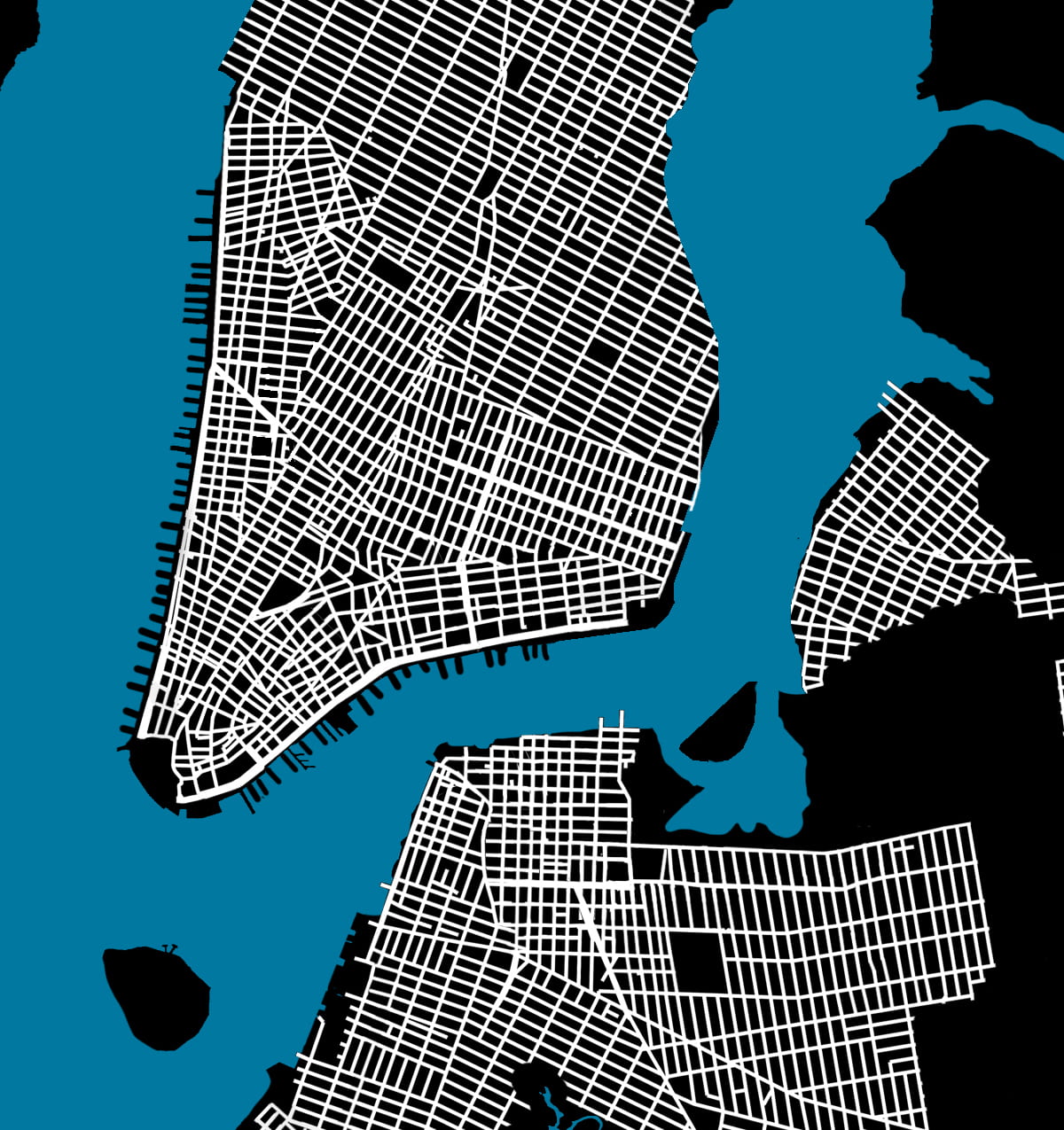
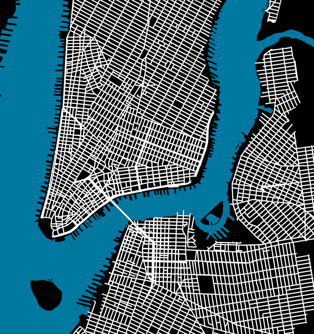
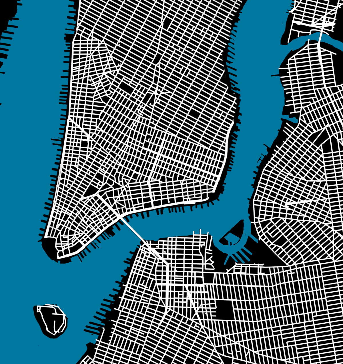
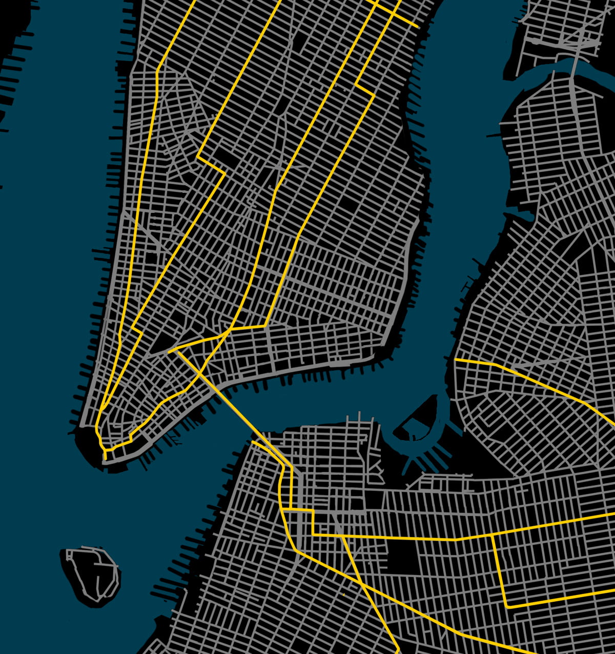
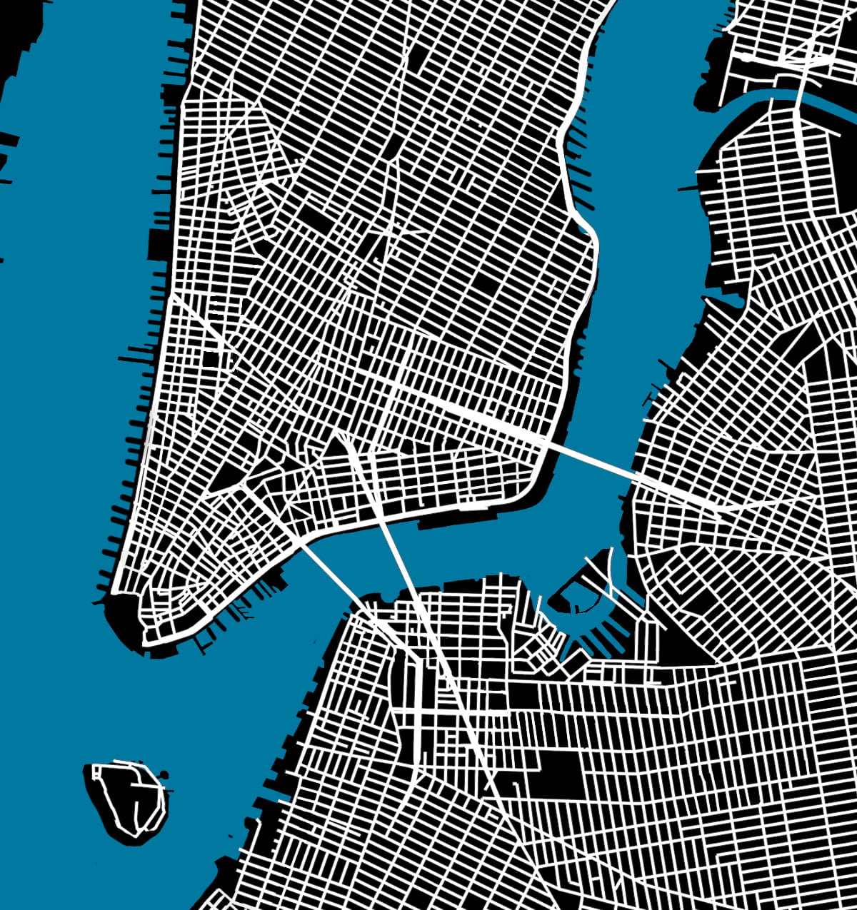
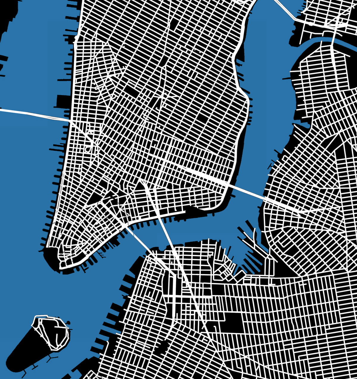
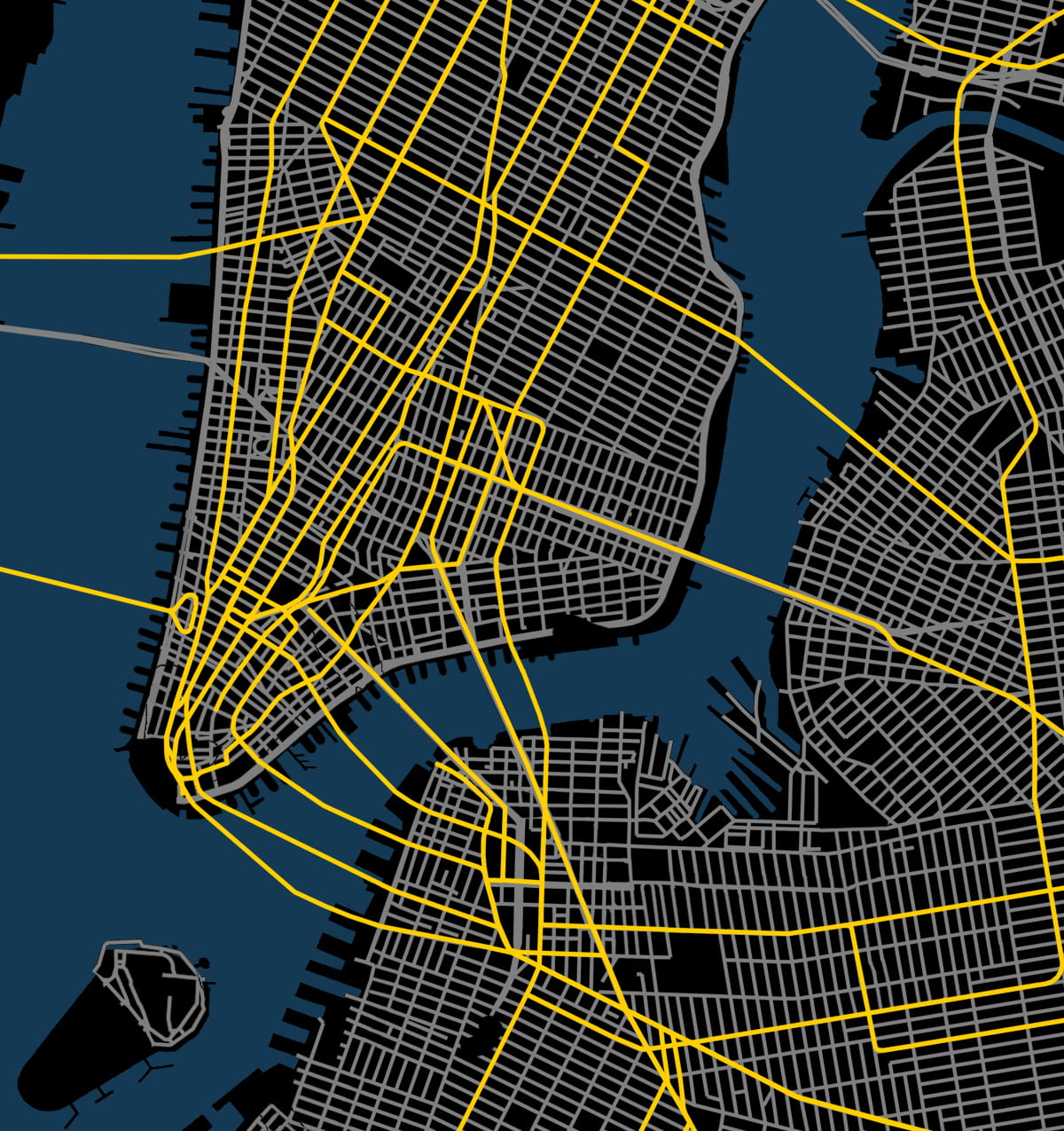
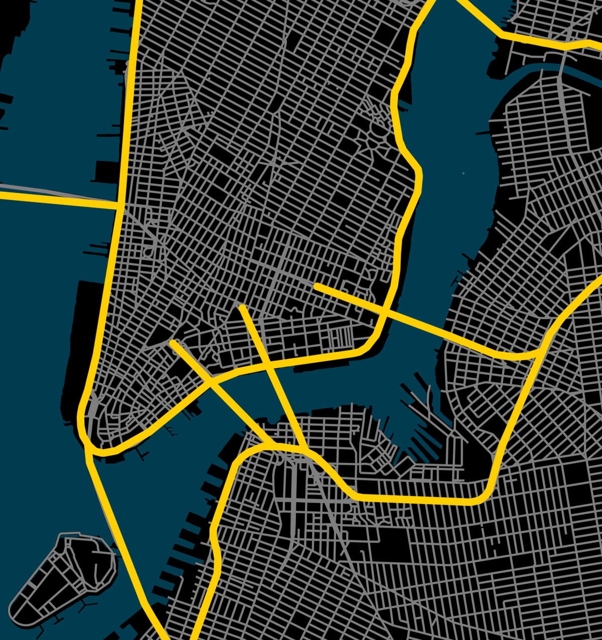
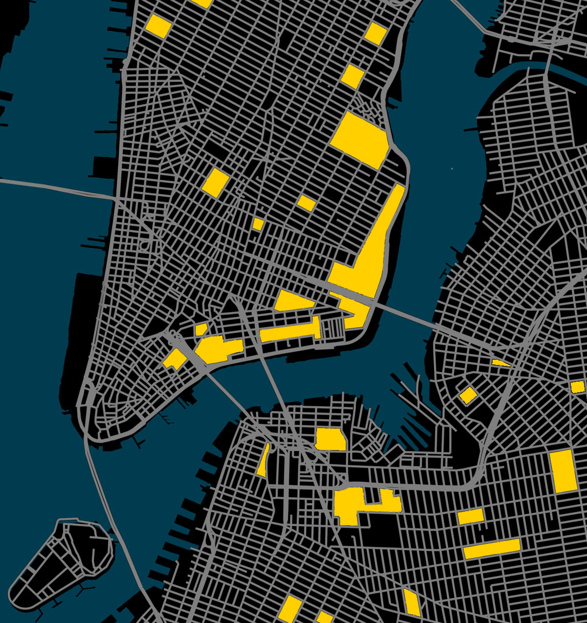
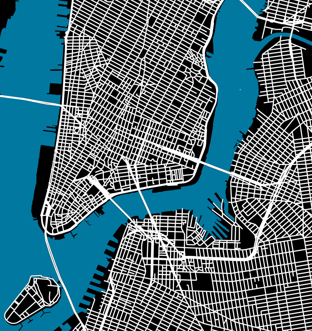
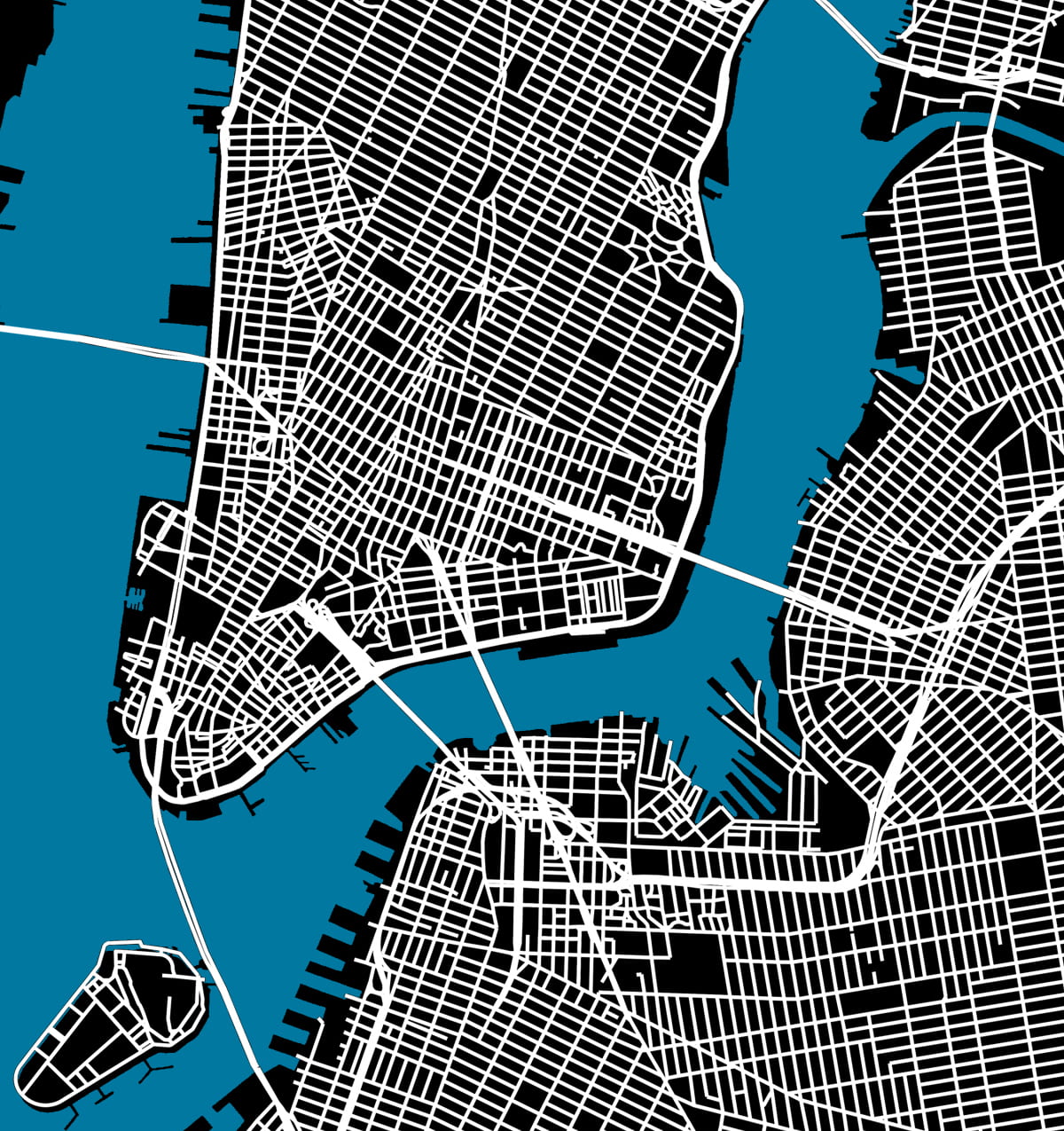
Here Grows New York visually animates the development of this city’s street grid and environment from 1609 to the present day, using geo-referenced road network data, historic maps, and geological surveys. The resulting short film presents a series of “cartographic snapshots” of the built-up environment at intervals of every 20 to 30 years in history. This process highlights the organic spurts of growth and movement that typify New York’s and most cities’ development through time. The result is an abstract representation of urbanism.
Featured in:
– Laughing Squid   March 12, 2019
Viewing NYC   March 14
– silive.com   March 14
Open Culture   April 17
– Columbia Data Science Institute   May 1
– Library of Congress Blog   May 2
– Kottke.org   May 6
NYNJ.com   May 13
– 6sqft   May 13
– UK Daily Mail   August 28
– LangweileDich.net   June 11, 2020
– Wikipedia
New Amsterdam History Center   December 1, 2020
Bunk History   July 2021
– Camden Town, 2023 textbook by Westermann Group
– Inspired by Cambridge University’s London Evolution Animation and this map of Barcelona

.

2. The Interactive Map

The results of this animation are transformed into this fully interactive map

.

3. Research Method

Several hundred maps in the digital archives of the New York Public Library and Library of Congress were analyzed to assemble this film. About 25 of these maps were then selected, downloaded, merged, stretched, and warped in a single document to align with each other. This provided a consistent scale and allowed easier comparison of differences between maps of different date. As the source files were all in different colors, scales, and designs, we created a single base map with unified graphics. The redrawing not only permits correcting errors in less accurate old maps but also provides a graphic representation that is consistent over time. This coherence allows the rate and trends in urban growth to be read more easily and compared between eras.
Click here to read the research methodology and list of maps consulted.
Or watch the video tutorial below of the workflow and software behind the animation

.

.

4. Conclusions and Analysis

This data visualization informs our analysis of the history of the New York City grid. This analysis reflects on the question: What can the built environment of Manhattan’s streets reflect about the evolving social and economic priorities of city planners and leaders? The long phases of urban growth and shifting transportation modes created distinctive road networks in Manhattan. The predominance of different forms of transport during each era also prompted changes to the location and dimensions of streets in response. Manhattan illustrates the evolution of these road networks over four centuries of near continuous growth. A plot can describe a street grid, as well as its builders’ story. This paper aims to tell this second plot, a story of urbanism.
Click here to read the conclusions as part of a working paper
written with Professor Kenneth T. Jackson.

.

.

5. Credits and Appendix

This project would not have been possible without the support, mentorship, and patience of my parents, Anne Mabry and Zemin Zemin Zhang. Nor would this project have been possible without the historical expertise of Columbia University professors Kenneth T. Jackson (History Department) and Gergely Baics (Urban Studies). Thanks is also extended to those who reviewed and critiqued this project in its early stages, including Chris Kok, Wright Kennedy, Dan Miller, and the Center for Spatial Research at Columbia’s Department of History. Most importantly, I thank my dog ChoiChoi.

.

Anyone may reuse or republish this content, so long as credit is provided with the link back to this page. If you email [email protected], I will gladly send along the graphics, maps, and source files associated.

.