• This website includes dozens of videos, hundreds of essays, and thousands of drawings created over the past twenty years. Search to learn more about the history of buildings, places, prisons, Newark, New York City, and my PhD research on spatial inequality.

  • Or scroll down for the latest publications.

The Slave Trader Turned Banker: Slavery and the Origins of a Modern Bank

Based on primary sources and archival records of the slave trade
Written for Rebecca Scott’s history seminar: The Law in Slavery and Freedom
Read / download essay as PDF, opens in new tab
Selling slaves equipped Liverpool merchant Thomas Leyland with the money to create what is now the Hong Kong Shanghai Bank of China. With profits from merchant trading and Caribbean slave sales, Leyland wrote thousands of letters to build a Transatlantic business. Analyzing these 250-year-old business records reveals the mechanisms of human trafficking.
From the comfortable distance of Liverpool, Bristol, and London, Leyland’s letters describe bodies he and his co-investors would never see some 4,500 miles away in the Caribbean. In an age before telegraphs, steamships, and rapid transcontinental communication, Leyland required a paper trail to carry out his orders. Across the distant branches of his global business empire, the medium of written letters linked these distant investments to London.
Thomas Leyland was a banker, trader, millionaire, and three times Mayor of Liverpool. Born 1752 to working class family of limited means, little land, and no royal titles, he chanced upon wealth when in 1776 he won £20,000 in the lottery. He was only twenty-four. This wealth he first invested in merchant ships to sell consumer goods and transport the likes of oats, peas, wheat, oatmeal, bacon, hogs, and lard from Irish farmers to British markets.[1] By 1783, with profits from these businesses, Leyland turned to the risk-intensive capital required to launch slave voyages, purchasing captives on the West African coast and selling them to cotton and sugar plantations in the Caribbean. His ~70 recorded slaving voyages transported an estimated 22,365 captives to the Americas, of whom about one in ten died during the months-long voyage. By his death in 1827, Leyland had amassed a fortune of some £600,000.[2]
Examination of his account books in Liverpool and at the University of Michigan show the 1789-90 journey of the Hannah with 294 African captives and the 1792-92 journey of the Jenny with 250 captives. Both year-long journeys began in Liverpool, sailed for West Africa, exchanged guns and cloth for human cargo, sold their captives in Jamaica, and then sailed home to Britain. His written correspondence of 2,262 letters also survives in the Liverpool Record Offices. Close reading of these documents in parallel – the ship manifest and the letter book – unpacks the mechanics and finances of Leyland’s slaving operation turned modern bank.
These documents reveal the mechanisms and mentality of a human trafficker. Never in them does Leyland claim – as a moral cover for their profit motives – that such African bodies were being saved from a darker fate of certain death from their African captors. These letters never claimed either that slavery was justified. Nor did Leyland use the cover of Christianity and the Christian language of missionary work to justify in his letters what he did to these Africans. His few written comments on the subject do not even recognize the need to justify slavery, the slave trade, or his role in it.[3]
Instead, the letters present the trafficking of human cargo in matter-of-fact language. In one day’s correspondence and from the same desk, Leyland ordered his agents to landscape the lawn of his country house, purchase grain from Ireland, deliver rum to an associate, and sell Africans in Jamaica. The tone of Leyland’s writing in flowing cursive script and flowery prose does not change, whether discussing matters as banal as drapery or as life changing as human trafficking. From Liverpool, Leyland managed business but at no point had he ever seen or inspected the human products he was buying, and nor did his London colleagues. In this way, these letters all describe slaves in the abstract, as bodies, as cargo, and profits per head sold. Leyland’s writing transforms the human body – a name, a person, a fate – into nothing more than a number on a page.

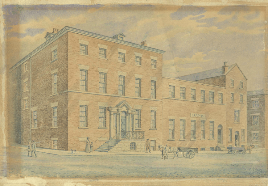
Watercolor of Leyland & Bullins bank on York Street in Liverpool in 1807. Bank offices at right. Leyland’s family home at left. Warehouse for Caribbean rum, Irish oats, and slave trade goods in rear. This building survives today unchanged. [4].

Read More


.

St. Paul’s Cathedral Dome: a synthesis of engineering and art

Developed with James Campbell, architectural historian at the University of Cambridge
Inspired by taking George Deodatis’ lectures on The Art of Structural Design
at Columbia University’s Department of Civil Engineering

.

In 1872, Eugène-Emmanuel Viollet-le-Duc, the French author and architect celebrated for restoring Notre-Dame of Paris, wrote in his Lectures on Architecture that the form of the Gothic cathedral was the synthesis of the early Christian basilica and the Romanesque three-aisled church. In this analysis, Viollet-le-Duc reasoned that a thesis (early Christian) plus an antithesis (Romanesque) produced the synthesis (Gothic).

.

Animation from Stephen Murray

Although the history and origins of Gothic are more complex than Viollet-le-Duc’s formula, this formula provides a method to dissect the Renaissance and Enlightenment counterpart to the medieval cathedral: the Greco-Roman basilica, as embodied by St. Paul’s Cathedral, constructed from 1675 to 1711 by Christopher Wren (1632-1723). St Paul’s is a symbol of Enlightenment-era London, built to rival its medieval counterpart of Westminster Abbey.
In this essay, and in my analysis of this neoclassical cathedral, I will parallel Viollet-le-Duc’s analysis of the medieval church. The thesis is that St. Paul’s is a work of techno-scientific engineering. The antithesis is that this building is a work of art that speaks to the larger cultural moment of Enlightenment London. The synthesis is the dome of St. Paul’s that merges these two forces of engineering and art into a unified and impressive creation.

.

Thesis: ENGINEERING
The engineering of this dome is more complex than meets the eye.

In this animated construction sequence, view how the dome was engineered.

.

Music from the organ (William Tell’s Overture) and bells of St Paul’s (recorded 2013)

.

St. Paul’s Cathedral features an innovative triple dome structure. On the circular drum, the inner dome rises and is visible from the cathedral interior. Above this inner dome, a brick cone rises to support the 850 ton lantern. This brick cone also supports the wood rafters and frame of the outer dome, which is covered in wood and lead. This three dome system allows the cathedral to support such a heavy lantern, all the while maintaining the great height needed to be a visible London landmark.
  • Inner dome – visible from inside and purely for show; height 225 ft (69m)
  • Middle brick cone – a brick cone that is invisible from below but supports the 850 ton lantern above; height 278 ft (85m)
  • Outer dome – a wood and lead-roofed structure visible from the cathedral exterior; height 278 ft (85m)
  • Lantern – an 850 ton stone lantern and cross, whose weight is carried to the ground via the middle brick cone 365ft (111m)
The inner and outer domes are decorative, while the brick cone is the true weight-bearing support. The model below is created from measured plans and is accurate to reality.

Read More

.

Virtual Reality Model
(click to play)

.

.

What’s wrong with Jeremy Bentham’s Panopticon?

Animation and research as featured by Open Culture

.

Postmodernist thinkers, like Michel Foucault, interpret Jeremy Bentham’s panopticon, invented c.1790, as a symbol for surveillance and the modern surveillance state.
This lecture is in two parts. I present a computer model of the panopticon, built according to Bentham’s instructions. I then identify design problems with the panopticon and with the symbolism people often give it.

.

Related Projects

– Computer animation of Jeremy Bentham’s panopticon
View the panopticon in virtual reality
Explore about Eastern State Penitentiary, a building inspired by Bentham

Computer Model of Jeremy Bentham’s Panopticon

Created at the University of Cambridge: Department of Architecture
As part of my Master’s thesis in Architecture and Urban Studies, as featured by:
– Special Collections department at University College London
– Open Culture
– Tomorrow City
– Aeon: a world of ideas
.
To say all in one word, it [the panopticon] will be found applicable, I think, without exception, to all establishments whatsoever, in which, within a space not too large to be covered or commanded by buildings, a number of persons are meant to be kept under inspection.
– Jeremy Bentham
.

.

Since the 1790s, Jeremy Bentham’s panopticon remains an influential building and representation of power relations. Yet no structure was ever built to the exact dimensions Bentham indicates in his panopticon letters. Seeking to translate Bentham into the digital age, I followed his directions and descriptions to construct an exact model in virtual reality. What would this building have looked like if it were built? Would it have been as all-seeing and all-powerful as Bentham claims?
Explore Bentham’s panopticon in the animation above or in virtual reality below
based on Bentham’s drawings at University College London:

.

.

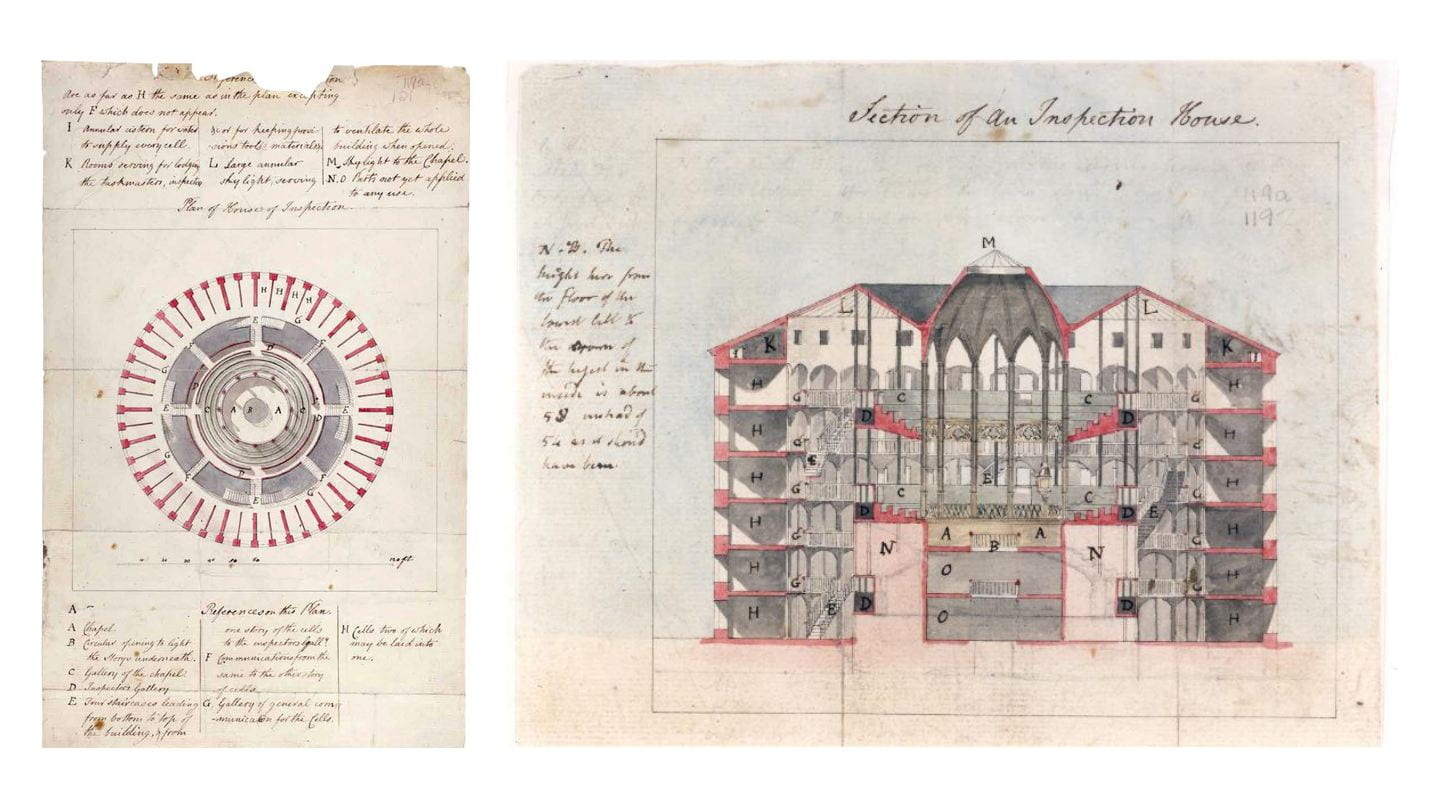
c.1791 plans of panopticon, drawn by architect Willey Reveley for Jeremy Bentham

Creative Commons image credit: Bentham MS Box 119a 121, UCL Special Collections

.

Panopticon: Theory vs. Reality

Central to Bentham’s proposed building was a hierarchy of: (1) the principal guard and his family; (2) the assisting superintendents; and (3) the hundreds of inmates. The hierarchy between them mapped onto the building’s design. The panopticon thus became a spatial and visual representation of the prison’s power relations. As architectural historian Robin Evans describes: “Thus a hierarchy of three stages was designed for, a secular simile of God, angels and man.”

.

Author’s images from computer model

.

To his credit, Bentham recognized that an inspector on the ground floor could not see all inmates on the upper floors. The angle of view was too steep and obstructed by stairs and walkways. To this end, Bentham proposed that a covered inspection gallery be erected between every two floors of cells.
By proposing these three inspection galleries, Bentham addressed the problem of inspecting all inmates. However, he created a new problem: From no central point was it now be possible to see all activity, as the floor plans below show. The panoramic view below shows the superintendent’s actual field of view, from which he could see into no more than four complete cells at a time. The view from the center was not, in fact, all-seeing. Guards would have to walk a continuous circuit round-and-round, as if on a treadmill. They, too, are prisoners to the architecture.

.

.

Author’s images from computer model

.

The intervening stairwells and inspection corridors between the perimeter cells and the central tower might have allowed inspectors to see into the cells. Yet these same architectural features would also have impeded the inmates’ view toward the central rotunda. Bentham claimed this rotunda could become a chapel, and that inmates could hear the sermon and view the religious ceremonies without ever needing to leave their cells. The blinds, normally closed, could be opened up for viewing the chapel.

.

.

Bentham’s suggestion was problematic. The two cross sections above show that, although some of the inmates could see the chapel from their cells, most would be unable to do so.
In spite of all these obvious faults in panopticon design, Bentham still claimed that all inmates and activities were visible and controlled from a single central point. When the superintendent or visitor arrives, no sooner is he announced that “the whole scene opens instantaneously to his view,” Bentham wrote.

.

.

Despite Bentham’s claims to have invented a perfect and all-powerful building, the real panopticon would have been flawed were it built as this data visualization helps illustrate. Although the circular form with central tower was chosen to facilitate easier surveillance, the realities and details of this design illustrate that constant surveillance was not possible. That the British public and Parliament rejected Bentham’s twenty year effort to build a real panopticon should be no surprise.
However flawed the architecture, Bentham remained ahead of his time. He envisioned an idealistic and rational, even utopian, surveillance society. Without the necessary (digital) technology to create this society, Bentham fell back on architecture to make this society possible. The failure of this architecture and its obvious shortcomings do not invalidate Bentham’s project. Instead, these flaws with architecture indicate that Bentham envisioned an institution and society that would only become possible through new technologies invented hundreds of years later.

.

Related Projects

My computer model is available here in virtual reality.
Read my research on Eastern State Penitentiary, a radial prison descended from Bentham’s panopticon

.

.

Credits

Supervised by Max Sternberg at Cambridge, advised by Philip Schofield at UCL
The archives and publications of UCL special collections, Bentham MS Box 119a 121

Audio narration by Tamsin Morton
Audio credits from Freesound
panopticon interior ambiance
panopticon exterior ambiance
prison door closing
low-pitched bell sound
high-pitched bell sound

You may reuse content and images from this article, according to the Creative Commons license.

24 Hours in the London Underground

Audio effect: Heartbeat from Freesound

.

Through analyzing 25,440 data points collected from 265 stations, this animation visualizes commuting patterns in the London Underground over two weeks in 2010.
Each colored dot is one underground station. The dots pulsate larger and smaller in mathematical proportion to the number of riders passing through. Big dots for busy stations. Small dots for less busy stations.
Dot color represents the lines serving each station. White dots are for stations where three or more lines intersect. Each dot pulsates twice in a day: Once during the morning commute; and again during the evening commute.
By syncing the audio volume with the density of riders and the background color with the time of day, the animation becomes acoustically legible. The audio volume rises and falls to mirror the growth and contraction of each colored dot during the daily commute.

.

.

The rhythmic pulsing of commuters is analogous to the breathing human body. The passage of red blood cells from the lungs to the organs is analogous to the movement of people to and from the city’s own heart: the downtown commercial district. This analogy of human form to city plan is a longstanding theme in urban studies.
See my film about commuting patterns in the NYC subway.

.

The Data

.

.

Method

No single data set could capture the complexity of a metropolis like London. This animation is based off of open-access data collected in November 2010. According to Transport for London: “Passenger counts collect information about passenger numbers entering and exiting London Underground stations, largely based on the Underground ticketing system gate data.” Excluding London Overground, the Docklands Light Railways, National Rail, and other transport providers, there are 265 London Underground stations surveyed. For data collection purposes, stations where two or more lines intersect are counted as a single data entry. This is to avoid double-counting a single passenger who is just transferring trains in one station en route to their final destination.

Every fifteen minutes, the numbers of passengers entering the system are tallied. This yields 96 time intervals per day (4 x 24). Multiplying the number of time intervals (96) by the number of stations (265), we get the number of data points represented in this animation: 25,440. Each station was assigned:

  • A location on the map of latitude and longitude
  • A color according to the lines extant in 2010: Bakerloo, Central, Circle, District, Hammersmith & City, Jubilee, Metropolitan, Northern, Piccadilly, Victoria, Waterloo & City.
  • A circle scaled to reflect the number of passengers moving through. Stations range in business from a few hundred passengers to over 100,000 per day.
  • A time of day: each 15-minute interval becomes one image in this film. Overlaying these 96 “snapshots” of commuter movement creates  a time-lapse animation. Thus, a single day with 25,440 data points is compressed into a mere 8 seconds.

Sources

Station Coordinates: Chris Bell. “London Stations.” doogal.co.uk (link)
Ridership Statistics: Transport for London. “Our Open Data.” (link)
Click on the section “Network Statistics” to view “London Underground passenger counts data.”

.

Powered by TfL Open Data. Contains OS data© Crown copyright and database rights 2016.

Evolution of the English Country House

Developed with Paul Barnwell, historian at the University of Oxford

.

Music: Piano Trio in E Flat, Op. 100 by Franz Schubert

.

This animation traces changes to English country house design between 1660 and 1715. In 1660, the typical Elizabethan style country house was compact, fortified, and square. By 1715, the emerging Baroque and Palladian country house was spread out, less compact, and better integrated into the rural landscape. The gardens became an extension of the house. This animation illustrates the aesthetic and architectural changes during this era.

.

Burford Church Construction Sequence

This project is also featured on Burford Church’s official website.
Created with the late Cathy Oakes, medieval art historian at the University of Oxford

.

.

Construction Sequence: 1175-1475

While studying history at Oxford University, I based my final research project on Burford Church near Oxford, England. With the generous help from Cathy Oakes, I visited this humble parish church and recreated its 300 year construction and evolution through a computer model. View the resulting animation above or download the digital source files for free at this link. Narration below:

.

  • c.1175 – Work begins on the Norman church working from east to west.
    It is a simple structure with round Norman windows and a choir, nave, and tower.
  • c.1200 – Demolition to construct a chapel, aisle, and entrance foyer.
  • c.1250 – Addition of north and south transept. Chancel is expanded.
  • c.1400 – The crypt is added, and the tower is heightened. The architectural style changes from Norman to Gothic, from round arches to pointed. Local cloth merchants construct a separate guild chapel at a slight angle to the main church.
  • c.1475 – Guild chapel is demolished to build the Lady Chapel. Most of the remaining nave is demolished to construct two new aisles, a larger west window, and new clerestory windows. Two chapels are added to either side of the choir, as well as a three floor entrance tower (not visible from this angle).
  • This completes the construction of Burford Church.

.

.

Visual Analysis

What is the visual language of Burford Church? What aspects of medieval social history can be deduced from the church decoration? Without written historical records, building fragments alone can tell the story of church construction.
Here is my tour of the architectural fabric.

.