• This website includes dozens of videos, hundreds of essays, and thousands of drawings created over the past twenty years. Search to learn more about the history of buildings, places, prisons, Newark, New York City, and my PhD research on spatial inequality.

  • Or scroll down for the latest publications.

California Waterscape: time-lapse history of water supply

California Waterscape animates the development of this state’s water delivery infrastructure from 1913 to 2019, using geo-referenced aqueduct route data, land use maps, and statistics on reservoir capacity. The resulting film presents a series of “cartographic snapshots” of every year since the opening of the Los Angeles Aqueduct in 1913. This process visualizes the rapid growth of this state’s population, cities, agriculture, and water needs.

.

Music: Panning the Sands by Patrick O’Hearn

.

Dams and Reservoirs

^ Created with open data from the US Bureau of Transportation Statistics and visualized in Tableau Public. This map includes all dams in California that are “50 feet or more in height, or with a normal storage capacity of 5,000 acre-feet or more, or with a maximum storage capacity of 25,000 acre-feet or more.” Dams are georeferenced and sized according to their storage capacity in acre-feet. One acre-foot is the amount required to cover one acre of land to a depth of one foot (equal to 325,851 gallons or 1.233 ● 10liters). This is the unit of measurement California uses to estimate water availability and use.

.

.

Aqueducts and Canals

^ Created with open data from the California Department of Water Resources, with additional water features manually added in QGIS and visualized in Tableau Public. All data on routes, lengths, and years completed is an estimate. This map includes all the major water infrastructure features; it is not comprehensive of all features.


Method and Sources

The most important data sources consulted are listed below:

This map excludes the following categories of aqueducts and canals:

  • Features built and managed by individual farmers and which extend for a length of only a few hundred feet. These features are too small and numerous to map for the entire state and to animate by their date completed. This level of information does not exist or is too difficult to locate.
  • Features built but later abandoned or demolished. This includes no longer extant aqueducts built by Spanish colonists, early American settlers, etc.
  • Features created by deepening, widening, or otherwise expanding the path of an existing and naturally flowing waterway. Many California rivers and streams were dredged and widened to become canals, and many more rivers turned into “canals” remain unlined along their path. Determining the construction date for these semi-natural features is therefore difficult. So, for the purposes of simplicity and to aid viewers in seeing only manmade water features, these water features are excluded.
Download and edit the open source QGIS dataset behind this animation.

Here Grows New York City

Music: “The Language of Cities” by Maserati

1. The Animation

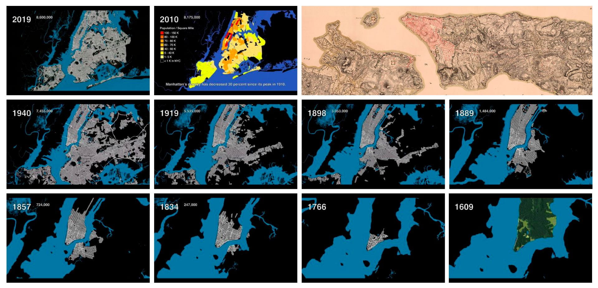
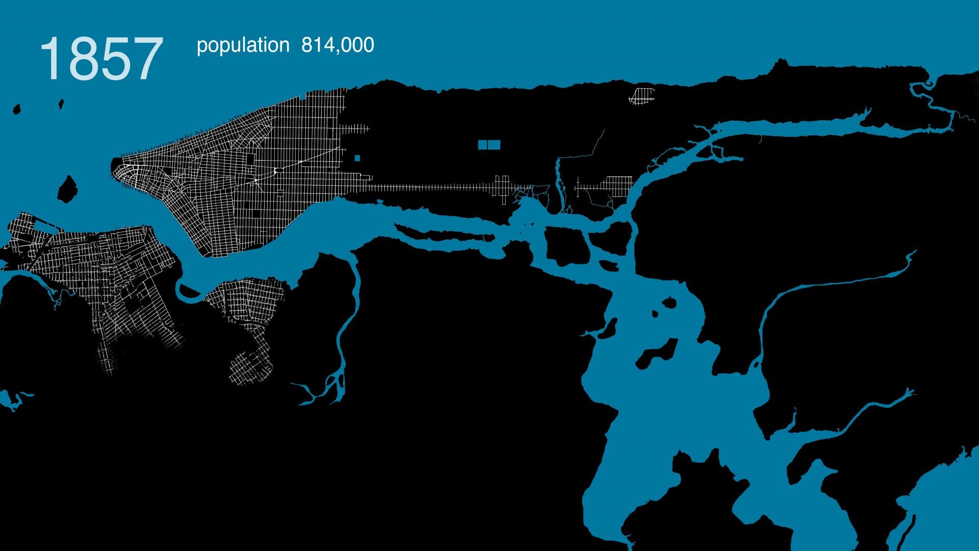
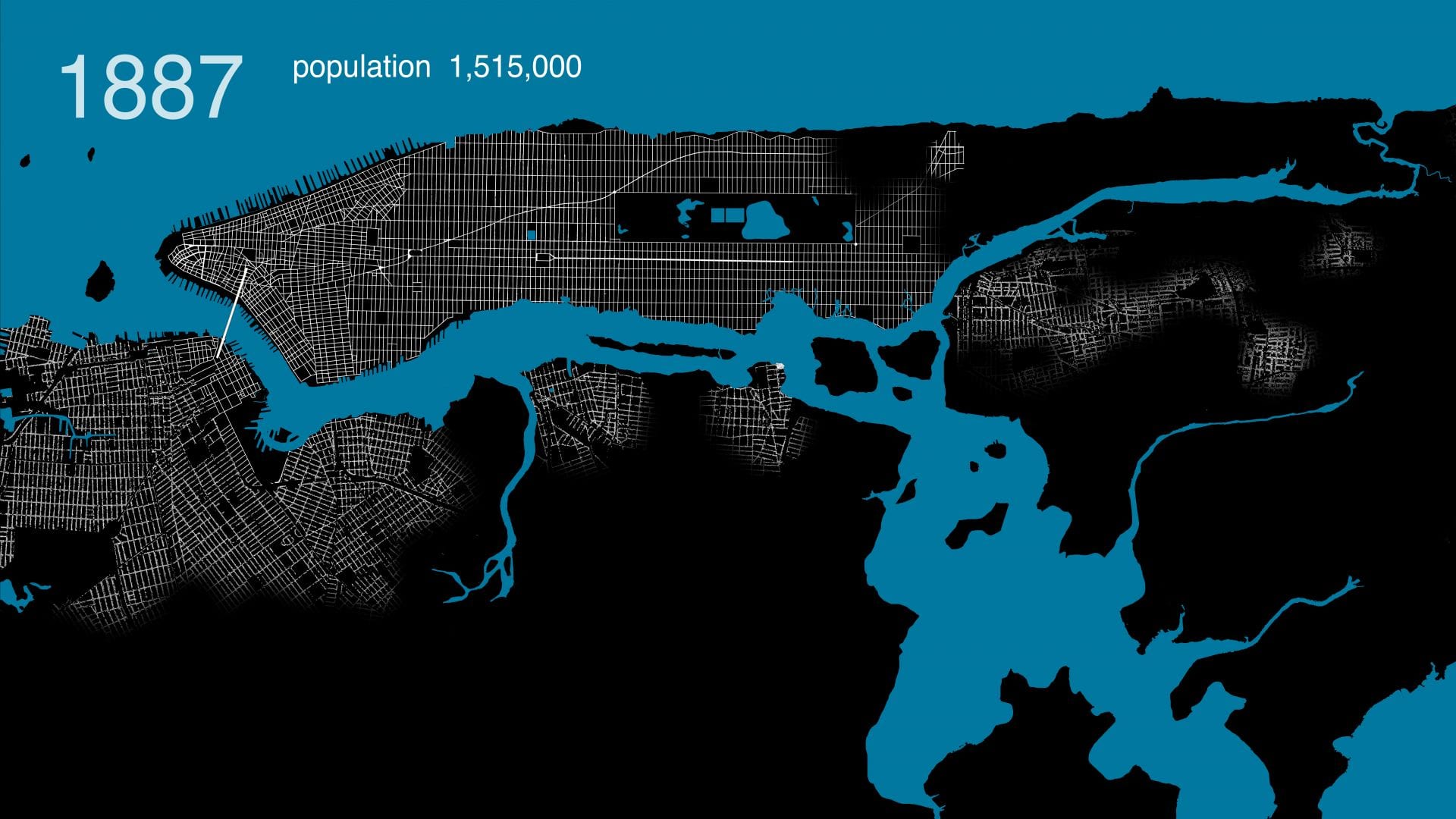
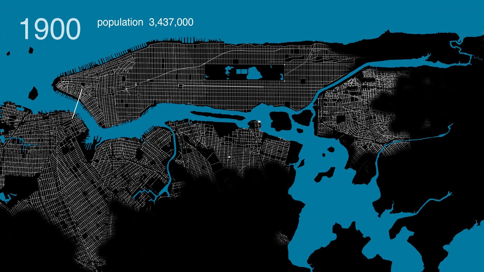
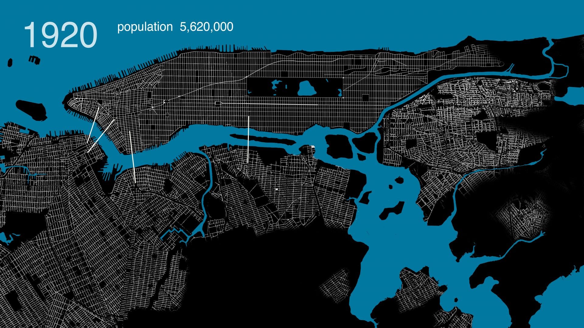
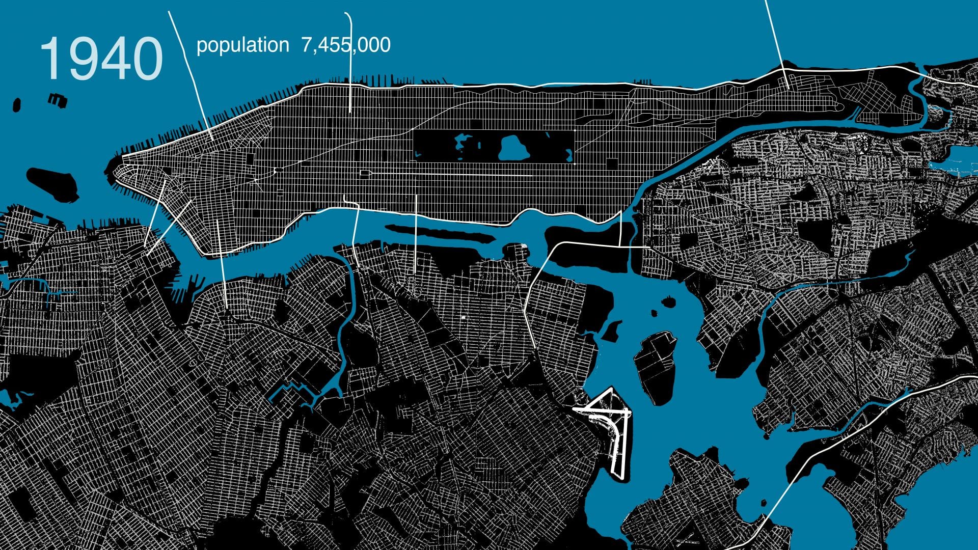
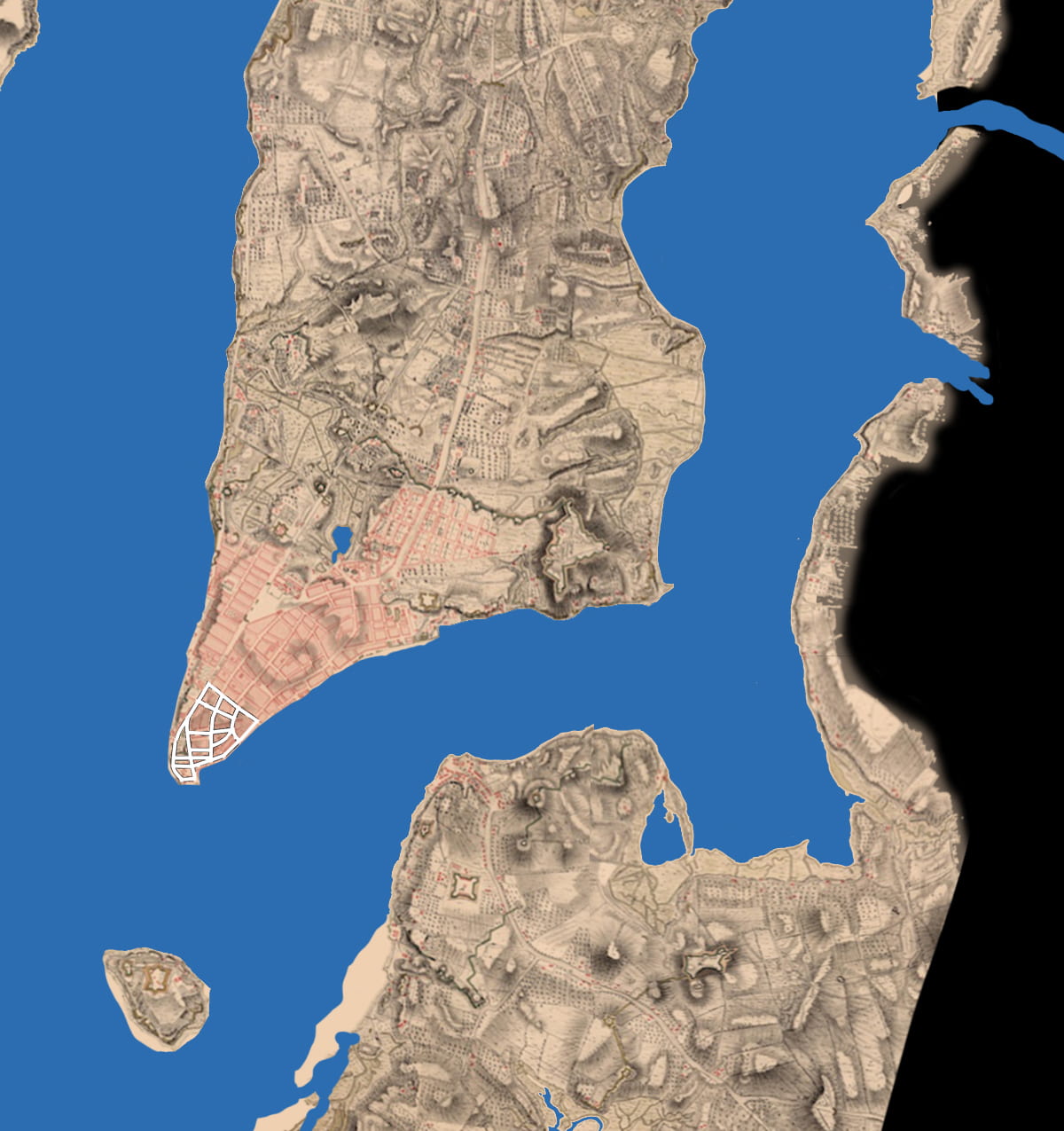
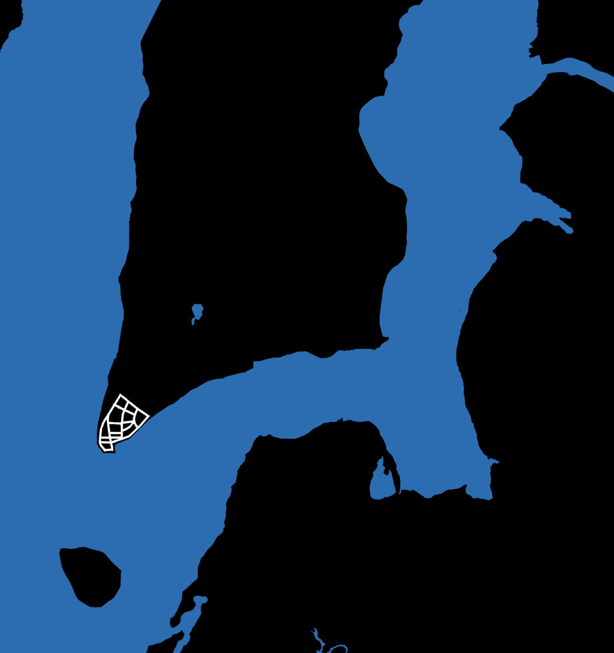
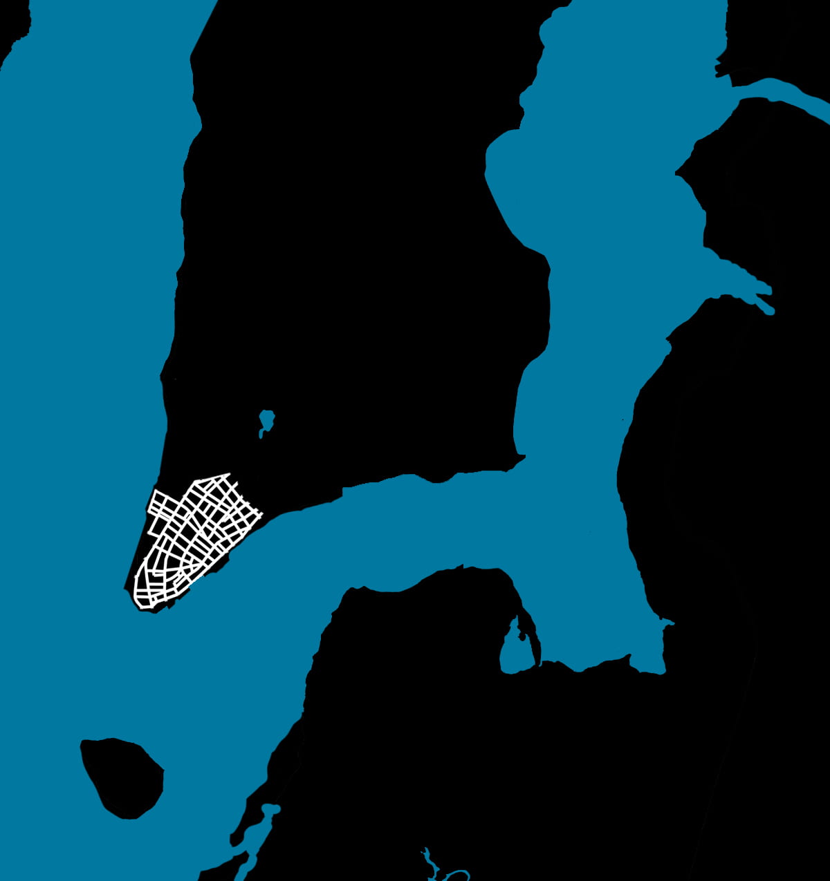
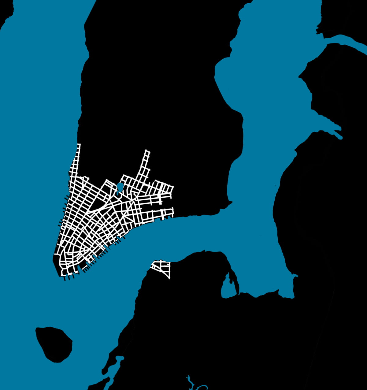
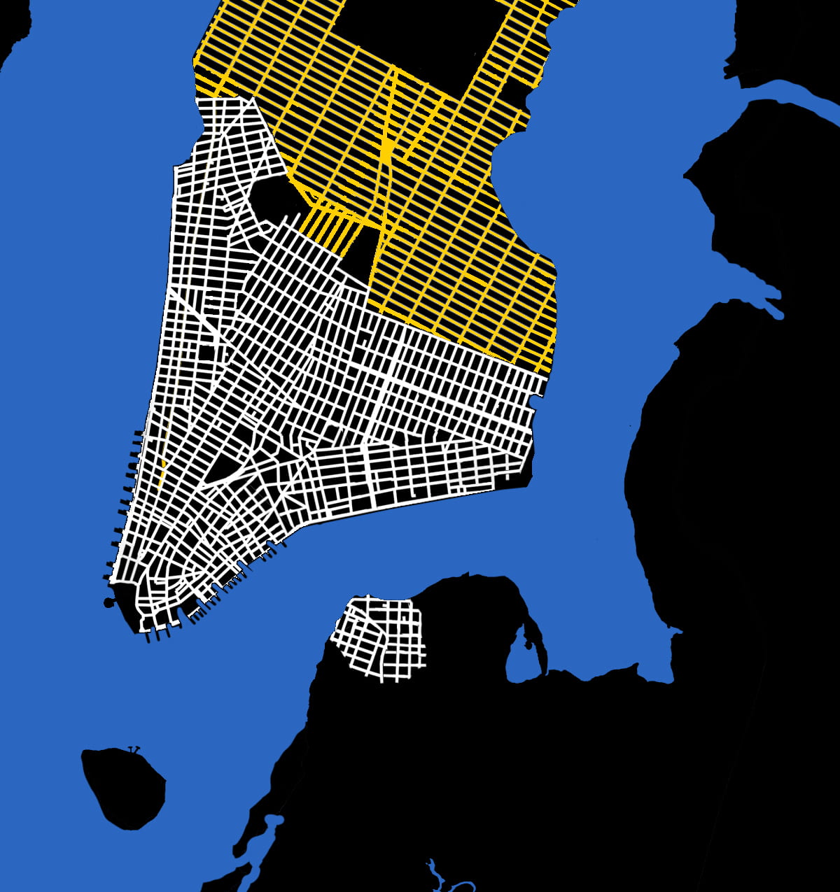
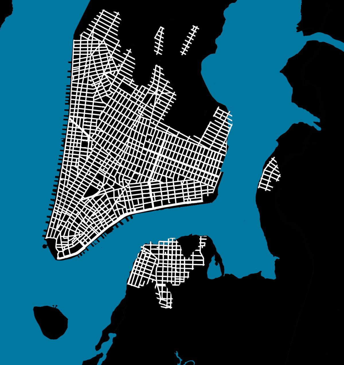
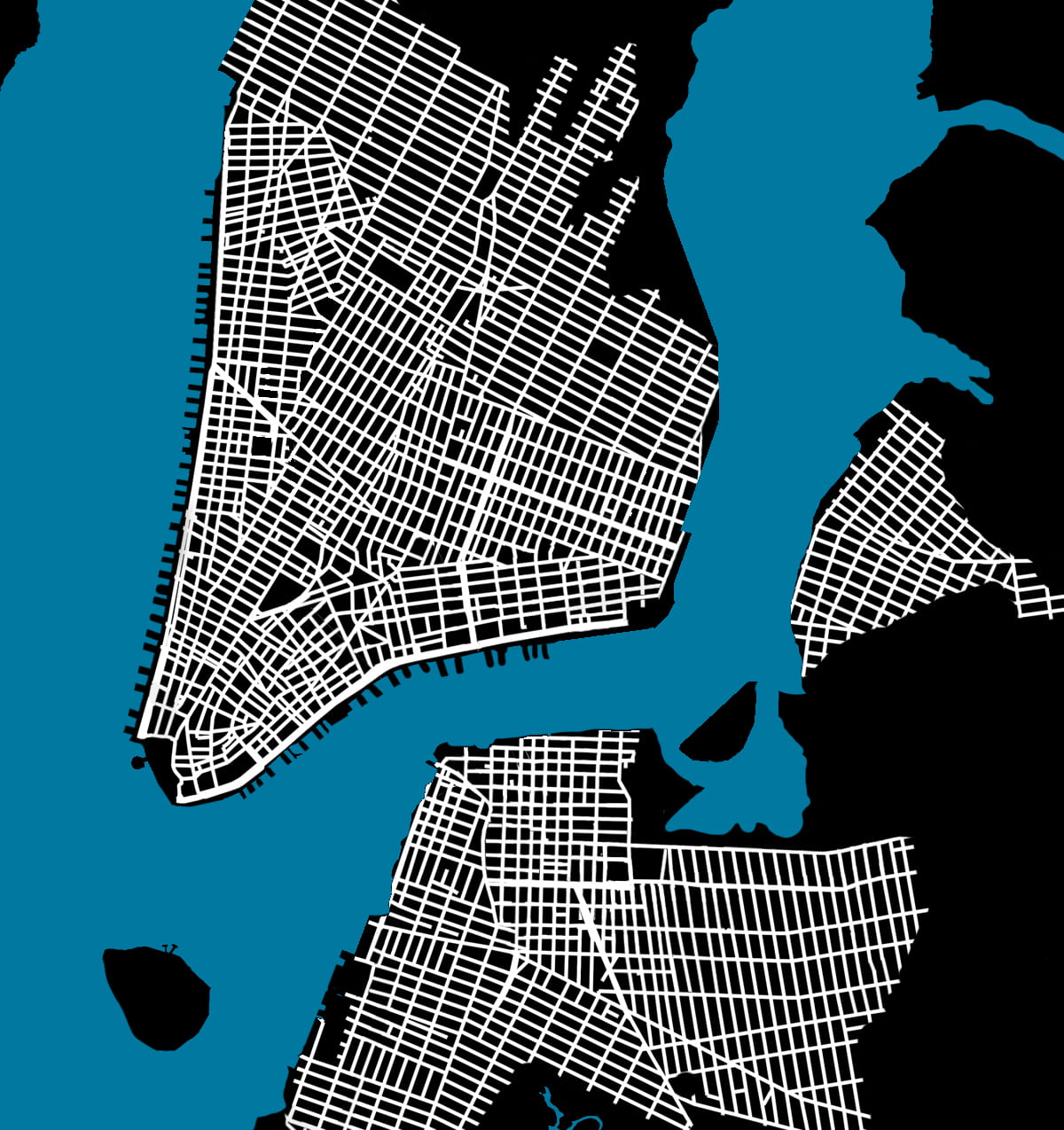
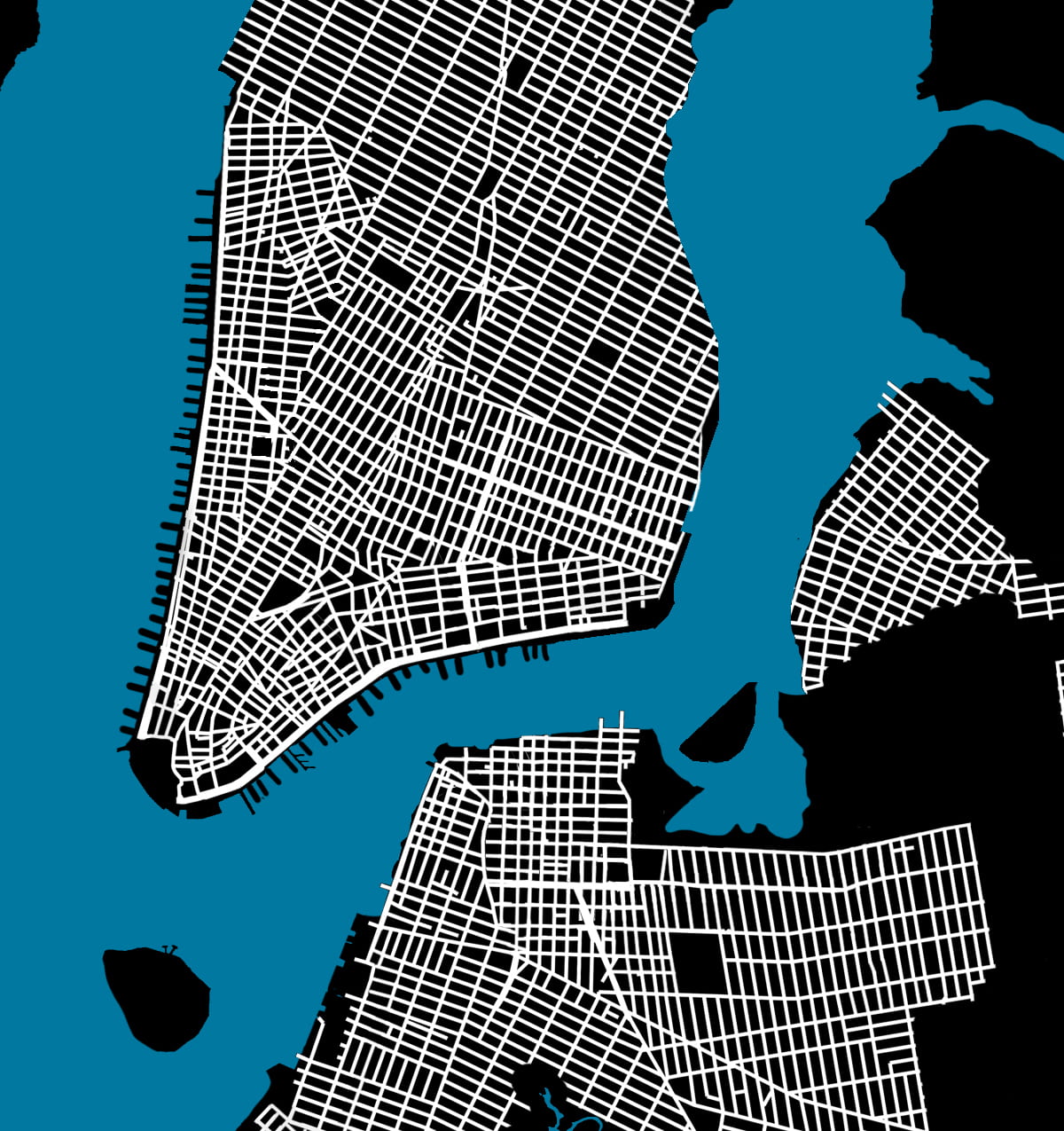
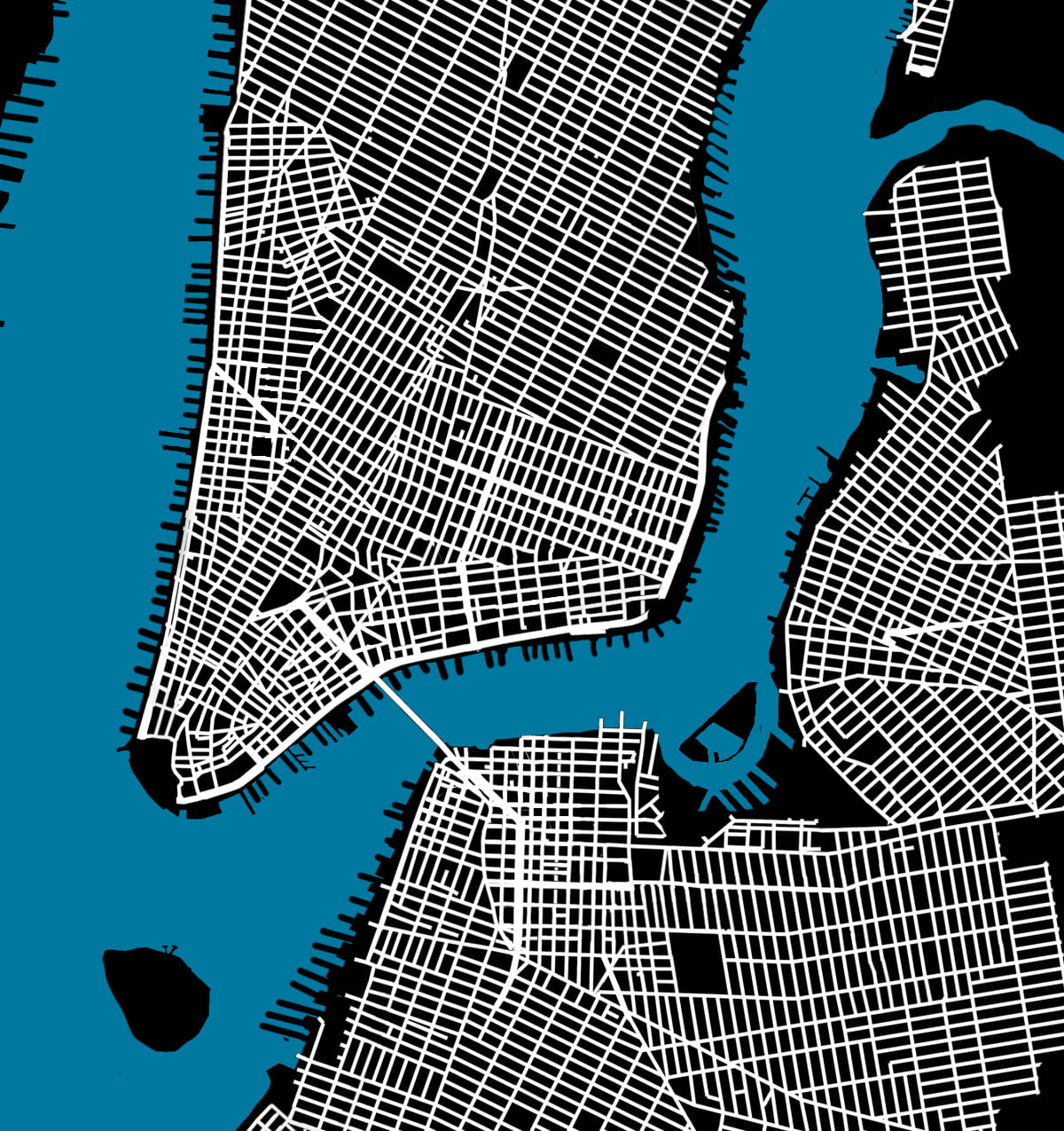
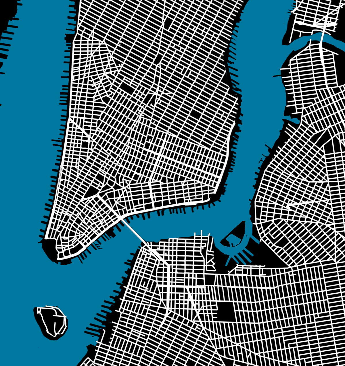
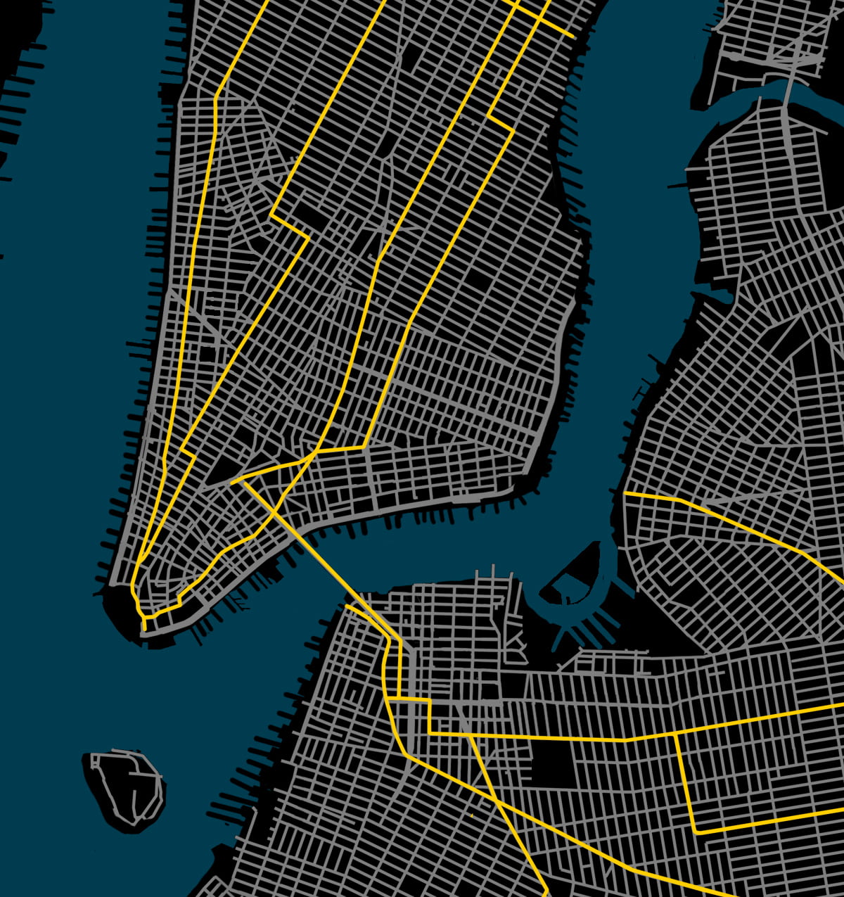
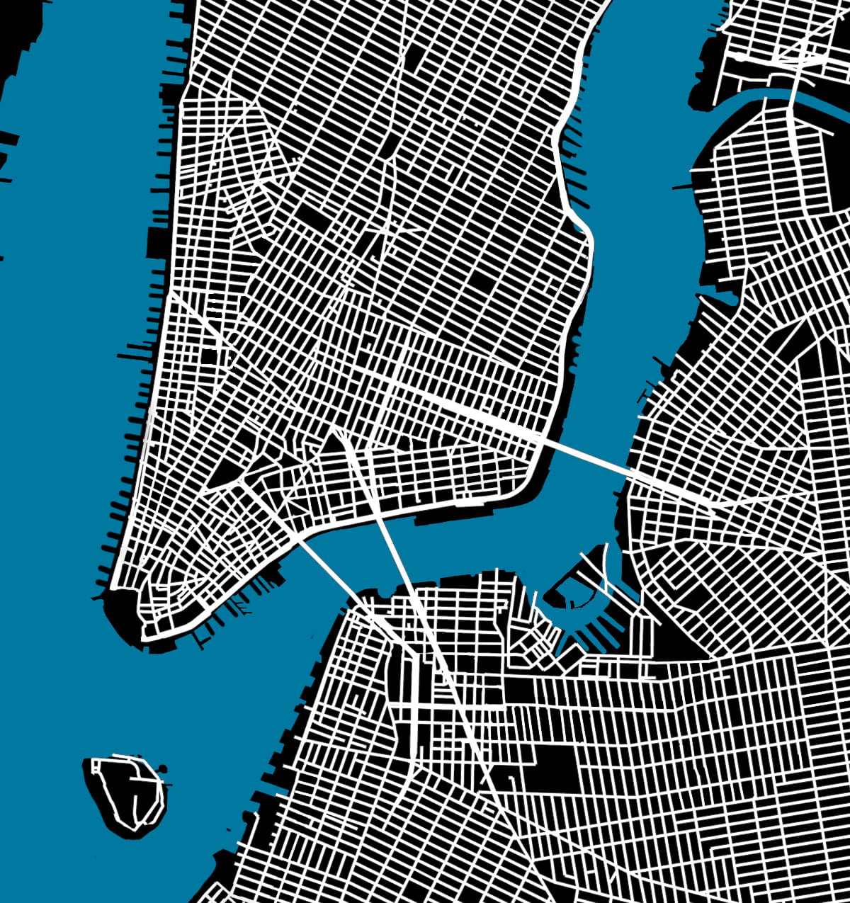
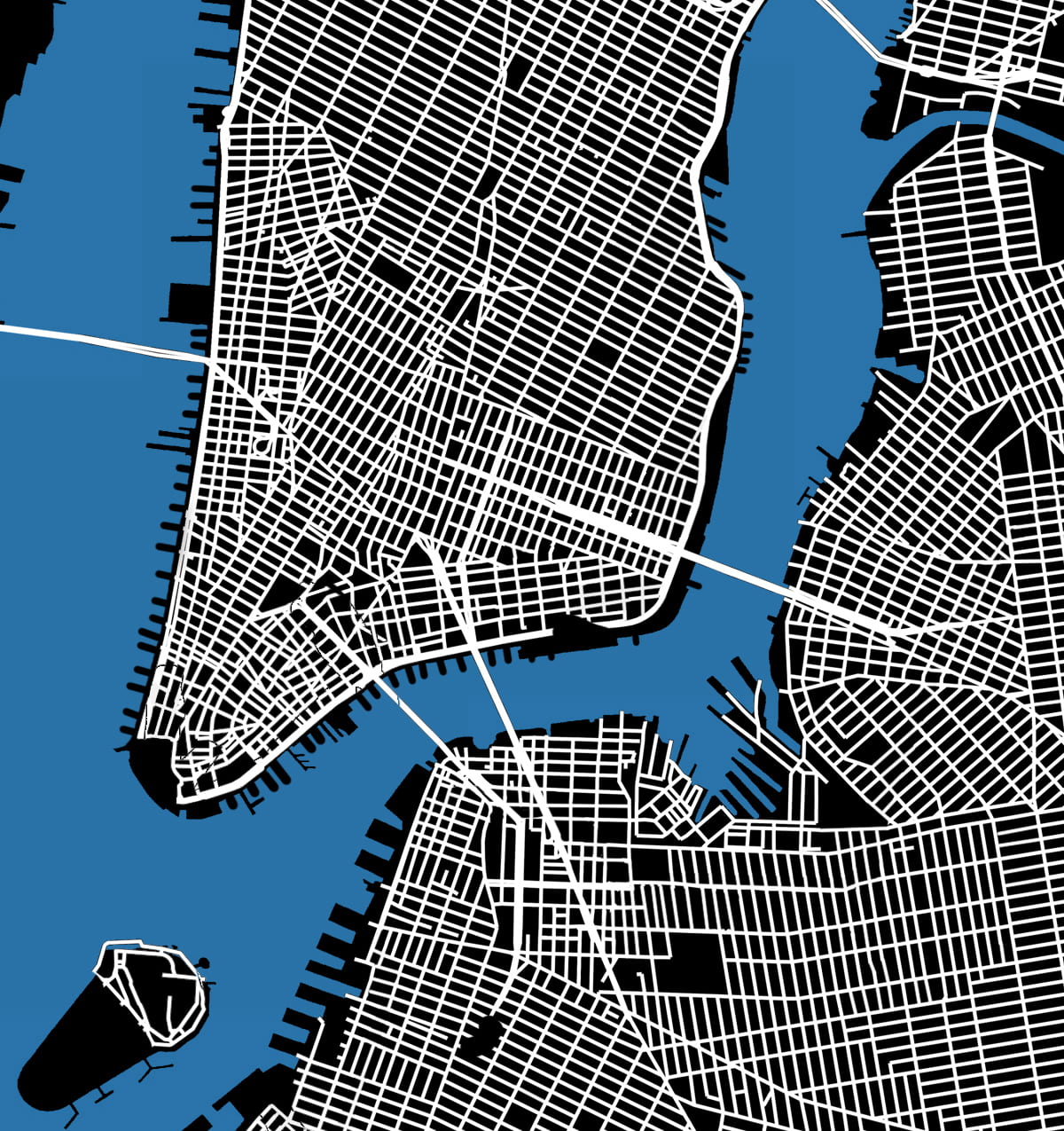
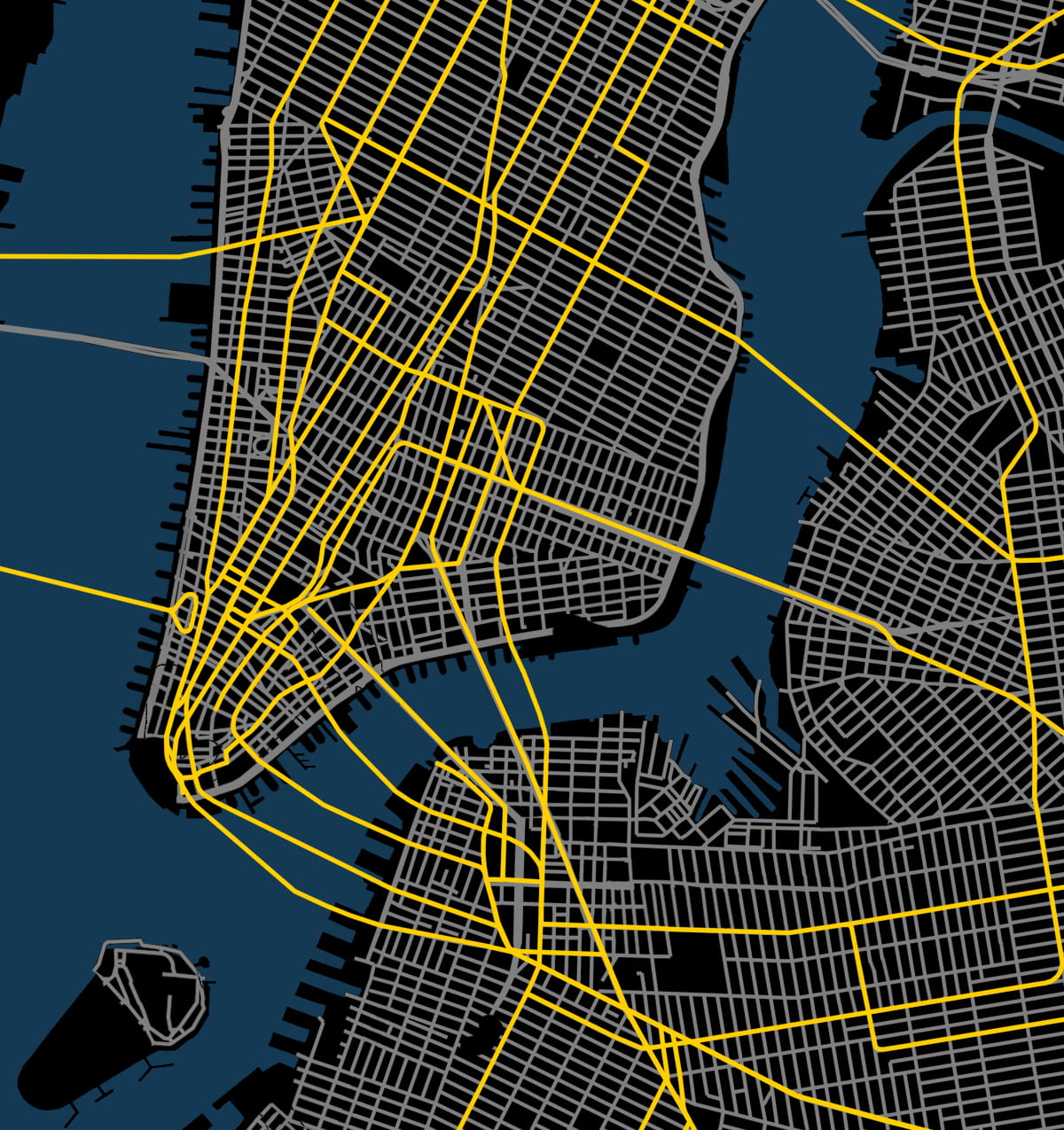
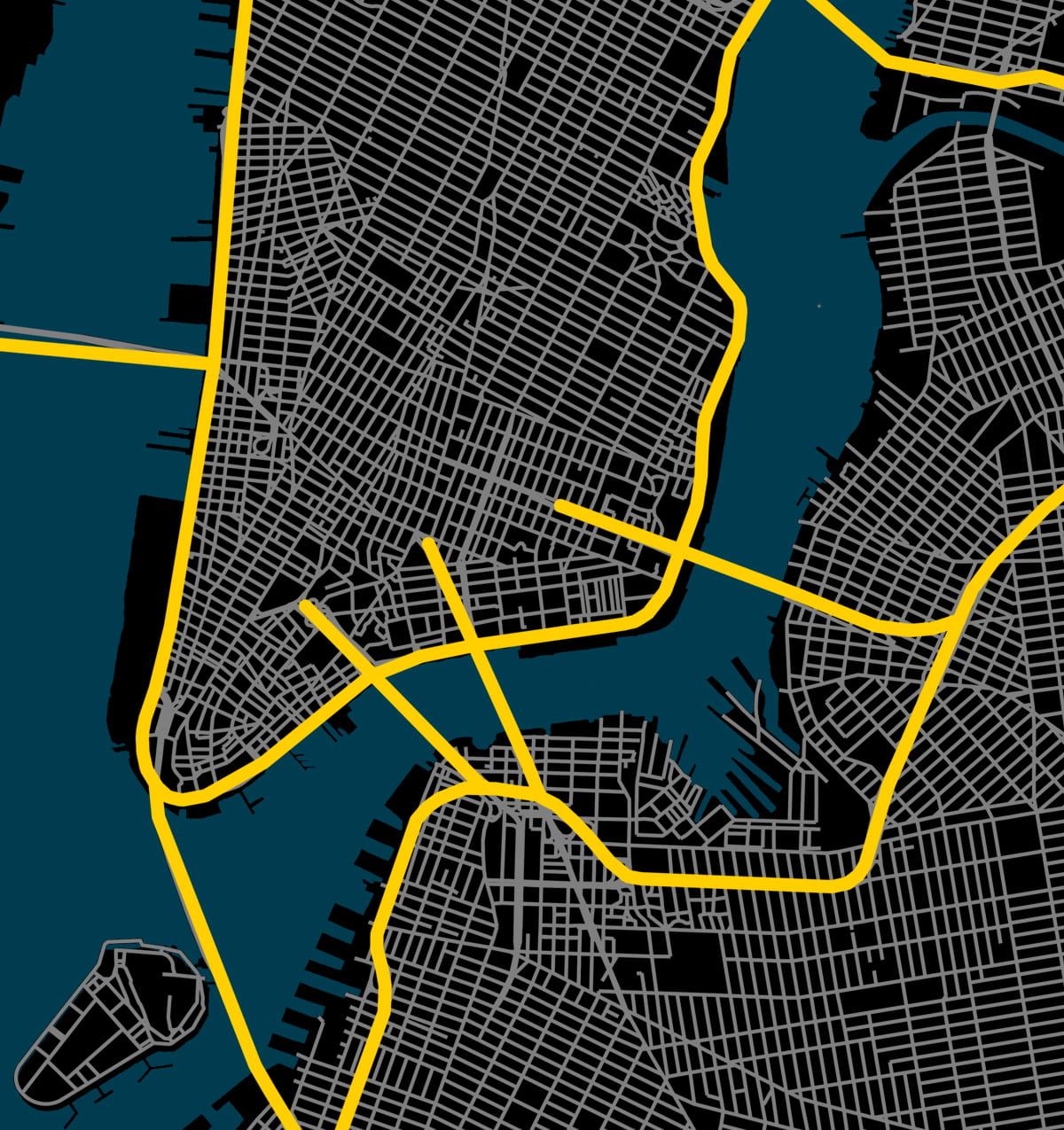
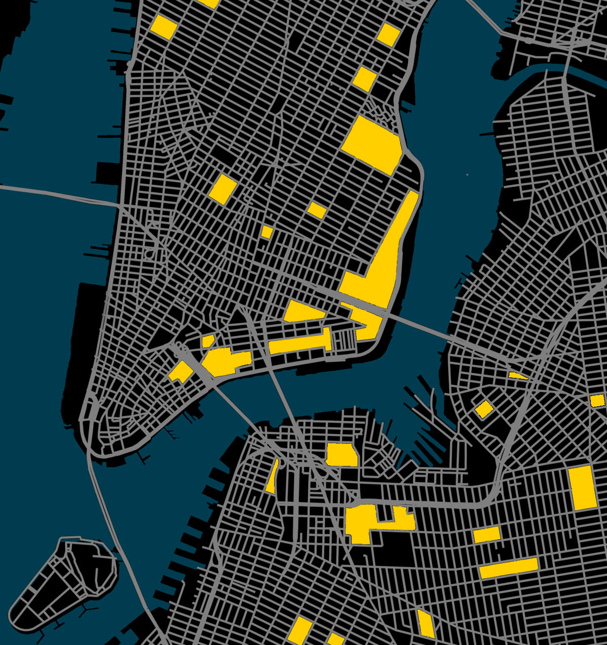
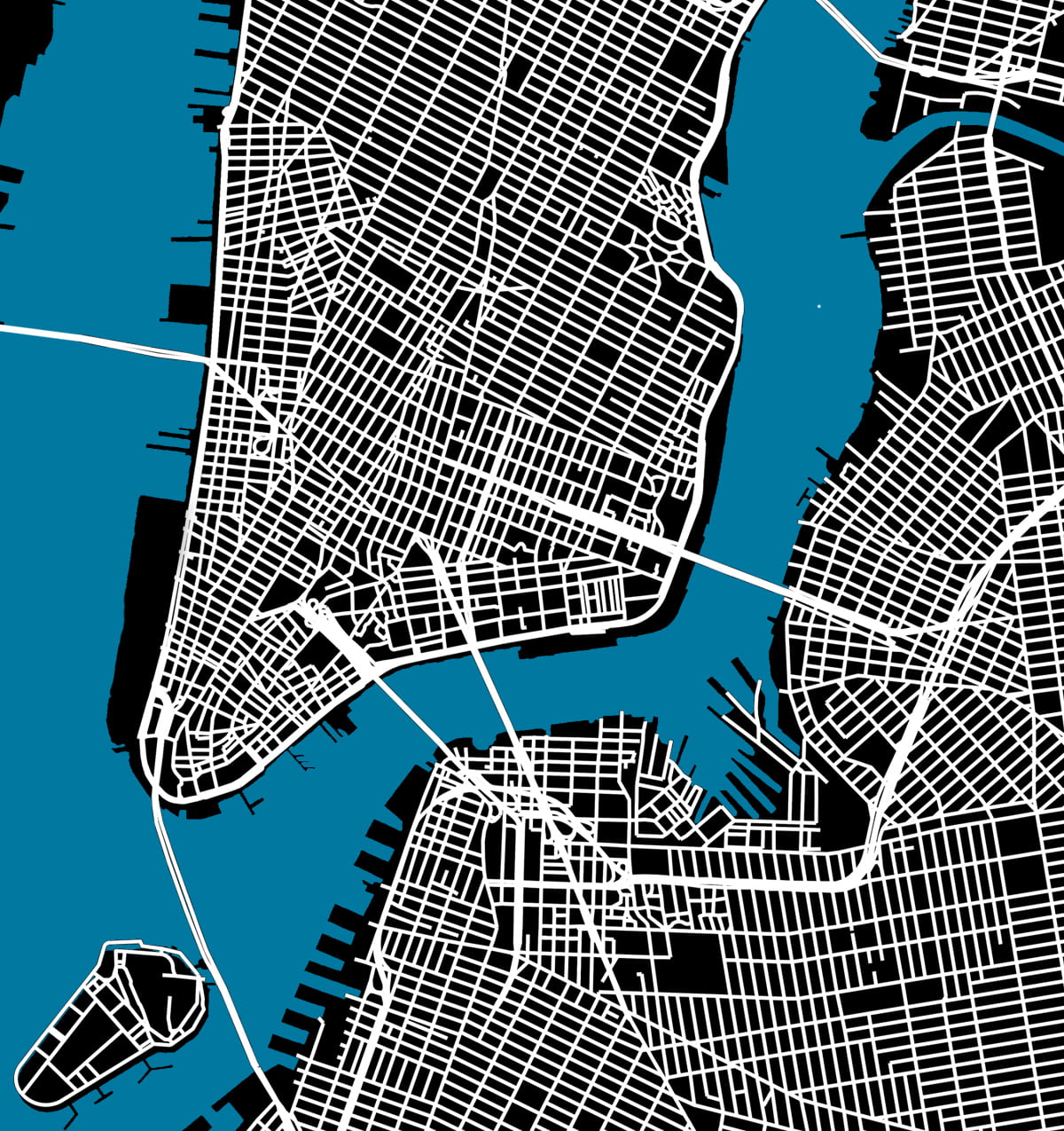
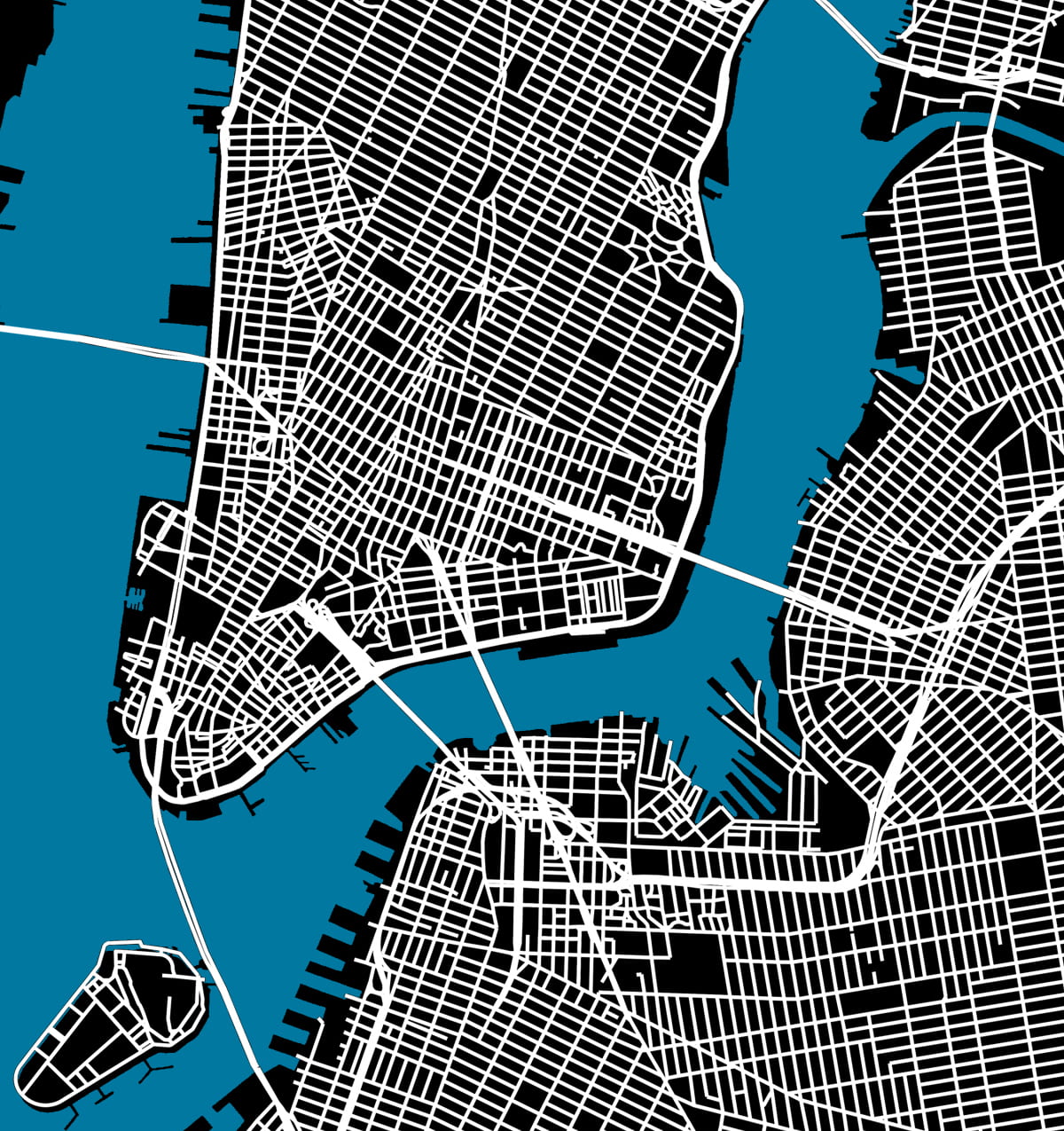
Here Grows New York visually animates the development of this city’s street grid and environment from 1609 to the present day, using geo-referenced road network data, historic maps, and geological surveys. The resulting short film presents a series of “cartographic snapshots” of the built-up environment at intervals of every 20 to 30 years in history. This process highlights the organic spurts of growth and movement that typify New York’s and most cities’ development through time. The result is an abstract representation of urbanism.
Featured in:
– Laughing Squid   March 12, 2019
Viewing NYC   March 14
– silive.com   March 14
Open Culture   April 17
– Columbia Data Science Institute   May 1
– Library of Congress Blog   May 2
– Kottke.org   May 6
NYNJ.com   May 13
– 6sqft   May 13
– UK Daily Mail   August 28
– LangweileDich.net   June 11, 2020
– Wikipedia
New Amsterdam History Center   December 1, 2020
Bunk History   July 2021
– Camden Town, 2023 textbook by Westermann Group
– Inspired by Cambridge University’s London Evolution Animation and this map of Barcelona

.

2. The Interactive Map

The results of this animation are transformed into this fully interactive map

.

3. Research Method

Several hundred maps in the digital archives of the New York Public Library and Library of Congress were analyzed to assemble this film. About 25 of these maps were then selected, downloaded, merged, stretched, and warped in a single document to align with each other. This provided a consistent scale and allowed easier comparison of differences between maps of different date. As the source files were all in different colors, scales, and designs, we created a single base map with unified graphics. The redrawing not only permits correcting errors in less accurate old maps but also provides a graphic representation that is consistent over time. This coherence allows the rate and trends in urban growth to be read more easily and compared between eras.
Click here to read the research methodology and list of maps consulted.
Or watch the video tutorial below of the workflow and software behind the animation

.

.

4. Conclusions and Analysis

This data visualization informs our analysis of the history of the New York City grid. This analysis reflects on the question: What can the built environment of Manhattan’s streets reflect about the evolving social and economic priorities of city planners and leaders? The long phases of urban growth and shifting transportation modes created distinctive road networks in Manhattan. The predominance of different forms of transport during each era also prompted changes to the location and dimensions of streets in response. Manhattan illustrates the evolution of these road networks over four centuries of near continuous growth. A plot can describe a street grid, as well as its builders’ story. This paper aims to tell this second plot, a story of urbanism.
Click here to read the conclusions as part of a working paper
written with Professor Kenneth T. Jackson.

.

.

5. Credits and Appendix

This project would not have been possible without the support, mentorship, and patience of my parents, Anne Mabry and Zemin Zemin Zhang. Nor would this project have been possible without the historical expertise of Columbia University professors Kenneth T. Jackson (History Department) and Gergely Baics (Urban Studies). Thanks is also extended to those who reviewed and critiqued this project in its early stages, including Chris Kok, Wright Kennedy, Dan Miller, and the Center for Spatial Research at Columbia’s Department of History. Most importantly, I thank my dog ChoiChoi.

.

Anyone may reuse or republish this content, so long as credit is provided with the link back to this page. If you email [email protected], I will gladly send along the graphics, maps, and source files associated.

.

The Urban Development of Newark: 1660-2016

Audio from Freesound

.

As Newark celebrates the 350th anniversary of its founding in 1666, I created this series of drawings based on historical images and maps. As Newark develops from a small town to a bustling and industrial metropolis, the sounds shift from quiet woodlands to the din of the vibrant city with rising skyscrapers. This two minute time-lapse aims to represent history as a living and fluid process.

.