• This website includes dozens of videos, hundreds of essays, and thousands of drawings created over the past twenty years. Search to learn more about the history of buildings, places, prisons, Newark, New York City, and my PhD research on spatial inequality.

  • Or scroll down for the latest publications.

Branch Brook Park Interactive History Map

As featured by the Branch Brook Park Alliance as the official park map

.

Navigate this interactive history map of Newark’s Branch Brook Park. Click on map features to learn about park amenities, recreational spaces, and historic features. Map annotations are paired with explanatory texts and comparative photos of past and present. Beneath each annotation is the Google Maps link that will display directions to that point in the park from wherever you are standing.
All historic images are from the archives of the Essex County Parks Department and Newark Public Library. Browse their digital collections or contact the agency to visit their archives. All descriptions are sourced from the Cultural Landscape Report that documented the park’s history and renovation.
Map created by Myles Zhang
Map texts by Linda Morgan, Curtis Kline, Myles Zhang, Maeher Khosla, and Jack Barron
Contemporary photos by Curtis Kline with Mouli Luo

.

Read More

.

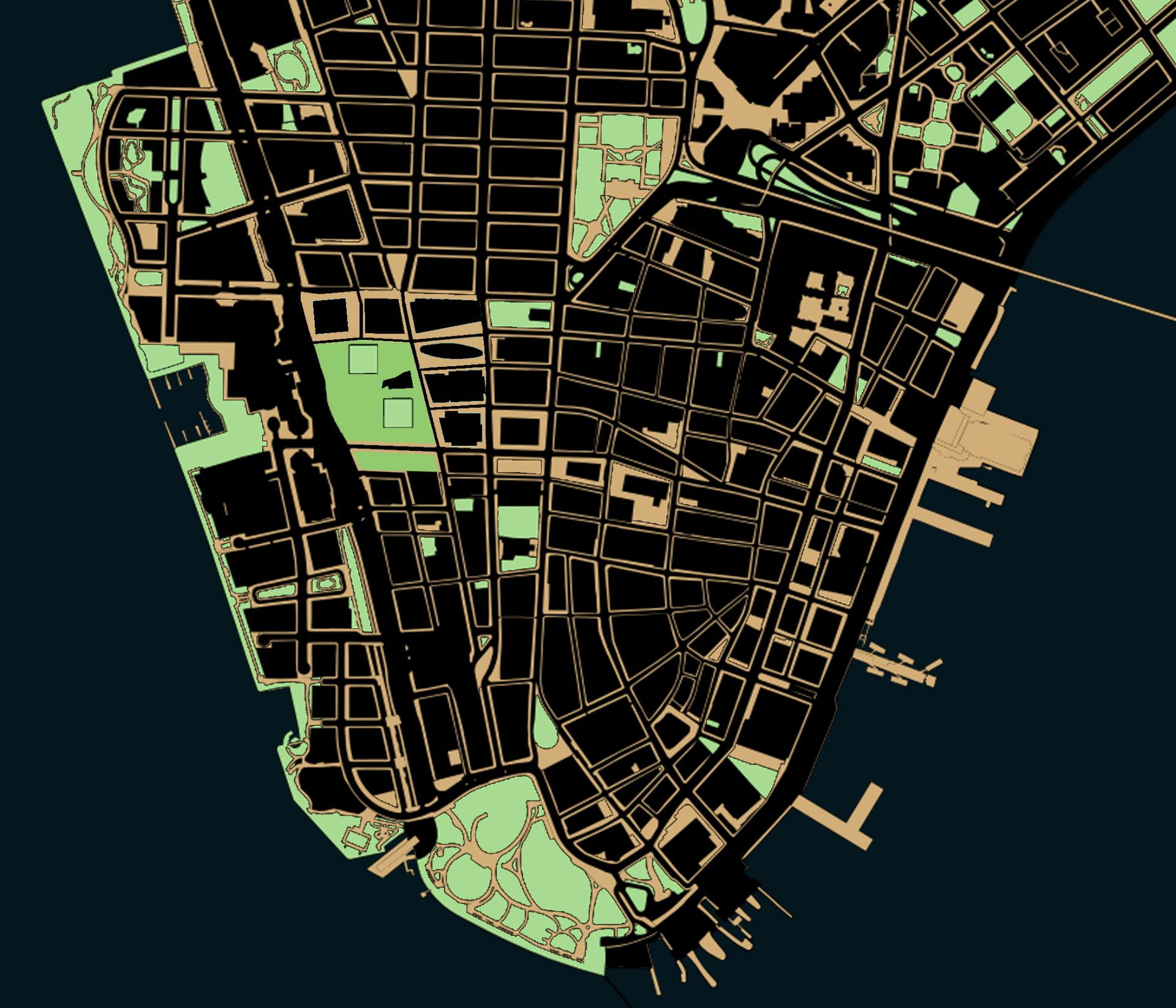
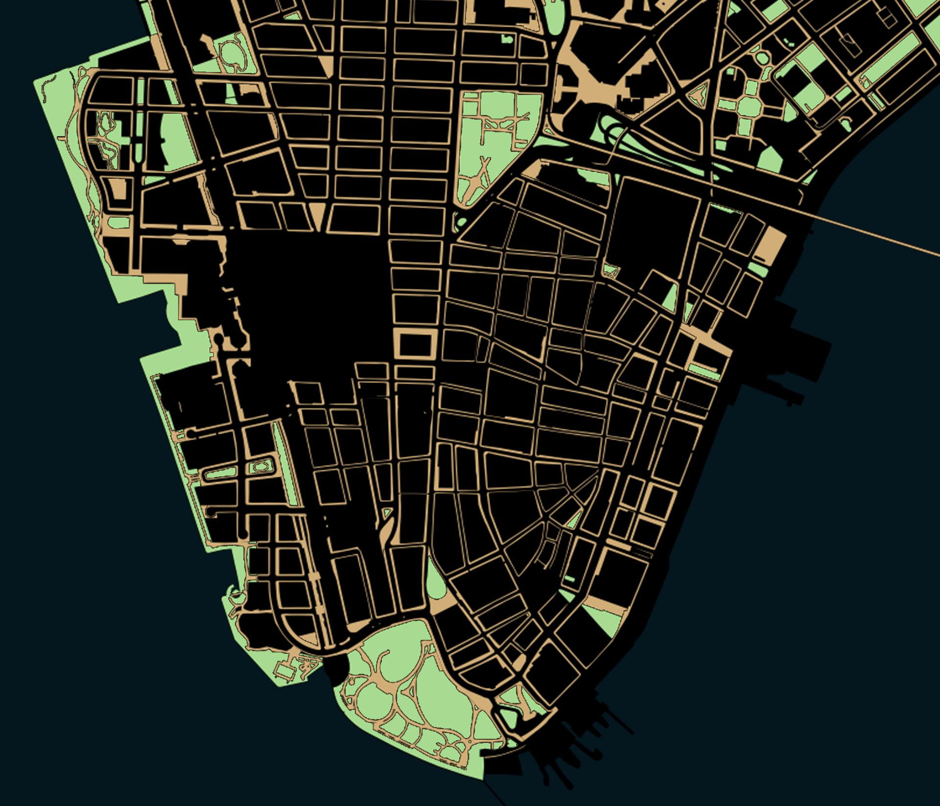
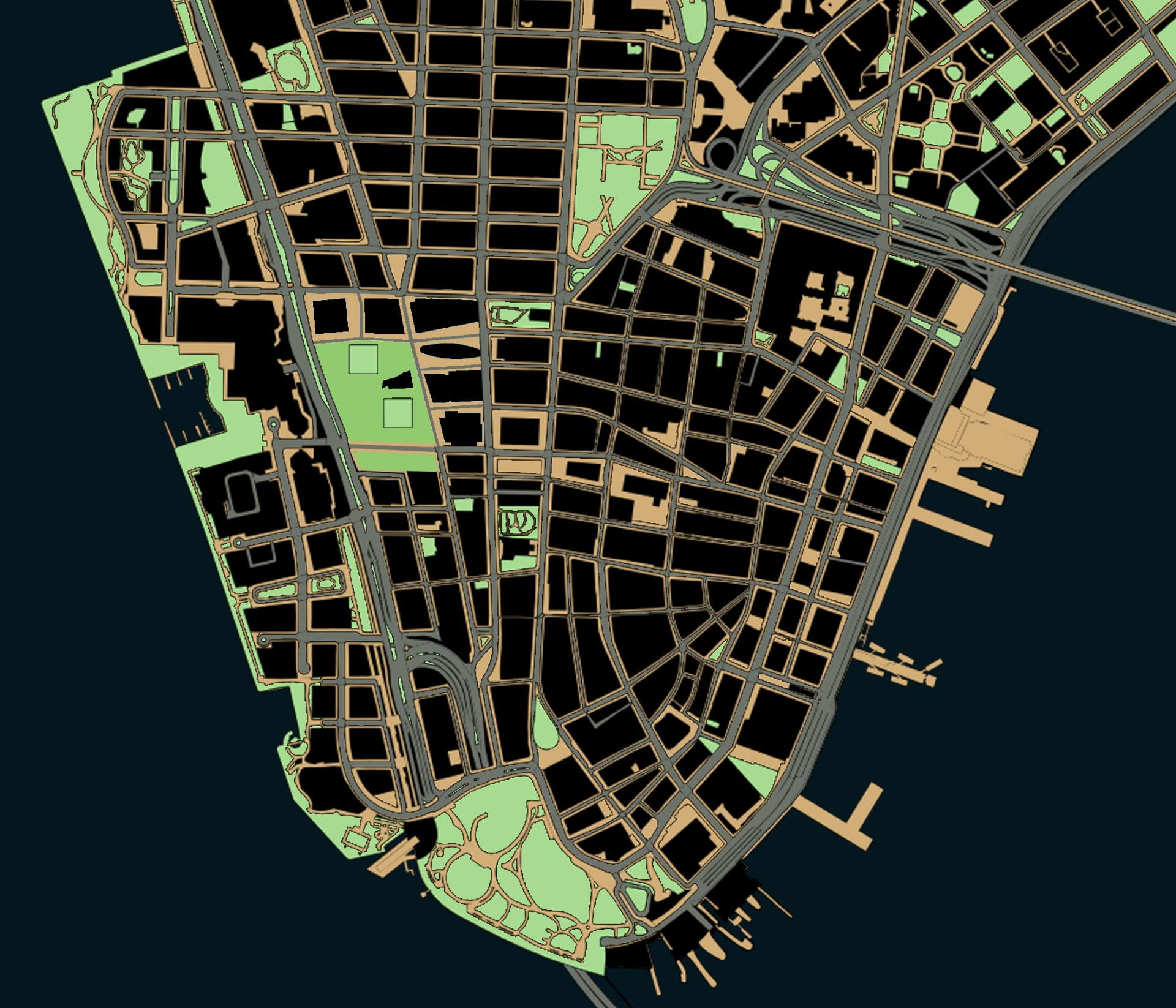
The Privatization of Public Space in Lower Manhattan

Map created by author in QGIS with planimetric data from NYC Open Data

.

More than a specific threat to New York City, the decades-long erosion of public space is an existential threat to democracy.

About 60% of Lower Manhattan’s surface area is listed as being public in some way, but only about 25% is totally unrestricted to the public in practice.*1

.

New York City – and the world’s wealthiest corporations headquartered in Lower Manhattan – had much to do with inventing and spreading new technologies that influenced the urban form. Construction companies like US Steel at 165 Broadway supplied materials for the highways that sliced through cities. Car companies like Chrysler in Midtown encouraged America’s affair with gasoline. Groups like Chase Bank at 28 Liberty Street supplied home loans for whites-only suburbs. Stores like Woolworth at 233 Broadway helped replace small businesses on main street with one-stop department stories and suburban shopping malls. Above them all, the New York Stock Exchange at 11 Wall Street supervised the twentieth-century migration of wealth and capital from American industrial cities to foreign countries with cheaper labor. These changes might have started with the “titans of industry” perched in Lower Manhattan’s skyscrapers, but highways, cars, home mortgages, shopping malls, and de-industrialization all had consequences for the rest of us. This makes Manhattan the ground zero – and in more ways than just September 11 – to understand the forces shaping the loss of public space.
Over the past century, three forces in Lower Manhattan have been chipping away at the quantity and quality of public space: the car, the corporation, and the police state. Each of these three forces effected Lower Manhattan in particular and the nation at large. Each of these three forces, prompted by changes in technology, reshaped the urban form: 1) the invention of the affordable and mass-produced car that substituted for public transit; 2) the abandonment of cities for suburbs that was enabled by the car and encouraged by corporations; and 3) the invention of surveillance technologies to collect, store, and analyze data collected from public spaces. Each of these three technologies were, in turn, weaponized against the urban form to chip away at spaces that once belonged to society at large but which now belong to a select few. Each force will be analyzed in turn – the car, the corporation, and the police state – to reflect on the impact of each on Lower Manhattan’s urban form.

.

Public spaces in theory:
~60% of Lower Manhattan’s surface area

Read More

.

  1. * Percentages are rough estimates from author, based on area south of Chambers Street with planimetric data from NYC Open Data. An exact estimate is impossible to arrive at because there is no single definition of public space.

Street Grid Development vs. Population Density

Adapted from Shlomo Angel and Patrick Lamson-Hall’s NYU Stern Urbanization Project,
here and here.

.

The animation at left shows street grid development from 1801 to 2011, mapping Manhattan’s gradual expansion north. The animation at right shows the population density over time of each census tract in Manhattan. Notice how Manhattan’s population density rises and peaks around 1900 before falling to present levels. Despite Manhattan’s appearance of being denser and more built up with skyscrapers than ever before, the island actually has a lower population density than a century ago.

.

.

Before the introduction of subways in the early twentieth century, the difficulties of commuting distances over land and water drove a denser form of urbanism than today. By 1900, the island of Manhattan had over 2.3 million residents in comparison to only 1.6 million in 2020. These people were crowded into dense blocks with upward of half a million people per square mile. The subways had not yet opened, suburban sprawl had not yet arrived, there were no rail connections under the Hudson River, and Manhattan had few or no road connections with the other boroughs and the mainland. This produced an island of remarkable density with the Lower East Side the densest place on earth, while only a few miles north, Harlem remained almost rural.
In 1903, the Williamsburg Bridge over the East River linked the Lower East Side with undeveloped Brooklyn. The trolley lines, subways, and roadway that stretched over the Williamsburg accelerated the development of Brooklyn, first in the higher density parts of Brooklyn closest to Manhattan and later to the distant parts of Brooklyn and Queens with suburban population densities. Suburban growth started earlier than the 1950s image of Levittown, and with the movement of people outwards from Manhattan, the centers of immigrant cultural life shifted, too. In every following year, the Lower East Side lost people, arriving at a density in 2020 only a sixth of what it was in 1900.
Over the following decades, improvements in public transportation and the introduction of the car “smoothed” out the population density. At the same time, Manhattan’s street network expanded to cover the whole of the island from end to end. As the subways made commuting easier, people no longer need to live within walking distance of where they worked. As a result, many industries remained in Manhattan while their workers moved to other boroughs, and later still to the more distant suburbs. As a result, the population densities of Manhattan today are more consistent from one end of the island to the other. Unlike in 1900, Harlem today is about as dense of the Lower East Side because transportation has made one part of the island almost as accessible to work as any other part of the island.
This animation illustrates Manhattan specifically, but Manhattan’s growth and population densities were influenced by larger population and technology changes in the New York region.

The Detroit Evolution Animation

Created in gratitude to the University of Michigan’s PhD program in architecture
Related: The New York City Evolution Animation

.

Soundtrack: “Pruitt Igoe” from Koyaanisqatsi, directed by Godfrey Reggio and composed by Philip Glass.

.

This film traces Detroit’s evolution from its origins as a French trading post in the 1700s, to its explosion as a metropolis, followed by its precipitous decline as a symbol of America’s post-industrial urban landscape. The film weaves in details about the city’s politics, population, and technology – all of which influenced the city’s geography and built environment. At each phase in urban history, the built environment grew and was modified in direct response to political events like racial segregation, population changes like the Great Migration, technology developments like the mass-produced car, and government interventions like urban renewal.
The animation tells the story of Detroit specifically and the story of American cities more broadly. To varying degrees, the path of Detroit’s development mirrors hundreds of other smaller cities and towns scattered across the American Northeast and Midwest. No other American city witnessed as large a population loss, as dramatic 1960s racial unrest, or as radical a transformation from symbol of progress into symbol of decay. To a lesser degree, other places in America followed Detroit in lockstep. Urban renewal projects, highway construction, racial tensions, suburban growth, and infrastructure under-investment happened across America, and in parallel to Detroit.
However, the most dramatic transformation of Detroit is left unwritten in this film. Beneath the surface-level events of political conflict and urban change, the largest event in Detroit is not unique to Detroit. As filmmaker Godfrey Reggio describes, the most important theme in the history of civilization is “the transiting from all nature, or the natural environment as our hosts of life for human habitation, into a technological milieu into mass technology as the environment of life.” European cities developed slowly and gradually over centuries, in the process removing all memory of the natural landscape before civilization. American cities are unique in their youth and speed of growth. They are new enough that an active memory survives through place names and written records of the landscape and indigenous peoples who lived there before colonization. As the oldest colonial settlement west of the Appalachians, and as the city that perfected the mass-produced automobile, Detroit becomes the prime symbol of man’s transformation of his home from a natural world into a technological society removed from nature.

View map bibliography and project methodology

Includes links to download all source files on which the film is based

.

The accompanying music is by composer Philip Glass and was written for Godfrey Reggio’s 1982 experimental documentary Koyaanisqatsi. The shifting layers and repetitive phrases of Glass’ music accompany Reggio’s montages of natural landscapes, factory assembly lines, and chaotic city streets. Koyaanisqatsi means “life out of balance” in the language of an indigenous American tribe called the Hopi. In the original documentary, Glass’ music was paired with scenes of desolate streets in the South Bronx, the abandoned Pruitt-Igoe public housing in St. Louis, and ruined skyscrapers falling in slow motion. In my reinterpretation of Glass’ music, the imagery is now of Detroit in maps. The pace and events in the animation are tied to the structure of the music. As the volume and speed of the music increase and decrease, so too does the growth and decline of Detroit.

View music in original context

Pruit Igoe from Koyaanisqatsi; composed by Philip Glass with images by Godfrey Reggio

.

Population Changes to Detroit Over Time

Hover over infographic for details of each census year.

.

The influx of Black people during the Great Migration and the outflow of cars from Detroit’s factories reshaped the city’s built environment and the American public’s perception of Detroit. Detroit is now thought of as a majority-Black city surrounded by majority-White suburbs. Today, 83% of Detroit’s population is Black, and only 11% is White. But the graph above shows that Detroit was majority-White until the 1980 census. For most of its history, Detroit was 95 to 99% White. Today, the majority of the metro region’s population lives in the suburbs that surround Detroit. But until the 1960 census, the majority of the population lived within the city limits. Today, Detroit is so reliant on the car that it has no commuter rail network, no subways, and limited public transportation options. But until the 1950s demolition of Detroit’s light rail network, a majority of residents lived within walking distance of a light rail station for commuting. Detroit’s demographics, suburban sprawl, and transportation options have all flipped in the past century. From a high-density, transportation rich, and majority-White city in 1920, Detroit has become a low-density, transportation poor, and majority-Black city in 2020.
A lot of people say Detroit has terrible public transit design. But from the perspective of car companies, the real estate lobby, and fearful Whites, the system does exactly what it was intended to do: to segregate and divide our country by covert means long after Jim Crow officially “ended.” Failure by design. The failure of Detroit is, in large part, planned and a consequence of government policy decisions that: prioritize suburban growth over urban development; benefit suburban Whites over urban Blacks; and encourage private cars at the expense of public transit.
As the Detroit Evolution Animation plays, the map key on the lower right hand corner indicates Detroit’s demographics at each decade in history. Try to link changes to demographics with changes to the urban form. Ask yourself the questions: How were technology, transportation, and demographic changes imprinted on the built environment? How does the built environment, in turn, shape urban and suburban life?

.

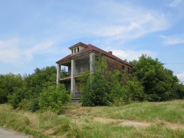
Decaying home near Detroit’s abandoned Packard Automotive Plant

A Drop of Water

Walking along Newark’s Pequannock Aqueduct from source, to tap, to sewer

.

The general public views rural, suburban, urban, and industrial areas as being separate with different land uses, populations, and landscapes. The rural reaches and forests of northwestern New Jersey exist outside the imagination of Newark residents, as if these green mountain lakes with WASPy names have nothing to do with their lived urban experiences in the concrete and asphalt jungle. For the suburban and rural residents of West Milford, Ringwood, Wanaque, Bloomingdale, Kinnelon, Rockaway, Jefferson, Hardyston, and Vernon where Newark’s water supply originates, the experiences and troubles of Newark seem similarly distant, as if the quality of their forest oasis has nothing to do with the health outcomes of Newark residents. However, Newark’s century-old system supplies a half million people with clean water and invisibly knits together the fates of diverse communities along its buried path.

.

Handmade drawing of Newark’s Pequannock water supply system, dated December 1892
The red line traces the path of the aqueduct from start at the Macopin Intake to end at South Orange Avenue. Green is the area of the watershed. The red graph beneath charts the relative height of the aqueduct above sea level at each point in the route. The aqueduct does not flow in a continuous downhill slope. Rather it hugs the ground just below the surface.

.

Map of Newark water supply system in 1946, showing the Pequannock system opened 1892 (lower left) and Wanaque system opened 1930 (upper left). View full size map from Newark Public Library website.

.

Over winter 2021, I documented the route of the Newark aqueduct from its origins in West Milford Township to its terminus in Newark Bay. I trace the path of Newark’s 26-mile-long aqueduct and 63-square-mile Pequannock Watershed and 94-square-mile Wanaque Watershed on the interactive map below.

.

Click on water features to display details of name, dimensions, or volume.

■   Watersheds
■   Reservoirs (7 total)
~~ Aqueducts (~55 miles total)

■   Towns supplied with Newark water (~10)
■   Towns relying on Newark sewers (48)
~~ Main sewer interceptor (~ 28 miles total)
      Along path of Passaic River from Paterson to New York Harbor via Newark

Read More

.

Homesteads to Homelots

The history of New Jersey suburbs as told through five data visualizations

.

View of the city from the suburbs, author’s panoramic drawing of suburbs with urban skyline in the distance

.

“The state of New Jersey offers an ideal setting in which to analyze the distinctive residential landscape of mass suburbia. [….] In time, 70 percent of the state’s total land area would qualify as suburban, so that by the turn of the twenty-first century New Jersey and Connecticut shared the distinction of being the nation’s most suburbanized states.”

.

– Lizabeth Cohen, “Residence: Inequality in Mass Suburbia” in A Consumer’s Republic, p. 197.

.

Northern New Jersey has long been central to the history of America’s suburban growth. From America’s oldest suburban developments to its most homogeneous to its most diverse, New Jersey’s 565 municipalities span the full portfolio of suburban living arrangements. New Jersey is unique in the sheer number of municipalities, each with its own elected leaders, school district, police, fire, and land use policies. As a result of inefficient and often duplicate public services in competing suburbs, New Jersey has some of the highest property taxes and cost of living in the country. This problem is not unique to New Jersey; it affects the country at large in dozens of other places. So the story of New Jersey makes for a powerful and revealing case study of larger trends in American suburban history.
This analysis examines New Jersey census data from 1940 to 2010. It is not the end point or a full analysis. Instead, each of these data visualizations plots a direction for future research. Telling history through maps and data reveals the history of a larger region and country, in ways that granular analysis of individual places cannot.

.

Method

With data from the US Census Bureau, I extracted details on the population of every New Jersey municipality from 1940 to 2010, the period of greatest suburban growth. With spatial data on municipal boundaries from the NJ Office of GIS, I plotted the census data onto the map of municipal boundaries. This allowed me to see spatial patterns and to produce heat maps of population change over time. The spatial data also revealed the surface area of each municipality, which allowed me to calculate the historical population density of each municipality as a function of municipal population divided by municipal surface area. You can browse all the data visualizations or download the open source data here from Tableau. These data visualizations represent analysis of about 13,560 data points for 565 municipalities over eight censuses.

Read More

.

Book Review of “Saving America’s Cities”

Lizabeth Cohen. Saving America’s Cities: Ed Logue and the Struggle to Renew Urban America in the Suburban Age.
New York: Farrar, Straus and Giroux, 2019. 547 pp.

.
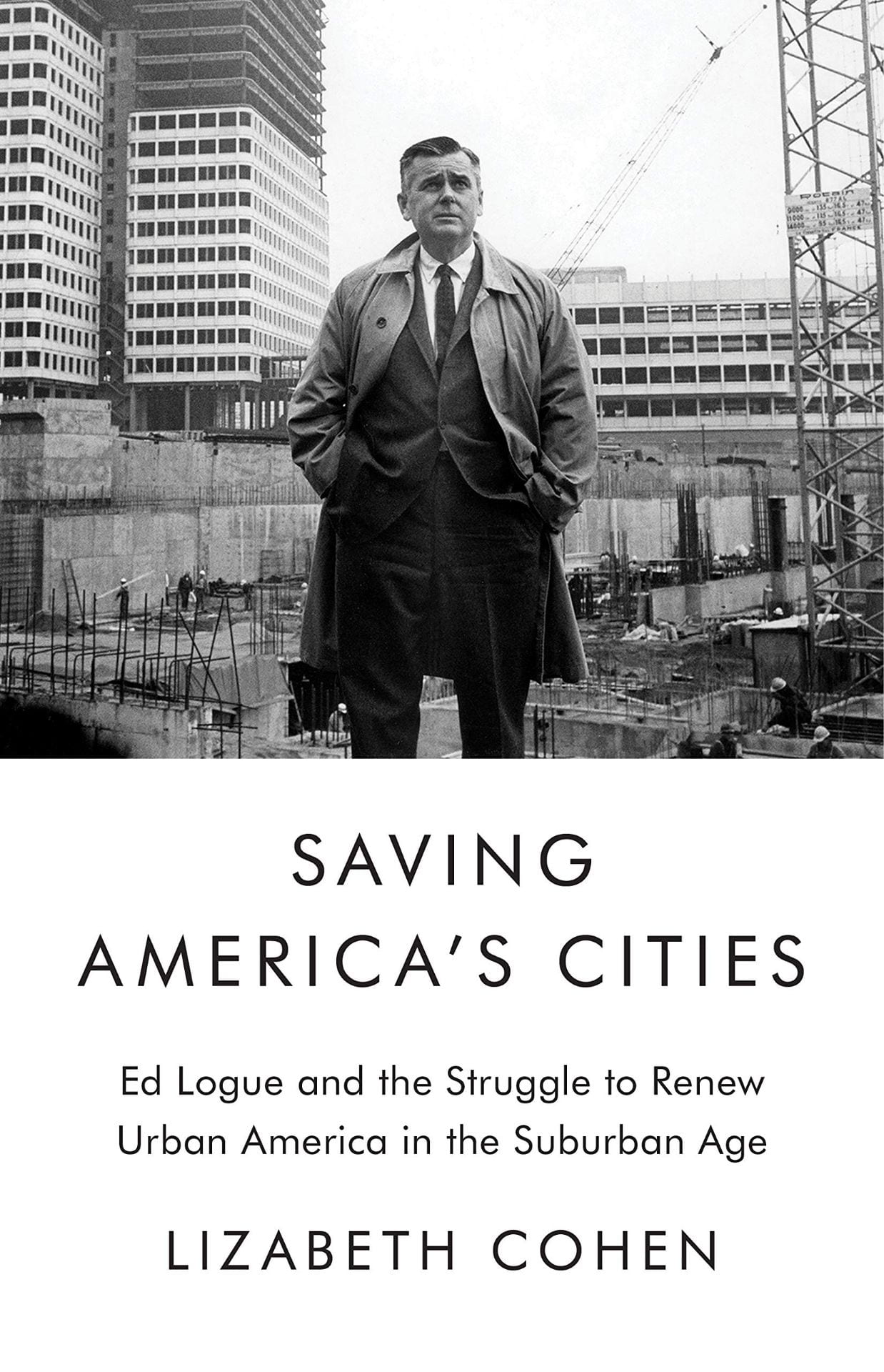
The memory of mid-century urban renewal will always evoke images of the bleak brick towers and windswept plazas of crime-ridden public housing. Urban renewal projects airdropped into the city fabric caused demolition and dislocation. This colossal failure has been epitomized by Robert Moses’ automobile-oriented vision of New York City. The Power Broker by Robert Caro described Moses stubbornly going alone to remove 1,500 families and pave the Cross Bronx Expressway through their vibrant neighborhood.[1] By contrast, in The Death and Life of Great American Cities, Jane Jacobs vividly described a sentimental city life with lively streets of safe neighborhoods. Pedestrians stroll along short city blocks while residents watch from brownstone stoops in her quaint Greenwich Village alleys.[2] The two polarized visions of activist Jacobs vs. authoritarian Moses have set the terms of the debate on city design and, by extension, about the government’s role in structuring urban life. Lizabeth Cohen, a Harvard historian of twentieth-century America, critiques the current dichotomy: “The lack of subtlety that I have lamented in current historical understanding of postwar American urbanism stems partly from its frequent framing as a monumental battle between the clashing visions of the villainous Robert Moses and the saintly Jane Jacobs.”[3] Between these two schools of thought, Cohen introduced the largely forgotten “Master Builder” Ed Logue to dispel misconceptions about urban renewal.
Logue serves a curious alternative to the polarity between Jacobs and Moses. Despite her biographical focus, Cohen does not lionize Logue’s dedication, but recounts his lifetime of successes, false starts, and imperfections. Logue came from a Philadelphia working-class family with an Irish Catholic background. Serving as a bombardier during WWII, he first experienced a top-down city vision from the air above Berlin and Dresden. Trained at Yale with a full scholarship, Logue was committed to the New Deal idealism of government serving the public good. His life, however, demonstrated how even the best of planners could not get the ill-conceived legal framework behind urban renewal to work most of the time. One reviewer of Cohen’s book asks in Architect Magazine: “How could such a clear-eyed, honest, and progressive guy, talented at getting lots of money from the federal government, oversee so many disastrous projects?”[4]
Through New Haven, Boston, and New York City, Cohen traces Logue’s city planning career of working against far larger anti-urban political and social forces. During his time in New Haven (1954-60), Logue planned to rescue the falling city by bringing suburban shoppers downtown. He built the Oak Street Connector for shoppers’ automobiles. This highway stub severed the urban fabric with an asphalt band of parking lots and uprooted a largely low-income Black community. However, Logue’s Chapel Square Mall in downtown New Haven, with indoor shopping and garage parking, never brought in enough enthusiastic suburbanites to survive against competing forces of anti-urban decentralization. What Logue called a “pluralist democracy” in New Haven planning actually relied more on experts’ work than on input from affected citizens.
Touting his approach of “planning with people,” Logue worked in Boston (1961-67) to break the city’s thirty-year economic stagnation. Unlike in New Haven, Logue created a “negotiated cityscape” of old and new in Boston and preserved some of the oldest architecture, such as Quincy Market. However, his ambitious Brutalist inverted ziggurat of the Government Center, next to a desolate brick-paved plaza, evoked an oppressive aura. His successful housing projects, particularly in the African-American Roxbury neighborhood, defied James Baldwin’s characterization that “Urban Renewal means negro removal.”[5]
Logue’s next career move (1968-75) landed him in New York City to lead the Urban Development Corporation (UDC) for 33,000 residential units, including thousands of affordable housing. After the “long, hot summer of 1967” with riots in 159 cities, President Nixon formulated his “suburban strategy,”[6] by appealing to suburban Whites’ fears of the inner city and Black insurrection. In a hostile climate, Logue encountered his political match from suburban residents. The wealthy Westchester towns vehemently opposed Logue’s attempt to place middle income and affordable housing in their backyard. The downward spiral of urban America became unstoppable. Neither urban renewal, nor affordable housing, nor highway construction could restrain the core middle urban tax base from driving away to the alluring American dream of “little boxes on the hillside,”[7] with “a chicken in every pot and a car in every garage.”[8]
Ousted from UDC, Logue settled for the final stage of his career (1978-85) at the South Bronx Development Organization. To revive the South Bronx with affordable housing, Logue no longer turned to demolition, as the urban fabric had already been devastated by arson, blight, and White flight. Logue recognized that the government had ceased investing in shopping malls, city halls, or intensely designed architecture. Instead, as if admitting the defeat of high-density urban development, Logue worked with residents to rebuild formerly urban Charlotte Street along suburban models of prefab homes with white picket fences. In a thriving nation of suburbs, the suburb had now come to the city.
Logue’s career capstone in the South Bronx was not polished architecture that he preferred, but the development that people desired. Community participations brought all stakeholders to the table, as Logue increasingly practiced. Over time, he realized that the top-down approach taken by urban redevelopment experts had serious limitations. People in the affected neighborhoods deserved to realize their vision of urban communities diversified with respect to income, race, and age. Their voices were the best insurance for equitable services for schools, transportation, retail stores, and affordable housing.
As Cohen asserts, Logue and urban renewal defy fast judgments. Across each decade, and in each of those three cities, Logue’s urban renewal had shifting goalposts, developed at various scales, and involved different levels of community participation. To attribute the flaws of urban renewal to arrogant individuals or to austere designs for “towers in the park” is to ignore the larger picture. As Logue’s battle for affordable housing in suburban Westchester revealed, the problem rests less with urban renewal itself and more with the nation’s social, economic, and political agenda against cities.
Throughout his career, Logue’s honorable goals proved impossible. With the Cold War fever in the ‘50s, the erosion of social tenets in the ‘60s, and post-Watergate suspicions against authority in the ‘70s, American public ceased to believe government had a mandate to bring about a just and equitable society. In his 1981 inauguration address, President Reagan expressed the core of the conservative belief: “In this present crisis, government is not the solution to our problem; government is the problem.”[9] During his final years, Logue watched helplessly as America increasingly turned to private investments for deteriorating infrastructure, eroding affordable housing, and shrinking essential services. Contemporary cities are defined by accumulated wealth, racial disparity, and privileged consumption. Even with Section 8 vouchers and “inclusionary” zoning, affordable housing is largely unavailable to diverse communities.[10]
The intriguing story of Logue’s life suggests that the fate of cities cannot be left solely to top-down developers or government bureaucrats or market forces. A process of negotiation is needed in order to bring all interests to the table. A spirit of experimentation defies an authoritarian way to remake cities. Paradoxically, to respond to a national emergency, Logue, a lifelong New Dealer, believed that the federal government’s pivotal role is essential for successful negotiations and experimentations. This would be the legacy of urban renewal, as Cohen concludes, that “the master builder” would want us to honor.

.

Endnotes

[1] Robert Caro, Robert Moses and the Fall of New York (New York: 1974).

[2] Jane Jacobs, The Death and Life of Great American Cities (New York: 1961).

[3] Lizabeth Cohen, “Saving America’s Cities: Re-evaluating the complex history of urban renewal,” Public Seminar, October 1, 2019. https://publicseminar.org/essays/public-seminar-excerpt-and-interview-lizabeth-cohen/

[4] Elizabeth Greenspan, “Ed Logue and the Unexpected Lessons of Urban Renewal: A biography of the forgotten ‘master rebuilder’ challenges established truths about city planning,” Architect Magazine, January 29, 2020. https://www.architectmagazine.com/design/ed-logue-and-the-unexpected-lessons-of-urban-renewal_o

[5] James Baldwin interview with Kenneth Clark, 1963. https://www.youtube.com/watch?v=T8Abhj17kYU

[6] Matthew D. Lassiter, The Silent Majority: Suburban Politics in the Sunbelt South (Princeton: 2006).

[7] From the song “Little Boxes” written by Malvina Reynolds in 1962, sung by Pete Seeger in 1963

[8] From Herbert Hoover’s 1928 presidential campaign slogan

[9] “Ronald Reagan Quotes and Speeches,” Ronald Reagan Institute. https://www.reaganfoundation.org/ronald-reagan/reagan-quotes-speeches/inaugural-address-2/

[10] Kenneth Jackson and Lizabeth Cohen, “Urban Renewal in the Suburban Age: The Struggle to Redefine the American City,” Brooklyn Public Library: Center for Brooklyn History, October 23, 2019. https://www.brooklynhistory.org/events/urban-renewal-in-the-suburban-age-the-struggle-to-redefine-the-american-city/

The time-lapse history of Manhattan in two minutes

.

This two minute time-lapse reconstructs the 400 year evolution of Lower Manhattan’s skyline. Watch as the city evolves from a small village into a glistening metropolis.
This is also a film about the history of technology. Changing methods of representing urban space influence our perception of time and the city. When New York City was founded, Dutch settlers captured their town’s appearance through seventeenth-century drawings and paintings. As the city grew, people started using printing presses to reproduce images of the city in the eighteenth and nineteenth centuries. In the twentieth century, photographers started capturing their city from above through aerial photos. For the first time, New Yorkers could view the entire city in a single panoramic photo.
In tribute to this long artistic tradition, this film constructs the city as each generation of New Yorkers would have represented it: through the subsequent technologies of drawing, printing, photography, and film.
.
New York City: Past and Present, 1870 and 2017

.

Sound effects from Freesound
Water and cloud effects from YouTube

The Berlin Evolution Animation

Abstract: The Berlin Evolution Animation visualizes the development of this city’s street network and infrastructure from 1415 to the present-day, using an overlay of historic maps. The resulting short film presents a series of 17 “cartographic snapshots” of the urban area at intervals of every 30-40 years. This process highlights Berlin’s urban development over 600 years, the rapid explosion of industry and population in the nineteenth-century, followed by the destruction and violence of two world wars and then the Cold War on Berlin’s urban fabric.

.

.

.

Animation der Wandlung Berlins

Zusammenfassung: Auf der Grundlage von historischen Karten visualisiert die „Animation der Wandelung Berlins“ die Entwicklung des Straßennetzwerks und der Infrastruktur Berlins von 1415 bis heute. In diesem kurzen Video wird eine Serie von 17 „kartographischen Momentaufnahmen“ der Stadt in einem Intervall von 30 – 40 Jahren präsentiert. Dadurch wird die Entwicklung der Stadt Berlin über 600 Jahre, das rapide Wachstum der Industrie und Bevölkerung im 19. Jahrhundert, die Zerstörung und Gewalt der zwei Weltkriege und abschließend des Kalten Krieges auf Berlins Stadtbild verdeutlicht.

German translations by Richard Zhou and Carl von Hardenberg

.

Year, Event and Estimated Population
1415 – Medieval Berlin – 7,000
1648 – Thirty Years War – 6,000
1688 – Berlin Fortress – 19,000
1720 – Rise of Prussian Empire – 65,000
1740 – War with Austria – 90,000
1786 – Age of Enlightenment – 147,000
1806 – Napoleonic Wars – 155,000
1840 – Industrial Revolution – 329,000
1875 – German Empire – 967,000
1920 – Greater Berlin – 3,879,000
1932 – Rise of Fascism – 4,274,000
1945 – Extent of Bomb Damage – 2,807,000
1950 – Germania – World Capital
1953 – Recovery from War – 3,367,000
1961 – Berlin Wall – 3,253,000
1988 – A City Divided – 3,353,000
Contemporary – A City United
Census year
Jahr, Ereignis und geschätzte Anzahl von Bewohnern
1415 – Berlin im Mittelalter – 7,000
1648 – Der Dreißigjährige Krieg – 6.000
1688 – Die Festung Berlin – 19.000
1720 – Der Aufstieg des Königreichs Preußen – 65,000
1740 – Der Österreichische Erbfolgekrieg – 90.000
1786 – Das Zeitalter der Aufklärung – 147.000
1806 – Die Koalitionskriege – 155.000
1840 – Die industrielle Revolution – 329.000
1875 – Das Deutsche Kaiserreich – 967.000
1920 – Groß-Berlin – 3.879.000
1932 – Der Aufstieg des Faschismus – 4.274.000
1945 – Die Spuren des 2. Weltkrieges – 2.807.000
1950 – Germania – Welthauptstadt
1953 – Deutsches Wirtschaftswunder – 3.367.000
1961 – Die Berliner Mauer – 3.253.000
1988 – Eine geteilte Stadt – 3.353.000
Heute – Eine wiedervereinte Stadt
Jahr der Volkszählung

.

Methodology and Sources

I chose not to represent urban development before 1415 for three reasons: Firstly, there are too few accurate maps of the city before this time. Secondly, I needed to find accurate maps that had visual style consistent with later years, to enable easier comparison of development over time. Thirdly, the extent of urban development and population is limited (fewer than 10,000 Berliners).
There are numerous maps showing Berlin’s urban growth. Yet, few of them are drawn to the same scale, orientation and color palette. This makes it more difficult to observe changes to the city form over time. Fortunately, three map resources show this development with consistent style.
  1. The Historischer Atlas von Berlin (by Johann Marius Friedrich Schmidt) published 1835 represents Berlin in the selected years of: 1415, 1648, 1688, 1720, 1740, 1786. This atlas is available, free to view and download, at this link.
  2. After the year 1786, I rely on three books from cartographer Gerd Gauglitz:
    Berlin – Geschichte des Stadtgebietsin vier Karten
    Contains four maps of Berlin from 1806, 1920, 1988 and 2020. Read article.
    Berlin – Vier Stadtpläne im Vergleich
    Contains four maps from 1742, 1875, 1932 and 2017. Read article.
    Berlin – Vier Stadtpläne im VergleichErgänzungspläne
    Contains four maps from 1840,1953, 1988 and 1950. The last map from 1950 is speculative and shows Berlin as it would have looked had Germany won WWII and executed Albert Speer’s plans for rebuilding the city, named “Germania.” Read article.
    Gerd Gaulitz’s three map books can be purchased from Schropp Land & Karte.
  3. I also show the estimated extent of WWII bomb damage to Berlin. This map is sourced from an infographic dated 8 May 2015 in the Berliner Morgenpost. View original infographic. This infographic is, in turn, based on bombing maps produced by the British Royal Air Force during WWII (and Albert Speer’s c.1950 plan for Berlin).
Below is an interactive map I created of the Berlin Wall’s route and the four Allied occupation areas:

.

.

Population statistics in the 17 “cartographic snapshots” are estimates. The historical development of Berlin’s population is known for a few years. For other years, the population is estimated with regards to the two censuses between which the year of the “snapshot” falls.

New York City Water Supply: animated history

Developed with Gergely Baics, urban historian at Barnard College

.

New York City has some of the world’s cleanest drinking water. It is one of only a few American cities (and among those cities the largest) to supply unfiltered drinking water to nine million people. This system collects water from around 2,000 square miles of forest and farms in Upstate New York, transports this water in up to 125 miles of buried aqueducts, and delivers one billion gallons per day, enough to fill a cube ~300 feet to a side, or the volume of the Empire State Building. This is one of America’s largest and most ambitious infrastructure projects. It remains, however, invisible and taken for granted. When they drink a glass of water or wash their hands, few New Yorkers remind themselves of this marvel in civil engineering they benefit from.
This animated map illustrates the visual history of this important American infrastructure.

.

Sound of water and ambient music from Freesound

New York City is surrounded by saltwater and has few sources of natural freshwater. From the early days, settlers dug wells and used local streams. As the population grew, these sources became polluted. Water shortages allowed disease and fire to threaten the city’s future. In response, city leaders looked north, to the undeveloped forests and rivers of Upstate New York. This began the 200-year-long search for clean water for the growing city.

.

Credits

Gergely Baics – advice on GIS skills and animating water history
Kenneth T. Jackson – infrastructure history
Juan F. Martinez and Wright Kennedy – data

.

Interactive Map

I created this animation with information from New York City Open Data about the construction and location of water supply infrastructure. Aqueduct routes are traced from public satellite imagery and old maps in NYPL map archives. Thanks is also due to Juan F. Martinez, who created this visualization.
Explore water features in the interactive map below. Click color-coded features to reveal detail.

.

Watersheds   Subsurface Aqueducts   Surface Aqueducts   Water Distribution Tunnels   City Limits

.

▼ For map legend, press arrow key below.

.

Sources

.
For such an important and public infrastructure, the data about this water supply, aqueduct routes, and pumping stations is kept secret in a post 9/11 world. However, the data presented here is extracted from publicly-available sources online, and through analysis of visible infrastructure features on satellite imagery when actual vector file data or raster maps are unavailable from NYC government.
.
Contemporary Maps
NYC System and Shapefiles – Juan F. Martinez
Watershed Recreation Areas – NYC Department of Environment Protection (DEP)
General System Map – NY State Department of Environmental Conservation (DEC)
.
Historic Maps
.
Texts
Water Supply Fast Facts – NY State DEC
Encyclopedia of the City of New York – Kenneth T. Jackson
.
Animation music – Freesound
Audio narration – Myles Zhang