• This website includes dozens of videos, hundreds of essays, and thousands of drawings created over the past twenty years. Search to learn more about the history of buildings, places, prisons, Newark, New York City, and my PhD research on spatial inequality.

  • Or scroll down for the latest publications.

Time-lapse Animation of Triangle Shirtwaist Factory Fire
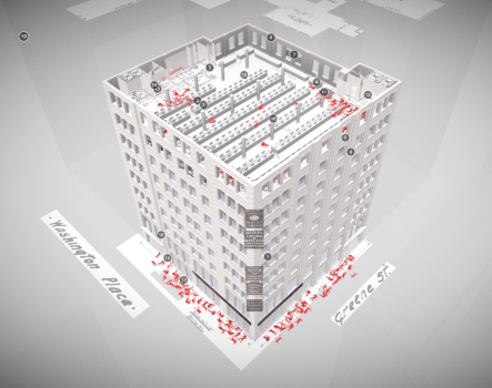
This animation reconstructs the exact conditions of the workplace, the locations of each fallen body, and the progress of the 1911 fire minute by minute. It is in an accurate-to-the-inch virtual reality model based on trial records, police reports, original measured plans, and primary sources.

.

Audio testimonies from:
Pauline Newman letter from May 1951, 6036/008, International Ladies’ Garment Workers’ Union Archives. Cornell University, Kheel Center for Labor-Management Documentation and Archives.
Louis Waldman eyewitness in Labor Lawyer, New York: E.P. Dutton, 1944, pp. 32-33.
Anna Gullo in the case of The People of the State of New York v. Isaac Harris and Max Blanck, December 11, 1911, pp. 362.

.

The Triangle Shirtwaist Factory fire on Saturday, March 25, 1911 was the deadliest fire in New York City history and one of the deadliest fires in American history. The factory was located on floors eight, nine, and ten of the Asch Building, built in 1901 for various garment sweatshops in Manhattan’s West Village.
To prevent workers from taking unauthorized breaks, to reduce theft, and to block union organizers from entering the factory, the exit doors to the stairwells were locked – a common and legal practice at the time. As a result, more than half of the ninth floor workers could not escape the burning building.
As a result of the fire and lack of workplace protections, 146 garment workers – 123 women and girls and 23 men – died by fire, smoke inhalation, or jumping and falling from the 9th floor windows. Most victims were recent Italian or Jewish immigrant women and girls aged 14 to 23.
After the fire, factory owners Max Blanck and Isaac Harris were not convicted and were ruled “not guilty.” They “compensated” each victim’s family a mere $75. The fire led to news laws requiring fire sprinklers in factories, safety inspections, and improved working conditions. The fire also motivated the growing International Ladies’ Garment Workers’ Union that organized sweatshop workers to fight for a living wage, job protections, and the right to unionize.
Click on individual annotations in model to fly around the factory and follow the time sequence of the fire.

.

Virtual Reality Model

.

Primary Sources

– Cornell University’s Kheel Center for Labor-Management Documentation & Archives (website)
– The 1,500 page transcript of witness and survivor testimonies (transcript)
– Victim names and causes of death (source and map of victim home addresses)
– Original architectural plans of the building used in the trial (PDF plans and source)

.

Architectural Plans

.

Stairway of death: view looking up the Washington Place stairway that was locked during the fire

Audio Sources

Horse drawn carriage
Power loom
Workplace bell
Classroom
Large crowd
Elevator
Small fire
Large fire
Fire truck bell
Fire hose
Dull thud
Heartbeat
– Closing song: Solidarity Forever by Pete Seeger, 1998
– Closing song: Solidarity Forever by Twin Cities Labor Chorus, 2009


The time-lapse history of Manhattan in two minutes

.

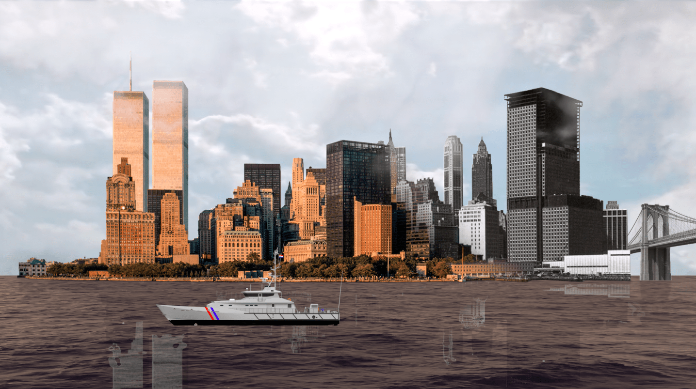
This two minute time-lapse reconstructs the 400 year evolution of Lower Manhattan’s skyline. Watch as the city evolves from a small village into a glistening metropolis.
This is also a film about the history of technology. Changing methods of representing urban space influence our perception of time and the city. When New York City was founded, Dutch settlers captured their town’s appearance through seventeenth-century drawings and paintings. As the city grew, people started using printing presses to reproduce images of the city in the eighteenth and nineteenth centuries. In the twentieth century, photographers started capturing their city from above through aerial photos. For the first time, New Yorkers could view the entire city in a single panoramic photo.
In tribute to this long artistic tradition, this film constructs the city as each generation of New Yorkers would have represented it: through the subsequent technologies of drawing, printing, photography, and film.
.
New York City: Past and Present, 1870 and 2017

.

Sound effects from Freesound
Water and cloud effects from YouTube

Excavating Old New York Penn Station

Also published by Viewing NYC in May 2019

.

“Through Penn Station one entered the city like a god. Perhaps it was really too much. One scuttles in now like a rat.”
– Vincent Scully

.

.

View of Penn Station from roof of Macy’s department store c.1910

.

“Human beings, myself included, have an unfortunate tendency to appreciate people and things only after they are gone. Pennsylvania Station is the catalyst for the historic preservation movement.”
– Kenneth Jackson

.

.

The accompanying audio is accurate to what the place sounds like from the locations shown. The audio for old Penn Station is my imaginative reconstruction of how the original station might have sounded like, based on recordings from MoMA. My project was also inspired by this 2015 New York Times article about the subtle influence of sound on how we experience urban space: “Penn Station’s low ceilings suppress sound, which becomes hard to make out, an audible metaphor for its rat’s maze of architecture.”


“You feel that your life is being lost in a room where sound dies. We need reverberation.”
– architect Renzo Piano on the design of the current Penn Station

.

.

.

When New York Penn Station opened in 1910, the Pennsylvania Railroad boasted in advertisements that their vast new station was built of travertine marble from the same ancient Italian quarries as the Coliseum and Pantheon. Old Penn Station was rich in the architectural language of Greece and Rome. The façade comprised a colonnade of massive, Doric columns that stretched almost 450-feet end-to-end; it was inspired from temples on the Greek Acropolis. The main waiting room, at 314-feet-long, 109-feet-wide, and 150-feet-high, was modeled on Rome’s Baths of Diocletian. The project was as much an aesthetic gesture to the emerging City Beautiful Movement as it was a political statement: The Pennsylvania Railroad was here to stay, as permanent as the Penn Station it built.
The finished station, however, was an architectural contradiction. The Neoclassical exterior concealed what was, belowground, an extensive and, at-the-time, hyper-modern system of tunnels, electric trains, and communication systems that conveyed millions of people, baggage, and mail from street-level to each of 21 platforms. Aside from the solid stone columns of the main façade, most of the interior was of thin limestone, marble, and plaster sheets mounted on a metal structural frame. The seeming permanence of the stone walls was a cover for the steel frame and modern technology within on which this Neoclassical stage-set rested.

.

.

Just over fifty years later, on October 28, 1963, demolition began. The Pennsylvania Railroad, burdened with debt and aging infrastructure, was selling off its most profitable real estate assets – its land, buildings, and equipment – to stay afloat until it declared bankruptcy by 1970. Through the same two Hudson River tunnels that building materials for the original Penn Station were delivered, some of the same rubble now passed. Much of this rubble was carted off and dumped in the New Jersey Meadowlands adjacent the tracks where commuter trains still pass. The Pennsylvania Railroad used, quite literally, the station’s technology to cannibalize itself, and as the foundations for the new, and current, Penn Station.
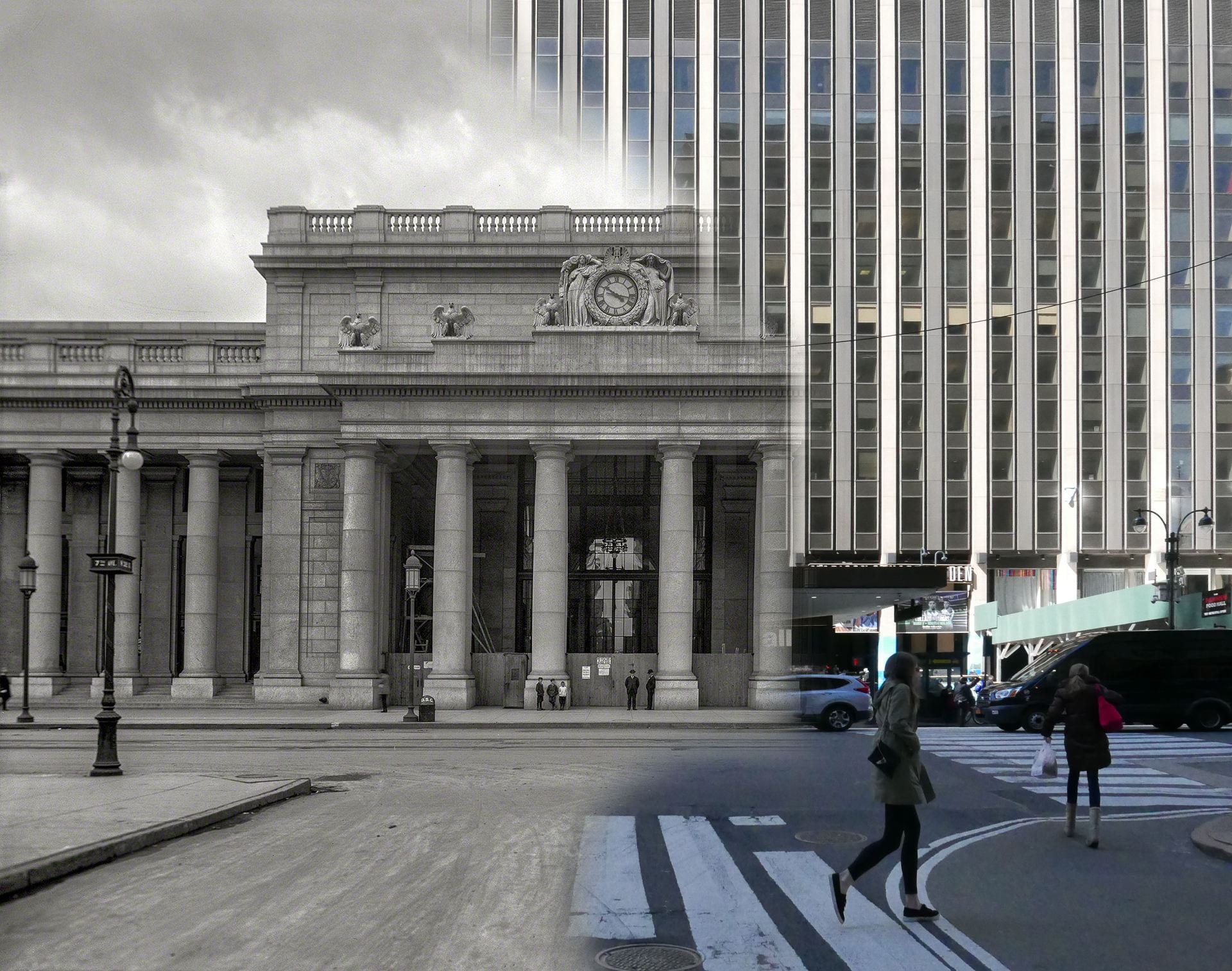
Searching for remnants of old Penn Station, I found historic photos from the New York Public Library, Historic American Buildings Survey, and Library of Congress. I returned to the same locations in fall 2019 to re-photograph these images from the identical camera angles. The resulting and visible ghost of the lost Penn Station presents a strong-clear vision of what Penn Station used to be, and by extension, what it could return to, given financial commitment and political will.

.

Train concourse: past and present from the same location

.

The current subterranean warrens represent a clean break from what was here before. As long as Madison Square Garden chokes Penn Station for air and light from above, the current lightless and oppressive Penn Station is here to stay. The current station’s cheap ceilings of corrugated metal, garish electric signage, and exposed concrete floors ironically proved more durable than the Roman marble and limestone of old. The current station is not so fleeting and has, in fact, existed longer on this site than the station before it.
Surprising still is how, for many New Yorkers, it seems inconceivable that the permanent and imposing appearance of the original station could, one day, vanish without a trace. This old station is more dream than reality, and it seems almost impossible to imagine the current arrangement as having anything to do with what came before. So little of the original station – and the pride in civic life and New York City this station stood for – remains visible. Interestingly, more of the original architectural fabric survives belowground than meets the eye aboveground.

.

View from corner of 31st Street and 7th Avenue in 1962 and 2019. The structure is unrecognizable aboveground.

.

.

.

.

32nd Street entrance to waiting room in 1962 and 2019
The southeast corner of the still-standing General Post Office is in both frames, in the far left hand distance.

.

.

.

In the five years that demolition and rebuilding lasted (from 1963 to 1968), Penn Station remained in active service. While builders demolished the old station above, commuters continued to pass by on the platforms and corridors below. For this brief moment, the two buildings lived side-by-side, until the present building swallowed almost all visible traces of the past. In spite of this loss, the confusing floor plan of the current Penn Station has much to do with remaining traces of the original. Column for column and void for void, the current Penn Station is built within the fabric of the original. The old Penn Station, completed 1910, had 21 tracks on 11 platforms. The new Penn Station has 21 tracks on 11 platforms. In the demolition process, not one track or platform moved. In the five-year re-construction process, none of the tracks and platforms were moved, and most of the stairs between concourse and track-level survived. This similarity enables us to situate parts of the old structure in relation to the new.

.

Frame of new Penn Station rises simultaneous to the demolition of the old c.1963-68
Passengers in train concourse as new structural frame divides them from the soon-to-be-demolished glass canopy of the old station.

.

Train concourse before and after insertion of the new structural frame, from the same camera angle

.

.

.

The above cross-section of old Penn Station’s waiting room shows the extent of change. The orange line indicates the elevation at ground-level to which the architectural fabric of the old building was demolished. Above this line, nothing of Penn Station survives. Below this line, most of the original structure, tracks, infrastructure, stairwells, and the general contours of the original rooms survive, except now hidden.
After the Roman Empire collapsed, its architectural monuments to empire and power fell into disuse; many were repurposed for more humble and practical purposes. The Coliseum became a stone quarry, the Roman Senate House a humble church, and the Theatre of Marcellus a medieval fortress. New purposes were developed in the shells of old monuments. When a building is reused and altered but still bears visible traces of its earlier form, architectural historians call this creation a palimpsest. A palimpsest is neither of the present nor of the past; it is a mixture of both. For instance, the two square fountains of the 9/11 Memorial in Lower Manhattan mirror the locations of the now-vanished Twin Towers. For a modern and young city in world terms, Penn Station is New York City’s largest palimpsest.

.

Shopping arcade in 1911 and 2019

.

.

View from 7th Avenue shopping arcade into the waiting room in 1911 and 2019

.

“Cutaway illustrating the principle of adaptive reuse.” Drawing by architectural children’s book illustrator, David Macaulay, proposes to discard the “non- functional” spaces of the medieval cathedral by erecting a Styrofoam drop ceiling just above the floor. Everything above – light, soundscape, and ornament is “superfluous” to the cathedral’s function.

The oppressively low ceilings of the current station are the structural division between the public areas belowground and the now private (formerly public) areas aboveground. These ceilings also align to the border between the infrastructure of the original station that survives and the architectural fabric that was lost.
The Pennsylvania Railroad made the decision that made the most economic sense: to keep the infrastructure beneath and decapitate the “non-functional” aesthetics of the soaring ceilings and open spaces aboveground. This was valuable land that could be put to more profitable use. Into these empty “air rights,” the corporation could insert Penn Station’s new functions of Madison Square Garden and office towers that would, at last, generate additional income. While exploring the station, I discovered this palimpsest valued the practical and made absolute economic sense: Who needs to enter the city on the scale of a titanic-sized god when humans require spaces no higher than 8-feet-high to pass through?

.

A cathedral with a drop ceiling

.

.

The shopping arcade in 1911 and 2019
Statue of Samuel Rea is in the shadows.

.

President Samuel Rea

The nuances of this palimpsest become clearer from inside the building. Passengers entering the old station proceeded down a long shopping arcade to the waiting room and platforms. What was once public space is now the private lobby of the commercial offices aboveground. On the right hand side, in the shadows of the private lobby, stands a statue of Samuel Rea, president of the Pennsylvania Railroad. A century ago, Rea stood at the entrance and welcomed passengers and the public; he now stands and watches the corporate clients and office workers. In old Penn Station, an inscription beneath announced his name and title. In the current location, Rea is out of place and has no relationship with his surroundings; the once prominent inscription is almost invisible on the new tablet behind him.

.

Statue of Samuel Rea is in the left hand niche.
Almost stone for stone, the location of the current waiting room escalator mirrors the location of the original.

.

.

Main entrance to waiting room: The left hand niche contains the statue of Alexander Cassatt, Pennsylvania Railroad president during construction.

.

.

The waiting room, once the largest indoor public space in New York City, is now a parking lot.

.

From the street-level arcade, passengers descended into the cavernous waiting room, sunken a few feet belowground. While the room itself is gone, the contours of this room survive in the general footprint of the sunken parking lot that now occupies the site. What was once public space is now private and patrolled by Madison Square Garden security guards who forbade me from standing at this location with my camera.

.

Perhaps, beneath this asphalt parking lot, fragments of the original waiting room floor remain.

.

.

Train Concourse

.

.

Train concourse, past and present.
White cutouts on the drop ceiling mirror the former locations of the demolished skylights.

.

.

.

.

.

.

This part of the train concourse is now the VIP entrance for spectators at Madison Square Garden.

.

The design problems with the current Penn Station are similar to those of old Penn Station: too few tracks, too many passengers, confusing circulation, and outdated infrastructure. After all, it is not the engineering and infrastructure that set these two buildings apart, as brick-for-brick and beam-for-beam, the 1960s rebuilding did not generally alter the areas belowground. This early-twentieth-century infrastructure was, after all, designed to handle no more than 200,000 passengers-per-day, and yet now struggles under the burden of 650,000-per-day. Instead, it is the envelope around this infrastructure that was rebuilt in the 1960s, and whose loss the public and historians now mourn.

.

.

At track-level, the railroad ties, location of the third rail, and support columns are original to 1910. The columns in the foreground were added in the 1960s to support the weight of Madison Square Garden. The columns in the distance are original to 1910. The 1960s modernist buildings above conceal below what is, in essence, early-twentieth-century infrastructure.

.

View from Track Six

.

Generations of New Yorkers hoped Penn Station would one day be restored with an architectural monument befitting New York City and the Western hemisphere’s busiest train station. In addition to rebuilding the General Post Office next door, other proposals over the years have called for rebuilding Penn Station exactly as it appeared before, or imagining a futuristic Penn Station emerging from the structural shell of the current Madison Square Garden, entitled “Penn Station Palimpsest.” Precedent exists for both proposals. Some post World War II cities rebuilt their monuments and bombed out city centers as they appeared before (such as Dresden and Warsaw), while others incorporated the rubble of the lost buildings into a modern building (such as Coventry Cathedral in England and Kaiser Wilhelm Memorial Church in Berlin). What we miss about old Penn Station was not the infrastructure, operations, or even the building itself, but rather the way this architecture made us feel dignified, and which we feel no longer.

Tour of desolate NYC during Coronavirus

This NYC tour follows the route of Kenneth T. Jackson’s night tour. As a Columbia University undergraduate, I joined Jackson’s 2016 night tour of NYC by bike, from Harlem, down the spine of Manhattan, and over the bridge to Brooklyn.
With a heavy heart, I gathered my courage on 30 March 2020 to revisit my beloved NYC, along this same route in the now sleeping city attacked by an invisible pathogen. The empty streets hit me with emotions in the misty and rainy weather – perhaps fitting for the city’s low morale.

.


.

The tour route is drawn below.  View this drawing in detail.

.

.

Audio effects from Freesound:  Street ambiancehighway ambiancepassing carsiren blastshort sirenlong siren

New York City Water Supply: animated history

Developed with Gergely Baics, urban historian at Barnard College

.

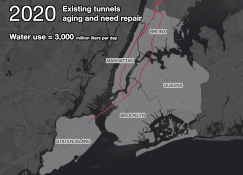
New York City has some of the world’s cleanest drinking water. It is one of only a few American cities (and among those cities the largest) to supply unfiltered drinking water to nine million people. This system collects water from around 2,000 square miles of forest and farms in Upstate New York, transports this water in up to 125 miles of buried aqueducts, and delivers one billion gallons per day, enough to fill a cube ~300 feet to a side, or the volume of the Empire State Building. This is one of America’s largest and most ambitious infrastructure projects. It remains, however, invisible and taken for granted. When they drink a glass of water or wash their hands, few New Yorkers remind themselves of this marvel in civil engineering they benefit from.
This animated map illustrates the visual history of this important American infrastructure.

.

Sound of water and ambient music from Freesound

New York City is surrounded by saltwater and has few sources of natural freshwater. From the early days, settlers dug wells and used local streams. As the population grew, these sources became polluted. Water shortages allowed disease and fire to threaten the city’s future. In response, city leaders looked north, to the undeveloped forests and rivers of Upstate New York. This began the 200-year-long search for clean water for the growing city.

.

Credits

Gergely Baics – advice on GIS skills and animating water history
Kenneth T. Jackson – infrastructure history
Juan F. Martinez and Wright Kennedy – data

.

Interactive Map

I created this animation with information from New York City Open Data about the construction and location of water supply infrastructure. Aqueduct routes are traced from public satellite imagery and old maps in NYPL map archives. Thanks is also due to Juan F. Martinez, who created this visualization.
Explore water features in the interactive map below. Click color-coded features to reveal detail.

.

Watersheds   Subsurface Aqueducts   Surface Aqueducts   Water Distribution Tunnels   City Limits

.

▼ For map legend, press arrow key below.

.

Sources

.
For such an important and public infrastructure, the data about this water supply, aqueduct routes, and pumping stations is kept secret in a post 9/11 world. However, the data presented here is extracted from publicly-available sources online, and through analysis of visible infrastructure features on satellite imagery when actual vector file data or raster maps are unavailable from NYC government.
.
Contemporary Maps
NYC System and Shapefiles – Juan F. Martinez
Watershed Recreation Areas – NYC Department of Environment Protection (DEP)
General System Map – NY State Department of Environmental Conservation (DEC)
.
Historic Maps
.
Texts
Water Supply Fast Facts – NY State DEC
Encyclopedia of the City of New York – Kenneth T. Jackson
.
Animation music – Freesound
Audio narration – Myles Zhang

New York City in a Box

As featured in this article from Live Auctioneers

.

.

.

Inspired by the Stettheimer Dollhouse at the Museum of the City of New York, this pop up model in a recycled metal box (measuring 8 inches wide by 15.5 long and 2.5 deep) reveals a miniature world of New York City architecture and landmarks within. About 30 buildings made from hand cut paper and tin are spread across a flat ground of painted streets. Each building is made from a single sheet of paper that is cut and folded like origami to create different shapes and sizes. A hand cranked lever operates a mechanism of chains and gears hidden beneath the  paper surface of the city streets. These gears move the magnetized trains and airplanes through the city.

.

.


.

Hand-crank and music box recording from Freesound

Here Grows New York City

Music: “The Language of Cities” by Maserati

1. The Animation

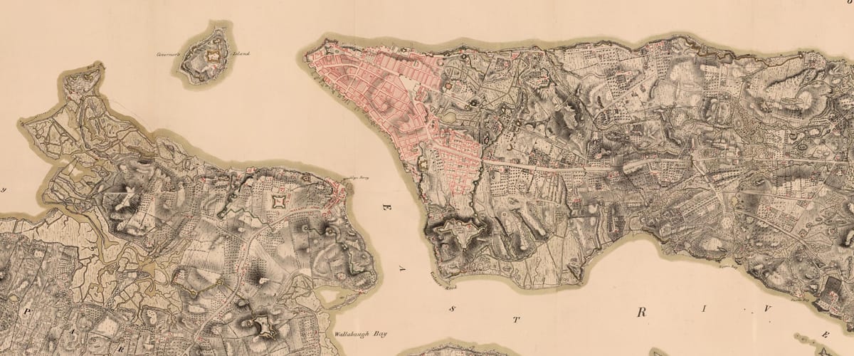
Here Grows New York visually animates the development of this city’s street grid and environment from 1609 to the present day, using geo-referenced road network data, historic maps, and geological surveys. The resulting short film presents a series of “cartographic snapshots” of the built-up environment at intervals of every 20 to 30 years in history. This process highlights the organic spurts of growth and movement that typify New York’s and most cities’ development through time. The result is an abstract representation of urbanism.
Featured in:
– Laughing Squid   March 12, 2019
Viewing NYC   March 14
– silive.com   March 14
Open Culture   April 17
– Columbia Data Science Institute   May 1
– Library of Congress Blog   May 2
– Kottke.org   May 6
NYNJ.com   May 13
– 6sqft   May 13
– UK Daily Mail   August 28
– LangweileDich.net   June 11, 2020
– Wikipedia
New Amsterdam History Center   December 1, 2020
Bunk History   July 2021
– Camden Town, 2023 textbook by Westermann Group
– Inspired by Cambridge University’s London Evolution Animation and this map of Barcelona

.

2. The Interactive Map

The results of this animation are transformed into this fully interactive map

.

3. Research Method

Several hundred maps in the digital archives of the New York Public Library and Library of Congress were analyzed to assemble this film. About 25 of these maps were then selected, downloaded, merged, stretched, and warped in a single document to align with each other. This provided a consistent scale and allowed easier comparison of differences between maps of different date. As the source files were all in different colors, scales, and designs, we created a single base map with unified graphics. The redrawing not only permits correcting errors in less accurate old maps but also provides a graphic representation that is consistent over time. This coherence allows the rate and trends in urban growth to be read more easily and compared between eras.
Click here to read the research methodology and list of maps consulted.
Or watch the video tutorial below of the workflow and software behind the animation

.

.

4. Conclusions and Analysis

This data visualization informs our analysis of the history of the New York City grid. This analysis reflects on the question: What can the built environment of Manhattan’s streets reflect about the evolving social and economic priorities of city planners and leaders? The long phases of urban growth and shifting transportation modes created distinctive road networks in Manhattan. The predominance of different forms of transport during each era also prompted changes to the location and dimensions of streets in response. Manhattan illustrates the evolution of these road networks over four centuries of near continuous growth. A plot can describe a street grid, as well as its builders’ story. This paper aims to tell this second plot, a story of urbanism.
Click here to read the conclusions as part of a working paper
written with Professor Kenneth T. Jackson.

.

.

5. Credits and Appendix

This project would not have been possible without the support, mentorship, and patience of my parents, Anne Mabry and Zemin Zemin Zhang. Nor would this project have been possible without the historical expertise of Columbia University professors Kenneth T. Jackson (History Department) and Gergely Baics (Urban Studies). Thanks is also extended to those who reviewed and critiqued this project in its early stages, including Chris Kok, Wright Kennedy, Dan Miller, and the Center for Spatial Research at Columbia’s Department of History. Most importantly, I thank my dog ChoiChoi.

.

Anyone may reuse or republish this content, so long as credit is provided with the link back to this page. If you email [email protected], I will gladly send along the graphics, maps, and source files associated.

.

New York City Subway Ridership

Created with data from the MTA.
Published by Gothamist on 22 January 2019.
Related: my data visualization of London Underground commuting patterns.

.

The visual language of data addresses a deeper need to humanize and soften the concrete jungle.

.

Sounds of breathingheartbeat, and subway from Freesound

.

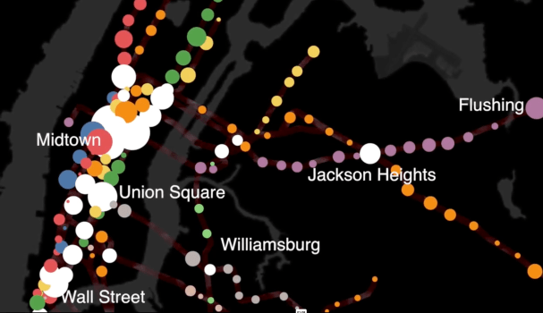
In this animation based on subway ridership statistics by station:
● Dots are color-coded according to the subway lines they serve.
● White dots are for junctions between two or more lines of different color.
● Dot size corresponds to the number of riders entering each station within a 24 hour period.
● Larger dots are for busier stations. Smaller dots are for less busy stations.
Movements through the New York City subway are analogous to rhythmic breathing.
People often describe cities in relation to the human body. Major roads are called “arteries” in reference to blood flow. The sewers are the city’s “bowels” in reference to our own digestive systems. Central Park is the city’s “lungs.” At various times in history, key industries like garments and finance were described as the “backbone” of New York’s economy. Although cities are complex organisms, wordplay makes the giant metropolis somehow more human and familiar.
The 424 subway stations and 665 miles of track are analogous to the human circulatory system. Every weekday pre-coronavirus, the subway carried 5.4 million people, mostly commuters. This daily commute is ordered, structured, and rhythmic – as Manhattan’s population swells during the daily commute and then contracts by night. Each passenger symbolizes the movement of a single red blood cell. With each paycheck, the oxygen of capitalism flows from the heart of Manhattan to the cellular homes in the outer boroughs.
Commuting patterns mirror the rhythmic expansion and contraction of the human body while breathing. By contrasting weekday and weekend ridership patterns, we detect the city’s respiratory system.

.

.

Interactive Map

.

Research Method

In this video lecture, I walk you through how I manipulated MTA and NYC open data
to create this animation.

.

The Metropolitan Transit Authority (MTA) publishes statistics on weekday and weekend (Saturday + Sunday) ridership for all 424 stations. These statistics, updated yearly, are public and can be analyzed to track trends in urban growth. I downloaded the MTA data and assigned each station a geographical coordinate (latitude + longitude) so that the data points would appear at their corresponding map locations.

I have a love-hate relationship with the New York City subway. At rush hour, it is crowded, hot, and slow. From years of riding its squeaky trains, it’s given me a ringing tinnitus sound in my ear. Despite its flaws, the subway is one of the few urban spaces where all social classes and ethnicities mix, where their separate lives are momentarily shared. Rich or poor, everyone rides the subway. I hope this animation renews appreciation for this engineering and the people behind it.

.

Sources